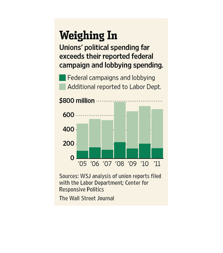
The title of the graphic is  weighing in. It says that Union's political spending far  exceeds
their reported federal campaign and lobbying spending.
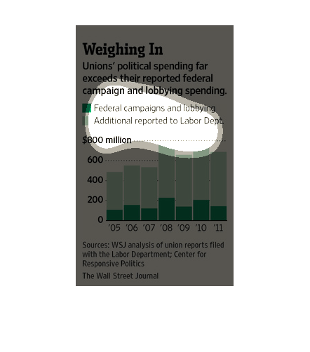
This is a chart showing that the unions political spending drastically exceeded their reported
lobbying spending. There is then a chart that shows all these figures.
This chart describes weighing in. Specifically, Unions' political spending far exceeds their
reported federal campaign lobbying spending. The highest spike on the chart comes in 2008.
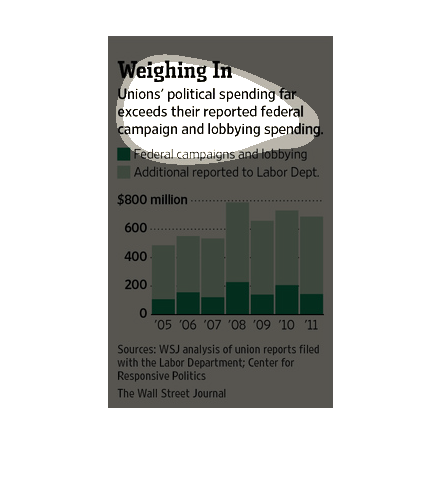
This image details political campaign spending, showing that the Union political campaign
and lobbying spending has been more than reported to the federal government. Original reported
spending falls around or under the 300 million mark, while additional spending is almost 3
times that over the years. The graph displays the original reported spending in dark green,
with the lighter green showing what was actually spent by the campaign and lobbying.
This chart from the Wall Street Journal shows how unions are spending on political areas in
the United States during the 2012 election and how it has changed over time
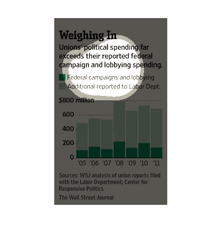
This graph shows that unions political spending far exceeds their federal campaign and lobbying
spending from the years 2005 to 2012 using Labor Department statistics.
This image is entitled "Weighing In."  It shows Unions' political spending far exceeds their
reported federal campaign and lobbying spending.  Two comparisons are made between federal
campaigns and lobbying (dark green) and additional reported to Labor Department (light green).
 Amounts range from 0 to $800 million from 2005-2011.  Data was obtained from The Wall Street
Journal.
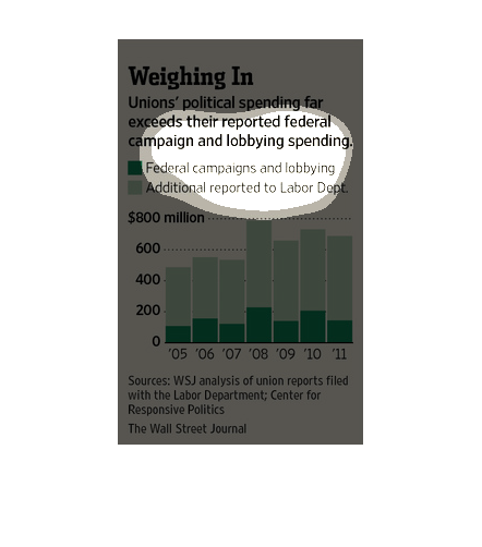
This graph shows how unions' political spending far exceeds their reported federal campaign
and lobbying spending. From 2005 to 2011 there is a 300-500 million difference in reported
spending and actual spending. The largest difference was in 2008 and was about 600 million.
There is a huge discrepancy in the way the facts are being presented to the American public,
according to a study conducted by the Wall Street Journal from documents obtained from the
Labor Department.
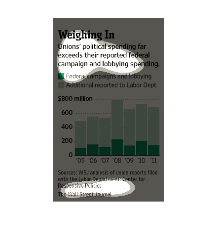
This shows that unions political spending far exceeds their federal campaign and lobbying
spending and has labor statistics data from 2005 to 2011 for both categories.
This chart from the Wall Street Journal shows how union spending on political activities in
the United States has increased over time and changed.
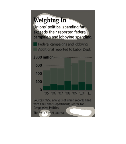
This chart demonstrates the actual total political spending of unions versus the federally
reported lobbying and campaign spending for the years 2005 - 2011.  It demonstrates the data
poorly, getting across primarily the point that the total is much higher than the reported.
 There does not appear to be a strong correlation, but it seems to demonstrate a consistency
(around 20%).  Color choice is poor, far too much writing to efficiently get across a point.