This is a series of diagrams and related statistics depicting that New York City shootings
had increased while homicides had gone down in the year 2012.
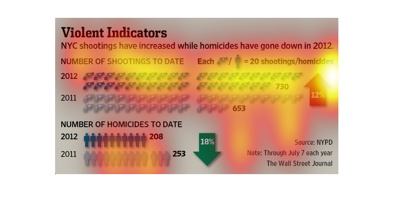
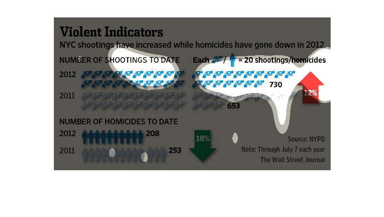
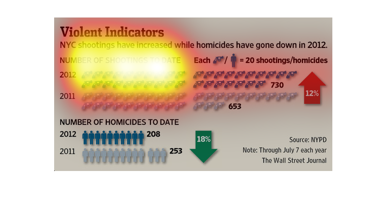
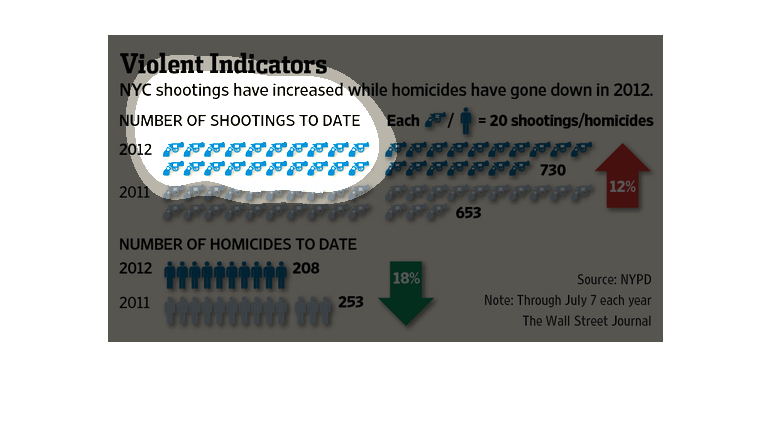
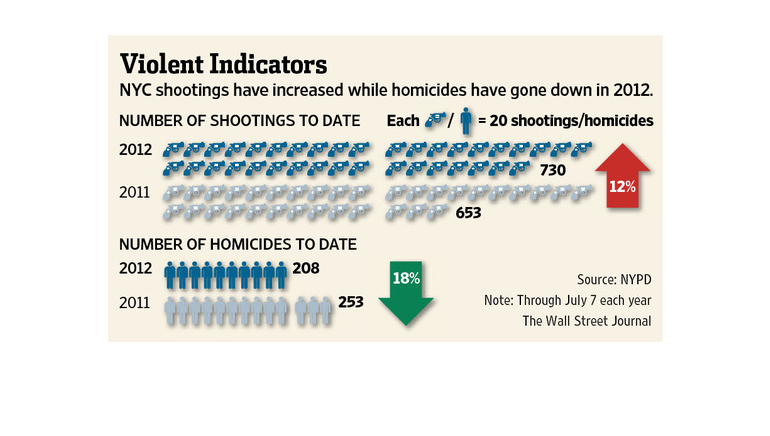
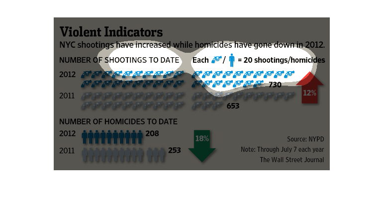
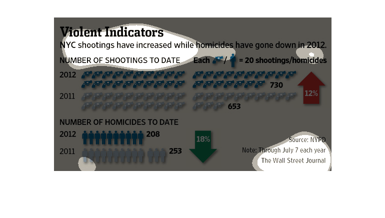
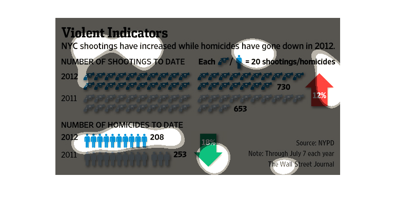
This image is entitled "Violence Indicators."  Is shows NYC shootings have increased while
homicides have gone down in 2012.  The left side of the image shows the number of shootings
to date and the number of homicides to date.  The right side of the image shows that each
gun/person equals 20 shootings/homicides.  The source is NYPD.  Data shown in The Wall Street
Journal.
This chart from the Wall Street Journal shows how crime has changed in New York City and become
more violent despite the drop in the number of homicides
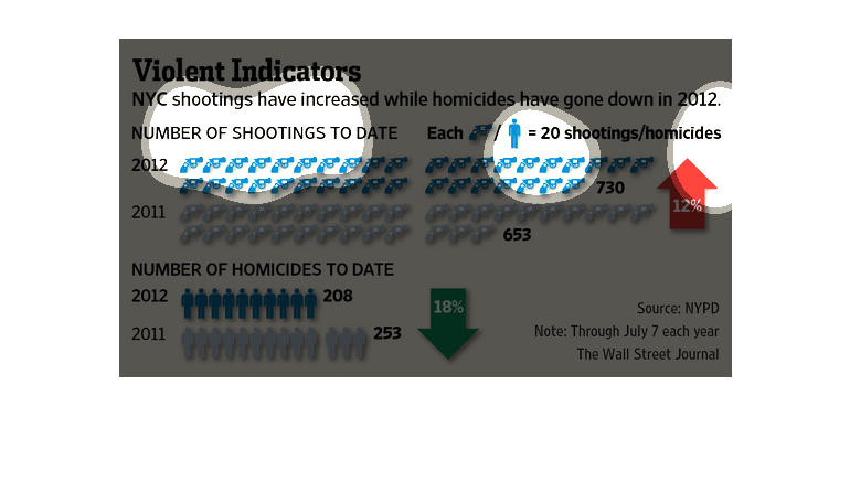
This chart shows how NYC shootings have increased while homicides have decreased in 2012.
The results are through July 7th each year, and they are from the NYPD.
The caption for this image is, "Violence Indicators, NYC shootings have increased while homicides
have gone down in 2012."  There are a few graphs displaying information on the number of shootings
in 2012 in New York City, as well as the number of homicides with a to date comparison.
This chart shows that NYC shootings have increased while homicides have gone down.  It has
the number of shootings to date in 2012 and as well as the number of homicides to date.
This chart compares the number of shootings vs the number of homicides in New York City in
2011 and 2012. The number of shootings have increased 12%, while the number of homicides have
gone down 18%.
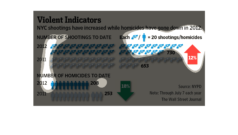
This is a series of charts that shows New York City shooting data including shootings to date,
number of homicides to date and number of guns per person.
In this Wall Street Journal study- conducted from vast data collected from the NYPD- shows
that there has been a great increase in shootings in the city these past couple of years.
The title of the graph is violent indicators: NYC shootings have increased while homicides
have gone down in 2012. It gives the number of shootings to date.
The image depicts data on New York shootings increasing while homicides had gone down in 2012.
Shootings increased 12%, while homicides decreased by 18%.
The image describes how the number of shootings in New York City while the number of homicides
has actually gone down. It provides a visual representation of each statistic.
This chart describes violent indicators. Specifically, NYC shootings have increased while
homicides have gone down in 2012. The chart includes several illustrations.
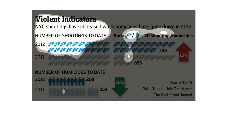
This chart from the Wall Street Journal shows how shootings have increased in New york city
but homicides have decreased, which presents a strange conundrum