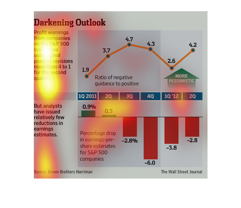
This chart describes darkening outlook. Specifically, profit warnings from companies on the
S&P 500 index have outweighed positive revisions more than 4 to 1.
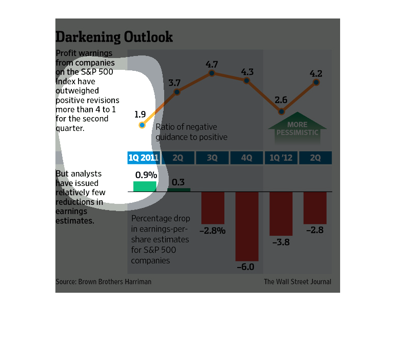
The image depicts profit warnings for companies in the S&P 500 outweighing positive revision
by more more than 4 to 1 in the second quarter. Percentage drops continue to increase, while
pessimism is also increasing.
This chart from the Wall Street Journal shows how the profit and revenue outlook for S&P 500
companies is on the decline, depressing stock prices.
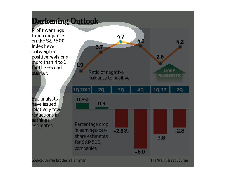
Here we have a top chart showing the trend of ratio of negative to positive guidance in profit
warnings across the first two quarters of 2011. Despite the above data, below it says economics
have issued relatively few reductions in earnings estimates, as shown in a bar graph.
In this study conducted by the Wall Street Journail- from data obtained from Brown Brothers
Harriman- there seems to be a rise in pessimism in several companies after the recession.
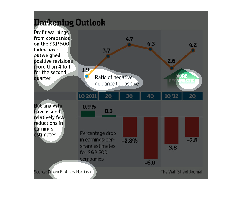
Even though profit warnings for S&P 500 companies have outweighed positive revisions for the
second quarter, analysts have issued relatively few reductions in earnings estimates.
This chart shows how optimistic or pessimistic the market outlook is. It was very optimistic
in the 3rd Q of 2011, but very pessimistic in the ist Q of 2012. The earnings per share estimate
dropped 6% in the 4th Q of 2011.
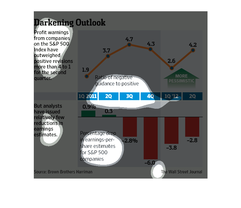
The title of the graphic is darkening outlook. It says that profit warnings from companies
on the S@P 500 index have outweighed positive revisions more than 4 to 1.
This image shows the ratio of negative to positive guidance for S&P 500 companies. The negative
outweighs the positive by at least 4 to 1. Even though these changes are noticed, analysts
don't think it affects earning estimates.
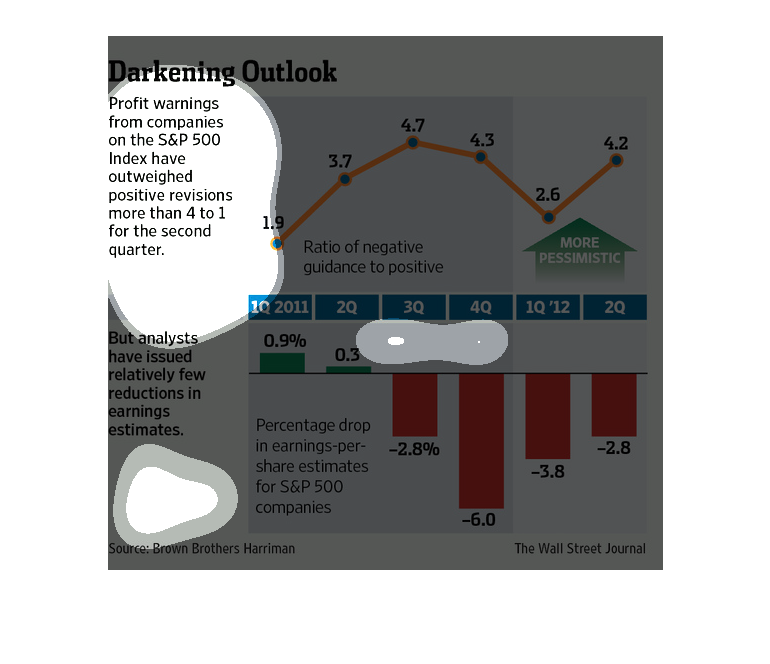
This shows the profit warnings that are coming out of the S&P 500 index and the reductions
earnings that have been correlated with them from 2011 to 2012.
This chart describes darkening outlook. Specifically, profit warnings from companies on the
S&P 500. Different categories are represented by different colors.
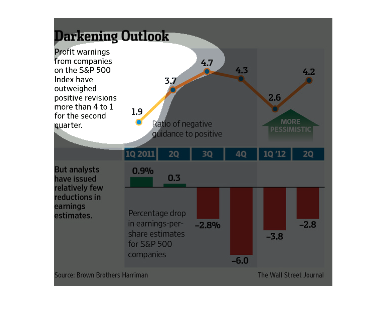
The top graph illustrates performance of the S&P 500 Index from 2011 to 2012 and the bottom
graph details percentage in earnings per share estimates for S&P 500.
This image shows or depicts in both line and bar graph formats statistics regarding profit
warnings from S&P companies that have outweighed positive revisions.
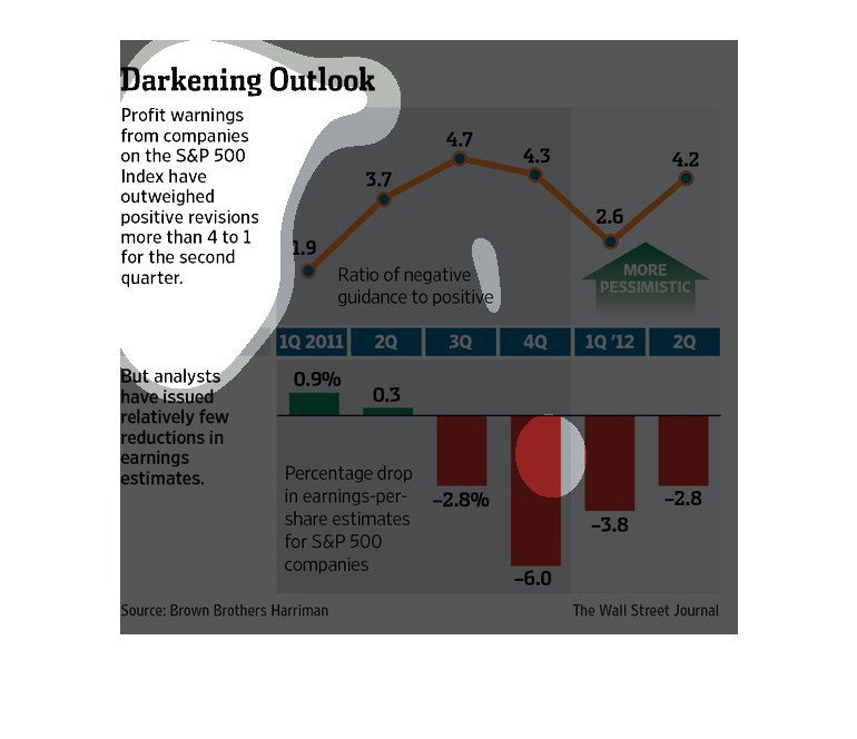
This chart from the Wall Street Journal shows how profit expectations for S&P 500 companies
are starting to decline which may be a bad thing for the eocnomy
An infographic from 2011 on the darkening outlook of S&P 500 companies as a large percentage
change their earning estimates to lower amounts after poor performance