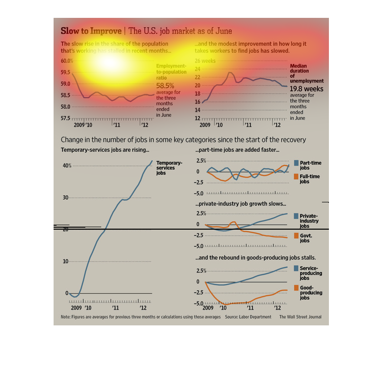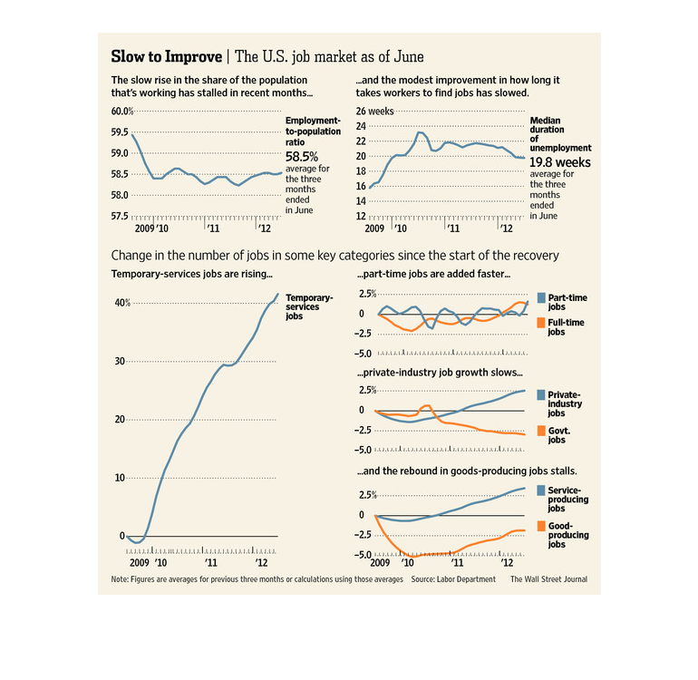
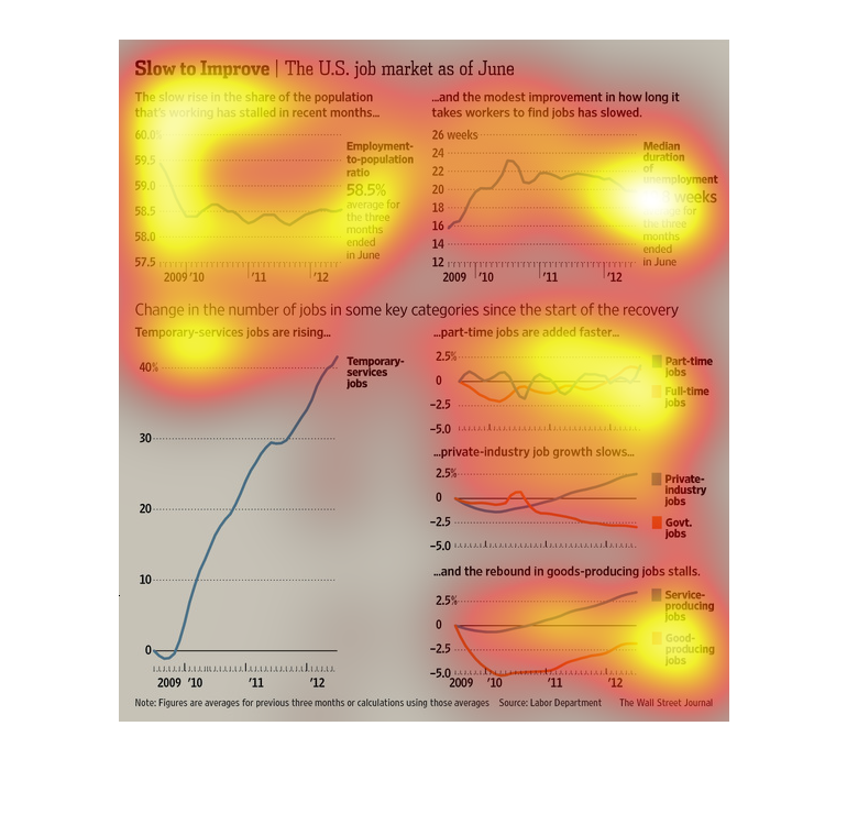
There are four separate graphs that comprise this image.  The caption for these images reads,
"Slow to improve, The U.S. job market as of June".  Each one of these graphs display different
information; one displaying the average for how long it takes to find a job, another displaying
employment to population rate, trending data for temporary jobs, and lastly the rate in which
part jobs has increased.
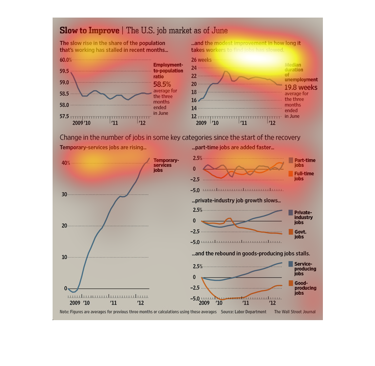
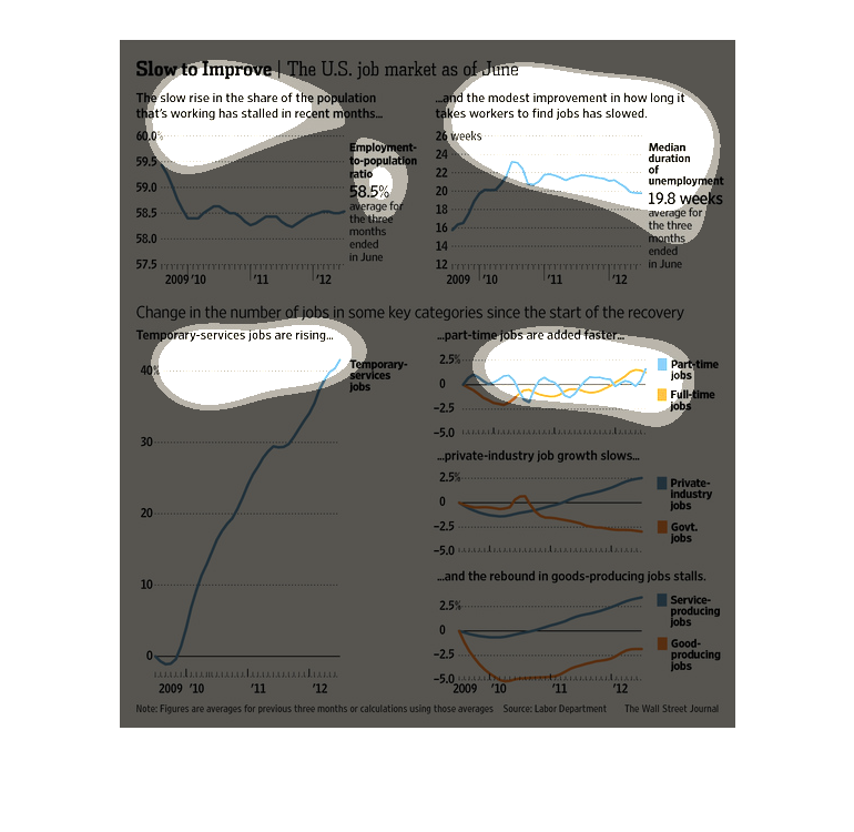
This image shows or depicts various statistical line graph formatted information regarding
the slow rise in the share of the population that's working has slowed in recent months.
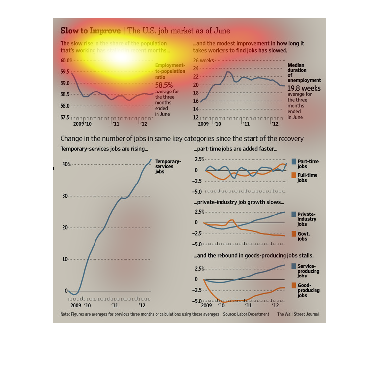
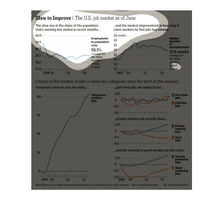
This graph shows that the U.S. job market circa 2012 appears to be slow on the rise. The employment-to-population
ratio has been hovering around the same 58% mark for several years. The amount of time it
takes workers to find jobs has also slowed--reaching about 19.8 weeks in summer 2012.  Temporary
service jobs have been on a steady rise, indicating that businesses are having trouble keeping
long-term employees. Part-time jobs are being added to the market more quickly, while private
industries and service/good producing jobs have come to a standstill.  This shows that in
2012, the U.S. job market was still showing signs of difficulty recovering from economic crises
earlier in the century.
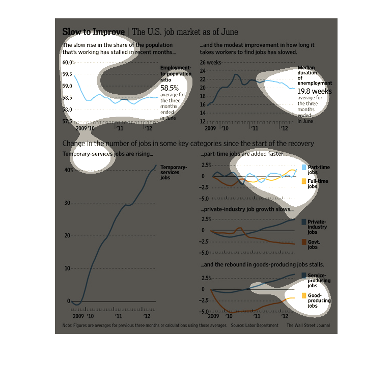
This graphic shows various statitics that are related to the labor market during the recovery
from the great recession. It shows various statistics in their own line graphs.
The title of this graphic is slow to improve: the us job market as of June.There is modest
improvement in the time it takes for potential employees to find work.
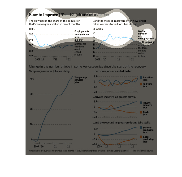
The top left shows the slow rise in the share of the population that is working, top right
is improvements in finding workers jobs, bottom left is temporary service jobs rising, and
bottom right part time jobs added faster.
This chart from the Wall Street Journal shows how the United States job market has slowly
improved as of this chart, which is quite dated. It shows slow growth after the recesssion
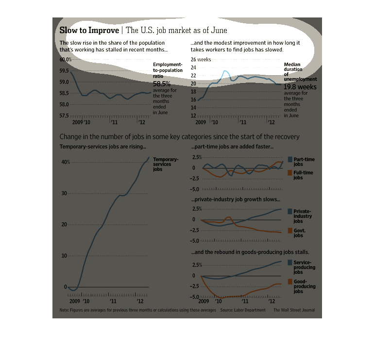
This is a series of charts showing slow job growth through June. It details a skyrocket of
temp jobs as well as part time increases opposed to full time.
This chart from the Wall Street Journal shows how the United states job market has improved
over time as measured by unemployment rate and other indicators
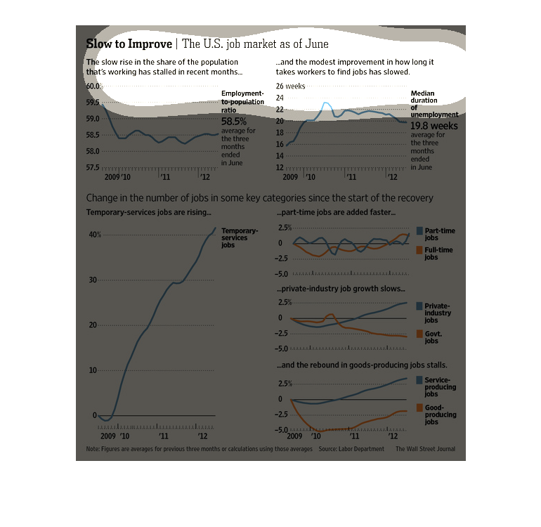
This is a series of color coded charts and related statistics depicting the United States
job market as of June, 2012 across a number of varying selected metrics.
These graphs show different information related to employment and the US job market as a whole
during the years of 2009-2012. The graphs show that most things related to the job market
took a steep drop during 2009 and 2010, but started to recover in late 2011 and early 2012.
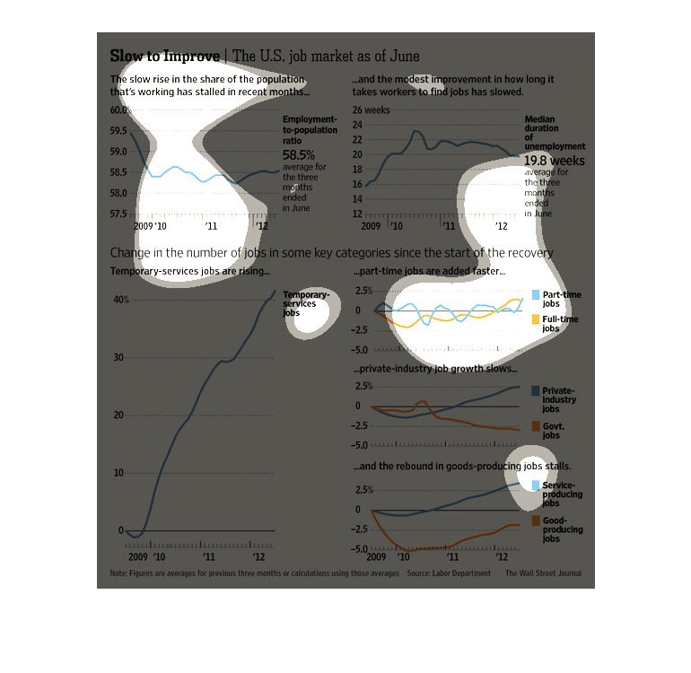
This is a chart showing some graphs related to the improving job market. The number of key
jobs in many positions seems to be increasing and things are slowly getting better it says.
This chart describes slow to improve. Specifically, the United States job market as of June.
Categories on the chart include median duration of unemployment.
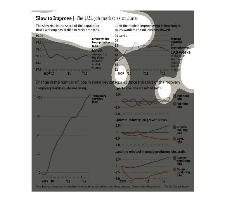
This chart presents information on the US job market from 2009 to June 2012.  Temporary service
jobs have risen to >40% in 2012 from <10% in 2009.  Part-time jobs are rising while private
industry growth slows.
This chart describes slow to improve. Specifically, the U.S. job market as of June. The slow
rise in the share of the population that's working has stalled.