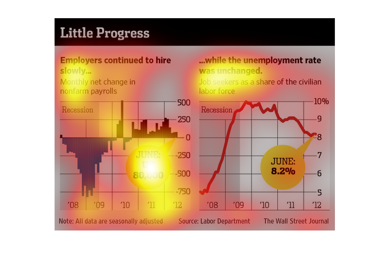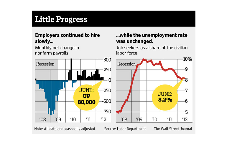
This chart from the Wall Street Journal shows the change in employment growth by private sector
employers and how it is starting to slow down over time
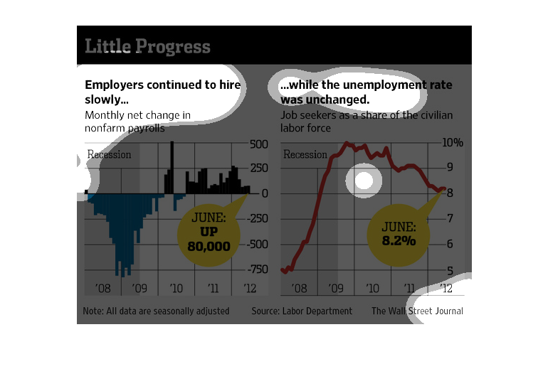
The left side of the chart shows slow hiring by employers during the recession period and
the right side shows job seekers as  share of the civilian labor force.
Employers are hiring slowly while the unemployment rate was unchanged. Monthly net change
in nonfarm payroll. June was up 80000. Job seekers as a share of the civilian labor force.
In June, unemployment was at 8%. This is from 2008-2012
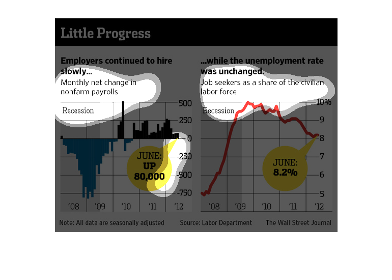
This is talking about how people are getting hired but the unemployment rate is still not
changing. Some people are getting fired while others get hired, therefore the number of people
employed never changes.
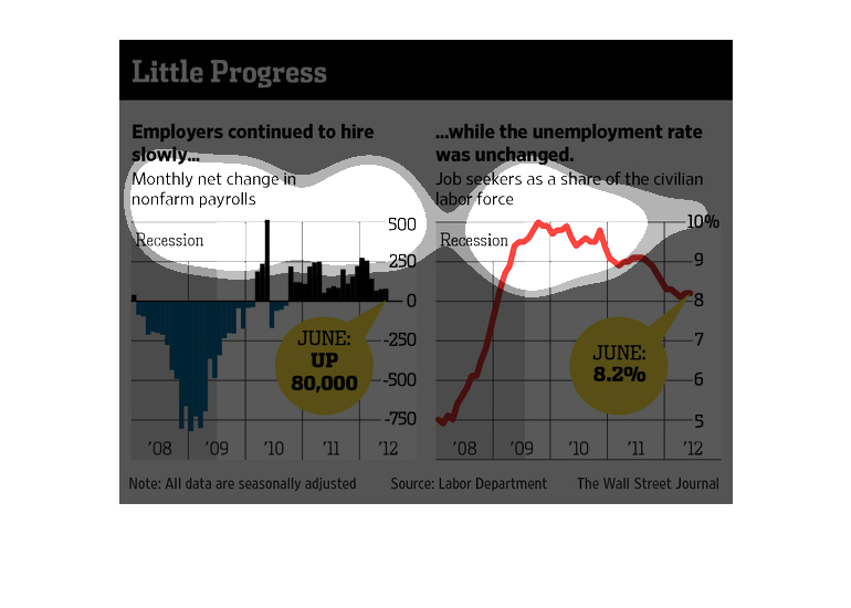
This chart is entitled "Little Progress."  It shows employers continuing to hire slowly while
the unemployment rate remains unchanged.  Two graphs are shown.  One shows the monthly net
change in nonfarm payrolls.  The other graph shows job seekers as a share of the civilian
labor force.  Information for the charts was obtained from The Wall Street Journal.
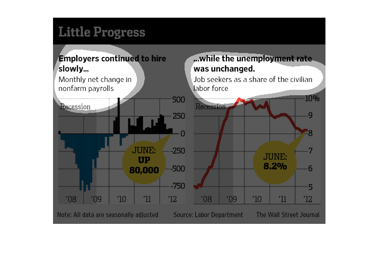
In this study from 2008 to 2012 conducted by the Wall Street Journal- information gathered
from the Labor Department- we see that due to the recession there is a high amount of unemployment.
This image shows or depicts in both bar and line graph statistical formats data concerning
how little progress is being made with employers continuing to hire slowly.
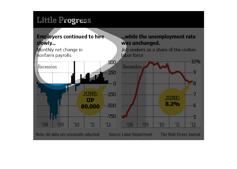
These charts detail slow economic growth in that not many jobs are being created and that
the unemployment rate has remain relatively unchanged. Data has been taken from 2008 to 2012.
This chart from the Wall Street Journal shows how the recovery post the recession is slow
and steady and not as fast as expected given slower than normal hiring
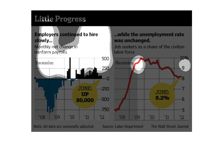
This chart describes little progress. Specifically, employers continued to hire slowly. Different
categories are represented by different colors on the chart.
We see two graphs, One of which shows unemployment rates spiking in 2009 and then declining
still in 2012. monthly net change on non farm employment. June, 2012 was up 80,000
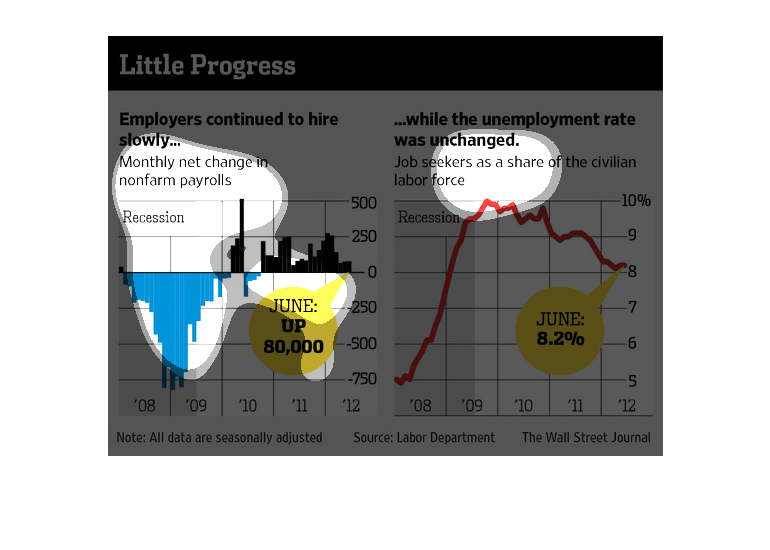
This chart describes little progress. Specifically, employers continued to hire slowly. Different
categories are represented by different colors on the chart.
The image depicts how employers are continuing to hire slowly, while the unemployment rate
remains unchanged. The data indicates that the economic recovery is not occurring at a speedy
enough pace with stagnant unemployment numbers and slow-hiring employers.

Employers continued to hire workers while unemployment was unchanged. Monthly net change in
non farm payroll. June payment up 80,000, while unemployment was unchanged. June unemployment
went down 8.2%,
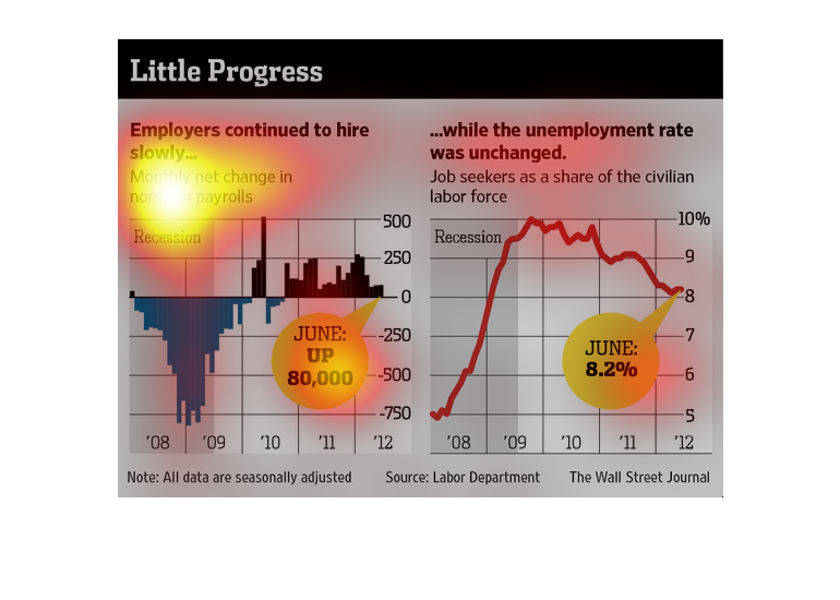
In 2008 and 2009, employers were slow to hire. In 2010 through 2012, there was increased job
production, overall. However, there were also more people looking for work.