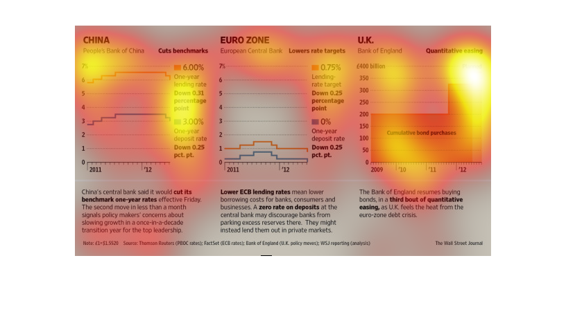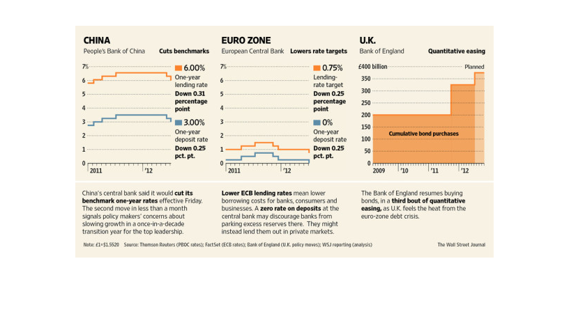
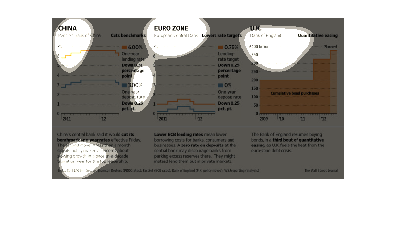
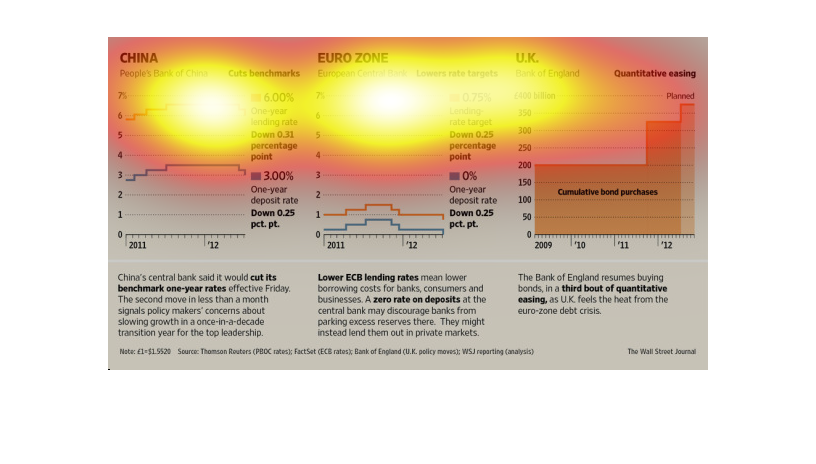
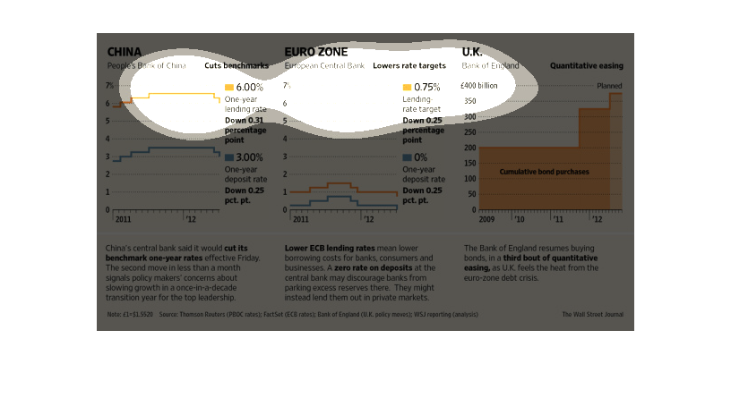
This chart from the Wall Street Journal shows how China, euro zone, and England have changed
because of central bank actions. other than that is hard to read
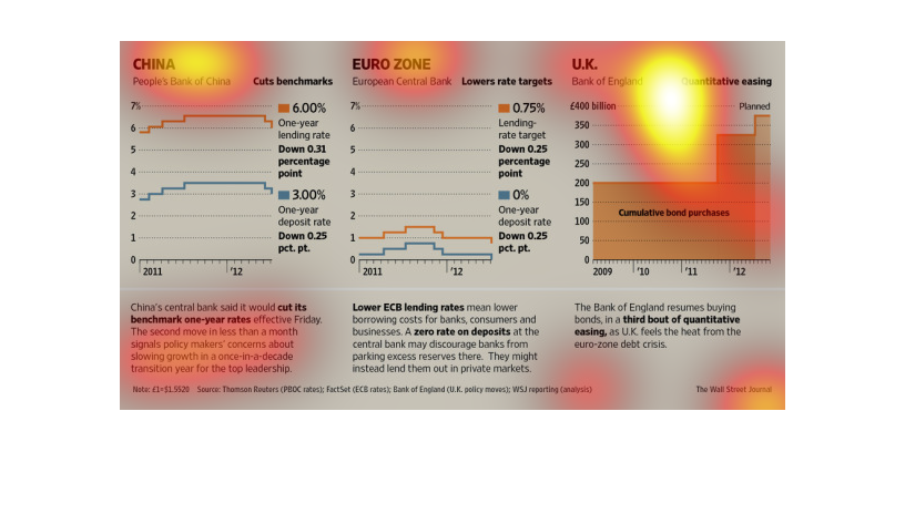
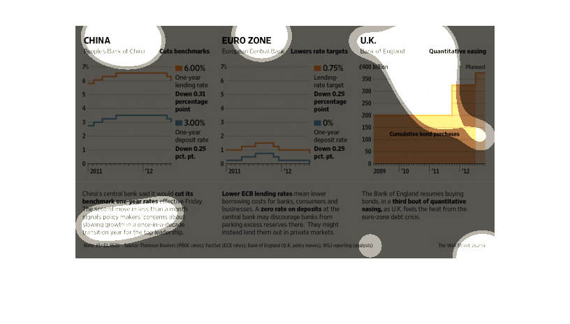
This series of graphs shows the different in rate targets between the chinese bank, Euro zone,
and UK banks. Each trending bar represents different percentage rates across the spectrum
This is a chart of three different graphs representing three different countries, China, UK
and Euro Zone. It shows different details about their banks.
The title of this graphic is China  and Euro Zone. It shows the differences between the  statistics
in the banks within China and the European zones.

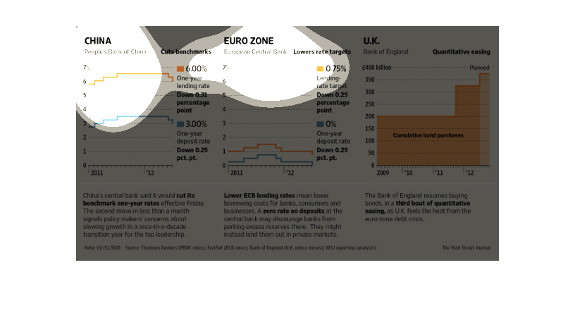
The image depicts a comparison of central banks in China, England and ECB, depicting the different
activities of banks in the midst of dealing with the eurozone crisis, and in China's case
responding to slowing economic growth.
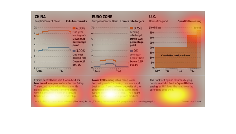
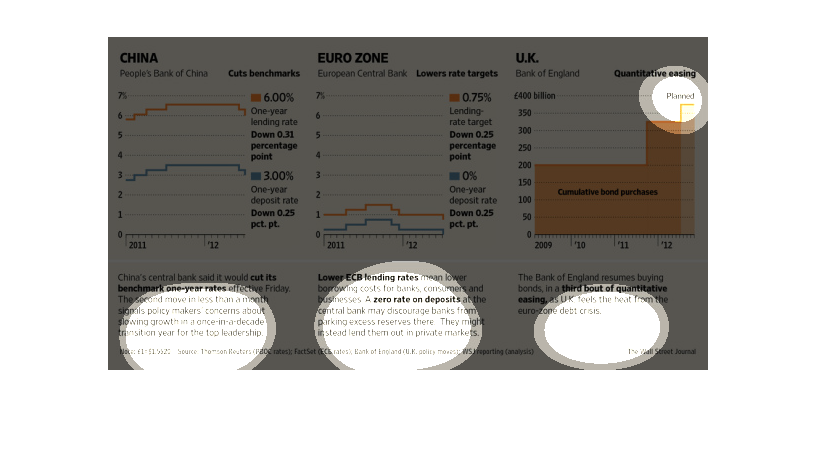
This chart describes the People's Bank of China. Specifically, the euro zone central bank.
The chart is divided into two categories, which include cuts benchmarks.
This graph describes that China central bank would be discontinuing its one year rates signalling
policy change in response to slowing growth. This graph shows rates of decrease in china,
europe, and the U.K.
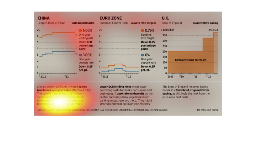
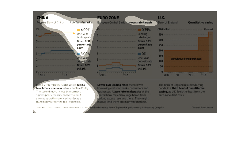
This graph shows on the left the Peoples Bank of China cost benchmarks, in the middle euro
zone European Central Bank rate targets, and in the UK Bank of England quantitative easing
on the right.
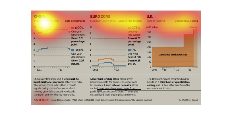
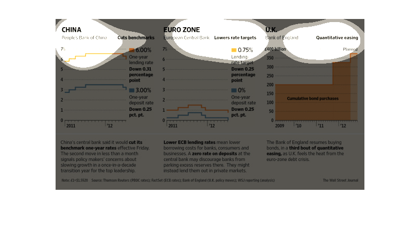
This image is about different banks lending rate in different places from 2011-2012, such
as China, Europe and the U.K. Europe had the lowest percentage in rate.
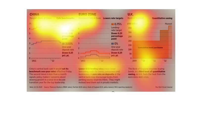
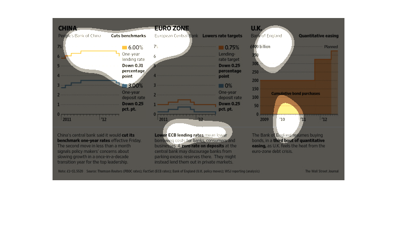
This chart from the Wall Street Journal shows how the discount or lending rate has changed
over time for China, the Euro Zone, and the UK. It shows it rising over time
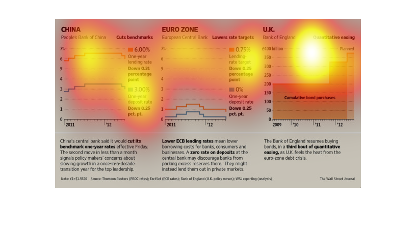
This image shows or depicts in line and bar graph statistical format information concerning
China vs Euro Zone vs U.K. in regards their central banks performance.
this graph is very very colorful if i say so myself the name of this graph is called. china
how cool is that this chart is about chinas population in their are.
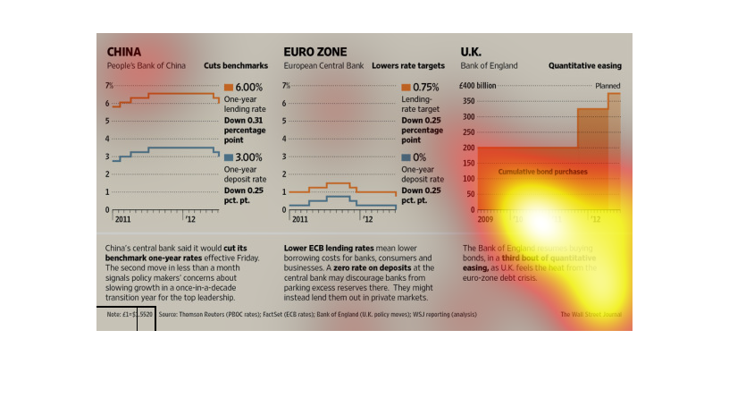
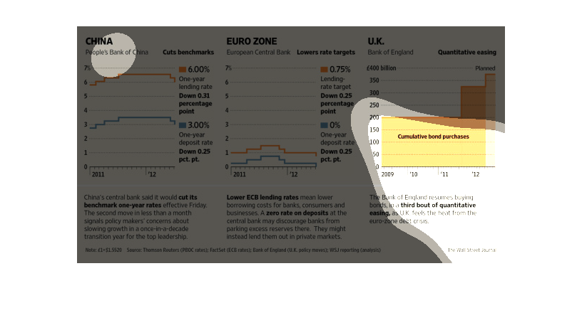
This is a series of color coded charts with related statistics depicting the different strategies
of world banks in terms of policies in effect, ie: qualitative easing.
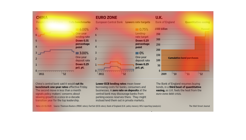
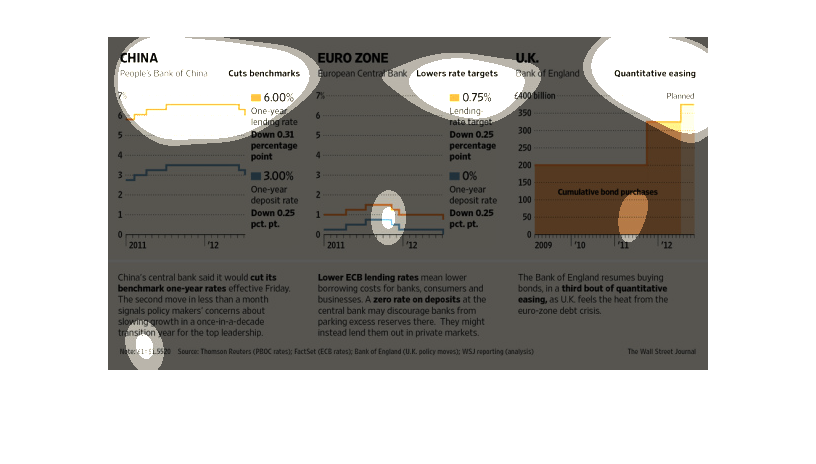
These charts compare the bank of China, the European Central bank, and the Bank of England.
They compare the one year lending rate between the bank. The Bank of England measures this
in pounds.