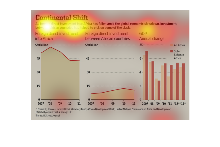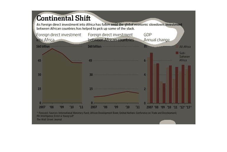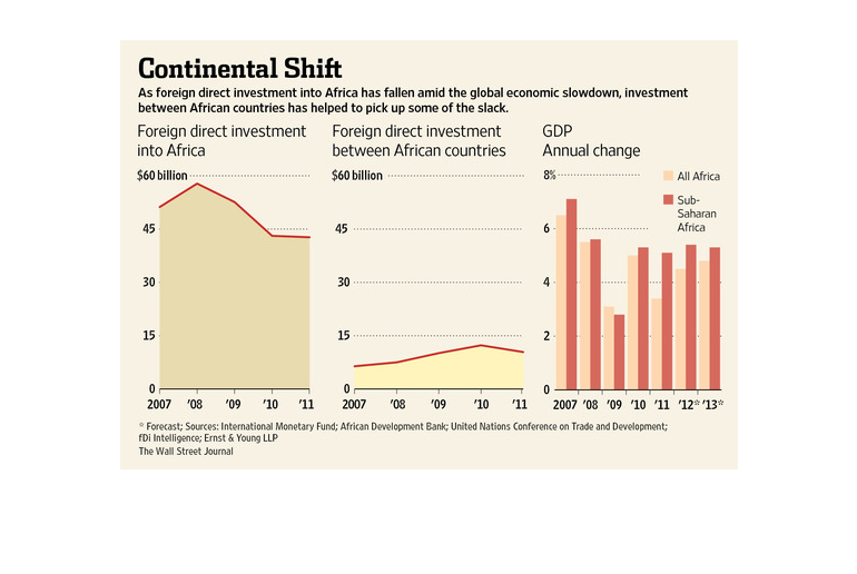
This series of graphs shows the direct investment of countries into africa, trending down
from 2007 to 2011, an graph on investment between african countries, and a bar graph showing
the annual GDP change for sub saharan and all african countries.
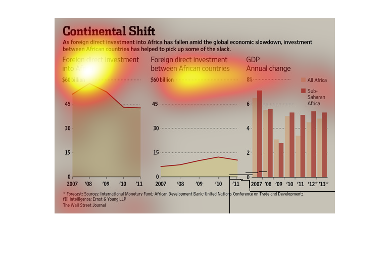
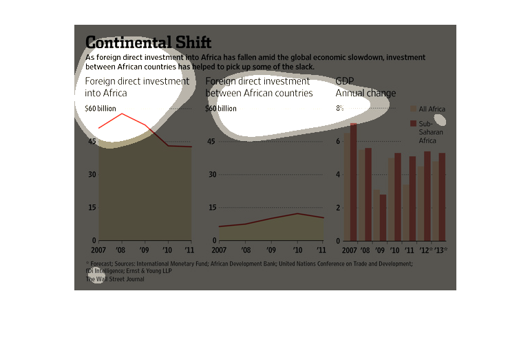
This bar graph is about the continental shift. It is talking about how how as foreign direct
investment into Africa have fallen amid the global economic slowdown, investment between African
countries has helped to pick up some of the slack.
This chart from the Wall Street Journal shows how foreign direct investment in Africa is slowing
down but that intra-african investment is picking up the slack
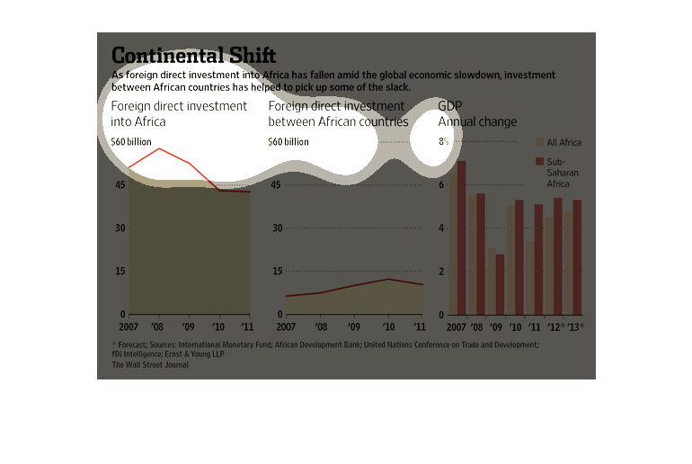
These graphs are related to the shift in economic growth in regions surrounding Africa. Particularly,
these graphs are talking about foreign direct investment.
This talks about since foreign domestic income into Africa has decreased (from ~60 billion
in 08' to less than 45 billion in 11'), sharing investments between African countries have
increased as a response.
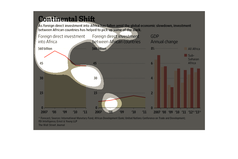
This chart describes continental shift. Specifically, as foreign direct investment into Africa
has fallen amid the global economic slowdown, investment between African countries has helped.
There are three graphs. One graph represents the Foreign direct investment into Africa from
2007 to 2011. Foreign direct investment has decreased through time. The second graph is foreign
direct investment between African countries from 2007 to 2011. These types of investments
has generally increased across time. The third graph represents GDP annual change between
All Africa and Sub-Saharan Africa. The change has been changing at unexpected rates.
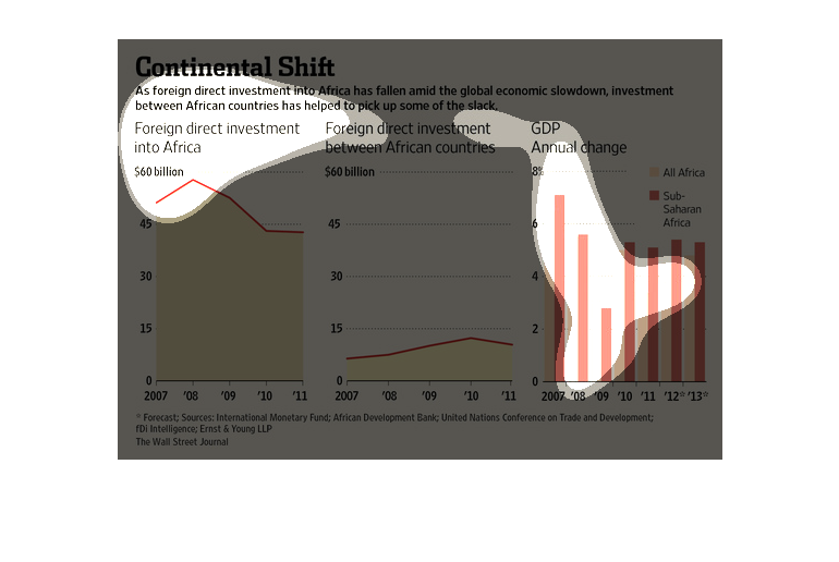
This figure is about continental shift in regards to investments. While foreign direct investment
into Africa has fallen, Investment between African countries has increased.
This info graphic illustrates how foreign direct investment into Africa has fallen during
the global economic slowdown, but that investment between African countries has picked up
some of the slack. At its highest, foreign direct investment was at 60 billion but by 2011
fell below 45 million. During the same time, African direct investment has increased from
7 million to just below 15 million which has picked up the slack for overall GDP.
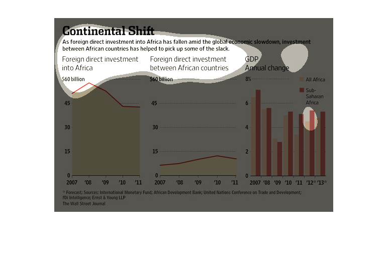
This chart from the Wall Street Journal shows how the economic growth of Africa has changed
over time. It is growing quickly but is starting to slow down
Continental Shift - As foreign direct investment into Africa has fallen amid the global economic
slowdown, investment between African countries has picked up.
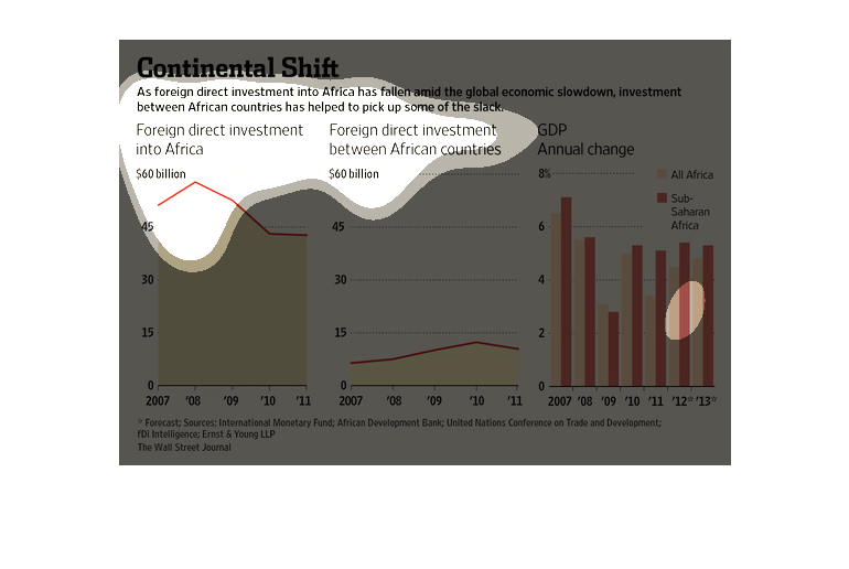
This chart depicts the rapid decline of foreign investment in African Countries'. This has
been largely replaced by other African countries essentially investing in their neighbors.
This image describes the worldwide economic shift. African countries have begun investing
cash flow between each other which is actually beginning to help pick up some of the slack
from the shift. A graph of GDP annual change is also present on the image.