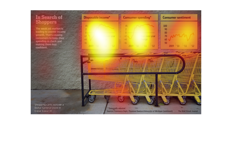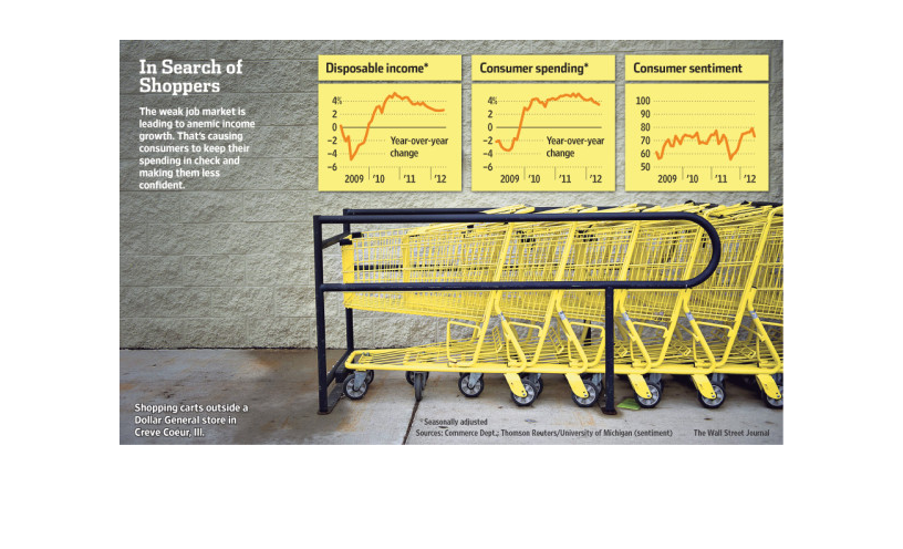
Shoppers are finding themselves with less disposable income to do their shopping post-job
market crash. Since the holidays of 2010, this disposable income has dropped over 1% each
year. Consumer spending habits have also stalled, in stark contrast to the great leap in spending
during the holidays in 2009. Consumer sentiment began to plummet in 2011, though it has partially
recovered it's still amidst a crippling stall as well.
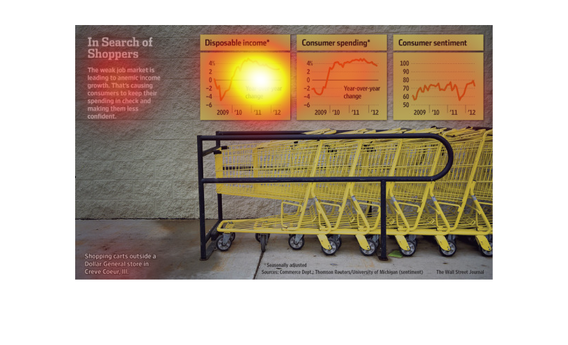
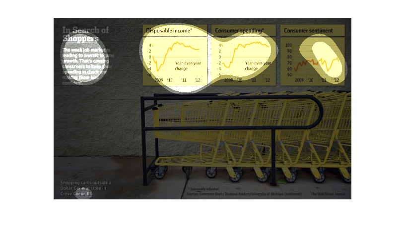
The title of the graphic is in search of shoppers. It says that the weak job market is leading
to anemic income growth, which causes consumers to spend less.
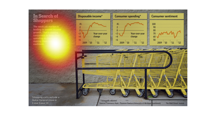
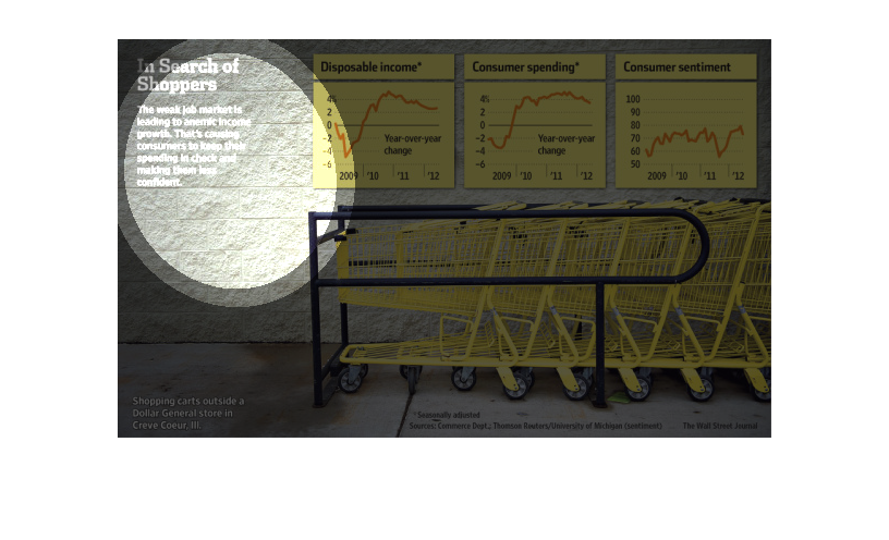
This chart illustrates the weak job market and reduced income growth.  It shows dispensable
income, consumer spending, and consumer sentiment about the current economic situation.
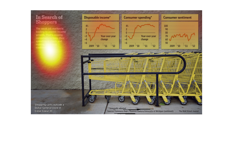
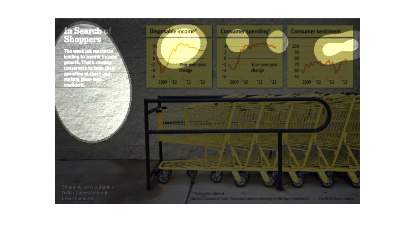
This chart from the Wall Street Journal shows how consumer spending has changed in the United
States and the leading indicators of sentiment, spending, and  disposable income have changed
This chart from the Wall Street Journal shows how consumer spending, sentiment, and disposable
income have changed and are impacting the broader US economy
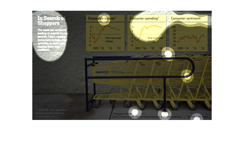
This is a diagram with attached related statistics depicting that a weak job market was leading
to anemic income growth which was causing consumer to keep their spending in check.
This image is entitled "In Search of Shoppers."  The bottom half of the image shows shopping
carts outside of a Dollar General store.  The top half of the image shows disposable income,
consumer spending, and consumer sentiment.   Each graph shows the changes from 2009-2012.
 Data was obtained from The Wall Street Journal.
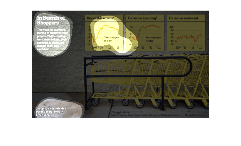
The charts are describing consumer income and consumer spending over the years 2009-20012
as well as consumer sentiment. Overall, consumer spending increases proportinally to consumer
income. However, sentiment seems not to be influenced by the amount of income.
Since the job market is weaker the graph seems to be saying that people are spending less
because of it. It also says that because of this people are less confident in their spending.
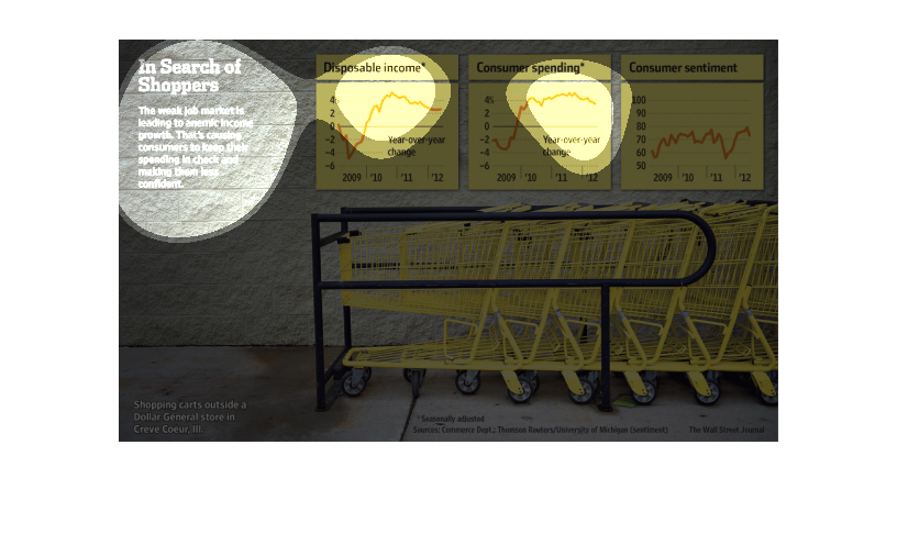
This chart details the amount of dispensable income people have, the amount of consumer spending
that occurs, and the average consumer sentiment about the financial state.
This chart shows the relationship between disposable income, consumer spending, and consumer
sentiment for 2009-2012.  The weak job market is leading to lower income growth which is causing
consumers to keep their spending in check.
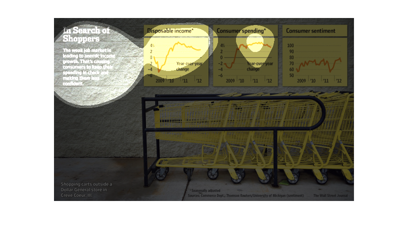
This chart describes in search of shoppers. Specifically, the weak job market is leading to
anemic income growth. That's causing consumers to keep their spending in check.
This chart is atrocious.  The colors blend with the background.  The graphs are poorly described,
and demonstrate 1-4% changes over years.  The intent appears to be to correlate 3 trend lines
from the period 2009 through 2012: disposable income, consumer spending, and customer sentiment.
 Unfortunately each is presented in a separate graph without joint axes, so correlations are
very difficult to demonstrate.  The explanation for the intent of this chart is blurry beyond
my ability to read it, and there isn't enough explanation on the graphs to fathom what is
supposed to be garnered from this data, but it does not appear to demonstrate anything of
note (and appears to wish it did)