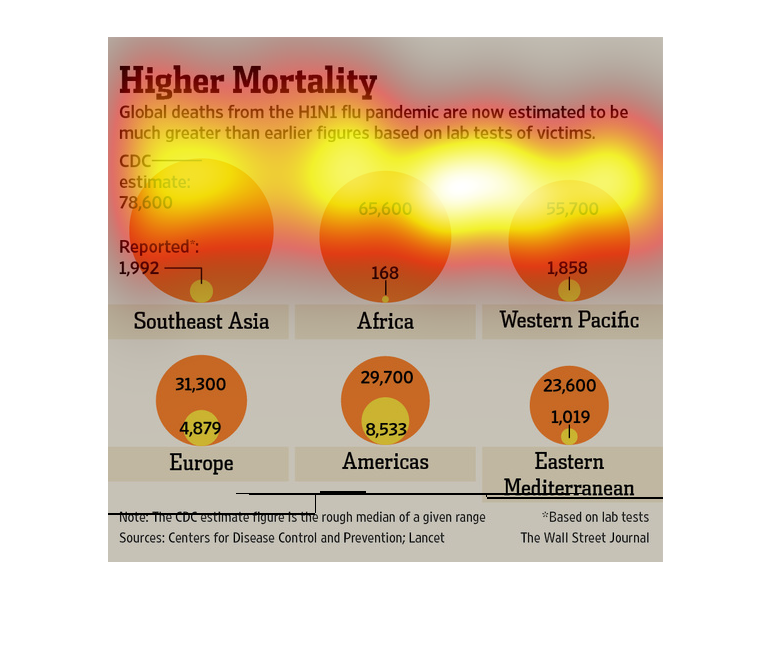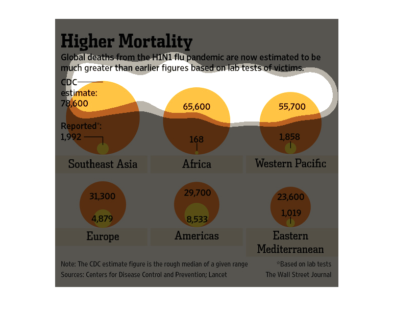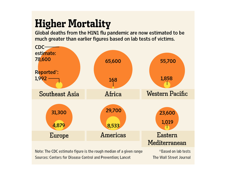
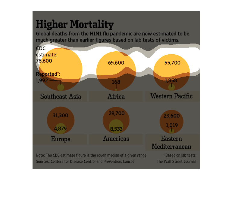
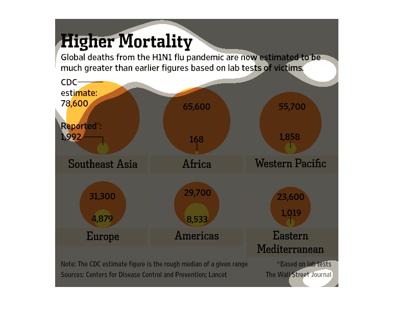
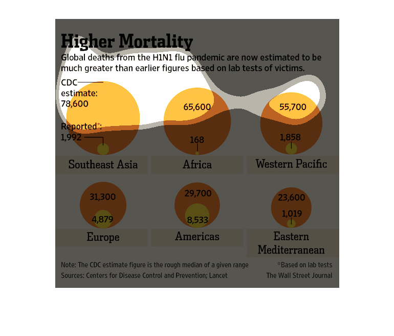
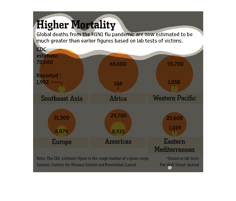
This chart describes higher mortality. Specifically, global deaths from the H1N1 flu pandemic
are now estimated to be much greater than earlier figures based on lab tests.
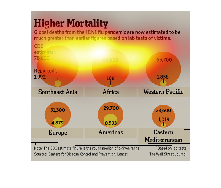
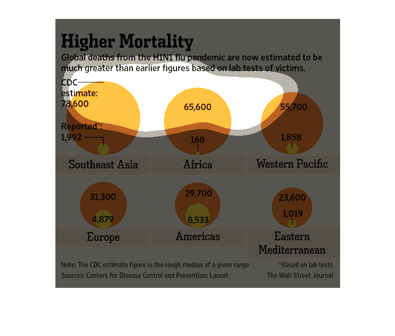
This is a series of charts with related statistics depicting global deaths from the H1N1 flu
pandemic were estimated to be much greater than earlier figures based on lab tests of victims.
In this study from the Wall Street Journal- with information provided by the CDC- the H1N1
flu virus is sweeping the nation and is a great threat to public safety.
This chart illustrates how global deaths from the H1N1 flu pandemic are now estimated at much
larger than earlier estimated figures based on lab tests from suspected victims.
The title of the graphic is high mortality. It says that global deaths from the H1n1 flu are
now estimated to much greater than earlier figures based on lab tests.
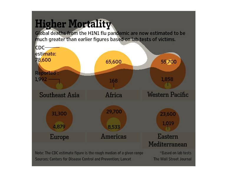
This chart describes the estimated global death rate from H1N1 flu pandemic and the relationship
between estimated and reported deaths. Southeast Asia is shown to have the largest amount
of estimated deaths at 78,600 with only 1,992 reported and Eastern Mediterranean with the
least at 23,600 having reported only 1,019 deaths. In contrast, the Americas had the most
reported deaths at 8,533 and an estimate of 29,700, while Africa had the least amount of reported
deaths at 168 but the second largest amount of estimated deaths at 65,600.
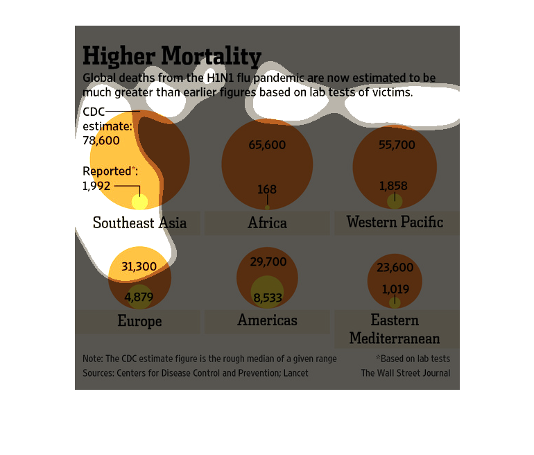
it shows a chart that is representing the death count from the flu that is effecting people
in many part in the world.it shows a chart that is representing the death count from the flu
that is effecting people in many part in the world.
This chart from the Wall Street Journal shows how a potential global pandemic of the H1N1
flu virus would be deadlier than predicted based on human samples
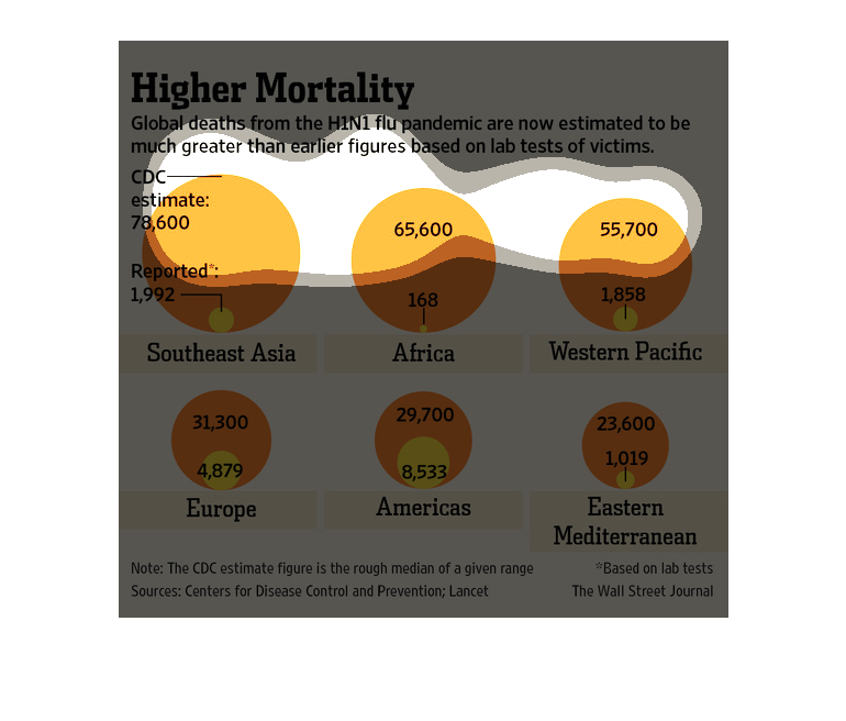
These pie charts illustrate the amount of deaths attributed to the H1N1 flu virus worldwide
by geographic region. Not surprisingly, the African continent and Southeast portion of Asia.
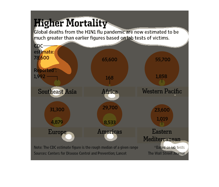
This graph depicts the numbers associated with the H1N1 epidemic in different regions of the
world, and how the laboratory testing provided numbers that were much higher than actual reported
cases for each individual region.
This is a graph showing the mortality rate of the H1N1 virus. It shows different countries
and how much the rate is there compared to the others by the size of these circles shown.
This chart describes higher mortality. Specifically, global deaths from the H1N1 flu pandemic.
Different categories are represented by different colors.
This shows the difference between what cases were reported to the CDC from the H1N1 epidemic,
to what the CDC has now estimated the actual number of cases to be. These new numbers have
been collected according to lab tests.
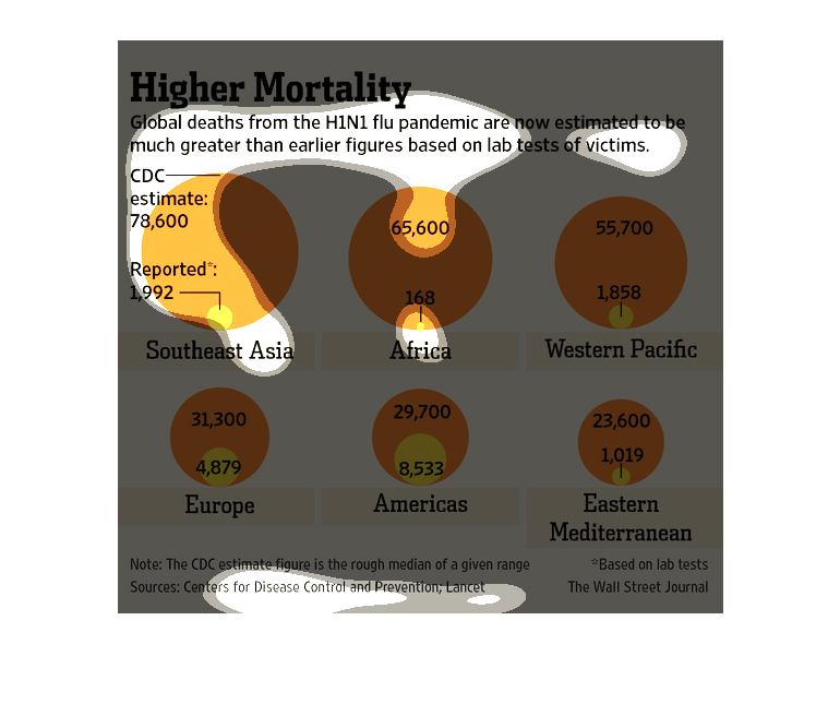
This graph is depicting the actual amount of death caused by the H1N1 pandemic. The graph
is illustrating that the actual number of deaths is greater than first estimated.