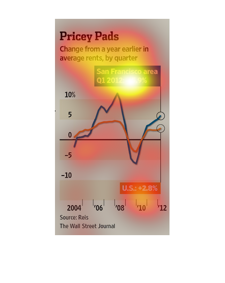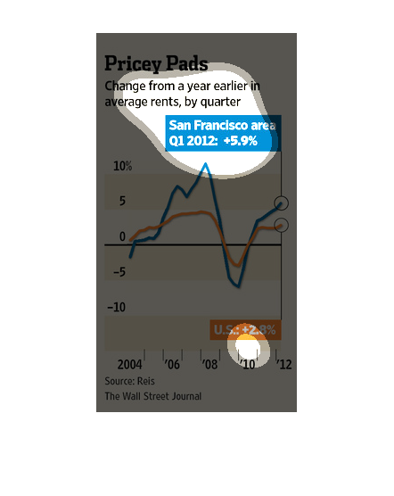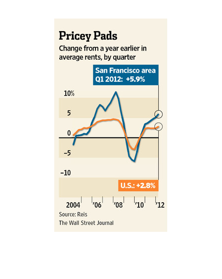
In this study conducted by the Wall Street Journal- from information gathered from Reis- rent
prices are at an all time high, especially in places like San Francisco and New York.
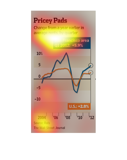
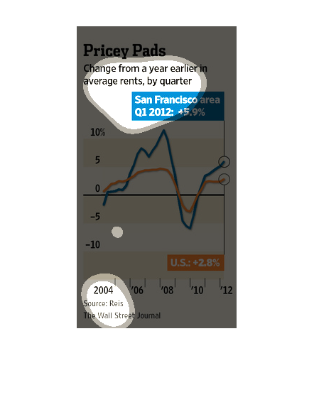
This chart from the Wall Street Journal shows how apartment and housing prices have increased
rapidly in high growth areas like San Francisco, California
This is a basic line chart consisting of rent prices in the San Francisco Area. It shows the
rise and fall in prices in the city on a time scale. It is a very expensive place to live.
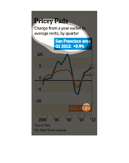
This graph is talking about the price factor of what seems to be housing in America.  Specifically
focusing on San Fransisco. I believe it is showing inflation values from early 2000's to 2012.
This image shows or depicts in line graph statistical format data concerning pricey pads.
Change in a year earlier for those paying higher rent in San Francisco areas.
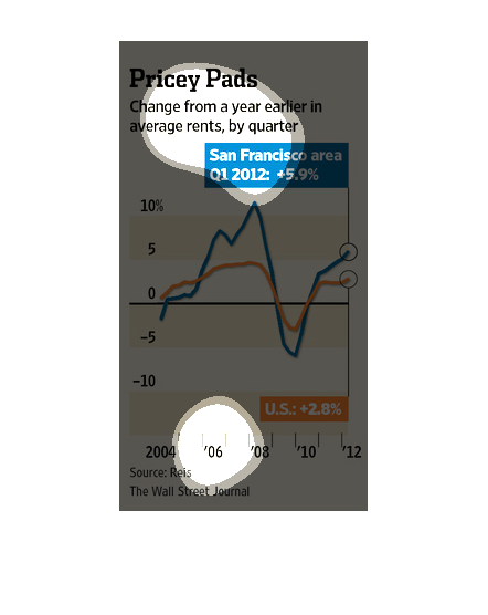
The graph is about changes in rent from a year earlier by quarter. In the San Francisco area
and the rest of the US. From 2004 to 2008 the price went up and up, however, from 2008 it
declined pretty fat until 2010.  Then went back up till 2012 where it ended slightly above
where the graph starts at.
This chart describes pricey pads. Specifically, change from a year earlier in average rent,
by quarter. Different categories are represented by different colors.
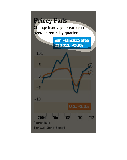
This graph is about Change from a year earlier in average rents, by quarter from 2004-2012.
The highest year was 2008  with about 10% and the lowest year was 2009 with just lower than
5%.
This chart from the Wall Street Journal shows how apartment and other housing prices in San
Francisco are increasing rapidly and faster than inflation.
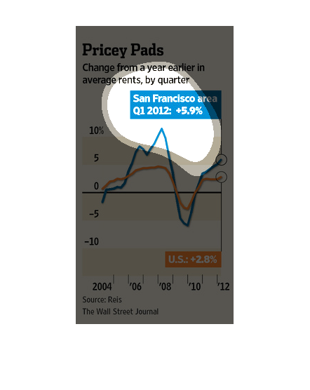
This graph illustrates the changes from the prior year in average rent prices from the years
2004 to 2012 with San Francisco rising almost 6% and the US in total rising almost 3%.
It is a graph showing the change in rent prices from the previous year.  It is titled "Pricey
Pads".  The graphs appears to target the San Francisco area from 2004 to 2012.
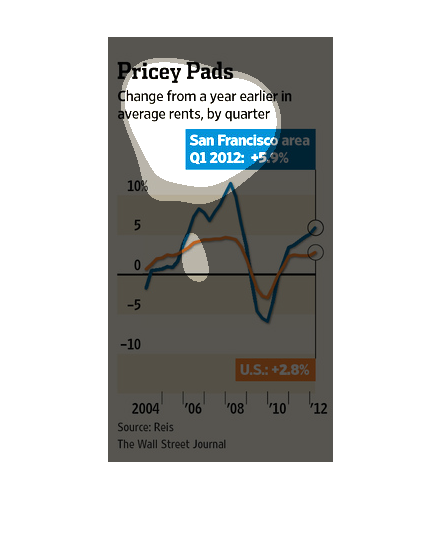
This shows rent change in the US vs in San Francisco, by quarter, from 2004 to 2012. The graph
shows that rent has increased by 2.8% in the US, but by 5.9% in the San Francisco area.

This graphic shows the change in rent from last year, highlighted by quarter. San Francisco
experienced an increase in the price of rent by about 5.9% while the U.S. averaged an increase
of about 2.8%.
This image shows us the change of different prices for renting a place to live in a few different
areas over the last year. San Francisco is leading the pack of increased living, although
the United States as a whole has also had a rise in rent costs.