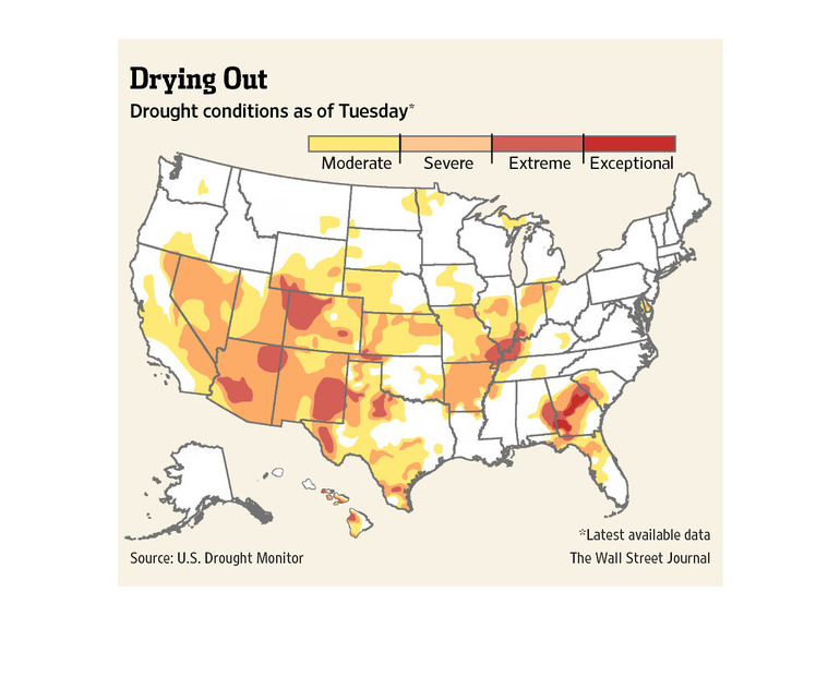
This chart describes drying out. Specifically, drought conditions as of Tuesday. Different
categories are represented by different colors on the chart.
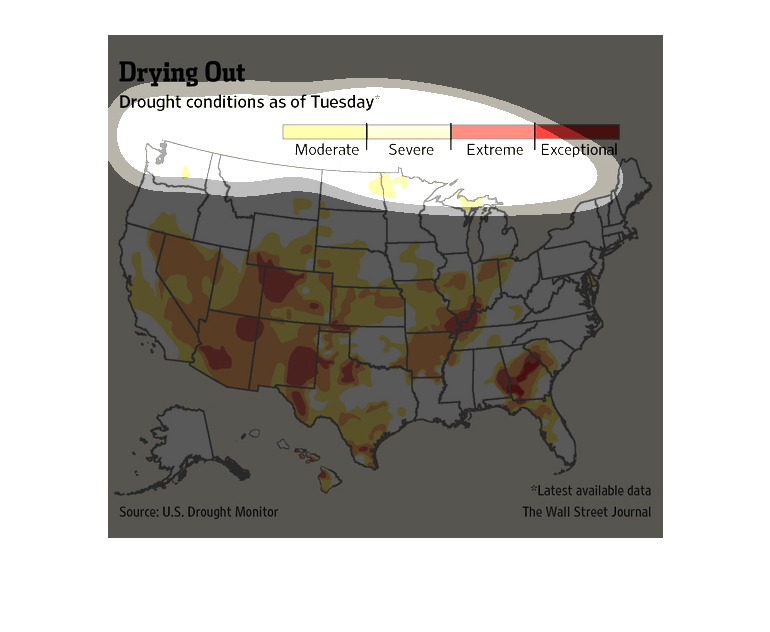
This image is entitled "Drying Out."  Is shows drought conditions as of Tuesday.  The image
is a map of the United States.  Colors depicting various stages of drought are:  Moderate
(yellow), Severe (light orange), Extreme (dark orange), and Exceptional (red).  The source
is the U.S. Drought Monitor.  Data was shown in The Wall Street Journal.
The image depicts the drought conditions in the US as of Tuesday. The southern portion of
the US appears to be heavily drought-stricken, with many states dealing with severe and extreme
conditions with moderate conditions covering many states as well.
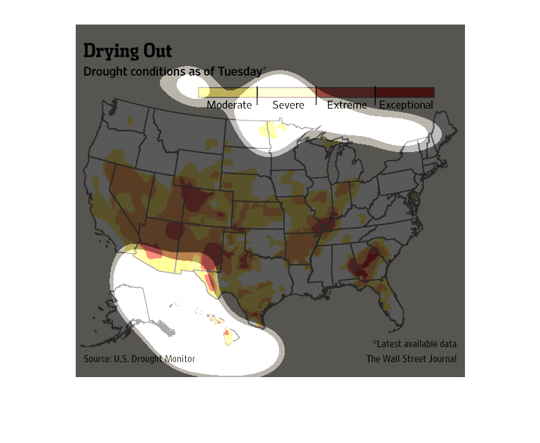
This professional chart from the Wall Street Journal shows how drought has impacted the United
States and where it is affecting most in terms of states
This map shows drought conditions across the United States. There is extreme drought through
parts of the southwest, southern Illinois, and Georgia. Georgia also has some exceptional
drought.
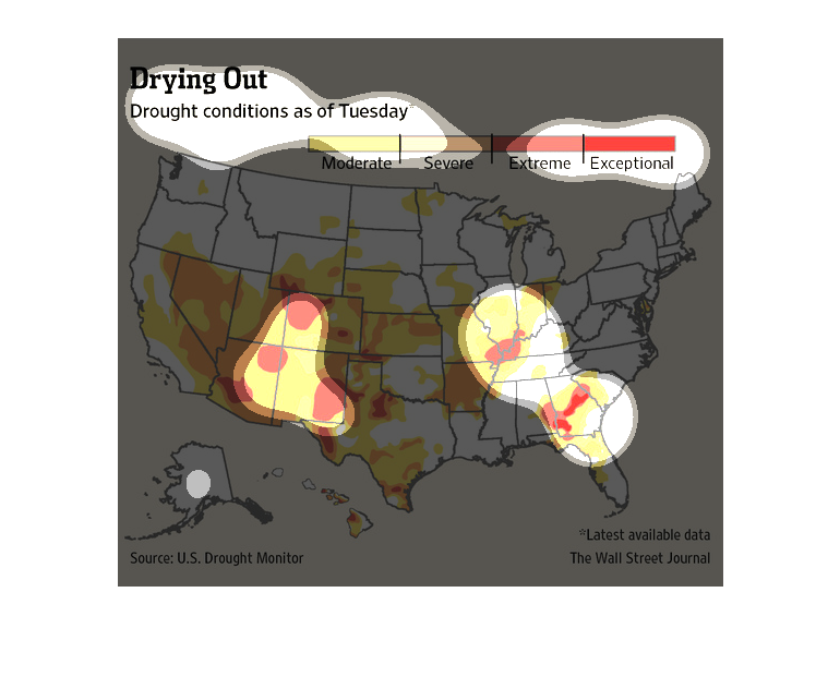
This graph depicts the severity of droughts throughout the United States. From the graph we
can see that the lower southeast parts of the country are the most affected by the droughts
ranging from moderate to extremely severe conditions. We also see a case of severe drought
in the southern state of Georgia. Some possible causes of drought could be due to the change
in climate or for reasons caused by humans such as our use of water for agriculture or daily
living.
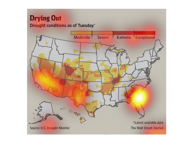
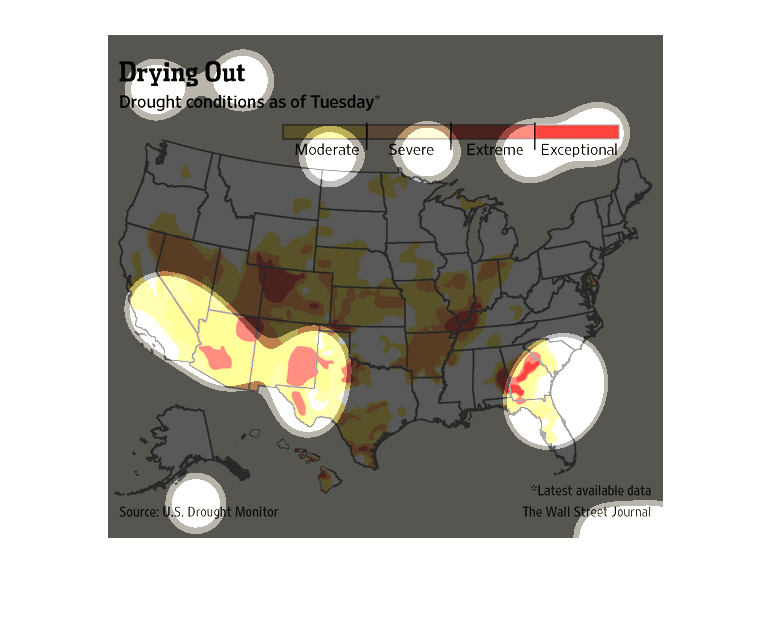
This is a map of the United States which shows drought conditions for the categories of moderate,
severe, extreme, and exceptional with several areas in south and Midwest showing exceptional
droughts.
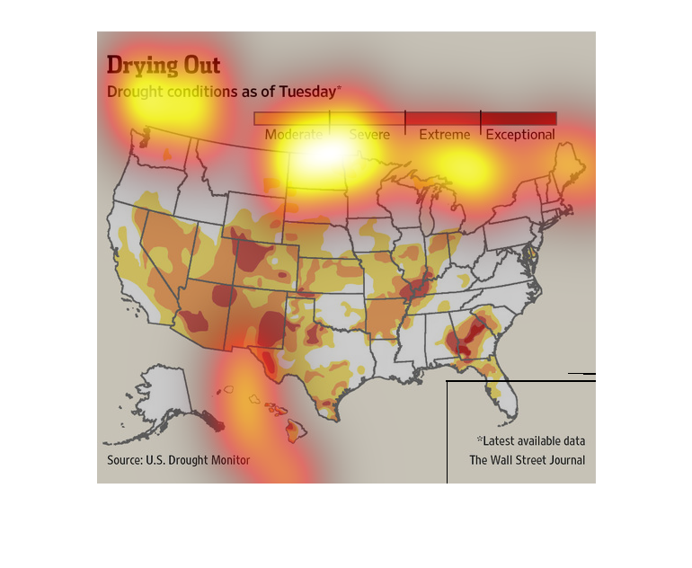
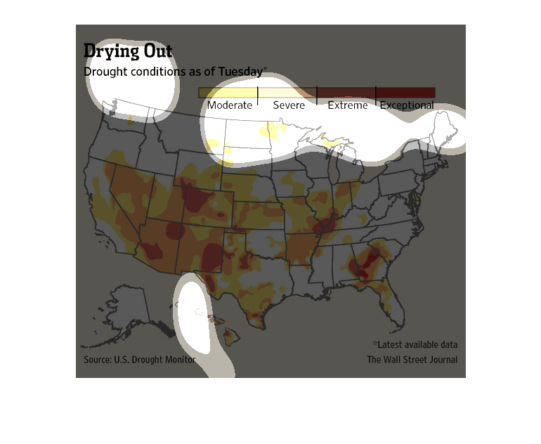
This chart from the Wall Street Journal shows how the drought in the United States is heavily
impacting the western and southwestern parts of the country
This map is entitled "Drought" and shows the drought conditions as of Tuesday.  Areas highlighted
in yellow are moderate; areas in orange are severe; areas in darker orange are extreme; and
areas in red are exceptional.  The overall map is of the United States.  The source of the
map is from U.S. Drought Monitor, and the data is from the latest Wall Street Journal.
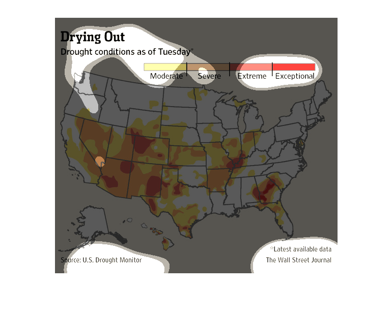
In this study from the Wall Street Journal- from information obtained from the U.S Drought
Monitor- We see a graphic broken down state by state informing us of the damage the drought
is causing,
The title of the graphic is drying off: drought conditions as of Tuesday. According to the
map, the drought conditions are worst in the SouthWest United states.
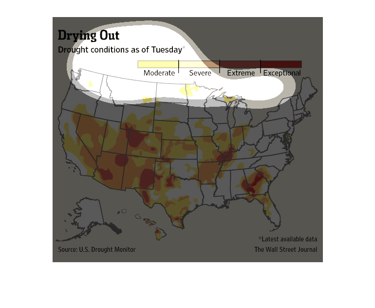
The image shows a map of the continental united states. The map is overlayed with red/orange/yellow
to describe the intensity of a drought in a specific area.
This is a map showing the levels of drought across the US. The southwest seems to be having
the hardest time, with the drought also spreading to the Midwest and the south east as well.