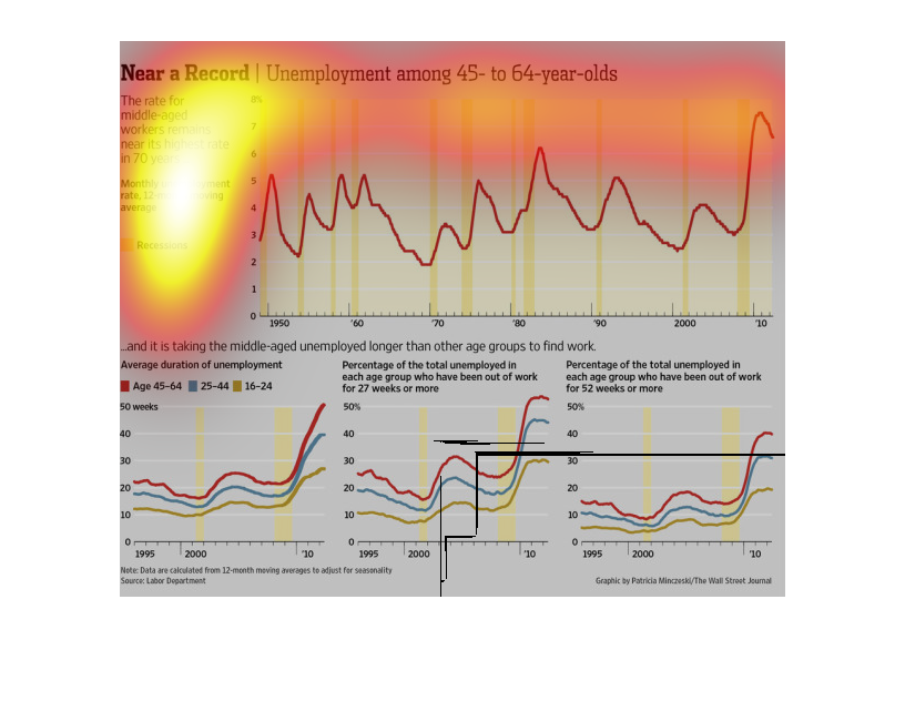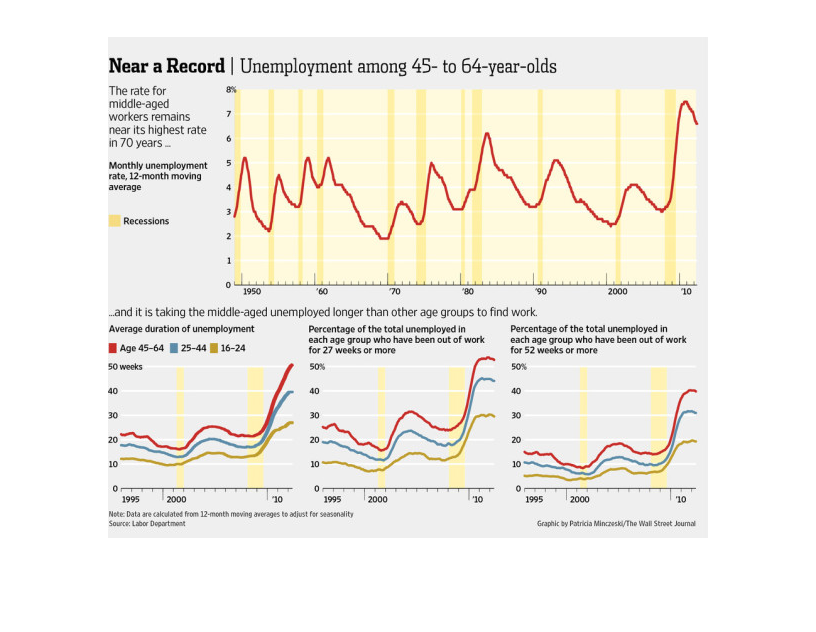
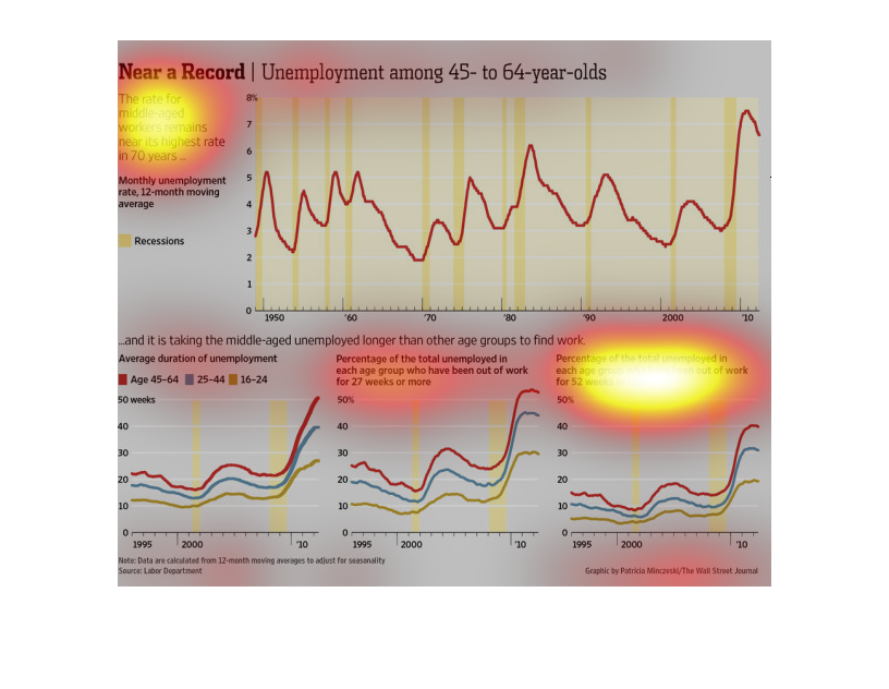
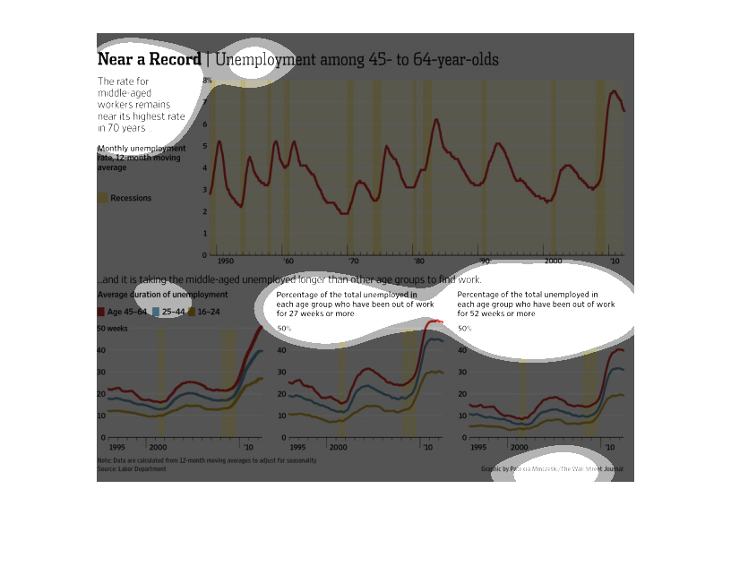
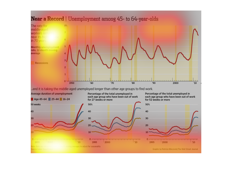
This chart shows the unemployment rate among 45-64 year olds and includes when the recessions
were. The greater the recession, the greater the unemployment in this group.
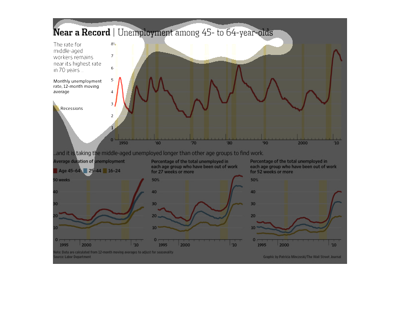
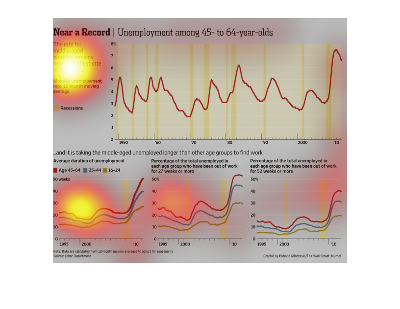
The graph is entitled "Near a Record: Unemployment among 45 - 64 year-olds." The first graph
show a steady increase in unemployment from 1950 to 2010. The second graph shows a steady
increase in the duration of unemployment over the same period of time.
The image depicts the unemployment among 45-64 year old. Unemployment for this group has dramatically
increased around 2010. Middle-aged unemployed are also taking longer to find work versus other
age groups of unemployed.
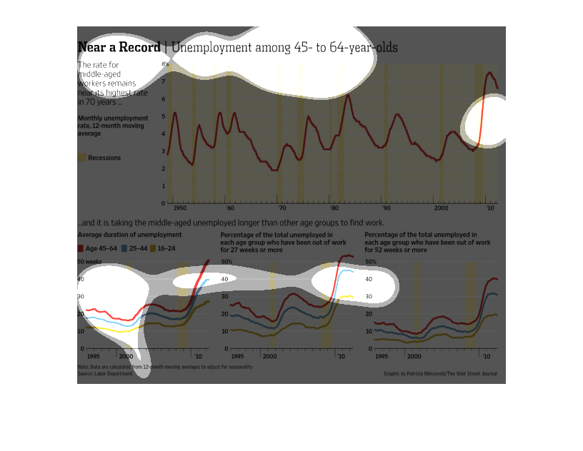
This image is entitled "Near a Record:  Unemployment  Among 45-60 year-olds."  It shows a
graph (at top) depicting the rate for middle-aged workers remains near its highest rate in
70 years.  It shows three graphs across the bottom showing:  Average duration of unemployment,
percentage of total unemployment for each age group who have been out of work for 27 weeks
or more, and total percentage unemployed who have been out of work for 52 weeks or more.
The source is Labor Department.  The image appeared in the Wall Street Journal.
There are two different graphs on this page. The first shows the relationship between age
and the current unemployment rate. It shows that Those who are middled aged or older have
record high unemployment rates. The second graph shows that it is taking longer for this age
group, 55-70, to find jobs, than any other age group.
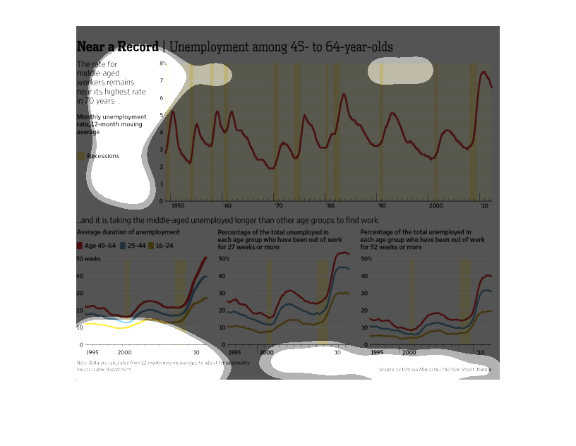
These graphs depict the rate for middle-aged workers remaining near its highest rate in 70
years with the highest spike hitting in 2010. it is then broken down by age groups showing
that ages 45-64 are among the highest percentage of unemployment.
The top graph compares unemployment rates over several decades and also shows times of recession
in comparison. The bottom 3 graphs shows a comparison of unemployment in different age groups
in 3 different scenarios; duration of unemployment, unemployment locating long than 27 weeks,
and unemployment lasting longer than 52 weeks.
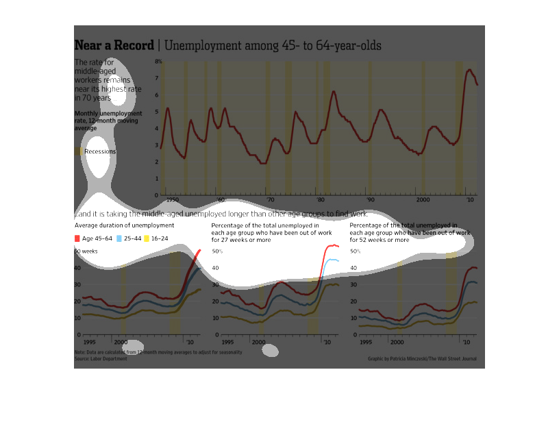
The figure presented to the left is titled Near a record.  The figure is a representation
of the statistical research data for Unemployment among 45-64 year olds.
This chart from the Wall Street Journal shows how unemployment rates are at a record high
for americans aged 45-64 and are not showing signs of decreasing
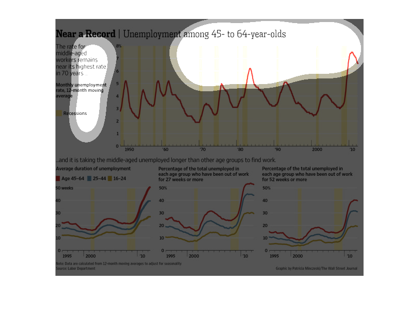
This chart illustrates unemployment rates among 45 to 64 year olds.  It shows that they are
the highest age group of unemployed workers.  IT also looks at average duration of unemployment
and they have the longest.
The image represents unemployment information for people between the ages of 45 and 64.
 The graphs show the relationship between times of economic recession and the number of people
unemployed during those same time frames.   The graphs indicate a relationship between economic
recession and increased unemployment in specific age ranges.  The 45-64 year old range appears
to show the highest percentage of unemployment in both cased.
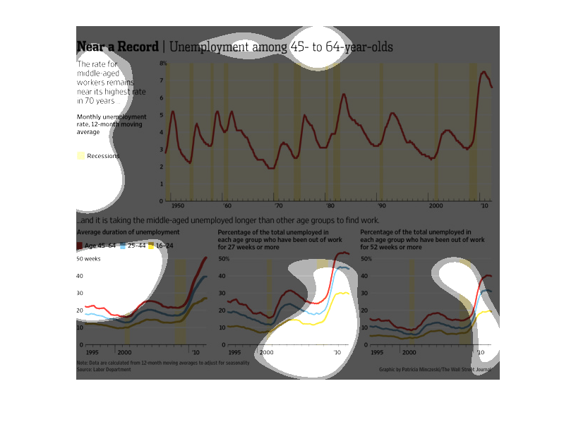
This chart from the Wall Street Journal shows how the unemployment rate for people aged 45
and older is at an all time high in the united States.