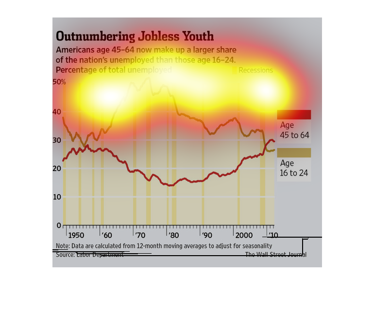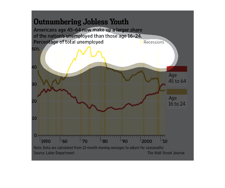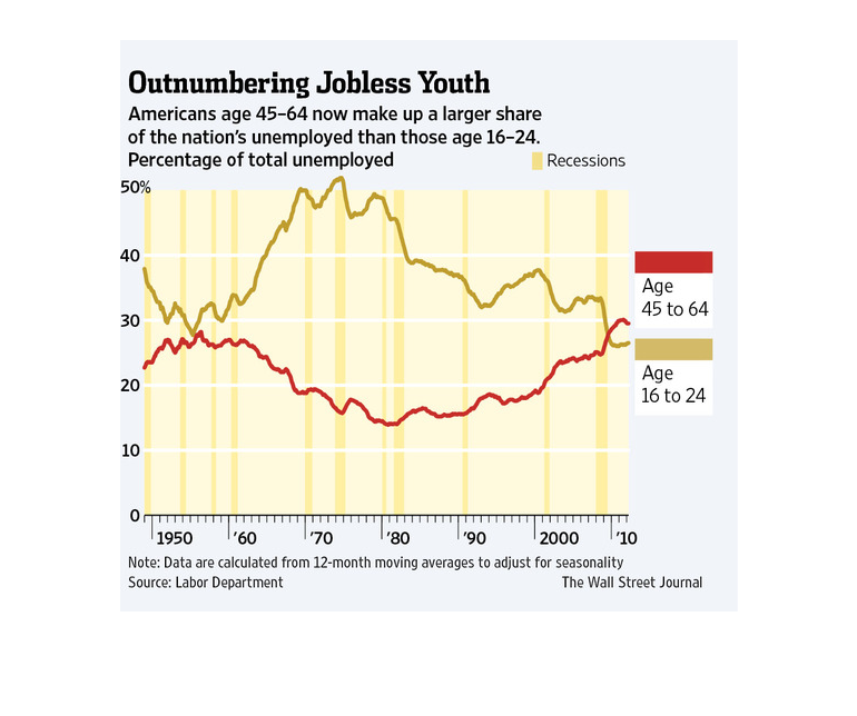
This is a graphic that illustrates the fact that those aged between 45 and 64 years in America
now make up a large share of those who are unemployed. this is more than those aged 16 to
24 years.
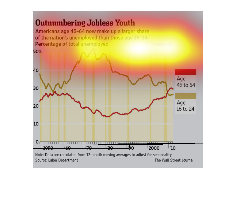
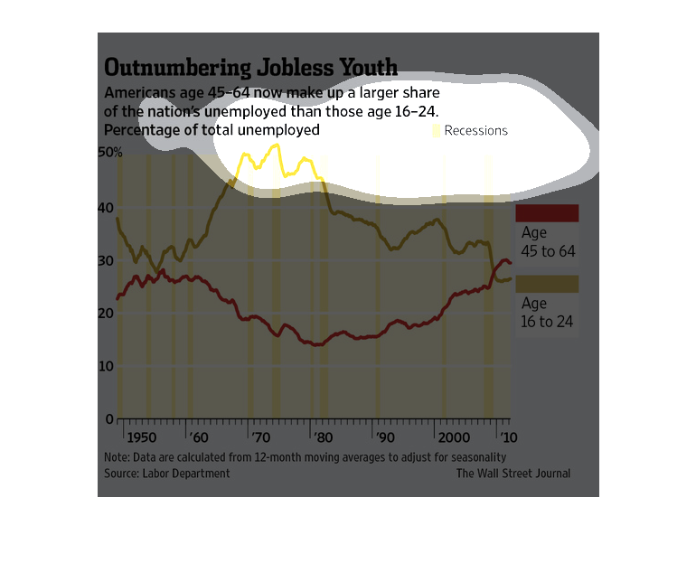
This chart from the Wall Street Journal shows how there is a significant gap between the youth
unemployment rate and the unemployment rate for older americans
The image depicts Americans age 45-64 making up the largest share of the nation's unemployed
compared to those age 16-24. Data also provided percentage of total unemployed. Age group
of 45-64 is slightly higher than 16-24.
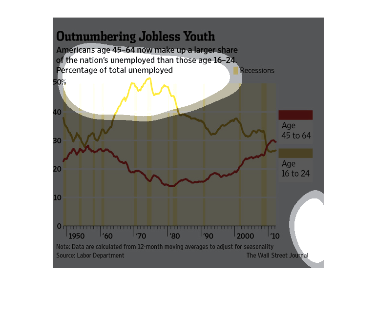
This is a comparison of the jobless population stressing that Americans aged 45-64 make up
a large portion of the jobless population when compared to young people. There are lines comparing
the two populations, from 1950 to the present day. Older Americans have overtaken younger
ones in only recent years.
Outnumbering Jobless Youth | American's aged 45-64 now make up a larger share of the nations
unemployed than those ages 16-24. This data is shown in a line graph. Y axis shows percentage.
X axis shows year. There is one line for each age group, numbers were close in the 50's, and
then again recently, to cross paths.
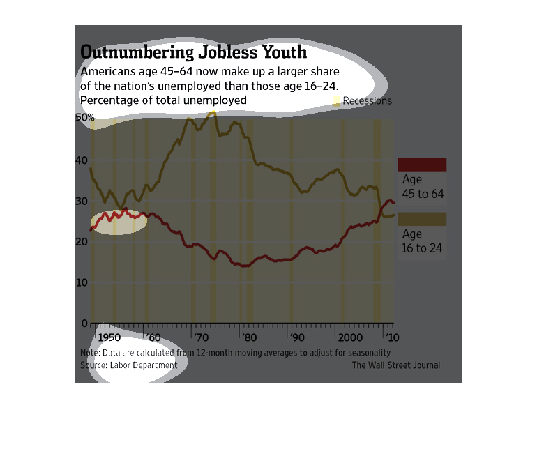
This chart shows the unemployment gap between Americans aged 45-64 to those aged 16-24. Unemployment
among older Americans was up in 2010 for the first time in years.
This chart from the Wall Street Journal shows how the jobless rate among young people is disproportiately
higher than the jobless rate for older americans
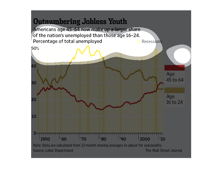
This line graph compare the changes in unemployment rates in two different age groups in the
United States. As of now, the older group is less employed than the younger group.
Outnumbering Jobless Youth. At this time, Americans aged 45-64  make up a larger share in
the nation's unemployed thank hose age 16-24 percent of total unemployed.   This chart measured
 unemployment rate for people age 45-64 versus people age 16-24 who are unemployed.
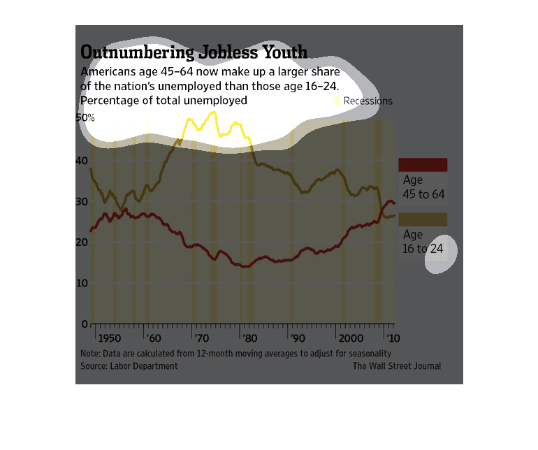
This is a chart stating that in the US 45-64 year olds are the larger number of employed people,
and that is larger than the 16-24 crowd as well. It shows the number from 1950-2010.
This line graph shows how people ages 45-64 outnumber the jobless youth ages 16-24. The graph
plots 1950 to the year 2000. In the 80's there was the highest gap between the two groups
with many more youths being unemployed.
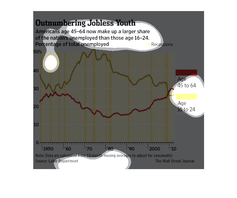
This image is on outnumbering jobless youth . The image tells you that adults between the
ages of 45-64 now makeup a large number of the nations employed than those between the ages
of 16-24.
This chart describes and depicts the United states unemployment rates as a comparison between
people aged forty five to sixty four and aged  sixteen to twenty four.