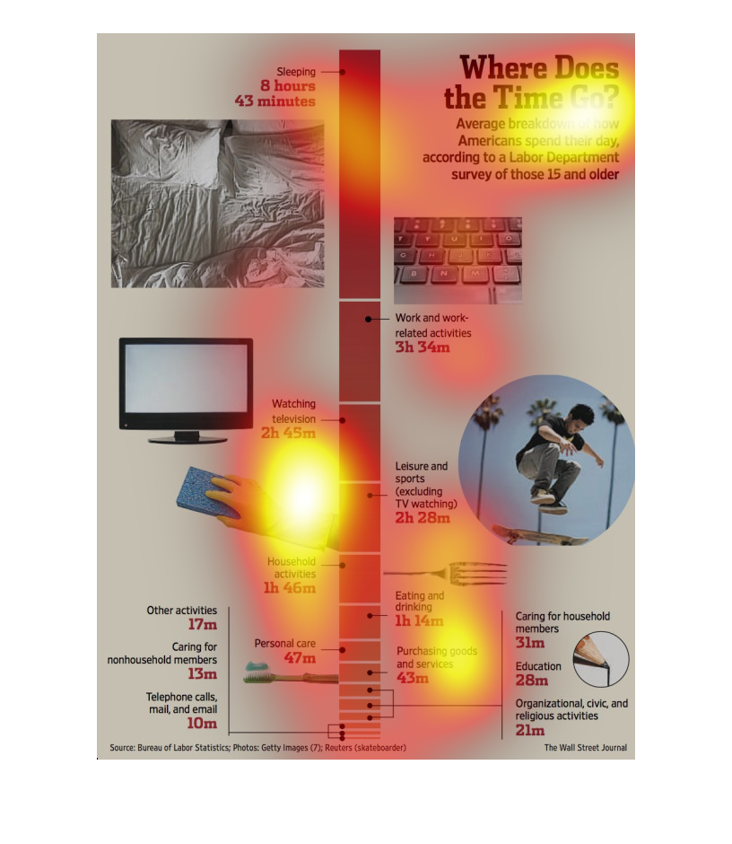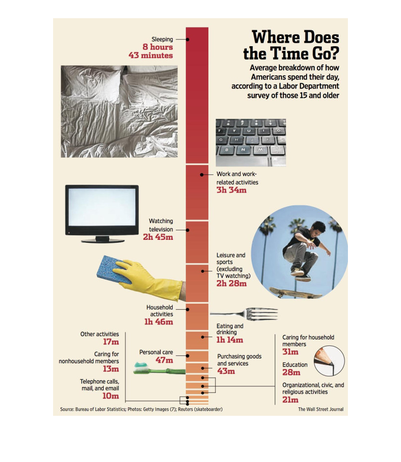
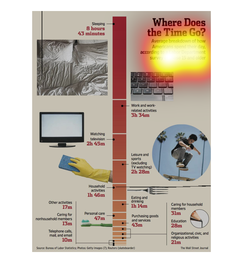
The image depicts the average breakdown of how American's spend their day, according to a
labor department survey of those 15 and older. Sleep takes up the majority of people's day
with 8 hours of the day, and phone calls in last place with 10 minutes spent per day.
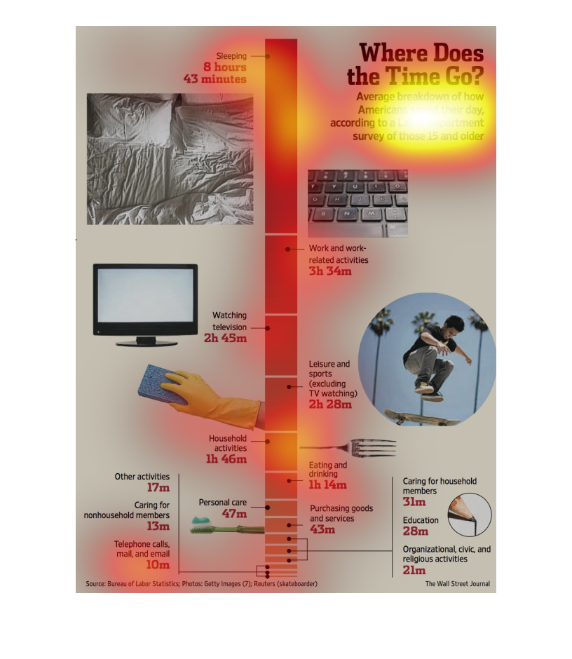
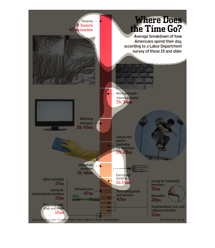
This chart describes where does the time go. Specifically, average breakdown of how Americans
spend their day. The chart contains photographs to enhance the information presented.
The image depicts the average breakdown of how Americans spend their day. The majority of
the day is spent sleeping, with work and work-related activities a close second, and telephone
calls in last place with least time spent.
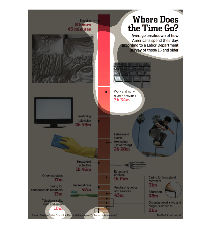
The image shows a visual aid to understating how Americans spend their day based on a poll.
Several images are used to represent different activities.
This is a chart showing how americans tend to spend their days. There are many activities
listed on this chart including television and using the computer.
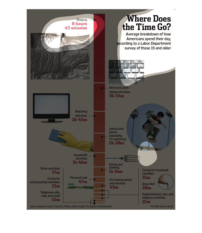
This chart is a vertical time line and it's titled Where does the time go? It offers an Average
breakdown of how Americans spend their day, according to a Labor Department survey of those
15 and older.
This image shows or depicts in illustrative and textual formats data concerning an average
breakdown of how americans spend their time throughout the day.
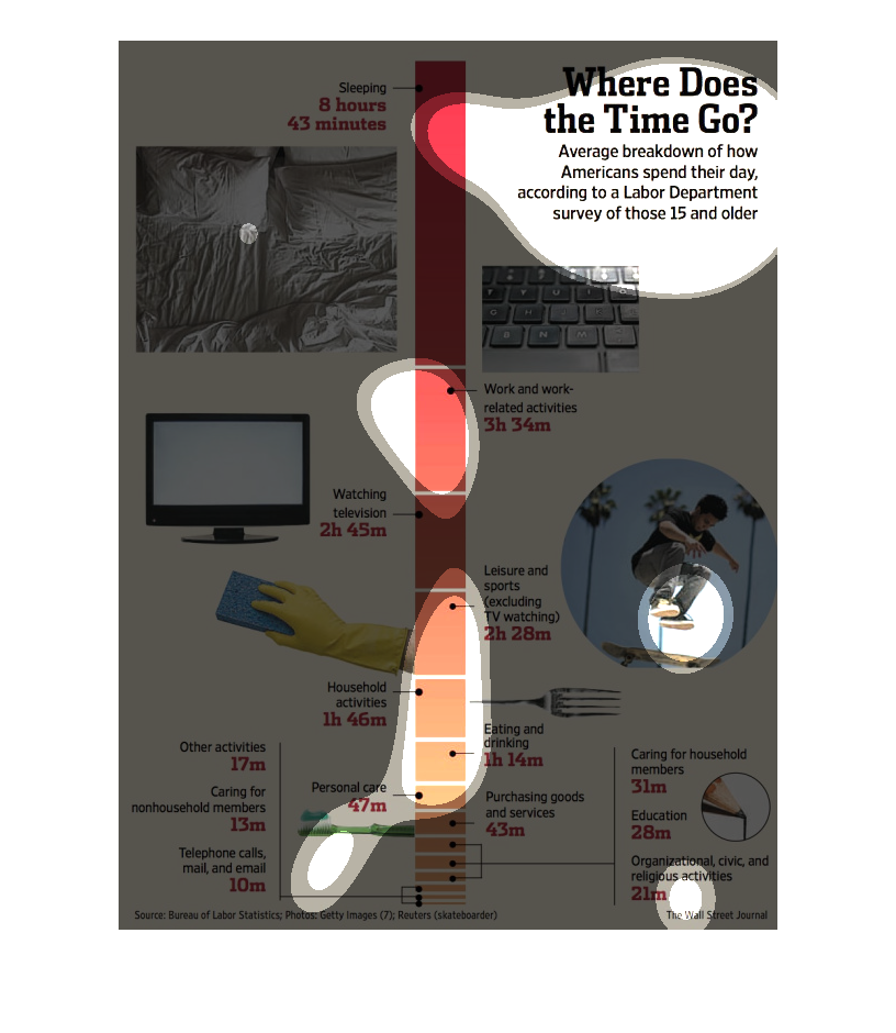
The graph is illustrating the amount of time that Americans spend filling their day. The graph
depicts that Americans spend a vast amount of their day working.

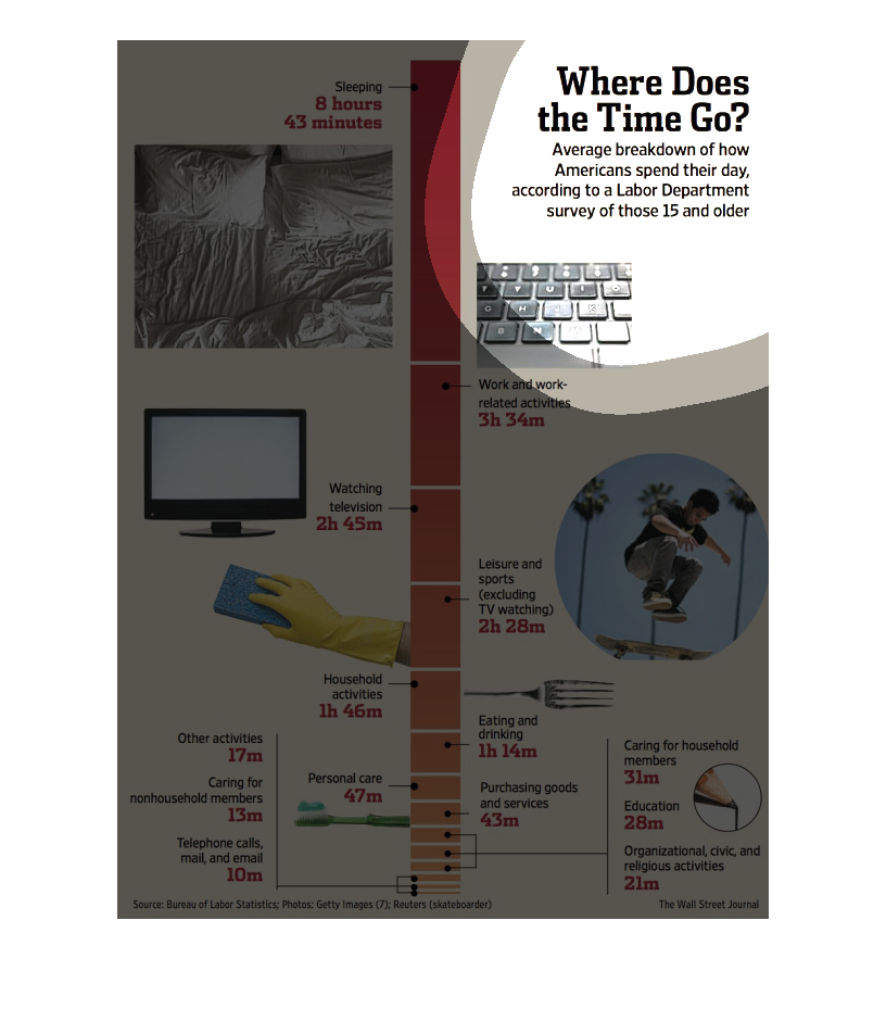
This infographic presents the average breakdown of how Americans, aged 15 and older, spend
their day. The information is based on statistics from the Labor Department.
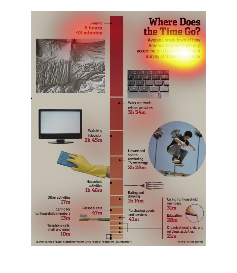
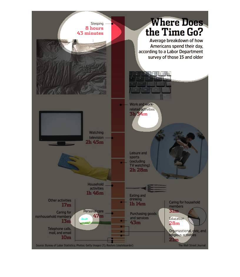
This chart from the Wall Street Journal shows how the average day is spent by americans as
broken down between work, sleep, and leisure. It shows work is the largest component
This chart describes where does the time go. Specifically, average breakdown of how Americans
spend their day. The chart contains photographs to enhance the information presented.
This is a set of various graphics that is being used to illustrate the average breakdown of
how Americans spend their day. This is for those who are aged 15 years and older.
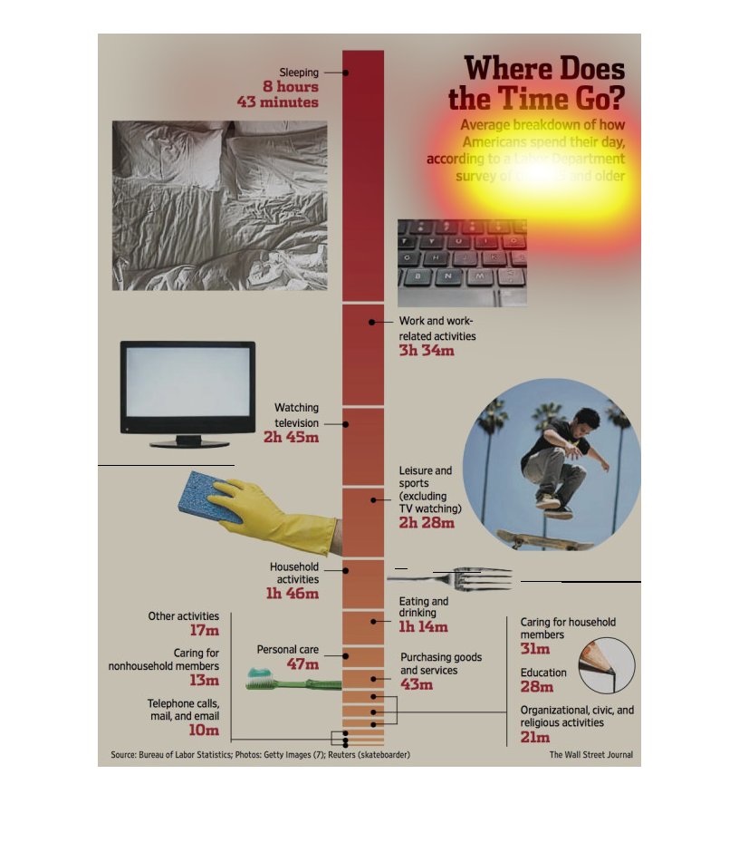
This is an infographic that shows how Americans use their time throughout a day. This is a
graph that uses pictures and text to explain how time is utilized by people
This chart from the Wall Street Journal shows how the average american spends their time,
with over a third of the time dedicated to sleeping and the other time to household chores