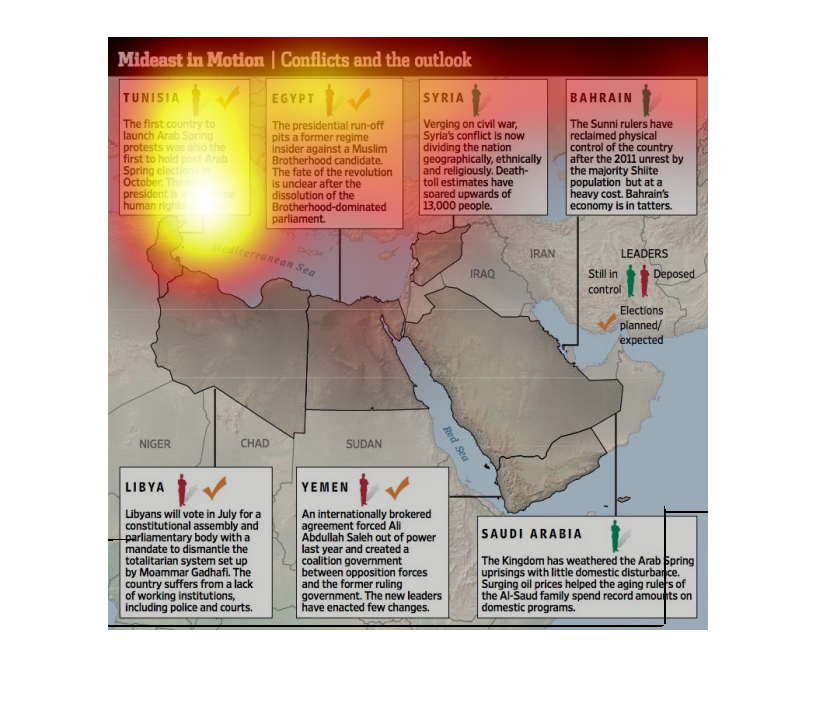
This chart from the Wall Street Journal shows how the middle east landscape has changed since
the arab spring revolts in libya and tunisia. it shows where all the changes are happening
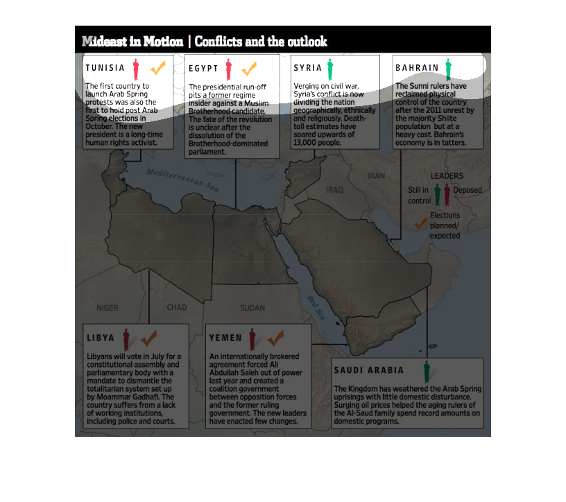
This shows the Mideast conflicts and outlook including the countries of Tunisia, Egypt, Syria,
Bahrain, Libya, Yemen, and Saudi Arabia.  It also shows whether leaders are still in control
or deposed.
This map of the middle east shows the location of ongoing conflicts, with text descriptions.
Each one has a red or green notation showing the possible outlook ahead.
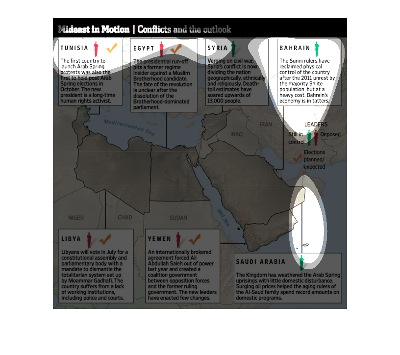
The graphic is a map of the Middle East region that shows the conflicts that have developed
across the region in recent years. The map includes nations such as Tunisia, Syria, and Iraq,
where recent conflicts have developed and continued. It pinpoints conflicts and deaths.
This chart represents all the various disputes and unrest in the middle east. It compares
the various states of conflict to a greater outlook on the future in those areas.
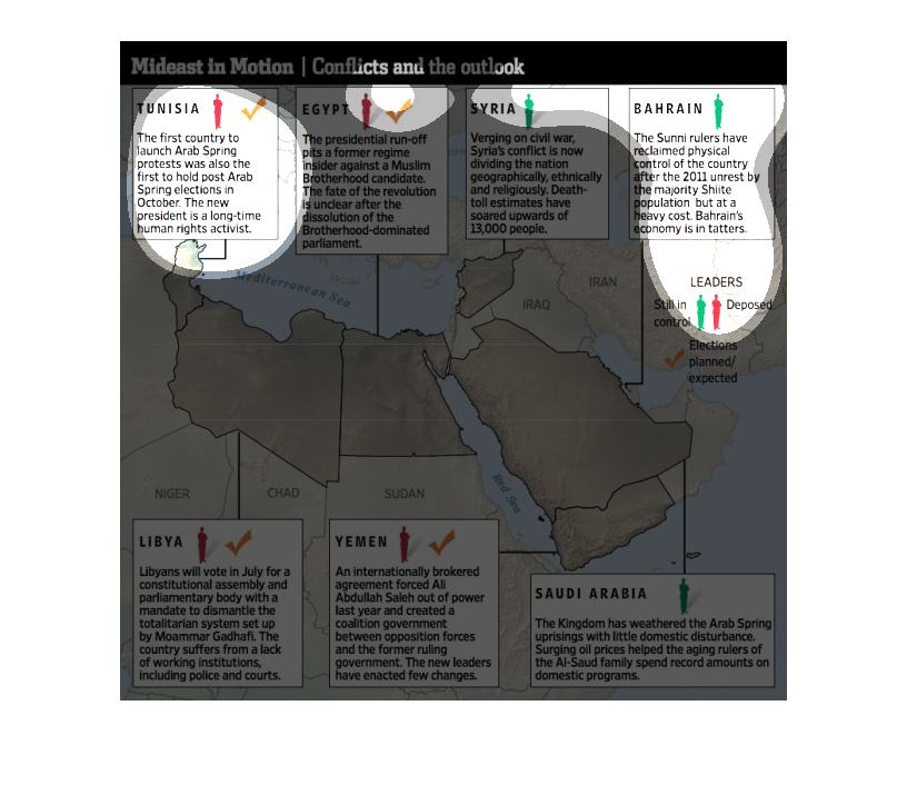
This image is a map of the entire Middle East, with accompanying text. The claim is that the
region is in turmoil.  For example, Tunisia is the first country with an 'Arab Spring' where
protests erupted; Syria is on the verge of civil war; and Bahrain's economy is in tatters.
This image shows a map of the middle eastern region and highlights several of the conflicts
happening in current events. Included are Syria and Egypt.
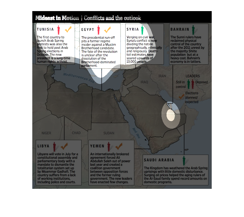
This is a map that shows the various conflict hot spots in the middle east. It shows the various
conflicts that are being experienced by each of these countries.
The figure presented to the left is titled Mideast in Motion.  The figure is a representation
of the statistical research data for conflicts and the outlook.
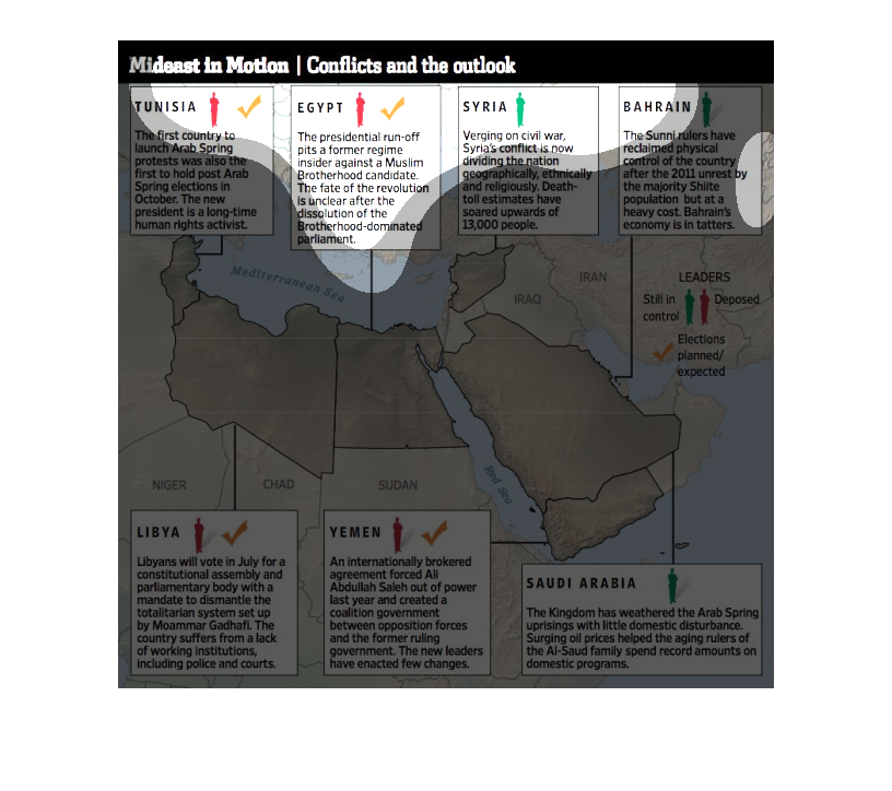
The chart describes and depicts the history of the conflict in the middle east as a timeline
in a myriad of different countries that are all involve in the process.