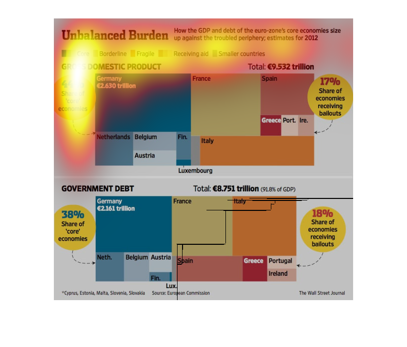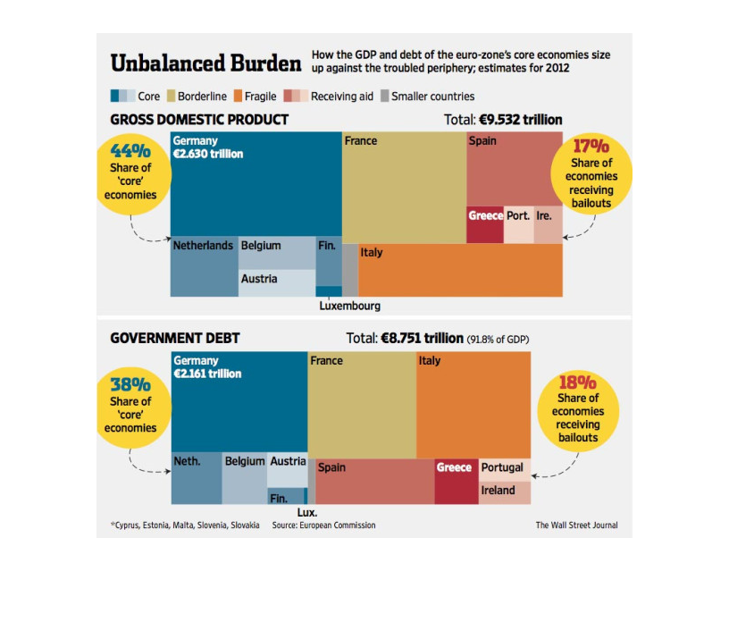
This image is meant to show the fact that the GDP and debt of many different European countries
compare to one another. For example, Germany's GDP is about 2.63 Trillion Euros, whereas its
government debt is equal to about 2.161 Trillion Euros.
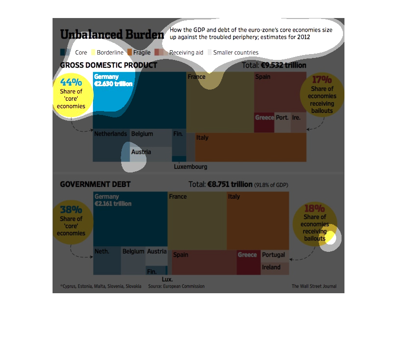
The figure presented is titled Unbalanced Burden.  The figure is a representation of the statistical
data for the debt with the GDP and the euro zone show signs of trouble.
The image depicts how the GDP and the debt of the eurozone's core economies compare to the
troubled periphery. The data shows the core economies having to prop up the periphery economies,
which are dragging down the entirety of the EU.
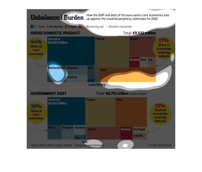
This image is entitled "Unbalanced Burden."  It shows how the GDP and debt of the euro-zone's
core economies size up against the troubled periphery.  Estimates are for 2012.  Countries
represented are:  Germany, Netherlands, Belgium, Austria; France, Spain, Greece, Italy.  Comparisons
are made between GDP and government debt.  The source is European Commission.  This image
appeared in The Wall Street Journal.
This chart shows economic outlook of the Euro zone including gross domestic product and government
debt in the categories of core, borderline, fragile, and receiving aid.
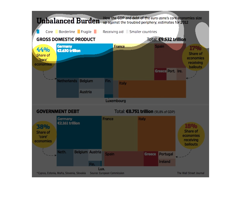
This image looks at how the Gross Domestic Product and debt of the Eurozone's core economies
stack up against the troubled periphery (ie, the debt-laden countries in the immediate vicinity).
 Two separate graphics back this claim visually with colors for each different country, and
textually and numerically.  One graphic is for GDP, the other is Government debt.
This chart from the Wall Street Journal shows how the core economies in the Euro zone fare
with regards to deficits and overall national debt in the trillions of euros
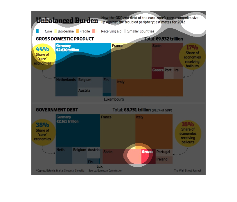
This chart estimates how the gdp will perform in 2012. It compares several countries on their
economic performance. Some countries received bailouts as well.
This image compares the GDP growth and levels of debt between the euro zone, France, Spain,
and Italy. Included are measures of core economies and percentages of economies receiving
bailouts.
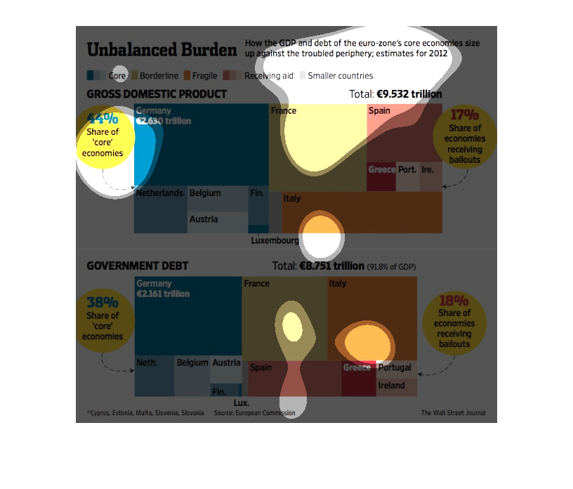
The image depicts how the GDP and debt of the eurozone core economies compares to the under-preforming
periphery. The data shows that core eurozone economies are having to hold up the troubled
eurozone economies, with Germany doing most of the work while Spain, Italy and Greece crumble.
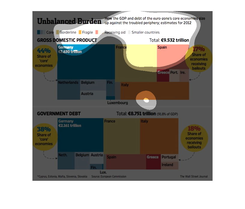
This chart from the Wall Street Journal shows how the debt burdens in the euro zone is not
evenly distributed and some countries have much higher debt to GDP ratios
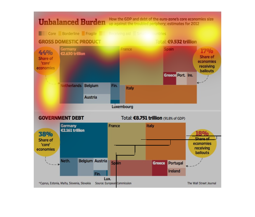
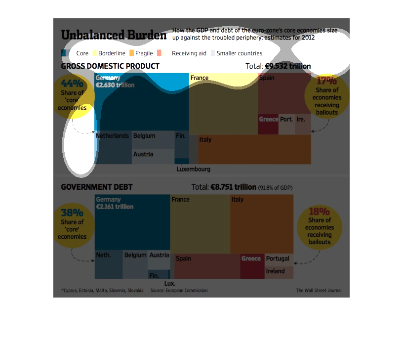
This is a graphic showing the balance of economies in the Euro Zone. In particular, the graphic
is drawing a comparison between Gross National Product and Debt as a proportion of the domestic
economies of various Euro Zone nations. Some nations do better than others.