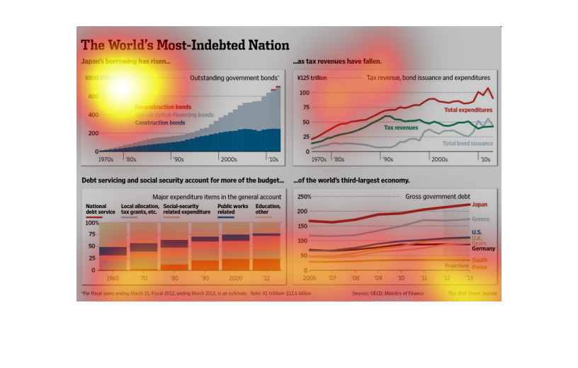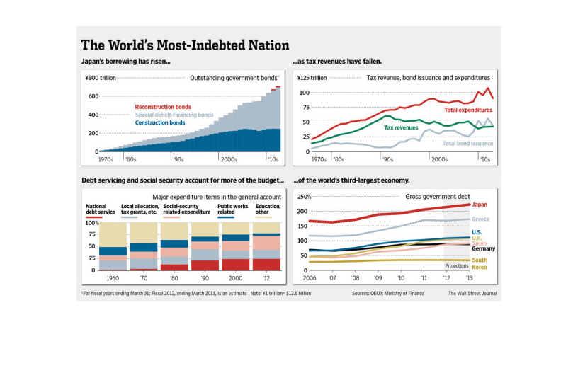
This chart from the Wall Street Journal shows how Japan is the most indebted nation in the
world as measured by debt to GDP. The amount of debt has grown rapidly
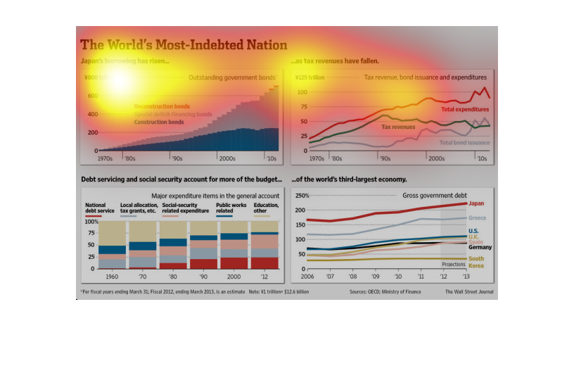
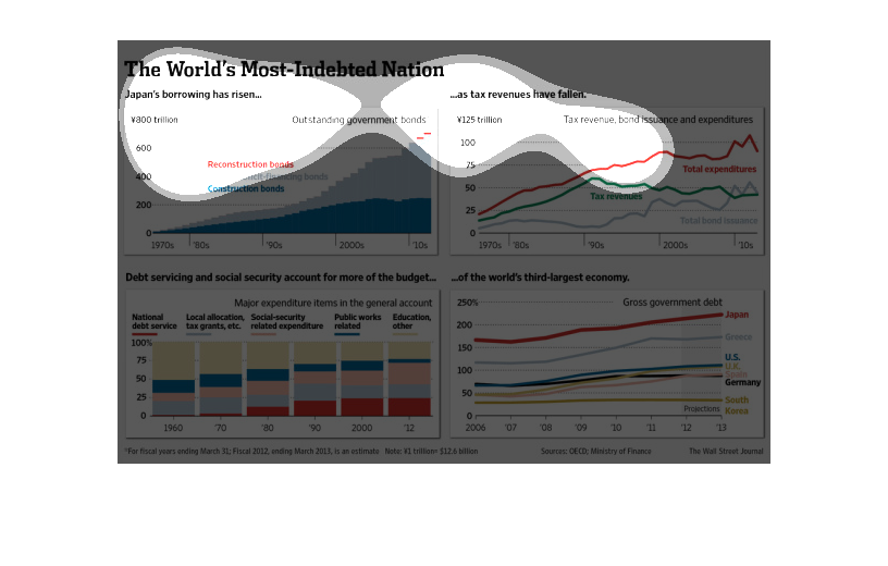
This chart from the Wall Street Journal shows how Japan is the world's most indebted nation
with the highest debt to GDP ratio of over 200%.
The article talks about the world's most-indebted nation. Then it talks about how Japan has
started to borrow a lot more money. Then there is 4 graphs on the bottom of the article showing
that japan is borrowing more money, that tax revenues has fallen, debt servicing  and social
security account for more than the budget, and the world's third-largest economy.
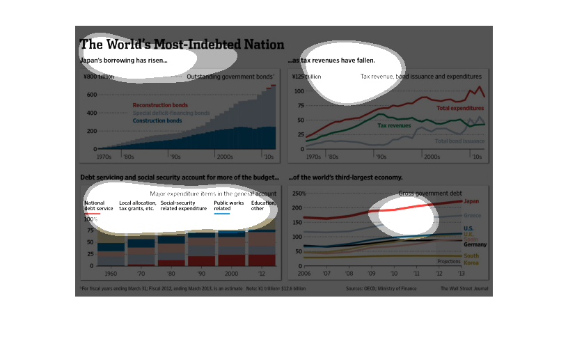
The figure presented to the left is titled the World's most indebted nation.  The figure is
a representation of the statistical research data for Japan's borrowing.
The image depicts the world's most indebted nation, Japan. Outstanding bond payments have
risen, tax revenues appear to have decreased, with welfare programs eating up more of the
budget.
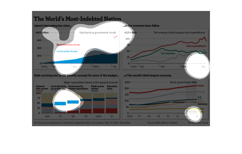
This chart is of different four graphs two line graphs, one labeling each nation, another
accounting for the nations finances, one area graph recording outstanding government bonds
and one bar graph showing how money is spent for each nation, comparing the economic status,
spending and trends of Japan and 5 Other Nation
In this study from the Wall Street Journal- constructed by data obtained from various sources-
we see the trends happening over the years in countries that are highly indebted.
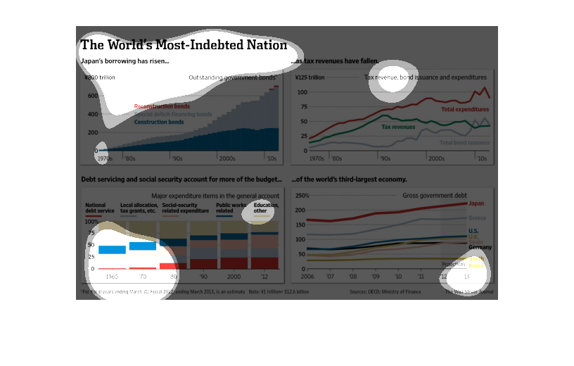
This image is entitled "The World's Most-Indebted Nation."  It shows Japan's borrowing has
risen as tax revenues have fallen.  Debt servicing and social security account for more of
the budget of the world's third-largest economy.  Four graphs are in the image ranging from
the 1970s to the 2010s.  Data shown in The Wall Street Journal.

This is a chart with multiple graphs showing information about Japans debt. It shows that
they are borrowing more money over time. It also showing the falling of tax revenues and other
information about Japans economy through graphs.
This chart shows the world's most indebted nations. It shows a trend of Japan's increase in
borrowing while tax revenues have been on the decline. Comparisons are made with other economies.
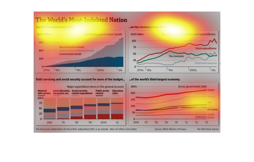
This describes Japanese debt.  This debt began in the 1970's, and jumped up in the mid-90's.
 It move up Both construction bonds and special purchase bonds have risen and used to be roughly
equal, but now construction bonds have leveled off.  Debt servicing has risen to 25% of the
budget, crowding out other spending.  Tax revenues have been falling and are now beneath budgeted
spend.  Their total debt now exceeds even US debt despite being a smaller economy.
This graph illustrates Japan's economy by showing the rise in borrowing on top left, fall
in revenue on top right, debt servicing and social security on bottom left, and gross government
debt on bottom right.