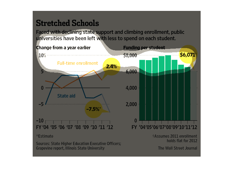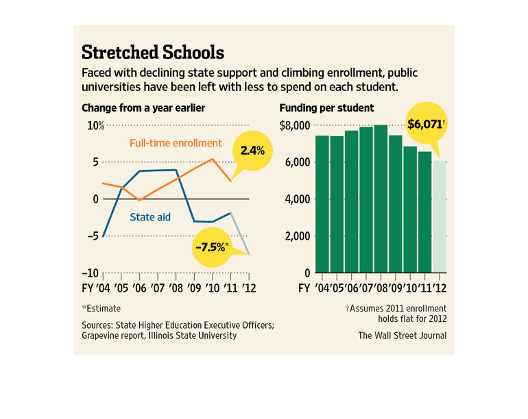
The figure presented to the left is titled Stretched Schools.  The figure is a representation
of the statistical research data for declining state support for schools.
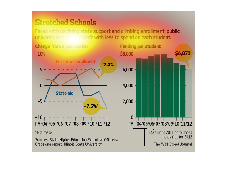
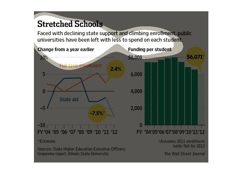
This chart compares state funding and enrollment. It shows that state funding started to greatly
decrease around 2008, while student enrollment kept increasing. The other chart shows funding/per
student and it has gone down each year recently.
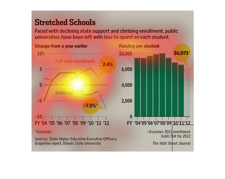
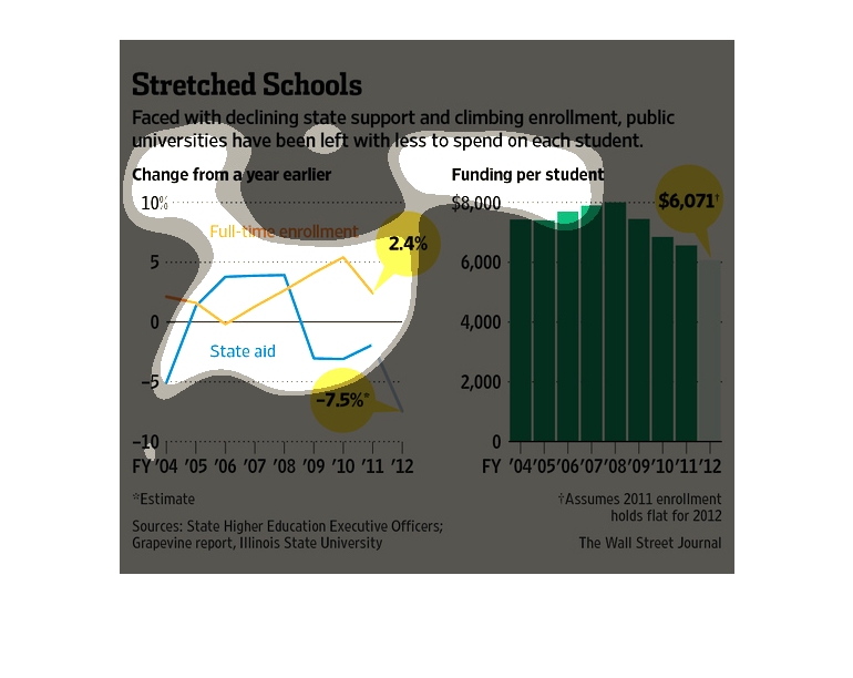
These are graphs tat illustrates that faced with a decline in expected support and climbing
enrollment, public universities have been left with less to spend on each student.
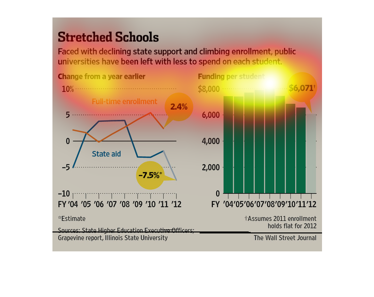
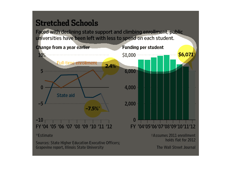
As enrollment in public schools has increased, the level of space provided for them and the
amount administrations are able to spend on each individual student has diminished significantly
over the years.
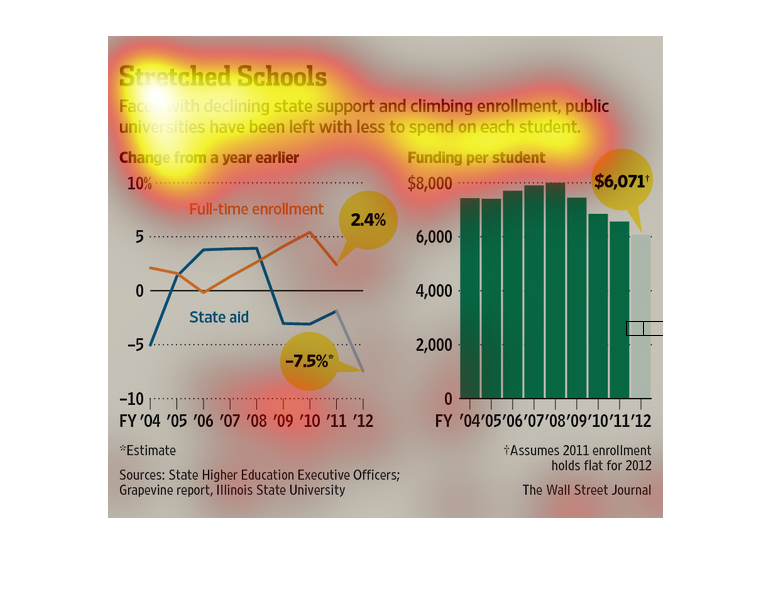
The image depicts declining state support for schools as well as growing enrollment numbers,
with public universities having less money to spend on students. Spending per student has
decreased from around 7,000+ to 6,071.
There are two graphs on this page. The first graph shows the relationship between enrollment
rates and state funding. It shows that in more recent years enrollment has gone up, but State
Universities have been receiving less money per student. The second graph show that funding
per student is at an all time low in 2012.
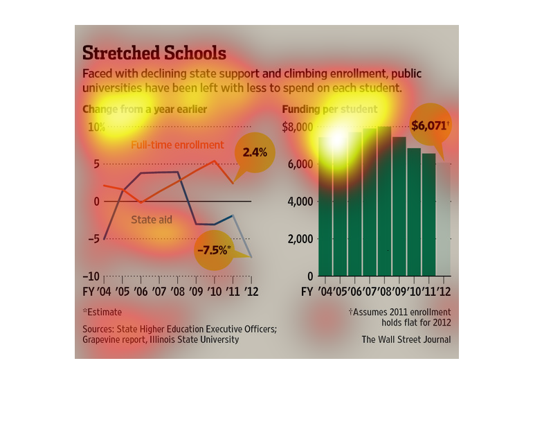
This image purports that with declining state funding and declining enrollement, colleges
and universities can now spend less on each student than they formally did.   There is a graph
and a bar chart that back up this claim, with data that goes from 2004 to 2012.

This shows university spend on each student with changes from a year earlier graphed on the
left hand side and spending per student in dollars graphed on the right side.

Stretched Schools is the title of this image. There is one line graph, and one bar graph.
The line graph is for Change From A Year Earlier with orange being Full Time Enrollment, and
blue being State aid. The graph is for funding per student, varying depending on year.
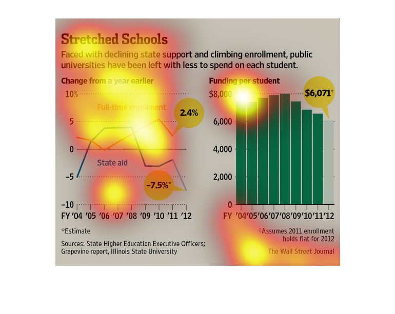
This chart from the Wall Street Journal shows how public universities in the United States
are experiencing decreasing funding and have to raise tuition to fit the bill

The image depicts declining state support and rising enrollment costs for public universities,
forcing public universities to spend less on individual students. Per student funding has
decreased to $6,071, while full-time enrollment is well above state aid.
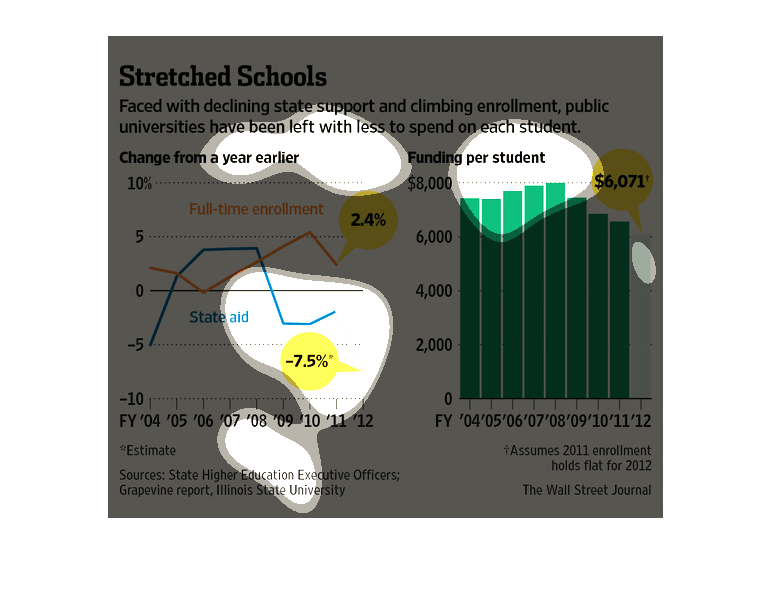
The image addresses the concerns of declining financial support of state schools, in contrast
to increased enrollment.   Two graphs depict 1) Amount of state funding allocated by financial
year.  2) Enrollment numbers by financial year.
This chart from the Wall Street Journal shows how public funding from states on universities
is forcing universities to cut per pupil spending to deal with the cuts