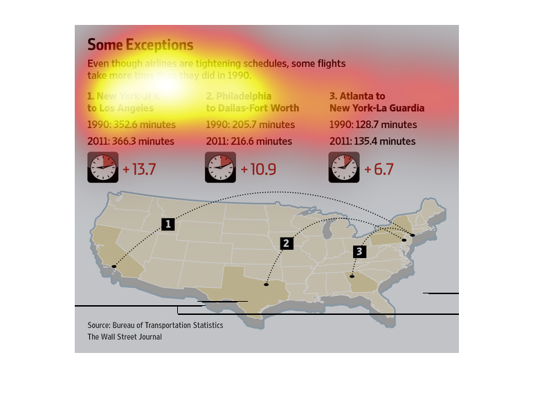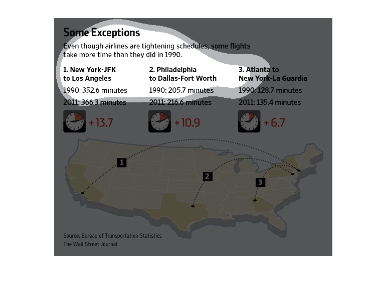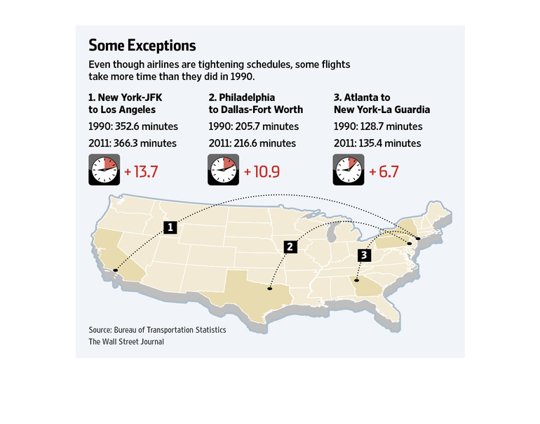
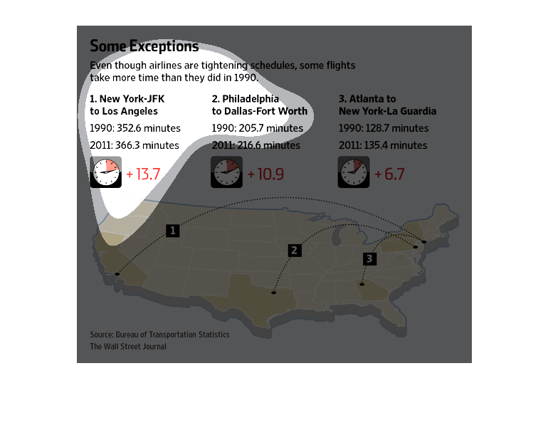
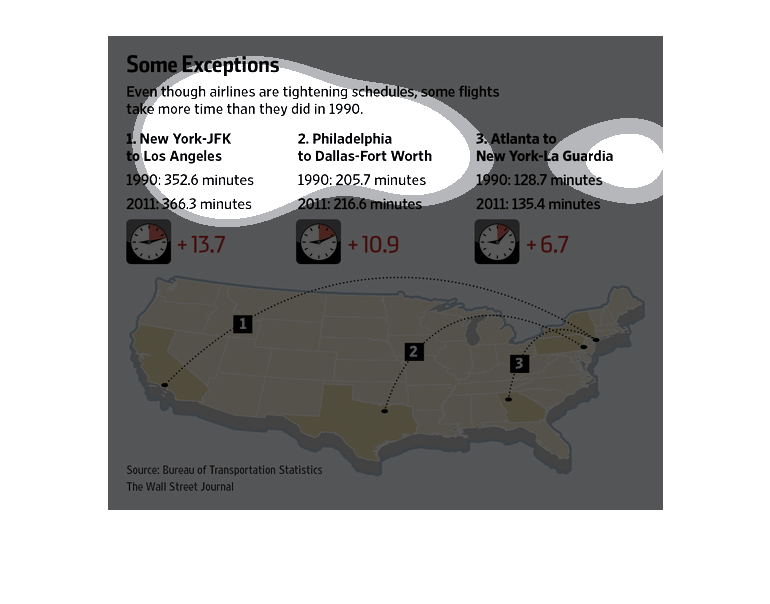
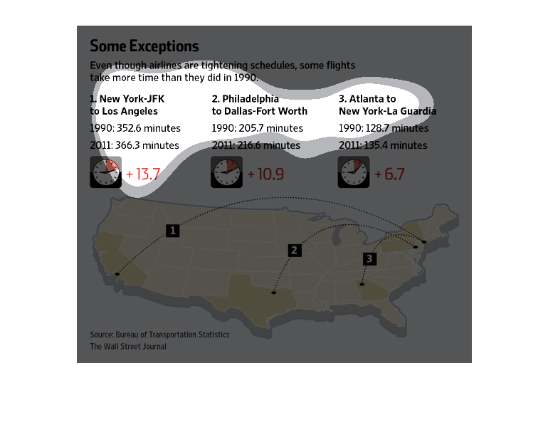
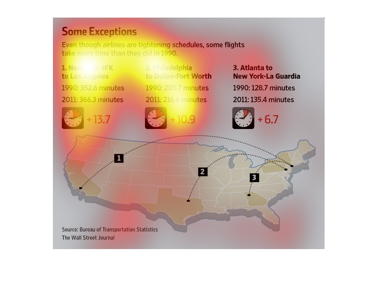
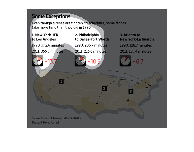
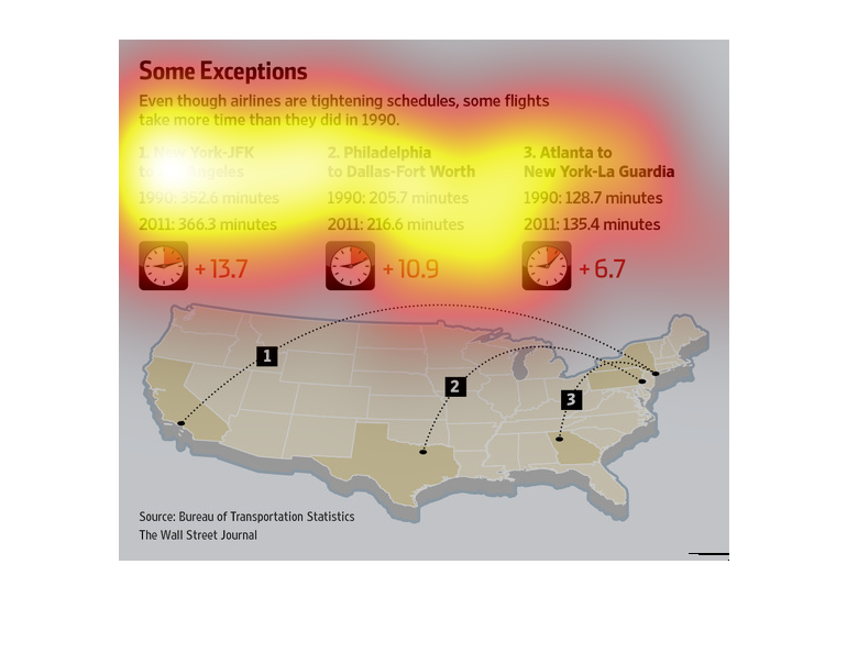
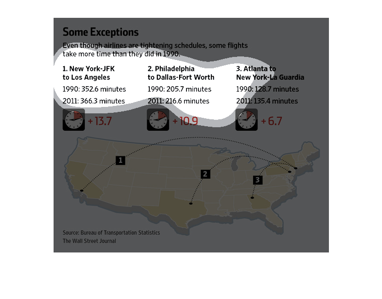
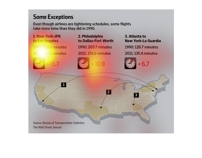
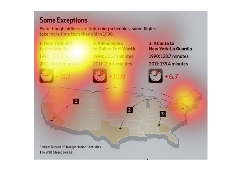
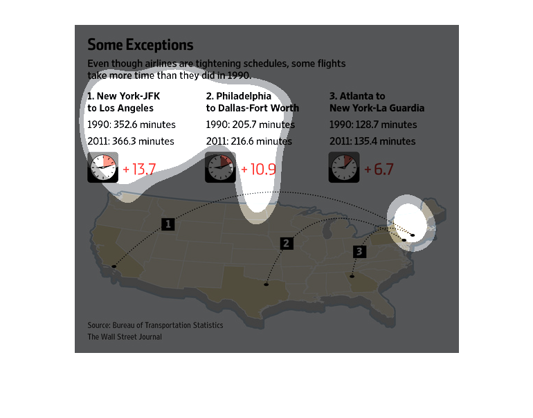
This chart from the Wall Street Journal shows how airline flights are on tight schedules to
ensure maximum revenue generation, but that some flights are taking longer than ever before
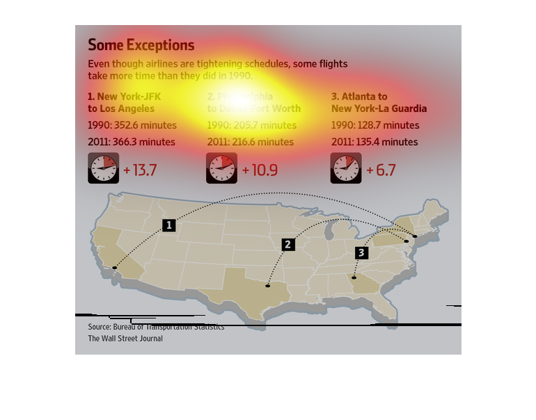
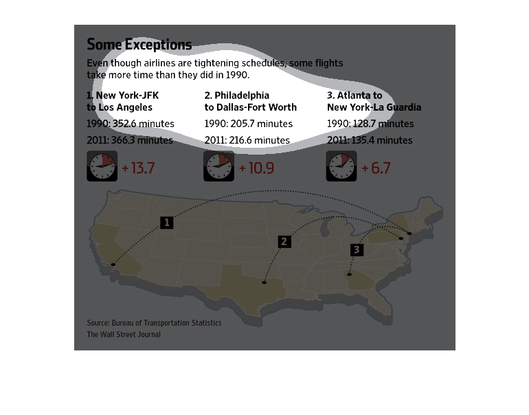
This image informs readers that, though airlines have become more efficient with their flight
schedules, some modern-day flights take more time to complete than they did over 20 years
ago, in 1990. One cited example is the trip from New York-JFK to Los Angeles; in 1990, the
flight took 352.6 minutes, but in 2011, the flight took 366.3. In the 21 years between those
reported times, the flight gained about 13.7 minutes. Another example is the trip from Philadelphia
to Dallas-Fort Worth; in 1990, the flight took 205.7 minutes, but in 2011, it took 216.6.
The duration of the flight increased by 10.9 minutes. Lastly, the trip between Atlanta to
New York-La Guardia went from 128.7 minutes in 1990 to 135.4 minutes in 2011, with a 6.7 minute
increase. The Bureau of Transportation Statistics provided the information and calculations.
This graph was published by The Wall Street Journal.
This is a picture graph depicting times of different  flights and different  time zones in
central  America  and the variation that would lie in there of
This chart shows how even though airlines are tightening their schedules, some flights are
taking longer.  Examples include New York to Los Angeles, Philadelphia to Dallas, and Atlanta
to New York.
This chart from the Wall Street Journal shows how airline routes have been contracted over
time yet despite the lower number of flights, delays are still more common
The image depicts how airlines are tightening their flight schedules, yet some flights are
taking more time than they did in 1990. Depending on the scheduled flight at different airports,
the data cites +13.7%, +10.9, and +6.7 additional seconds for individual flights.

This chart shows that even though some airlines are tightening schedules, some flights take
more time than they did in the 1990s. There seems to be an increase in time in 2013 compared
to the year 1990.
This article talks about how some flights are taking longer than flights in 1990. On the bottom
of the article is a map of the United States with 3 major cities flights.
This chart shows how long flights are taking more time than they did in 1990. It is comparing
New York airports with Philadelphia and Atlanta. It has a picture of the US at the bottom.
This chart shows flight times between two cities. It shows the time in 1991 and 2012 and that
the flight time has actually increased from earlier years to the current years
This graph shows that although some airlines are tightening schedules, some flights still
take more time than they did in 1990. Highlighted are three flights which show an average
of about ten minutes delay time.
This is a chart showing times it has taken airplane flights to be completed. It shows that
in 1990 the flights have been actually faster than they are now.
This is a graphic that is meant to illustrate that although some airlines are tightening schedules,
some flight still take more time than they did in 1990.