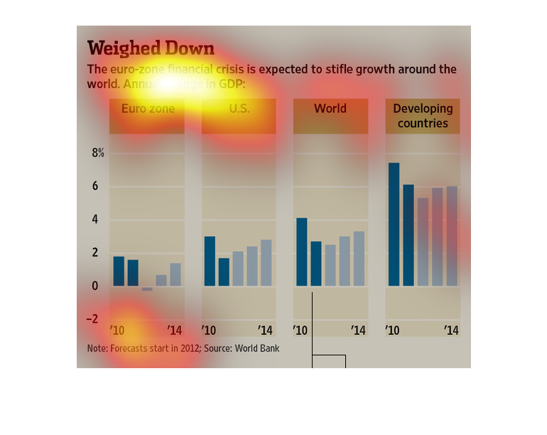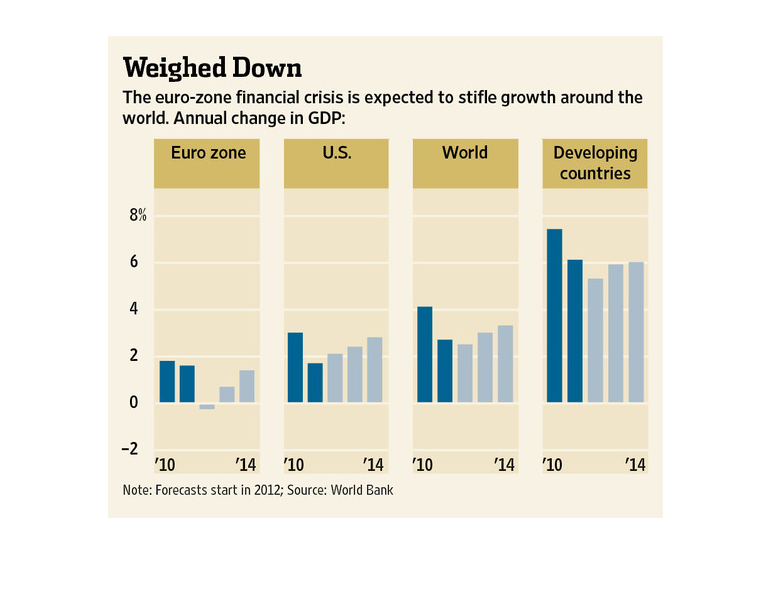
This chart from the Wall Street Journal shows how the euro zone is weighing down economic
growth not just in Europe but also the United States and the developing world
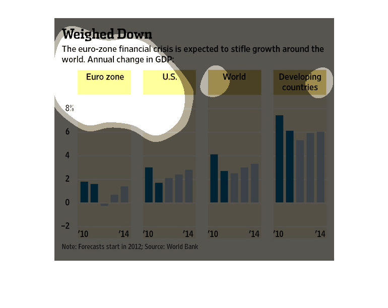
The figure presented to the left is titled Weighed down.  The figure is a representation of
the statistical data for the euro zone financial growth crisis.
This chart from the Wall Street Journal shows how the european sovereign debt crisis is expected
to depress GDP growth globally because of banks holding bad debt
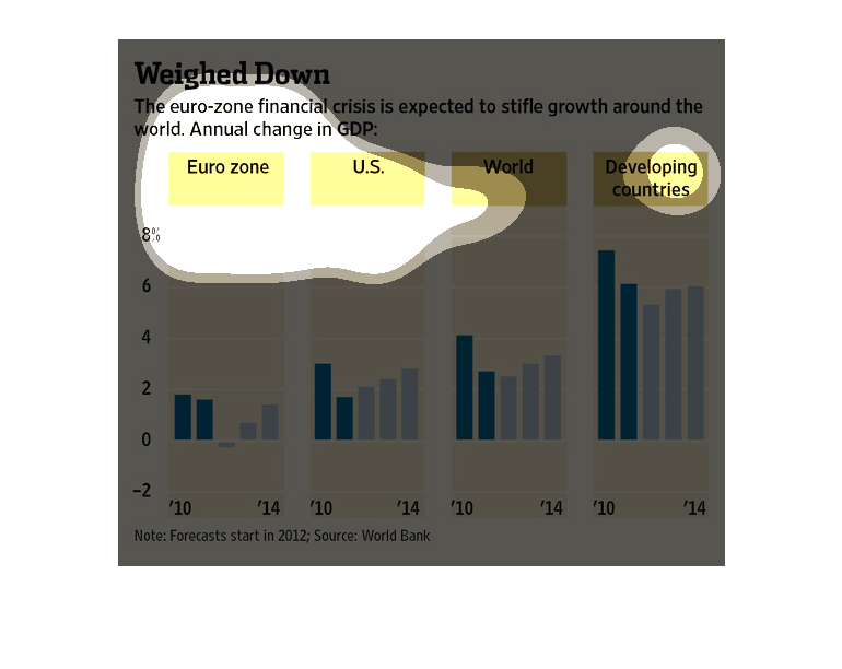
This image discusses the EuroZone financial crisis and how it is likely to infect the world's
economy.   The bar charts compare the EuroZone, the US, the  World, and the developing world
over a period of 4 years (2010-4)
These bar graphs compare the financial status of the Euro-zone, America, developing countries,
and the world. According to these graphs, the developing countries will experience the largest
growth.
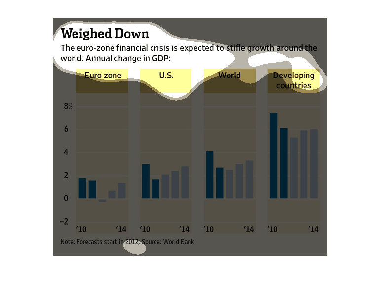
This chart shows weighted down of Eurozone financial crisis. Among all over the world, developing
countries, us, and euro, overall euro countries are lower than others and also decreased it
in 2014 than in 2012.
This image is entitled "Weighed Down."  It shows how much the euro-zone financial crisis is
expected to stifle growth around the world.  Annual change in GDP is shown in four graph charts:
 Euro Zone, U.S., World, and Developing Countries.  Percentages range from 0 to 8% from the
years 2010 to 2014.  The source is World Bank.
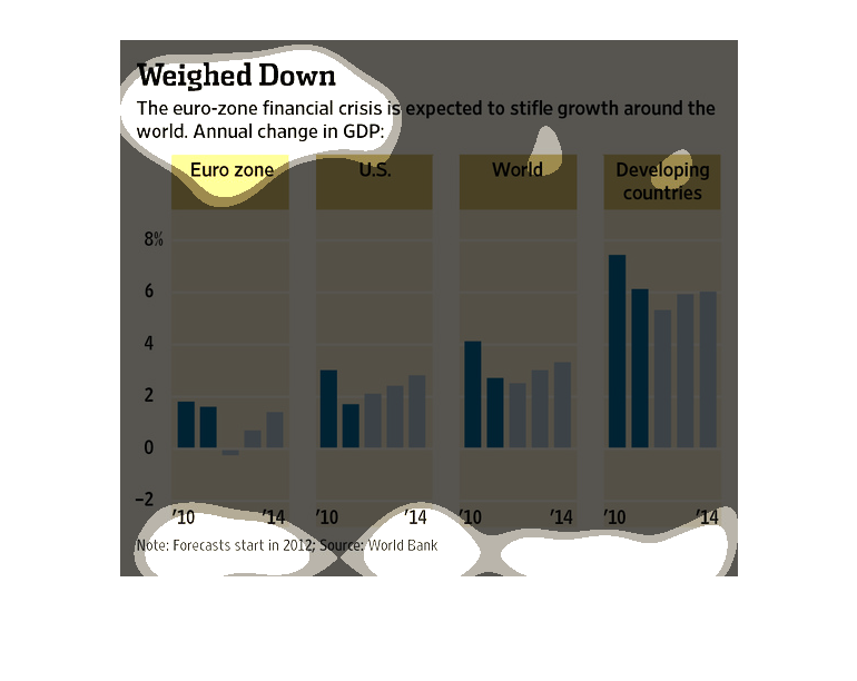
This chart describes weighed down. Specifically, the euro zone fiscal crisis is expected to
stifle growth around the work. Categories on the chart include Euro Zone.
This graph depicts the impact of the euro zone financial crisis around the world.  The GDP
growth (or lack thereof) are subdivided into the euro zone, the U.S., developing countries,
and the aggregate world.
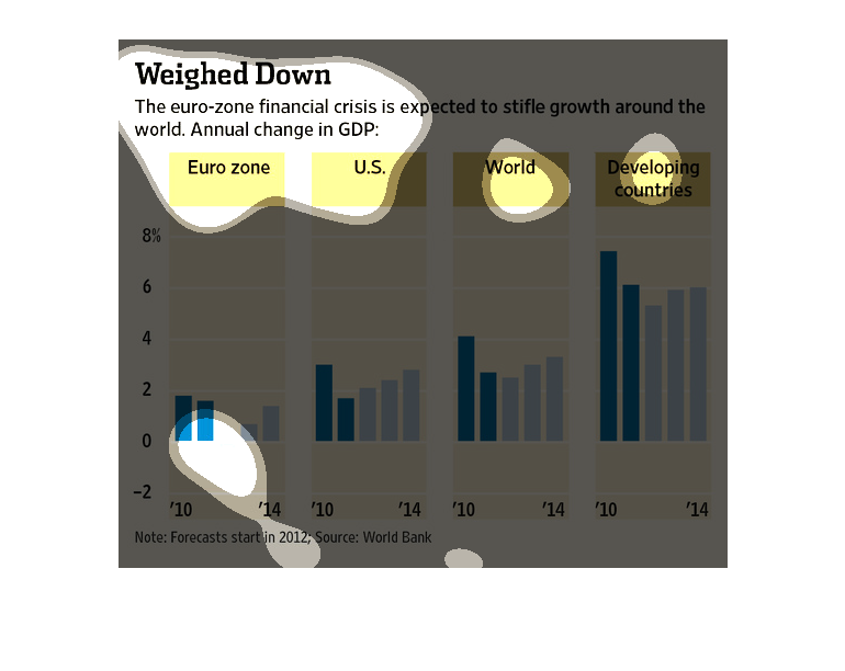
This graph is titled "Weighed Down" and shows how the European Financial Crisis affects other
countries around the world. Each graph is broken up by various regions, including Euro-Zone,
U.S., World, and Developing Countries.
This image shows the Eurozone's problems extend to to the US, to developing countries, and
to the rest of the world.  These four areas each have their own bar chart graphic which measures
changes in Gross Domestic Product.