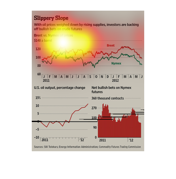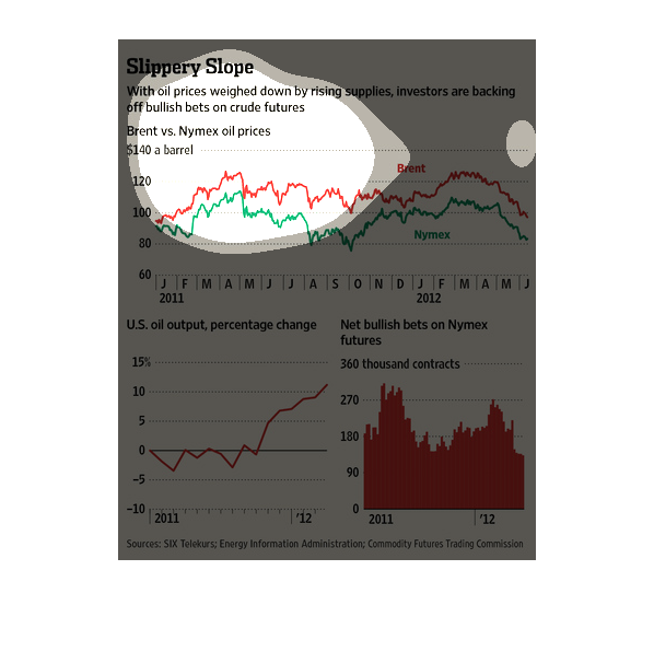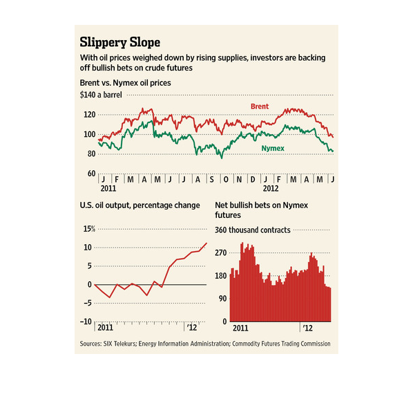
Slippery Slope | We See Brent maintaining a slight lead  over Nymex as shown by a color coded
line graph over the course of 2011/2012, while United States oil output has dramatically increased.
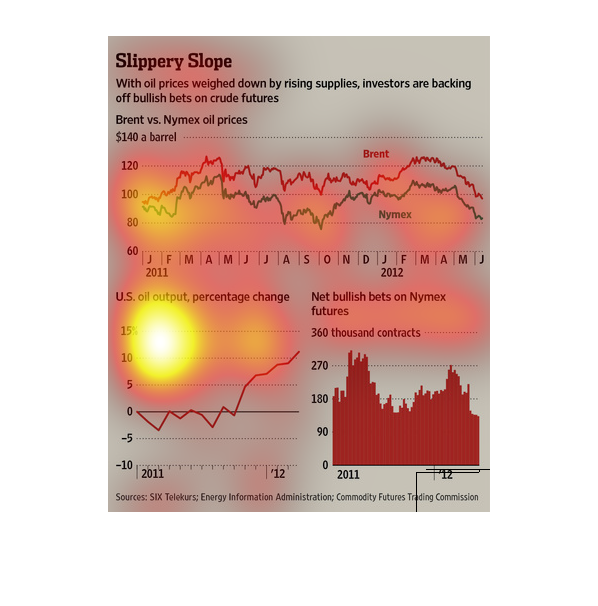
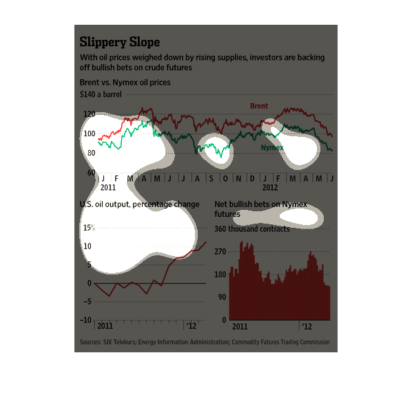
The charts show the oil market and the price of oil vs the nymex tables that triggered the
recession. It also d money rates the effects of bully bets.
This chart is title: Slippery Slope. With oil prices weighed down by rising supplies, investors
are backing off bullish bets on crude futures..........
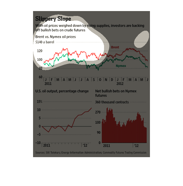
This chart shows the percentage of change investors have made when it comes to United States
oil output. It shows with rising prices, investors are backing off bullish bets.
The top half of the graph shows Brent vs Nymex oil prices.   The bottom left shows US oil
output percentage change and the bottom right shows net bullish bets on Nymex futures.
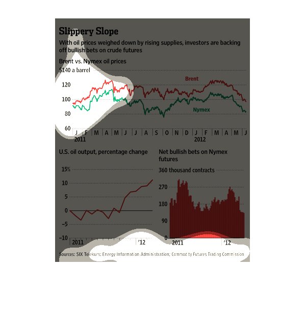
Three graphs under the title of "Slippery Slope". One is a line graph centered on Brent vs
Nymex prices. There is another chart focused on US oil output, and a bar graph for Net bullish
bets on Nymex.
This informational graph is showing that oil supplies have been rising and that is causing
oil prices to be weighed down. This is making it so that investors are backing off some bets.
There are some graphs showing this information.
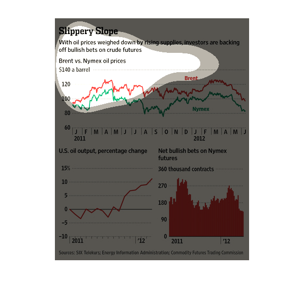
This chart from the Wall Street Journal shows how oil supply is at an all time high, making
investors betting on an oil rally hesitant to invest in futures
Here, oil commodities are examined. The claim is that since supplies have risen, prices have
fallen and investors have backed off their bullish sentiment and turned to other investments.
  Graphs and charts back up this claim. One shows US oil output/production and how it has
risen in recent quarters.

The image depicts oil prices decreasing due to rising supplies, with investors backing off
over-zealous attitudes pertaining to investments in crude futures.