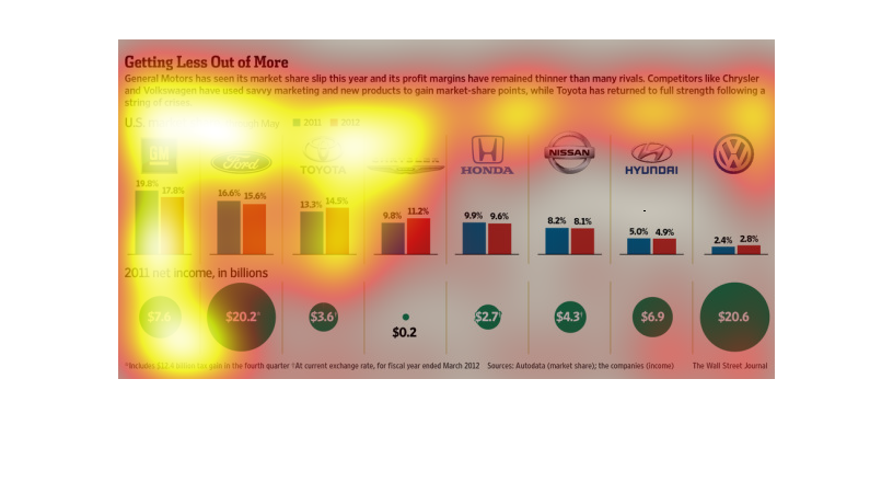
Here is a discussion of General Motor Companies market share decline, as well as its thinner
profit margins in recent times.  The graphic compares GM with other companies like Volkswagan
and Toyota which have had better performances.
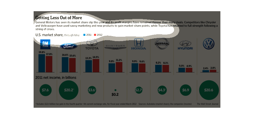
General Motors has seen it's market share slip and it's profit margins get thinner than many
of their rivals this year. Chrysler and Volkswagen have used savvy marketing and new products
to gain market share points. The chart compares the market share through May for 2011 and
2012.
In this study conducted by the Wall Street Journal- from various listed sources- we see that
after the big goverment bailouts of the car industry, each manufacturer has faced a crisis
where there were spending more than they were getting.

This chart depicts the U.S. market share of various car companies in 2011 and 2012. In 2011,
General Motors was at the top and had roughly 40% of the market, where Volkswagen had only
2.4%. This graph also shows net income for each company.
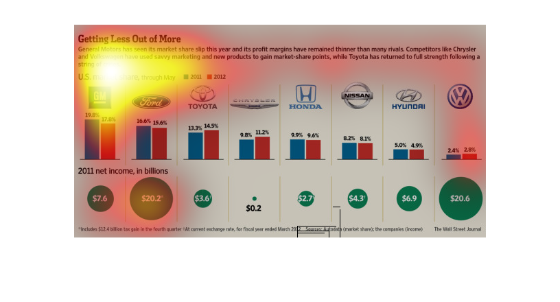
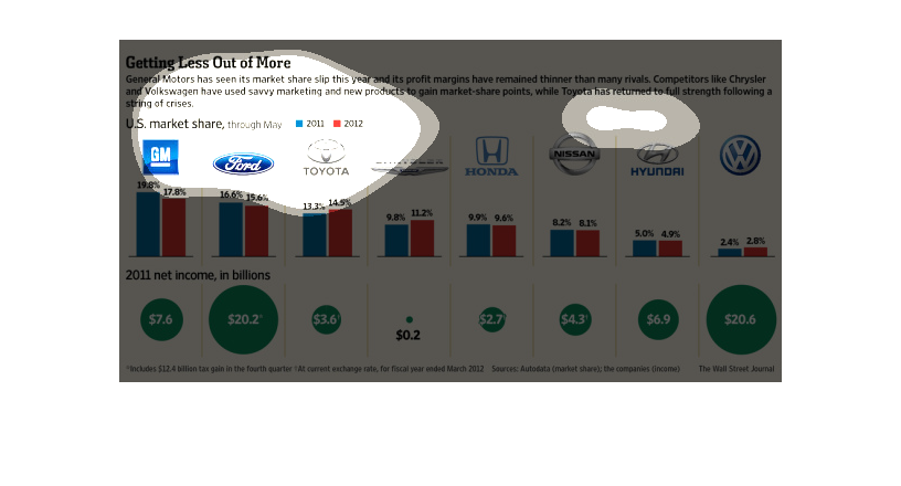
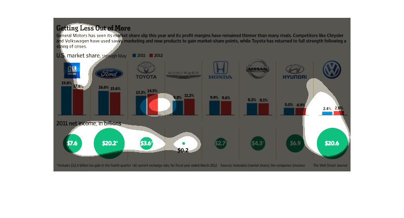
This chart is your typical graph chart that sets up one or a number of categories, illustrated
by either a map, a graph, an illustration, or photographs, etc.
The figure presented is titled Getting Less Out of More.  The figure is a representation of
the statistical data for General motors slip in share values.
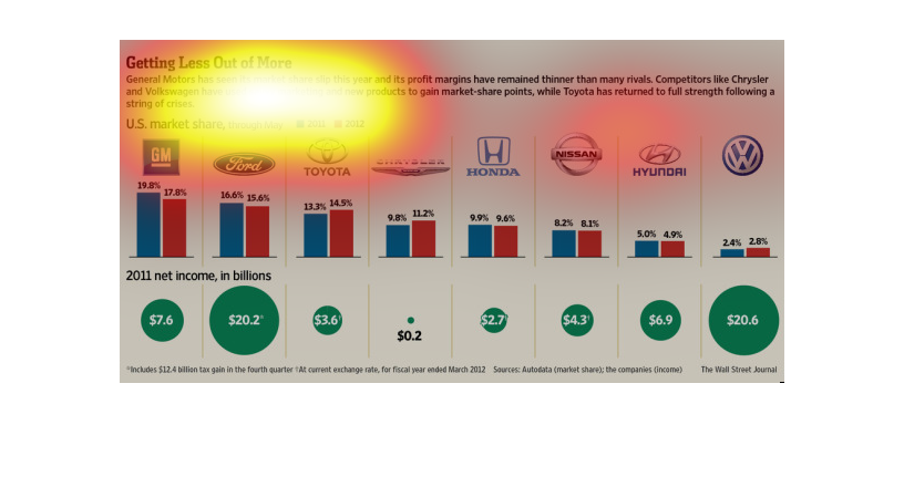
This chart is titled: Less out of more. General Motors has seen its market share slip this
year and its profit margins have remained than many rivals.
This chart from the Wall Street Journal shows how General Motors has seen its market share
drop because of growth in rival brands like Volkswagon and Chrysler
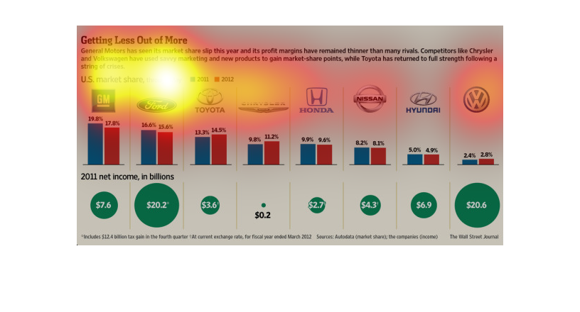

This chart from the Wall Street Journal shows how the market share breakdown for many major
car manufacturers is like in the United States. GM is the leader
This image shows the net market share and net income of the largest car manufacturers. Data
from 2011 and 2012 is compared. GM, Ford, and Honda are some that are compared.
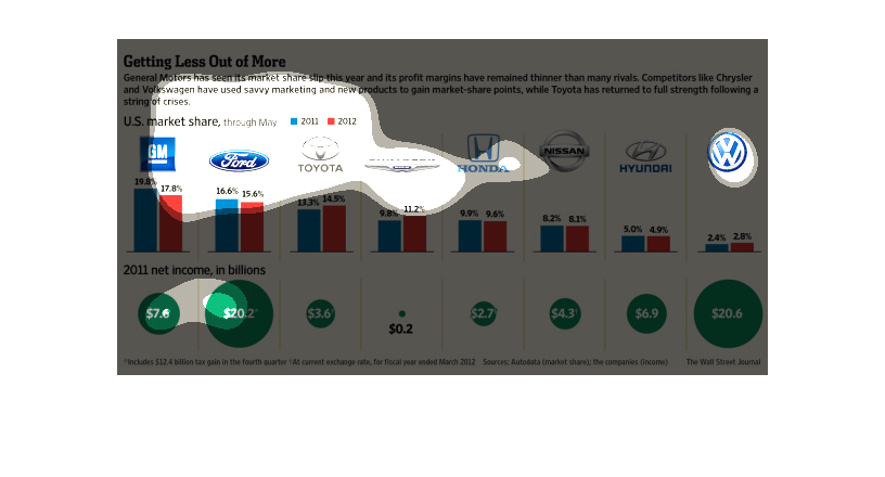
This series of graphs shows the US market share, in color coded graphs from 2011 and 2012,
of different auto manufacturers. Below each logo a proportional circle represents each companies
net income.
This is a chart showing General Motors versus many different car companies. It is stating
that their market shares have been slipping in comparison to others.
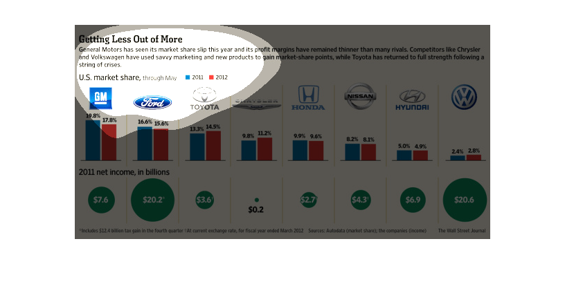
The graph shows the share of the auto U.S. market that has been captured by different auto
manufacturers in 2011 and 2012. GM and Ford have the largest market shares, although their
share dropped slightly from 2011 to 2012.  Toyota, Chysler, and VW were all able to grow their
market share slightly.  All were profitable in 2011, with Ford and VW having the greatest
net income.