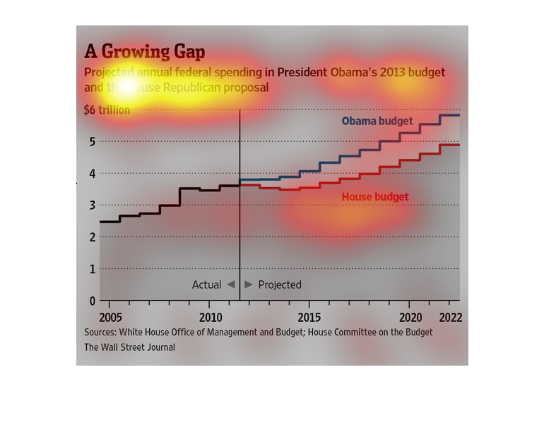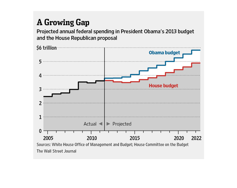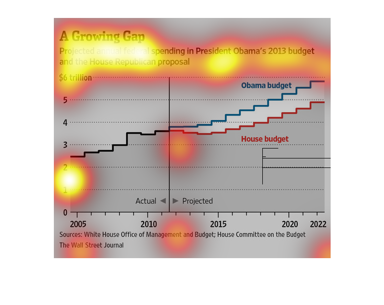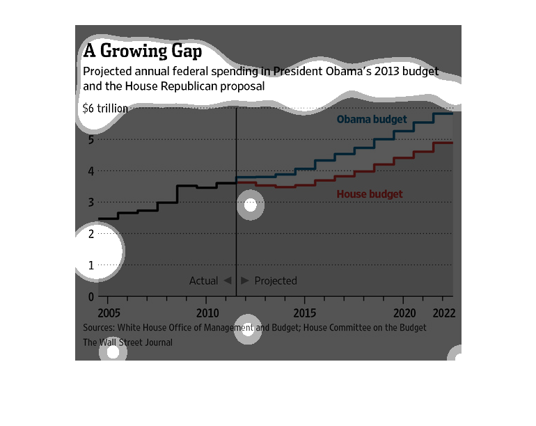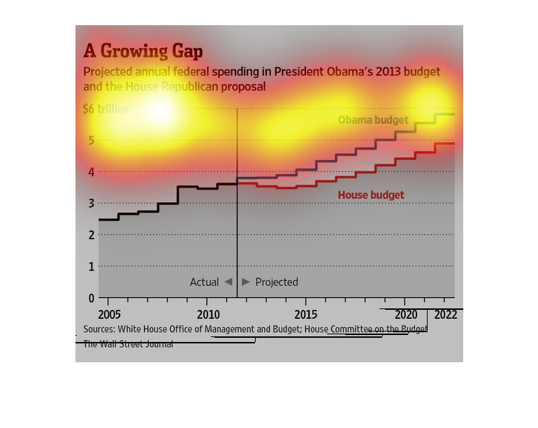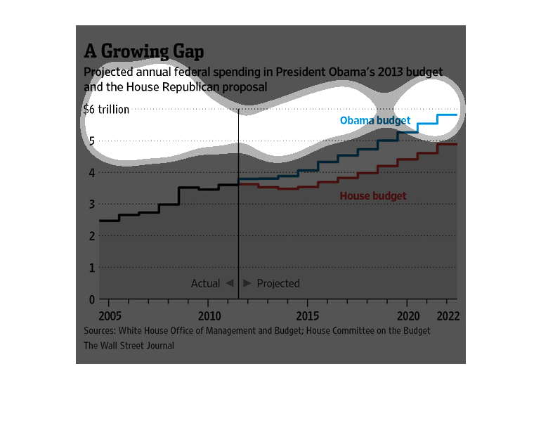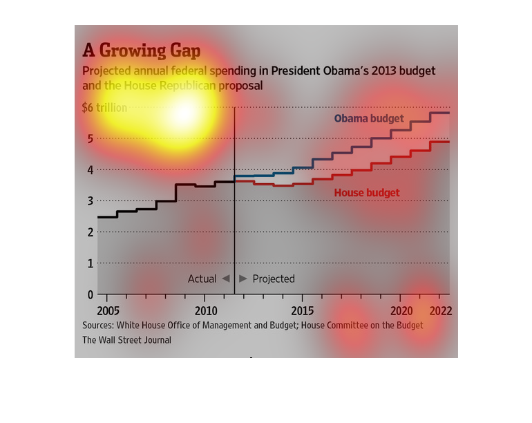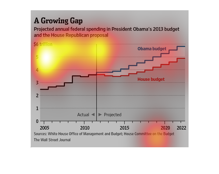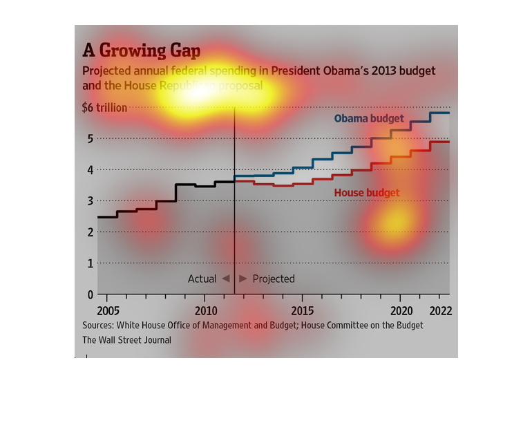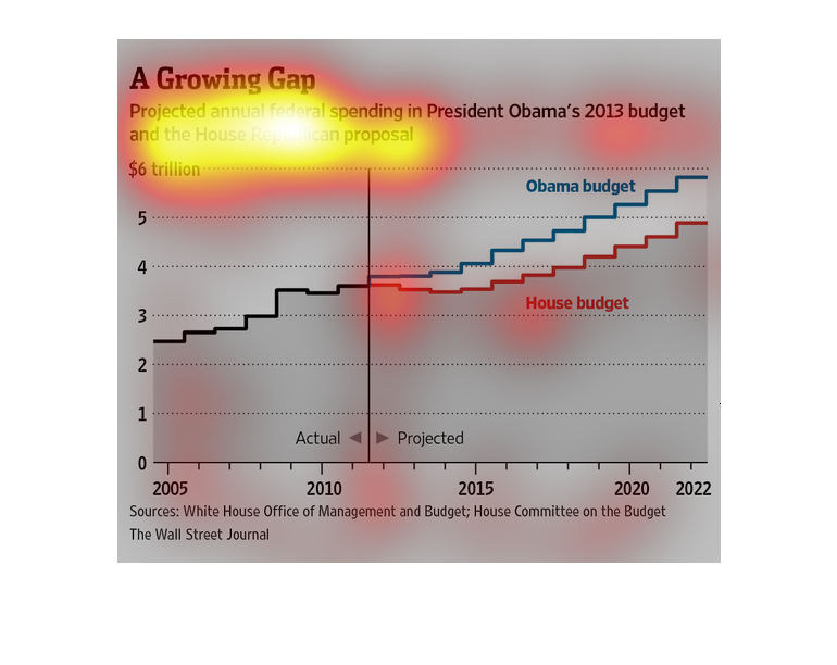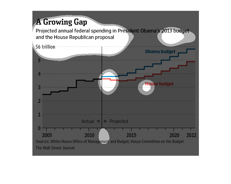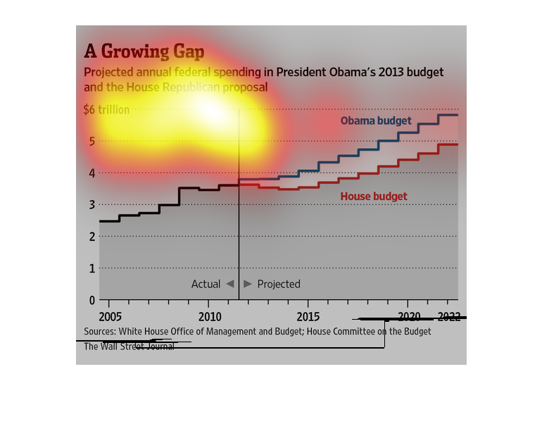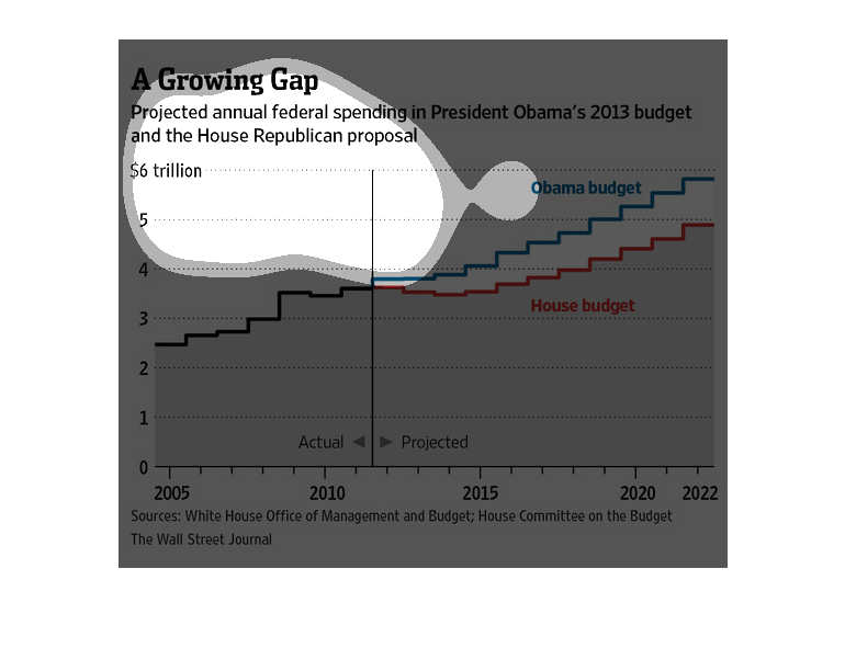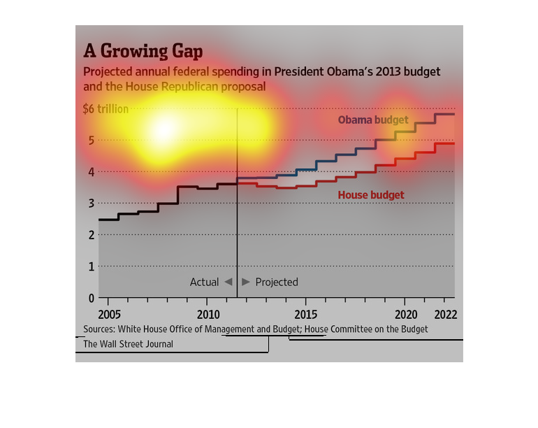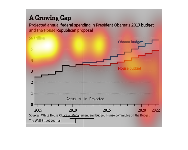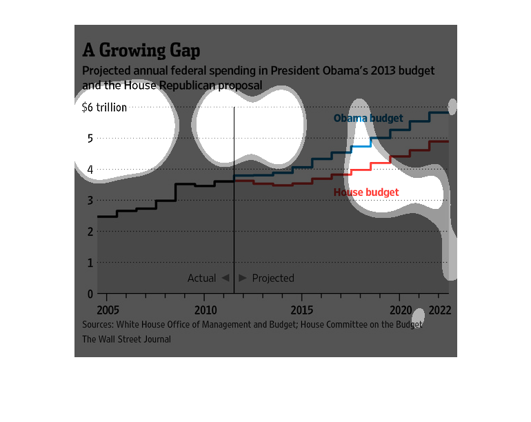
This graph is entitled "A Growing Gap"  Projected annual federal spending in President Obama's
2013 budget and the House Republican proposal. In 2005 the gap was about 2.5 Trillion. It
is project to steadily increase to over 5 trillion by 2022. Today it is about 3.5 trillion.


This graph is illustrating to difference between President Oboma's and the house republicans
budget proposals in 2013. This graph demonstrates the different spending ideas of the two
parties.


Graph showing gap between Obama's budget plan in election years and projected annual spending
by the republican house of representatives. Delineating Obama's expected revenue and returns
and the projected increase in spending during the election years.


This image is entitled "A Growing Gap."  It shows projected annual federal spending in President
Obama's 2013 budget and the House Republican proposal.  The graph ranges from $0 - 6 trillion.
 The dates are from 2005 to 2022.  The sources are The White House Office of Management and
Budget; House Committee on the Budget.  The image appeared in The Wall Street Journal.


This graph depicts the projected annual federal spending in President Obama's 2013 budget
and the House Republican Proposal reaching just under 6 trillion dollars with President Obama's
budget higher than the House budget.


Graph of President Obamas budget compared to the House Republican proposals. It appears there
is more spending in his budget then proposed by the Republican House.


This image shows a graph depicting the Obama administration's spending and the amount it is
projected to spend in the future. It compares this value to the budget of the House of Representatives.


The figure presented to the left is titled A growing Gap.  The figure is a representation
of the statistical research data for projected annual federal spending.


This image shows or depicts in line graph statistical format data concerning projected federal
spending during Barack Obama's 2013 budget and the house republican proposal.


This chart from the Wall Street Journal shows how President Obama and the republican leadership's
budget will impact federal spending and the deficit over time


This chart from the Wall Street Journal shows how the Republican budget and President Obama's
budget would increase the deficit/debt long term.


This line graph illustrates expected spending in the 2013 budget from the house proposal and
from President Obama with Obama's budget being higher than the House budget.


This graph talks about President Obama projected budget in 2013 and the house republican proposal.
According to the graph over the years the budget keeps rising. Also, that Obama's budget cost
more than the house budget.
