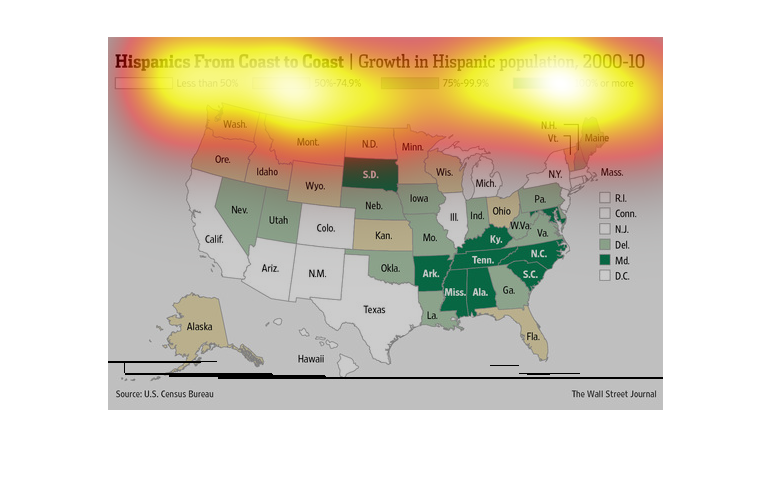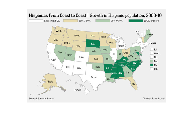
This image shows a map of the United States of America. In each state, the percentage of the
population that is Hispanic is noted. The east coast has more of a Hispanic population than
the west.
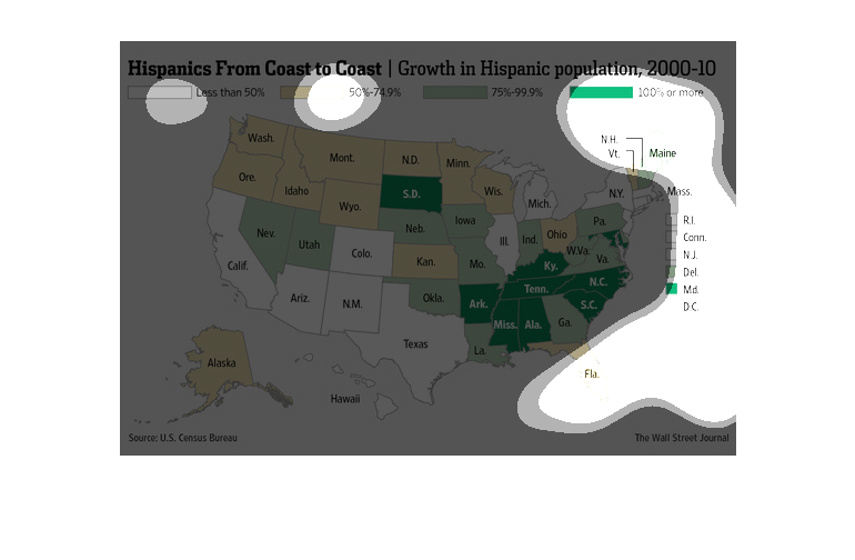
This graph shows the growth in Hispanic population across America from 2000 to 2010. Much
of the south saw 100% growth in the Hispanic population. However, the southwest saw less than
50% growth.
The figure presented is titled Hispanics from Coast to Coast.  The figure is a representation
of the statistical data for growth in Hispanic population.
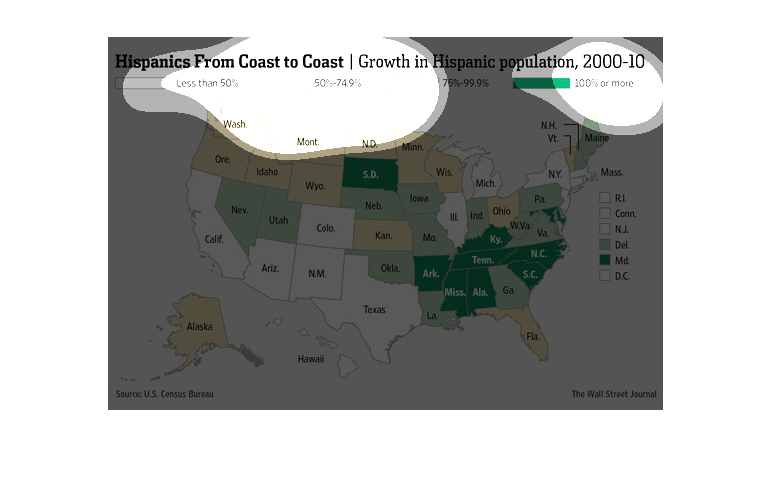
This chart from the Wall Street Journal shows how the hispanic population has grown dramatically
in the United states from 2000 to 2010 and in the southeastern US in particular
This chart is titled: Hispanics from Coast to Coast- growth in Hispanic population, for the
years of 2000-2010. This is a map of the US showing the growth by particular state.
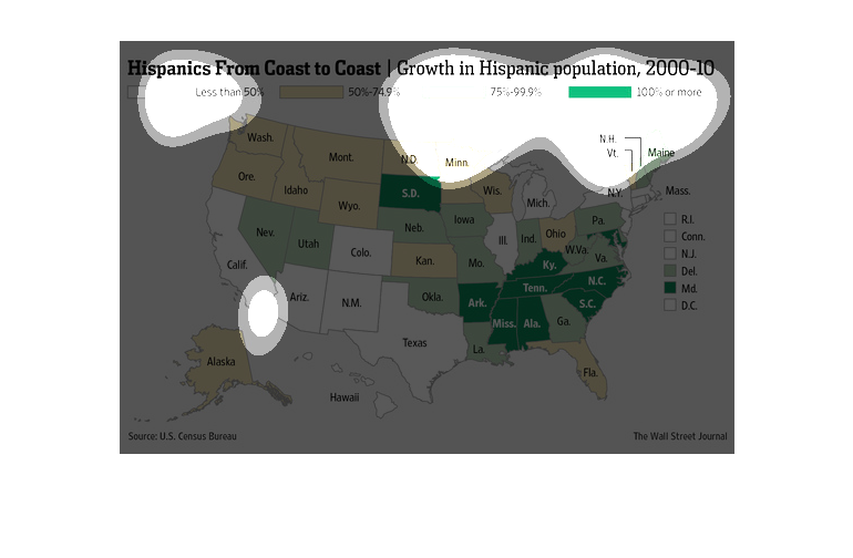
The image depicts the growth in Hispanic population, 2000-2010. The data indicates that the
US south, in many states, has ever-increasing Hispanic populations growth, in many cases by
100%.
This chart from the Wall Street Journal shows how hispanics in the united states are growing
since the 2000 census and are concentrated in the southeastern united states
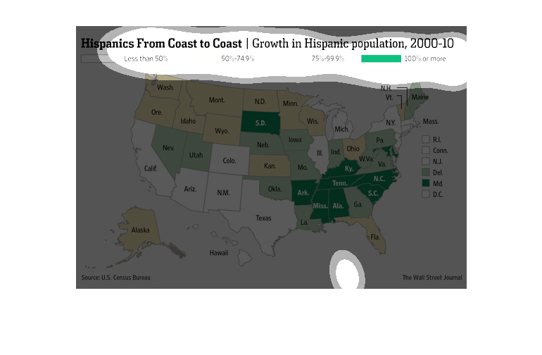
This shows Hispanics form coast to coast from the years 2000 to 2010 with growth in the Hispanic
population on the United States map with south and east having highest increases.
This image is about the Hispanic population and the growth of this population, from 2000-10.
 The map of the US spans this image and highlights areas of states where Hispanics have grown
in population.
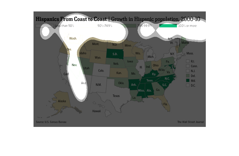
This US map shows the coast to coast growth in the population of hispanics, from 2000 to 2010.
The colored shading in each state represents less than 50%, all the way to a 100% increase
or more.
This image is entitled "Hispanics From Coast to Cast:  Growth in Hispanic Population 2000
- 2010.  The image is of the United States.  Areas are highlighted based on Hispanic population
growth.  White areas are less than 50%; tan areas are 50-74.9%; light green areas are 75-99.9%;
and dark green areas are 100% or more.  The source is U.S. Census Bureau.  This image appeared
in The Wall Street Journal.
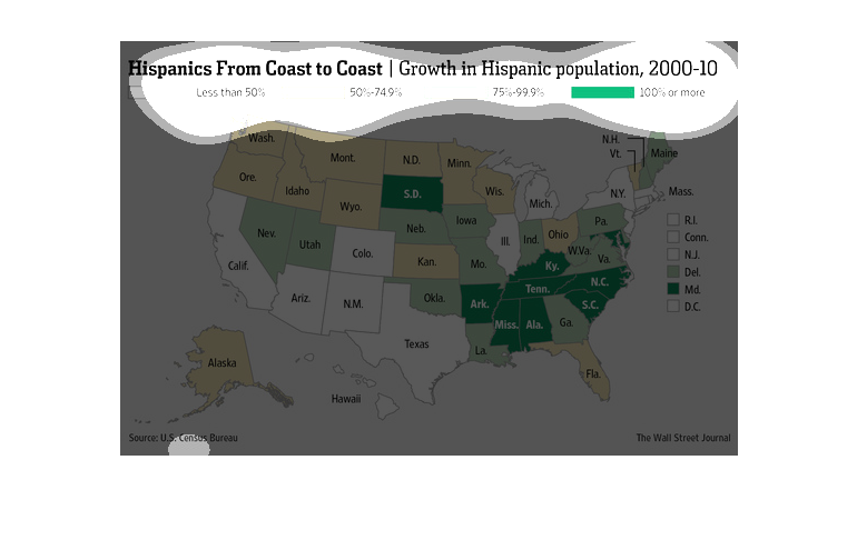
This chart describes as well as depicts the growth in hispanic population from coast to coat
of the United States as a color based system, which represent a percentage of hispanics.
This chart describes Hispanics from coast to coast. Specifically, growth in Hispanic population
. Different categories are represented by different colors.