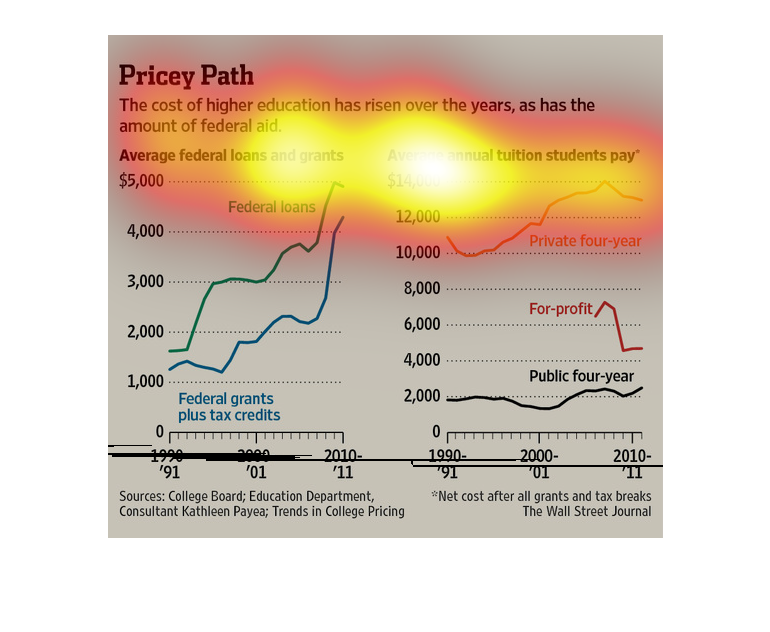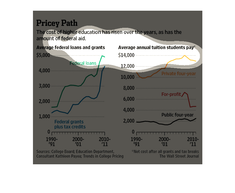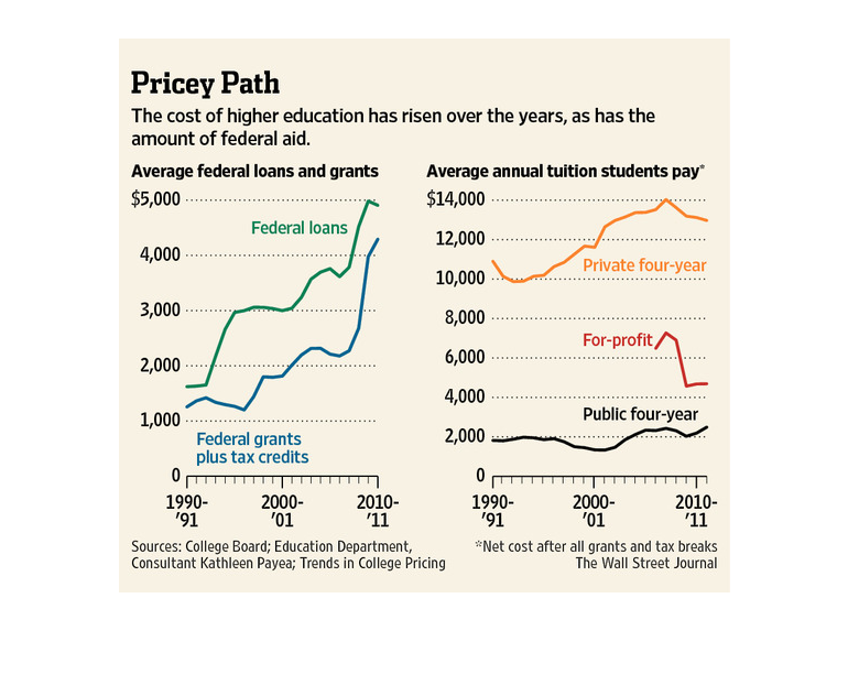
This graph describes the rise of costs for going to college in America since 1990 for private,
public and for profit colleges and the rise of use of federal loans and aid since 1990.
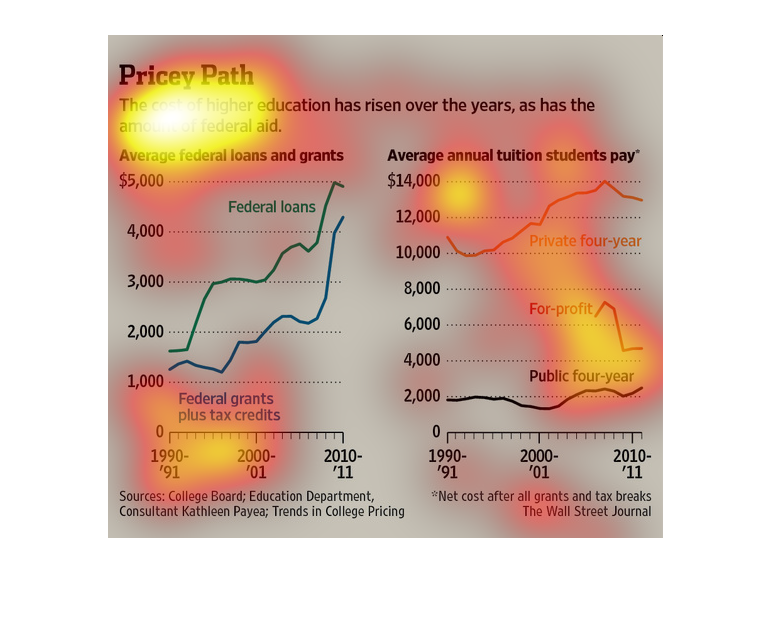
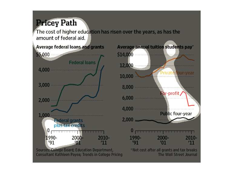
This chart from the Wall Street Journal shows how the price of higher education in the United
States is increasing at a rapid clip, resulting in higher student loan balances
The image depicts the cost of higher education rising over the years, as well as the amount
of federal aid. Average federal loans and grants as well as tuition students pay are all rising.
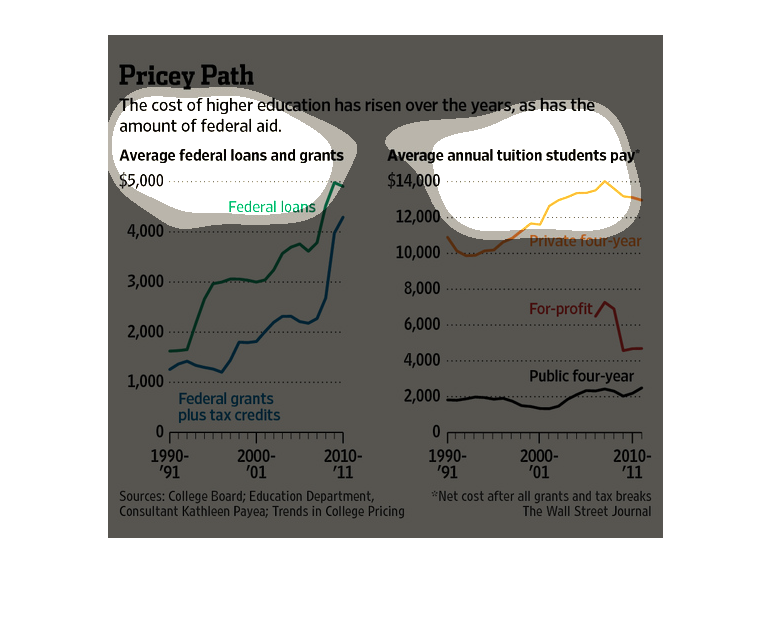
This chart from the Wall Street Journal shows how higher education costs have increased significantly
over the years in conjunction with federal aid.
These are graphs that are meant to illustrate that the actual cost of higher education has
risen greatly over the years as has the amount of federal aid.
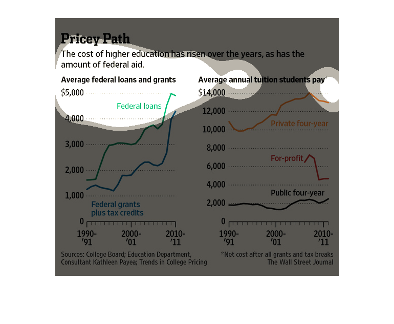
Two line graphs called "Pricey Path". The one with blue and green lines is focused on federal
loans and grants. The orange and red one is for Average Annual Tuition Students Pay.
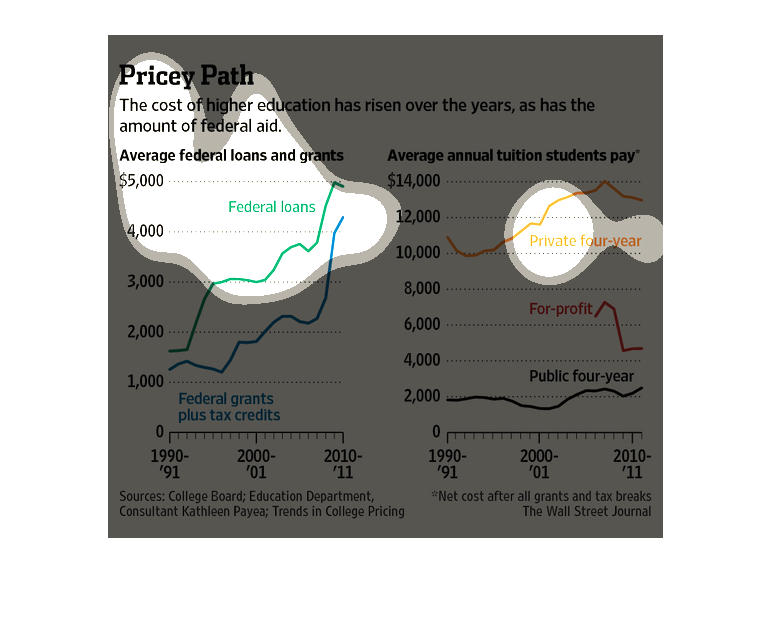
The left side of this graph illustrates average federal loans and grants received for schooling
and the right side contains data on the average annual tuition that students pay.
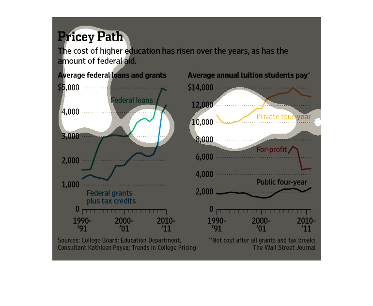
The cost of higher education has risen in recent years. Same with Federal aid.  Graphical
support: average federal loans and grants have risen substantially in the most recent years
(2010-11); but the average annual tuition students pay has dropped slightly for the same period.
The rising cost of higher education has led to an increase in governmental educational grants
and loans and tax credits, and an increase in the average amount of these benefits.  The trend
of increasing cost can be seen in both public and private four-year institutions, but not
in for-profit schools, which have experienced a drastic decrease in tuitions.
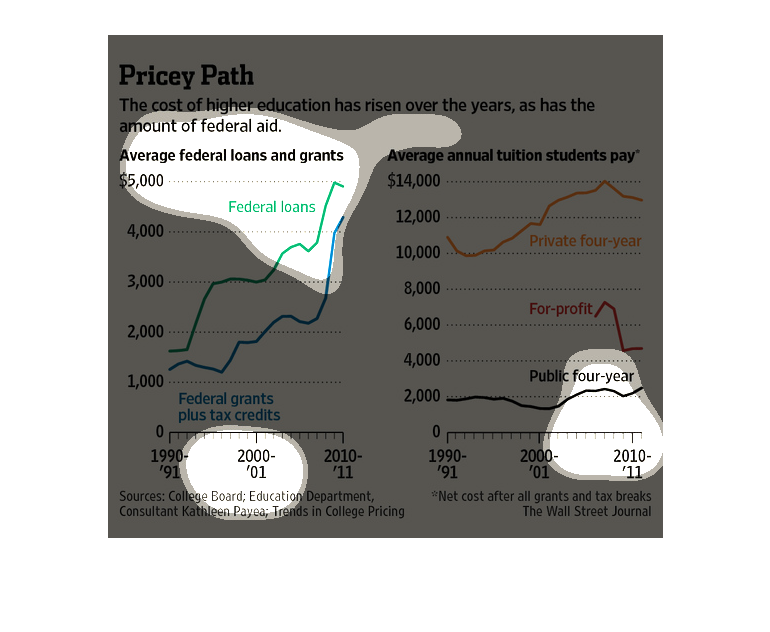
Pricey Path | the cost of higher education has risen over the years, as has the amount of
federal aid, the price of tuition for profit schools has actually dropped while federal aid
amounts have skyrocketed.
The figure presented is titled Prices Path.  The figure is a representation of the statistical
data for the cost of higher education rising over the years.