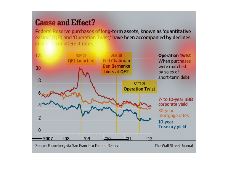
The image depicts the federal reserve purchases of long-term assets being accompanied by declines
in long-term interest rates. Treasury yields, mortgage rates and corporate yields are at multi-year
lows.
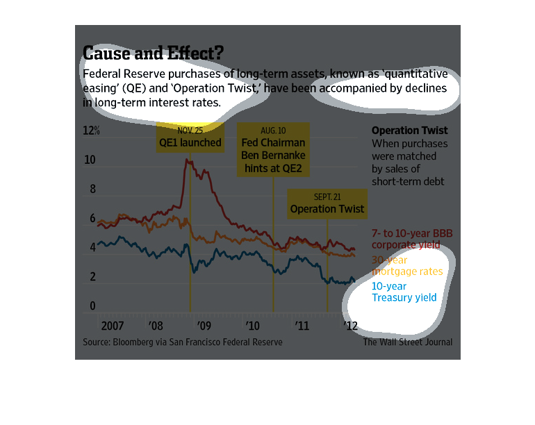
This image shows a line graph comparing changes in Federal Reserve purchases and the interest
rate levels over time. Several important point are noted. Both have decreased over time.
This seems to show that the Federal Reserve is purchasing more long term assets and that is
having an effect on interest. The chart shows the percentages changing as time goes by.
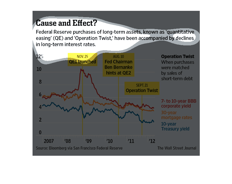
The chart is showing how the purchases made by the Federal Reserve for QE and Operation twist
have shown a decline in long term interest rates. Since launched there has been a decrease
in corporate yield, mortgage rate, and treasury yield.
This graph is illustrating the amount of money that the government is spending on long term
investments. The term used to identify this strategy is known as quantitative easing.
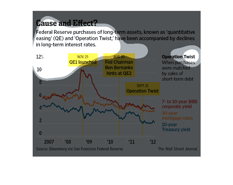
The graph explains how interest rates decline when Operation Twist happens. Operation Twist
is when purchases were matched by sales of short-term debt. The graph lines are high in 2008/2009
and drop during 2011 when federal reserve purchases were matched by sales of short-term debt.
The image depicts federal reserve purchases of long-term assets, and how they accompanied
by declines in long-term interest rates. Corporate yields, mortgage rates and treasury yields
have all decreased.
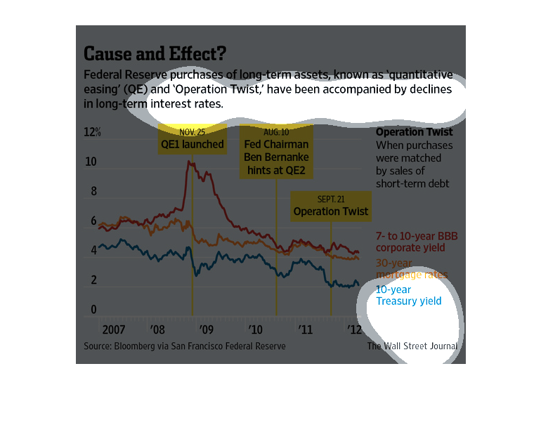
This chart from the Wall Street Journal shows how quantitative easing 3 (QE3) has resulted
in decreases in long term rates because of buying of long term assets
Questioning if there's a cause and effect between federal reserve purchases and long term
interest rates. The chart purposes that Federal Reserve purchases of long term assets causes
a decline in long-term interest rates.
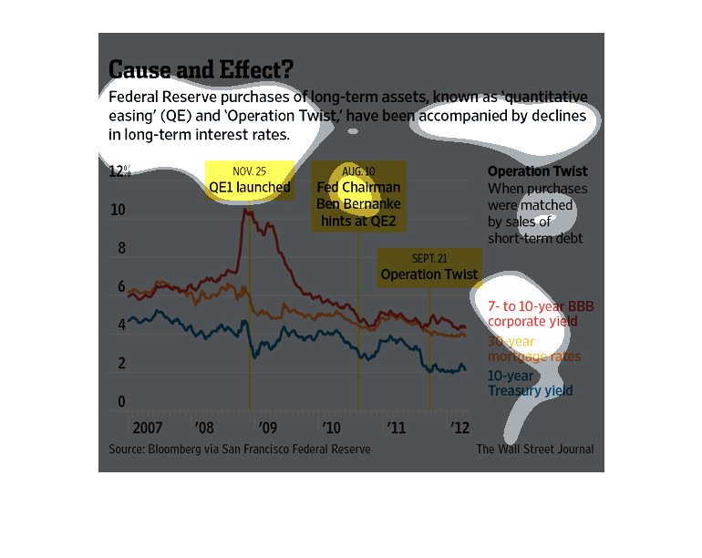
This is a graph that is being used to illustrate the federal government's purchase of long-term
assets known as quantitative easing (QE). This is for the year 2007 to 2012/
This graph shows the changes in bond prices and interest rates that are caused by the Federal
Reserve's bond buying policies. The changes are shown in terms of line graphs
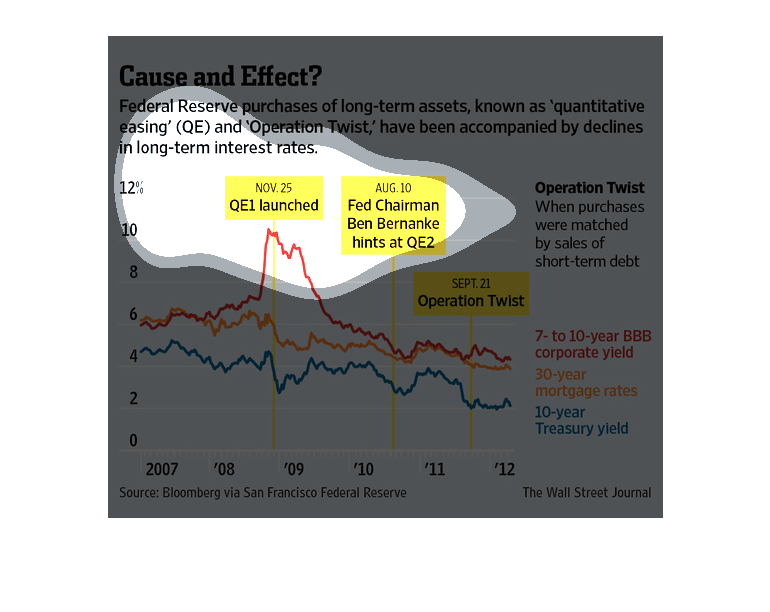
In this study we see the steady decline in long term interest rates. According to the research
done by the Wall Street Journal, we see that it will have a massive affect on the country.
This chart from the Wall Street Journal shows how the Federal Reserve's QE3 program has dropped
long term interest rates because of buying long term assets