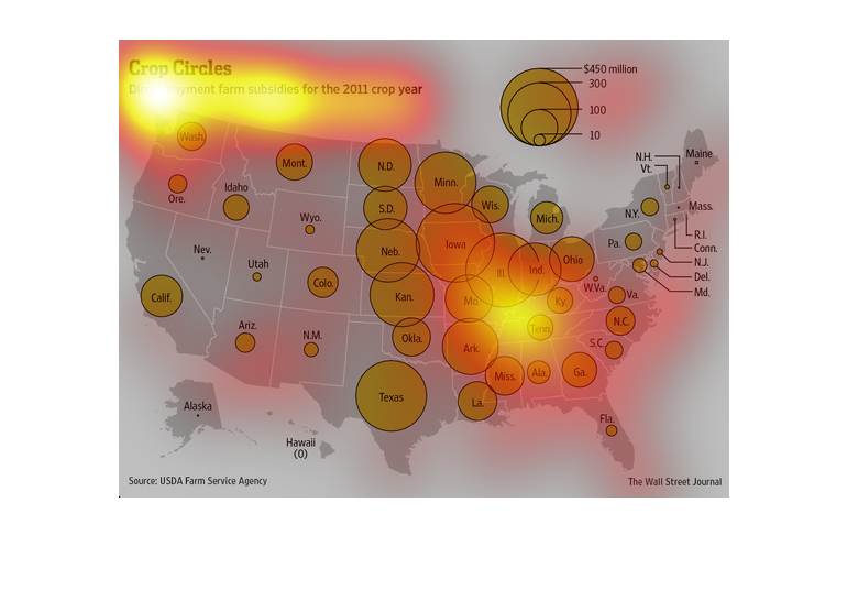
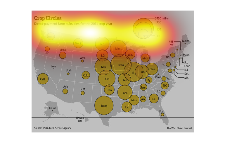
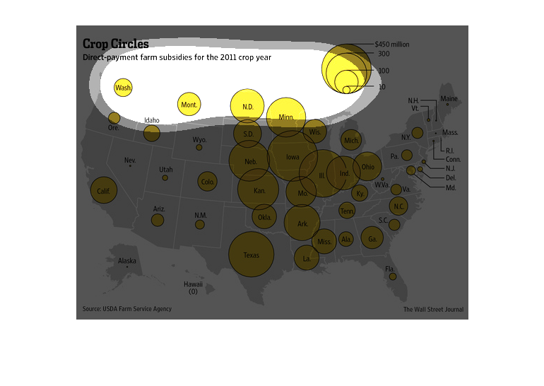
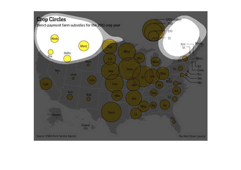
This chart shows direct payment farm subsidies for all of the United States for the 2011 crop
year. It highlights the high concentration shown in the central states.
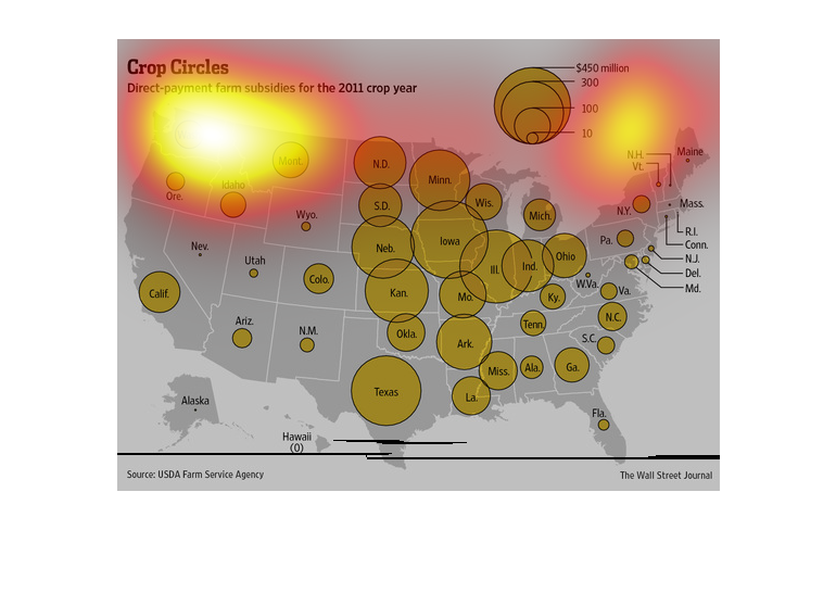
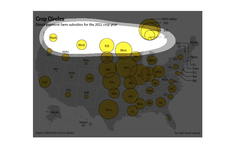
This chart from the Wall Street Journal shows how direct crop subsidies are primarily benefitting
the midwestern corn states in 2010 through 2011.
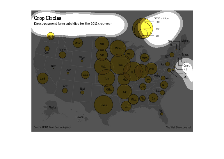
The images shown is titled Crop Circles and shows a map of the United States and the amount
of direct payment farm subsidies received by each state in 2011.
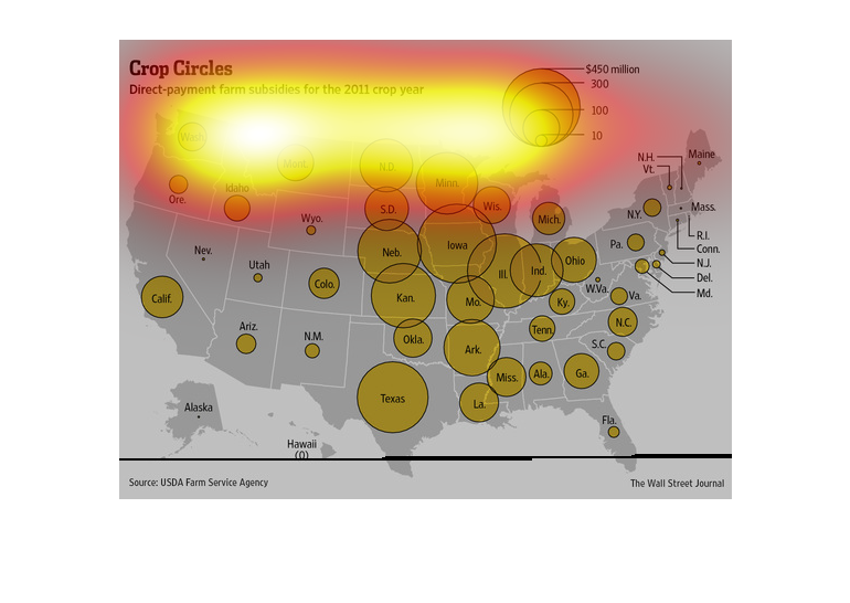
This chart from the Wall Street Journal shows how crop subsidies are distributed throughout
the United States, and in particular concentrated in the midwest
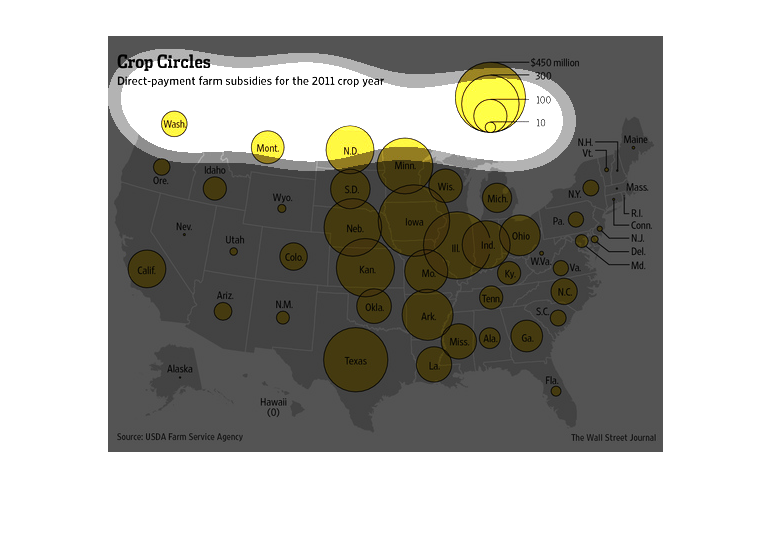
The image depicts direct-payment farm subsidies for 2011 crop year. The data indicates that
billions are spent yearly on farm subsidies across a large swath of the United States.
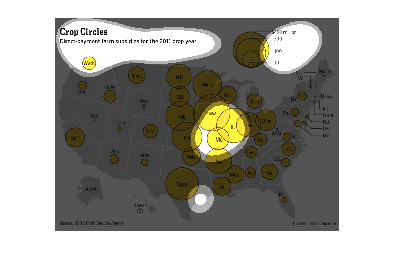
This chart shows a map of different states with different sized yellow circled within different
areas of The United States of America, from USDA Farm Service Agency displaying between $10
to $450 million  in the year 2011 that received direct-payment farm subsidies for Crop Circles.
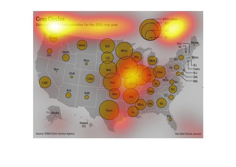
This map shows direct-payment farmers subsidies for the 2011 crop year with the highest amounts
in the northern middle and southern middle of the United States
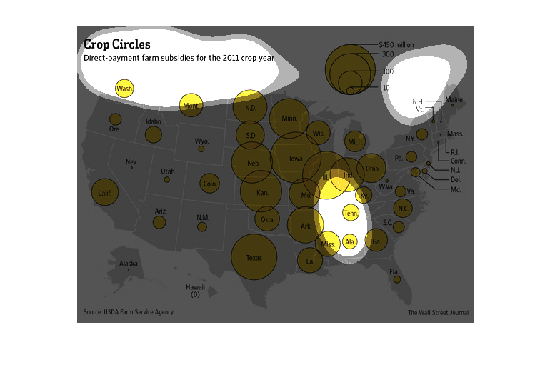
This colorful chart is simply titled Crop Circles. It's a map of the United States and is
highlighting Direct-payment farm subsidies for the 2011 crop year.

This image is  entitled "Crop Circles."  It shows direct-payment farm subsidies for the 2011
crop year. Different sized yellow circles are used to show subsidy amounts per state.  From
smallest to largest, the circles range from $10 million to $450 million.  The overall graphic
is of The United States.  The source is the USDA Farm Service Agency.  Data was shown in The
Wall Street Journal.
In this study conducted by the Wall Street Journal- from sources within the USDA Farm Service
Agency- we see the millions of farm subsidies distributed across the United States of America.
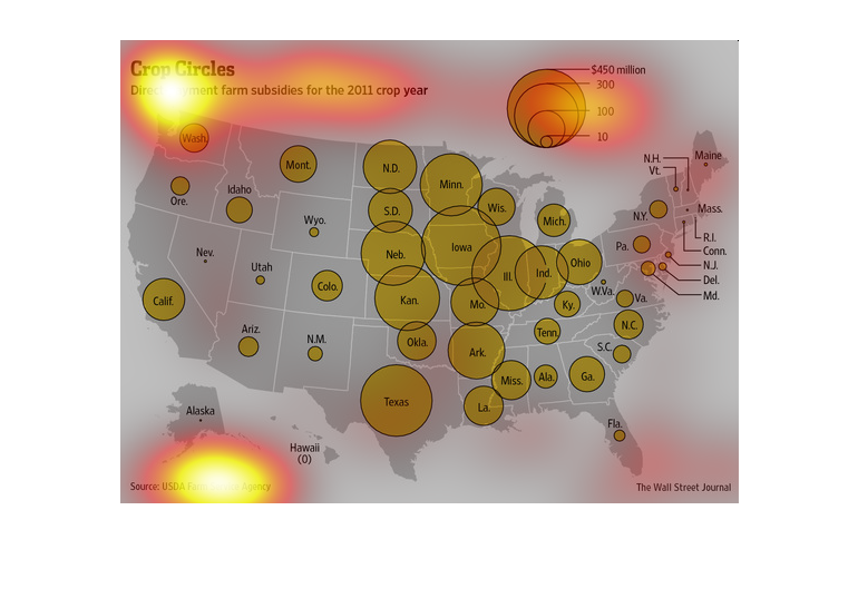
This is a map of the entire US. It illustrated the direct payment of farm subsidies of the
2011 crop year.  The biggest subsidies are found in the mid-west, while relatively few in
the northeastern states.
This explains where crop subsidies (direct payments) are concentrated in the United States.
 It's based on 2011 subsidies.  they appear to be concentrated in the  midwest -- with Illinois
and Ohio receiving the most.  California received less than I expected and Texas more -- maybe
crop subsidies are more for the grains (wheat, corn) than for vegetables like California produces.