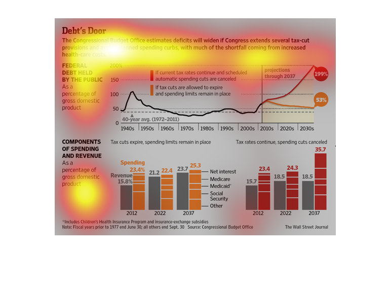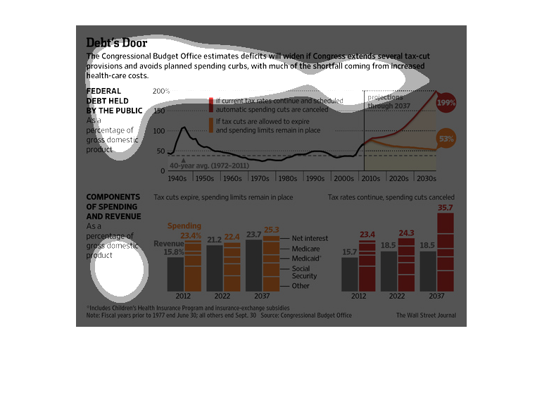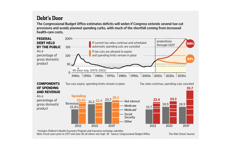
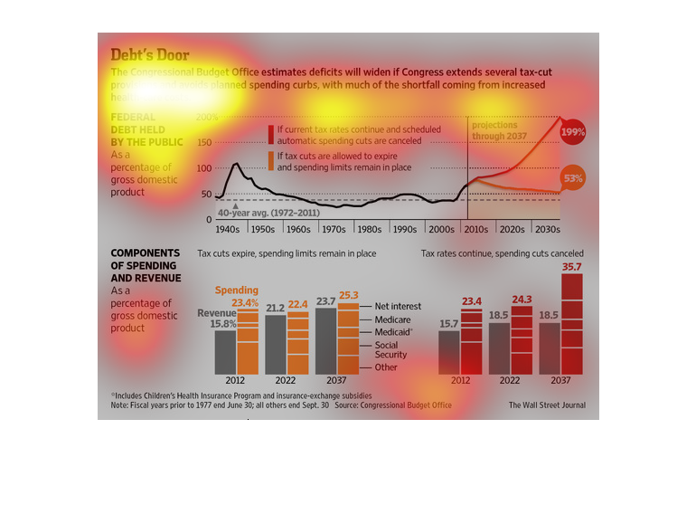
This graph depicts how the U.S. nation is currently in debt due to spending and the ways that
they are spending the money on such as healthcare. It also gives future projections to debt
if we keep spending.
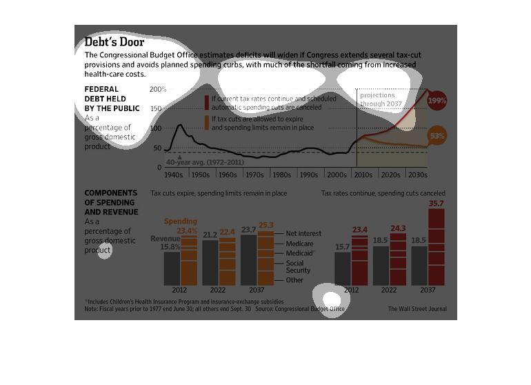
In this study conducted by the Wall Street Journal- from various listed sources- we see that
the recession has devastated the infrastructure of various different faculties.
This columnar chart is used to describe how debt will increase if Congress gives some planned
tax-cuts.  It is clearly labeled, nice colors, clearly defined credited sources. Nice line
graph with clearly labeled color change projections.
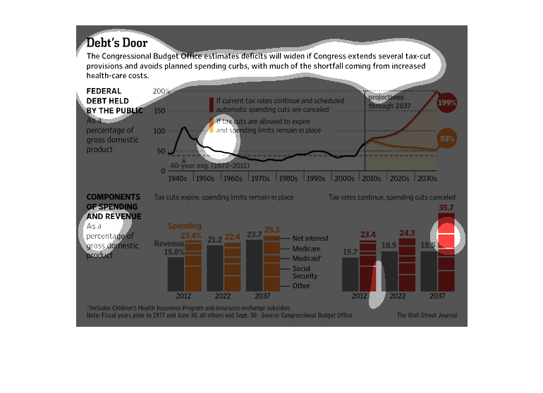
The fact that the debt and perception of this horrible mess going on in America is reflected
in the inquest done in this picture in regards to the wealth of the nation.
This chart from the Wall Street Journal shows how the federal deficit, and the national debt,
would widen if Congress enacted tax cuts without offsets.
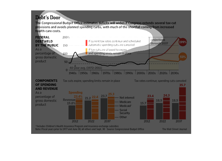
This shows graphs indicating our country's deficits will widen if congress continues to extend
tax provisions.  The graphs show that our spending far outnumbers our revenue.
Title: Debt's Door  The congressional budgets estimates deficits will widen if Congress extends
several tax-cut provisions and avoids planned spending curbs, with much of the shortfall coming
from increased health care costs.  There are two bar charts that back up this claim, as well
as a graph.  The graph, for instance, spans from the 1940s to the 2030s showing Federal Debt
Held by the Public as a % of GDP.
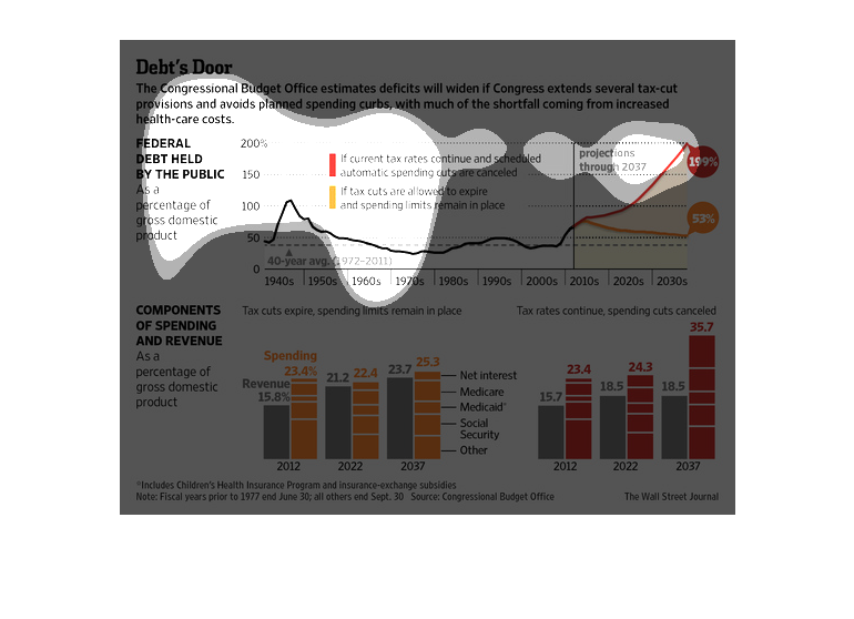
This chart describes debt's door. Specifically, the congressional budget office estimates
that deficits will widen if congress extends tax-cut provisions. Different categories are
represented by different colors.
This chart from the Wall Street Journal shows how the Congressional Budget Office projected
increasing deficits if Congress does not cut spending with anticipated tax cuts
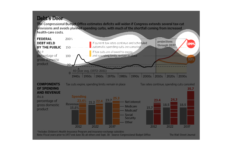
Three graphs under the title of Debt's Door. The flow one is for Federal Debt Held By The
Public and is black and white and goes up and down. The bar graph on the left is for Components
of Spending and Revenue, with orange and gray. The one to the right is for after spending
cuts are canceled.
The image depicts the Congressional Budget office deficit estimates widening if the congress
extends tax cuts and doesn't decrease spending, with much of the shortfall coming from healthcare-related
spending.
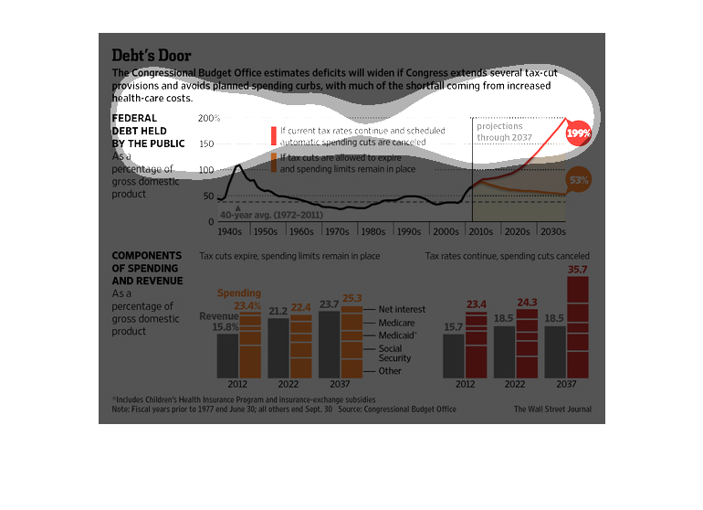
Federal Debt has increased dramatically over time. If Federal tax cuts are allowed to continue,
Revenue goes down and spending goes up. By 2037 our debt is raised by 199%
The charts and graph in the image describe the rate at which the deficit will increase if
government extends tax cuts and avoids proposed spending limits.  Medical expenses will represent
the largest portion of the increase.  There are direct comparison graphs to show the correlation
and scale of the deficit increase.
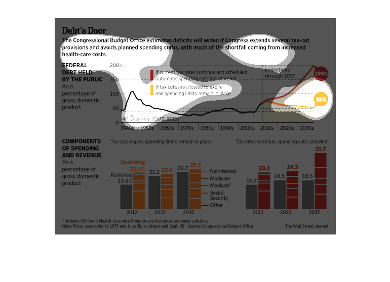
There are a few graphs on this informational chart. They are showing information about debt.
There is one depicting spending components and revenue, and another showing the federal debt
the public is holding.