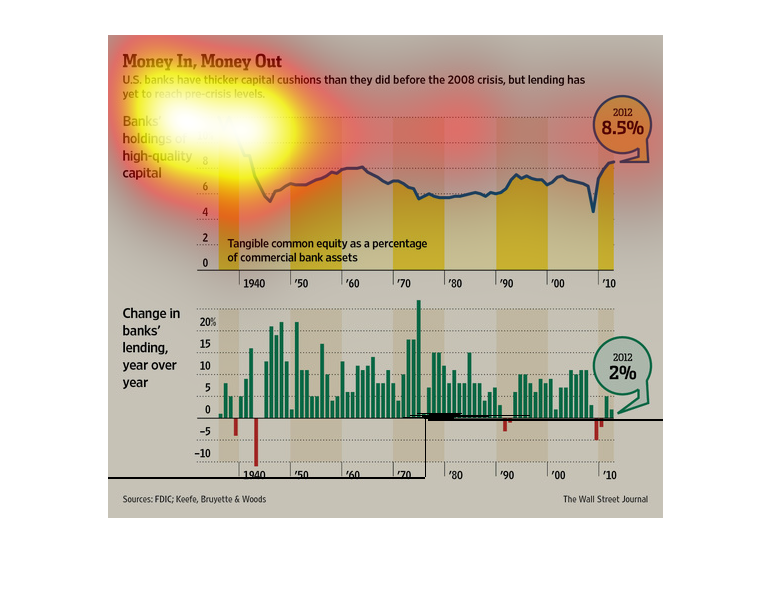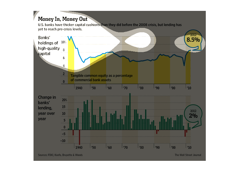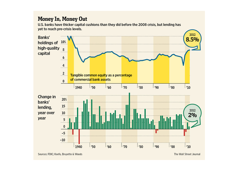
This chart from the Wall Street Journal shows how US banks are better capitalized than ever
and are better prepared for a downturn but are not lending as much
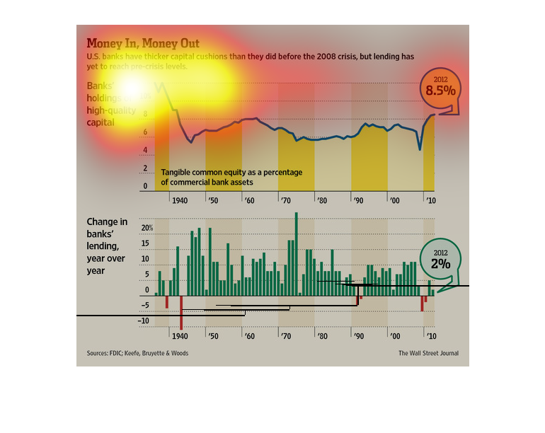
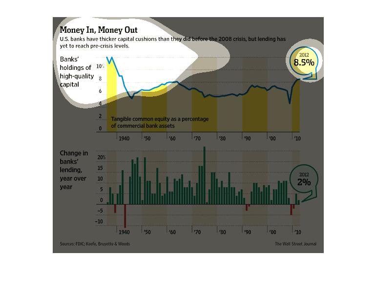
This is a brand graph depicting  money in and money out and the difference  banks holding
 with high quality  capital and change banks lending year over year
This image is presenting the return on investments that is currently taking place in the banking
world. The information presented is the desire of banks to gain a strong foundation against
financial crisis
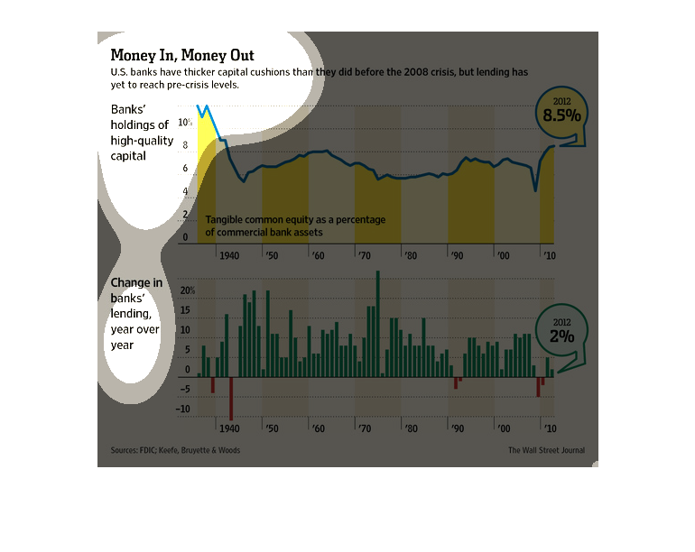
This is a set of different graphs that are meant to illustrate that United States banks have
thicker capital cushions than they did before the 2008 crisis.
This is a bar graph describing the money in v. money out of bank's lending and holding throughout
the years ranging from 1940-2010. It appears that the lending patterns have changed with banks
lending less money than usual in recent years. Additionally, the banks have lost some money
when lending money out to others. As of 2010 banks owned 8.5% of high-quality capital.
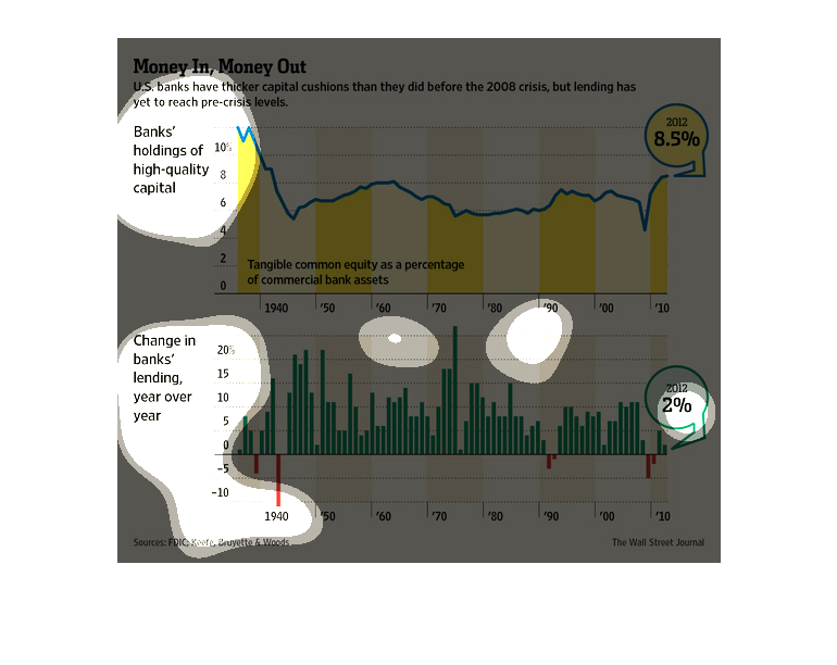
Two graphs with the titles "Money In, Money Out". The first one is about Banks' holdings of
high quality capital, it is yellow and goes up and down depending. The second is a green bar
graph called Change in banks' lending, year after year.
This chart shows that banks had thicker cushioning prior to the 2008 economic crisis and that
lending has yet to reach pre-crisis levels. One graph shows banks holdings from 1940 to 2010
while the other shows lending trends decreasing.
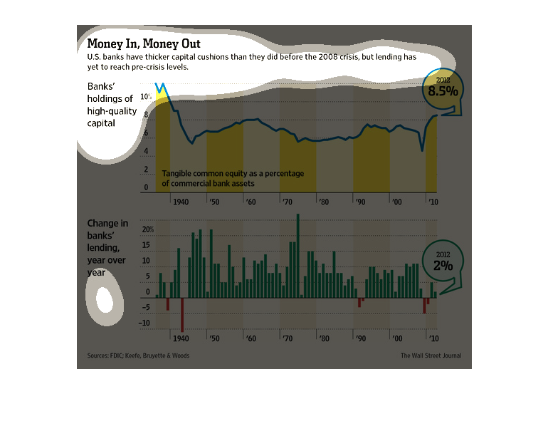
This graph shows US banks having higher capital cushions than before the 2008 crisis despite
lending not reaching pre-crisis levels. Bank's holdings of high quality capital vs. the change
in lending year by year are highlighted.
This chart is your typical graph chart that sets up one or a number of categories, which is
illustrated by either a map, a graph, an illustration, or photograph.
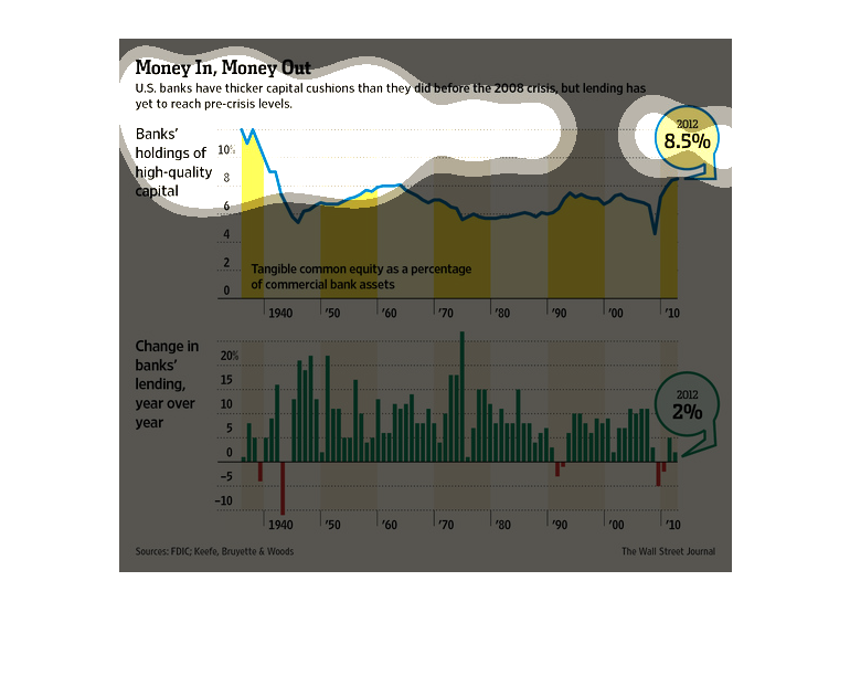
This is a graph of money levels in U.S. banks with higher capital cushions prior to 2008.
It compares the banks' holdings of high-quality capital with changes in banks' lending through
the years. The first is represented by yellow and the second by green.
This chart titled "Money In Money Out"  shows banks holdings of high quality capital in 2012
and the change in the banks lending year over year in two thousand twelve.
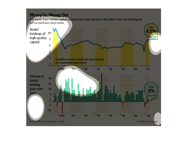
This chart shows the amount of capital that banks have had over the last 50 plus years. It
also shows the amount of money that has been lended out by year
This image shows two graphs. One depicts changes in lending levels and the second depicts
banks' holdings of high quality capital. Both these measures have decreased.
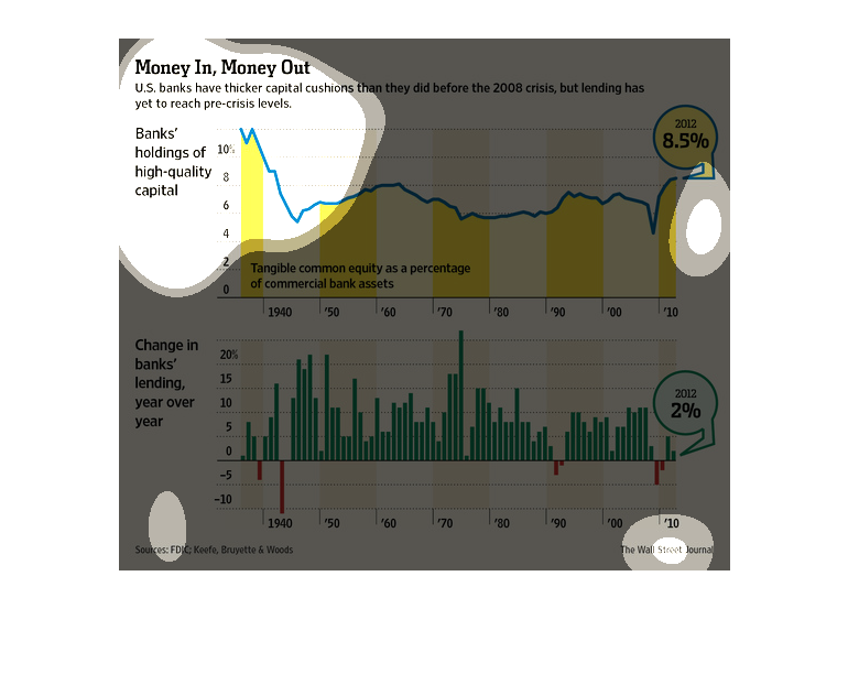
This chart from the Wall Street Journal shows how US banks have a better capital cushion than
before the 2008 recession but still face challenges going forward