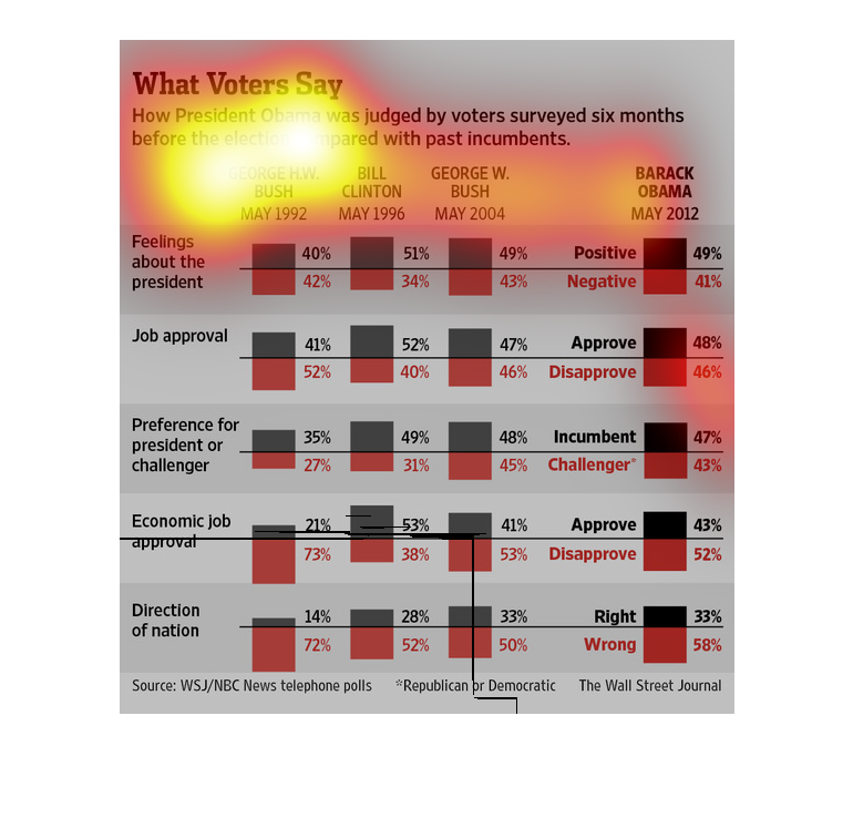
This chart from the Wall Street Journal shows how President Obama was rated by voters before
the 2012 election and compared it other incumbents up for re-election
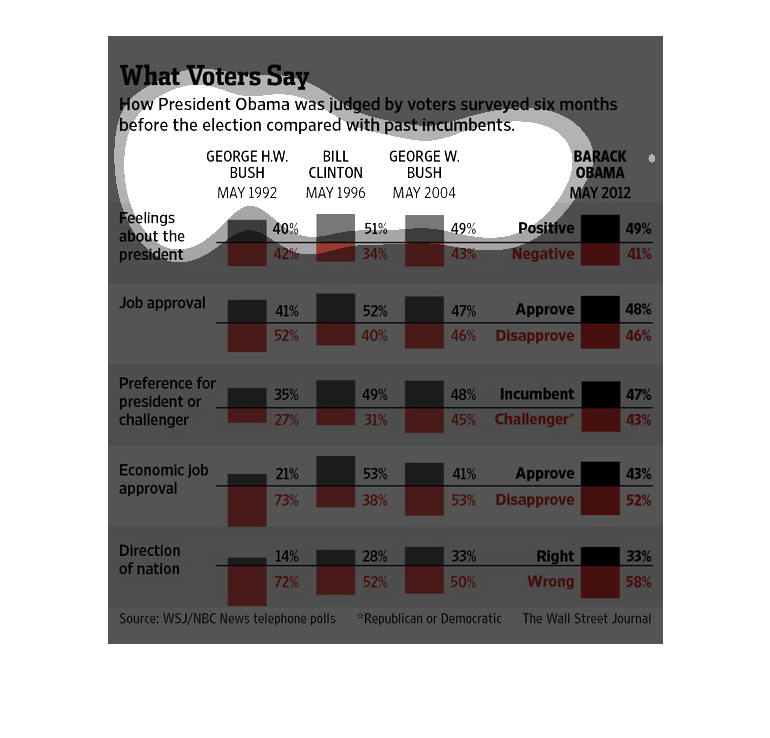
This is a chart showing different information about how presidents were judged six prior to
the election. It is comparing Obama to other past presidents who were in office. There are
different topics and information about this for each.
The image depicts how Barack Obama was judged by voters surveyed six months before the election
compared with other incumbents. Obama's numbers are comparable with Bush Jr, Bush Sr and Bill
Clinton, across almost all categories, part from two categories.
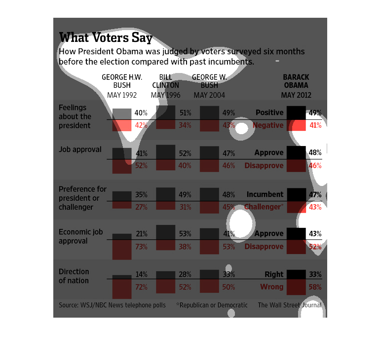
The image depicts voters opinions on Barack Obama in a survey taken six months before the
elections compared to other incumbents. Based on the data Obama's approval ratings in a number
of categories is comparable to the past three presidents, Bill Clinton, Bush Jr, and Bush
Sr.
The chart displays a survey from WSJ/NBC New Telephone Polls about the opinion of voters and
about How President Obama was judged six months compared to previous incumbents. Where black
is positive and red is negative.
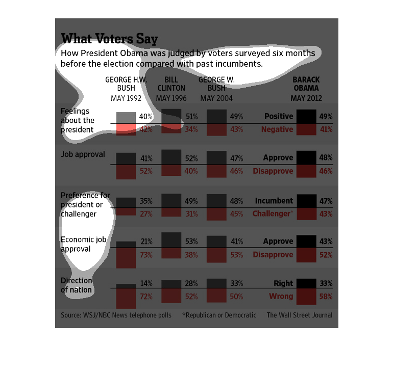
This image is entitled "What Voters Say."  It shows how President Obama was judged by voters
surveyed six months before the election compared with past incumbents.  Presidents shown are
George H.W. Bush, Bill Clinton, George Bush and Barack Obama.  Topics illustrated in the graph
are:  Feelings about the president,  job approval, preference for president or challenger,
economic job approval, and direction of nation.  The source for the image is WSJ/NBC News
telephone polls.  The image appeared in The Wall Street Journal.
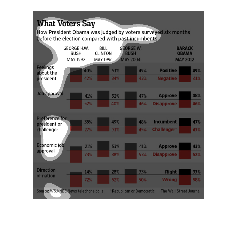
The following chart shows how voters viewed President Obama compared to other presidents of
the United States 6 months before the election. It gives different categories such as how
the economy is doing in their opinion and job approval, direction of nation etc.
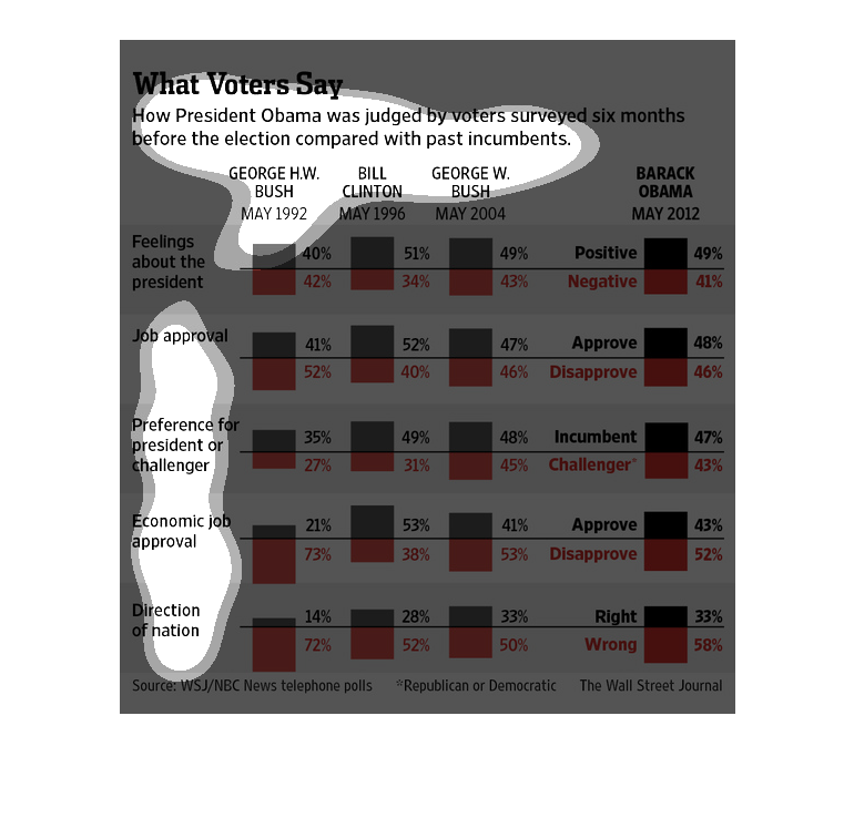
This is a bar graph that shows various stats of ways that voters approve or disapprove of
President Obama six months leading up to the 2012 election, compared with past incumbent presidents.
This image is entitled "What Voters Say."  It shows how President Obama was judged by voters
surveyed six months before the election compared with past incumbents.   The graph compares
George W. Bush, Bill Clinton and George W. Bush to Barack Obama.  Questions asked were:  Feelings
about the President, Job Approval, Preference for President or challenger,  Economic Job Approval
and Direction of Nation.  The source is WSJ/NBC News Telephone Polls.  Data is from The Wall
Street Journal.
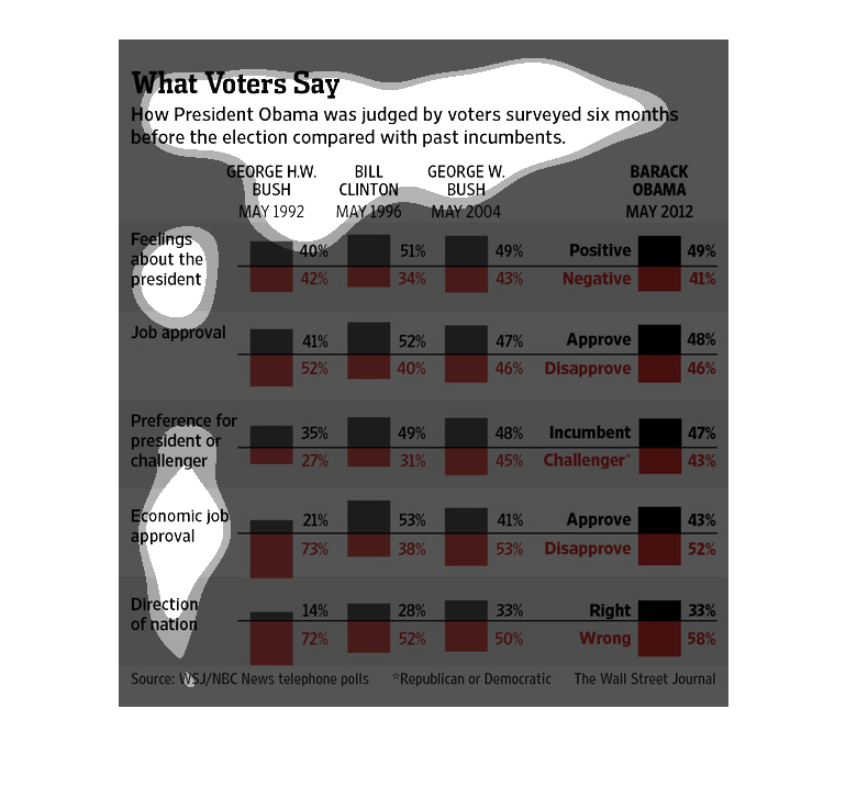
This describes voters feelings about Barack Obama 6 weeks before the election compared to
their feelings about three other presidents (Bill Clinton and bush's junior and senior).
It shows people felt about him almost exactly the same way as they did about bush jr (less
liked than clinton, more liked than bush sr).  That makes sense -- these are their end of
first term numbers, and clinton, obama, and bush jr were relected while bush sr was dumped.
This chart sows how President Obama was judged by voters surveyed six months before the election
compared with past incumbents. It highlights the equally positive and negative feelings as
opposed to the incumbents more mixed feelings.
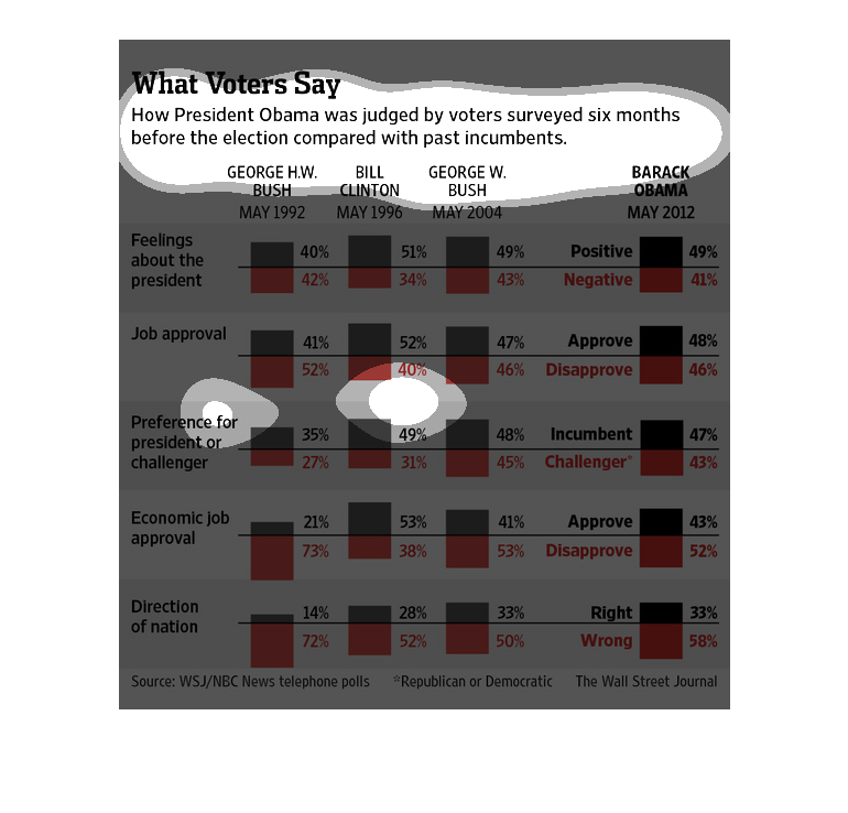
This chart shows what voters thought of Obama six months before his election compared with
other incumbents. Of the questions, what people felt about the president for Obama 49% was
positive compared to 40% with Bush Sr. On Direcetion of the nation, Obama 33%% was positive
compared to 14% with Bush Sr.
This chart from the Wall Street Journal shows how voters feel about Barack Obama before and
right after the 2012 presidential election.