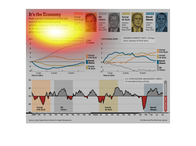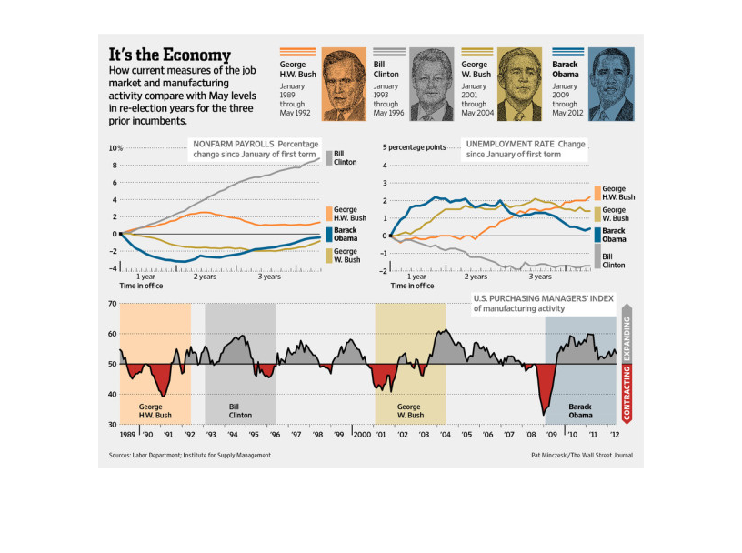
The image depicts the current manufacturing numbers versus the numbers in May in re-election
years for prior incumbents. The numbers show slow manufacturing growth for both Obama, Bush
Sr, and Bush Jr. Somewhat similar economic statistics appear for all three, with very minor
fluctuation.
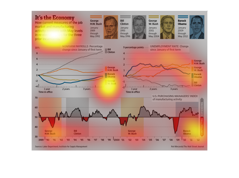
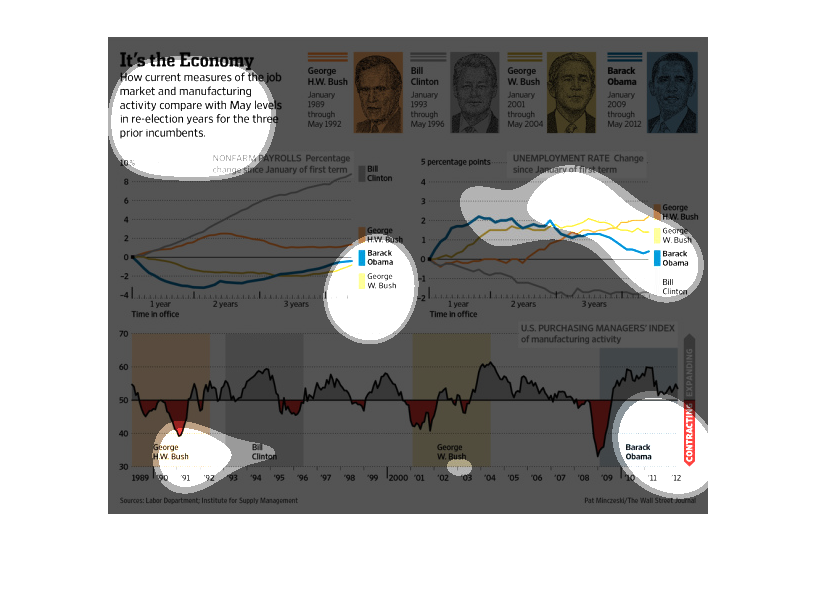
The Image is describing the economic gains or losses of current and past presidents and how
the economic situation can affect the ability for the incumbent to be reelected
This chart from the Wall Street Journal shows how the united states manufacturing industry
has changed since the presidencies of clinton and Bush 1.
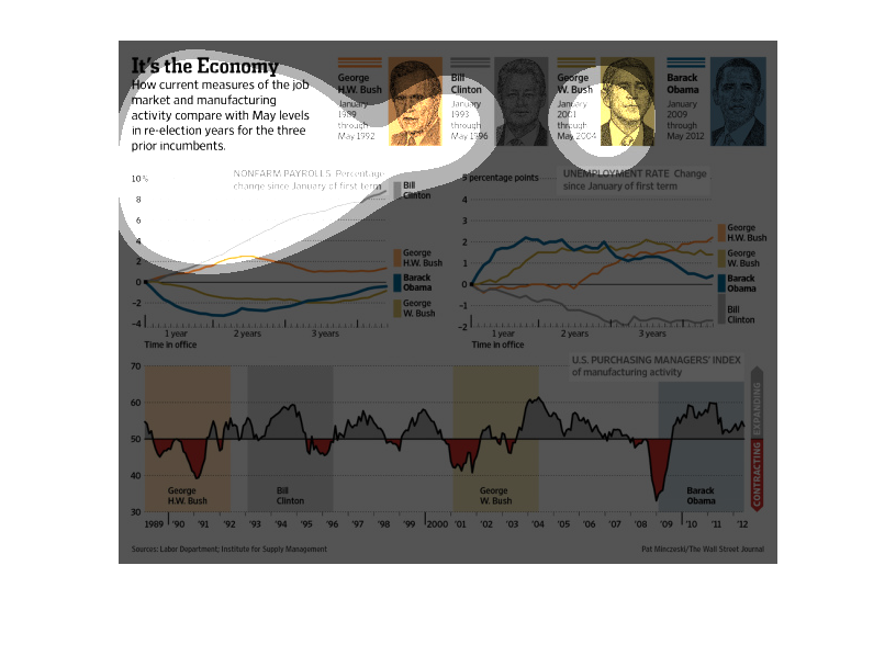
This is a graphic that illustrates how the current measures of the job market and manufacturing
compare with may level re-election for the three previous incumbents.
This chart is detailing the affects each President had on the economy. It appears that George
HW Bush lost the country more money than he gained it but his son managed to gain money for
the US.
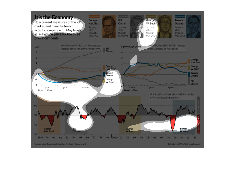
Three different graphs under the title of "It's The Economy". One is a line graph for Nonfarm
Payrolls, another one for Unemployment Rate. At the bottom is a large graph for US Purchasing
Manager's Index. Each graph has several different colors representing each different president.
This chart represents how current measures of the job market and manufacturing activity compare
with May levels in re-election years for the three years prior to incumbents. It highlights
the cycle of continued dips and spikes during certain times of the year.
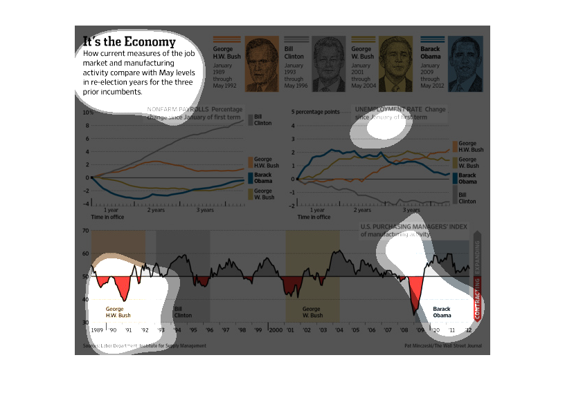
This chart is your typical graph chart that sets up one or a number of categories, illustrated
by either a map, a graph, an illustration, or photograph.
It's the economy. We see unemployment and growth rate graphs for the last four presidencies.
Obama has seen the highest increase in non farm payrolls AND the biggest shrink in unemployment
for the last four presidencies.
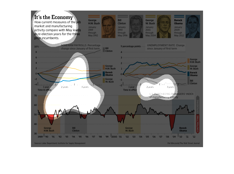
This chart titled "Its The Economy"  shows how current measurements of the job market and
manufacturing and productivity compare with May levels in reelection years for three prior
incumbents.
This image has charts depicting several measures of the economy over time under the administration
of various United States presidents. Included are both Bushes, Obama, and Clinton.
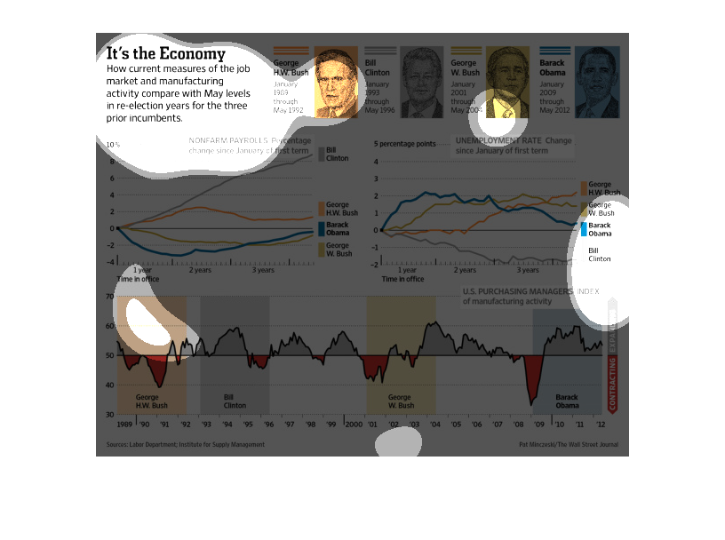
This chart from the Wall Street Journal shows how the past four US presidents economic record
when it relates to manufacturing jobs during their tenure
The figure presented is titled It's the Economy.  The figure is a representation of the statistical
data for how the current measures of the job market compare with May.