This chart is your average graph chart that sets up one or a number of categories, illustrated
by either a map, a graph, an illustration, or photograph.
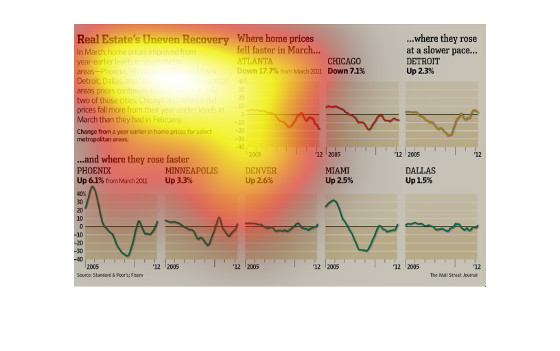
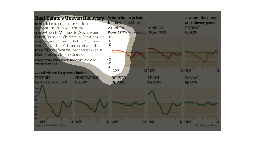
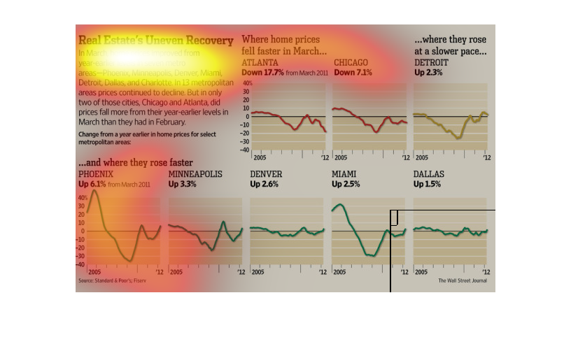
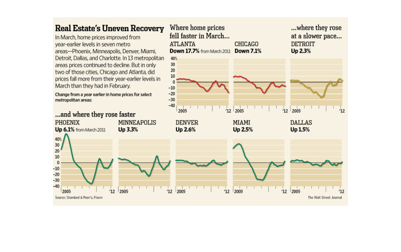
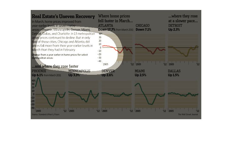
This chart is titled Real estate's uneven Recovery. In March, home prices improved from year-earlier
levels in seven metro areas-Detroit, Philadelphia, Phoenix, and several others.
This image has several graphs showing the uneven recovery of the housing market across the
country. some areas are recovering much quicker than others.
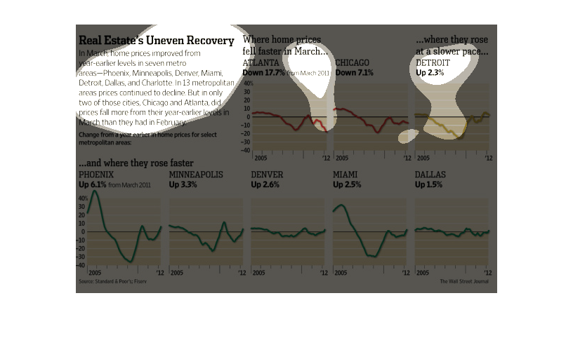
The image depicts the real estate market's uneven recovery. Declining prices are cited in
major cities, but only in two cities did the prices fall to year-earlier levels in subsequent
months. The data indicates the market is still in slow recovery.
this documents the uneven recovery for several metropolitan areas in the month of march. the
value went up in phoenix, minneapolis, denver, miami, detroit , dallas, and charlotte.  chicago
and atlanta prices fell more that their previous values that year.
This chart from the Wall Street Journal shows how the real estate recovery is uneven throughout
the country, with some reasons still in trouble and other experiencing rapid growth
This chart from the Wall Street Journal shows how the real estate market is having uneven
growth and recovery rates based on major cities and zip codes.
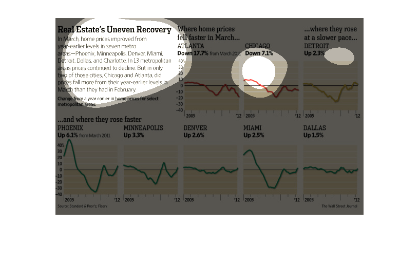
The image depicts how home prices have improved in metro areas, however only in two of the
urban cities listed did prices fall from their year-earlier levels in March than they had
in February.
This chart illustrates the real estate markets uneven recovery.  There are housing markets
that are rising faster such as Phoenix and Minneapolis and falling faster such as Atlanta
and Chicago.
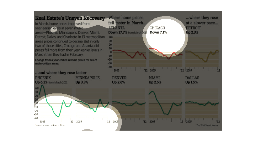
This chart highlights real estates uneven recovery. Home prices improved from earlier levels
in seven metro areas while prices declined at the same time in 13 metropolitan areas.
The figure presented to the left is titled Real Estate's Uneven Recovery. The figure is a
representation of the statistical data for the overall recovery of home values.
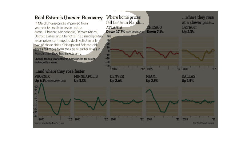
This chart is about real estate recovery in metro areas. There are a few charts that compare
cities where prices rose and fell. The time span is over a year.
This is a series of graphics showing the recovery of real estate after the recession in places
across the United States, including cities such as Minneapolis and Phoenix. The information
shows that the pace of real estate recovery varies by city and by time.