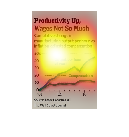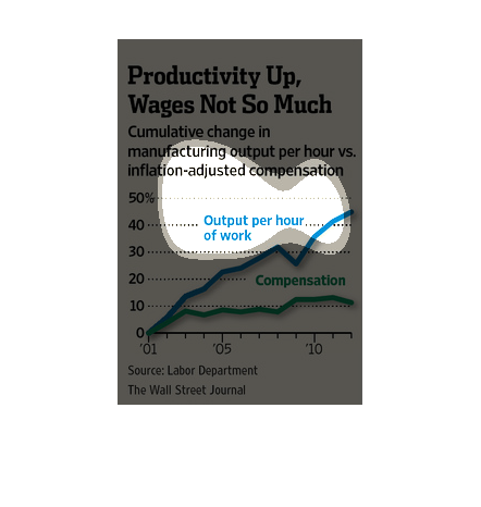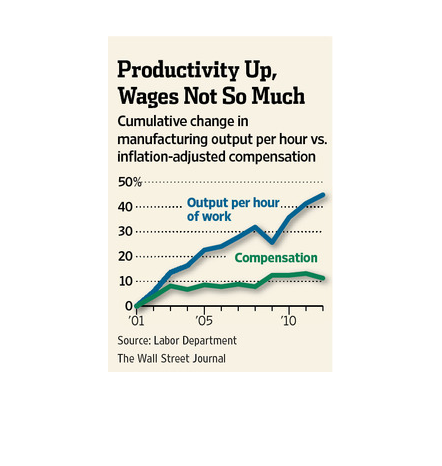
The image depicts the cumulative change in manufacturing output per hour versus inflation-adjusted
compensation. The data indicates that while per-hour output has increased, the compensation
has actually decreased.
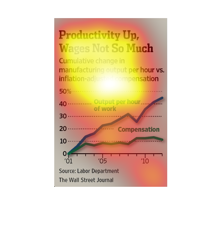
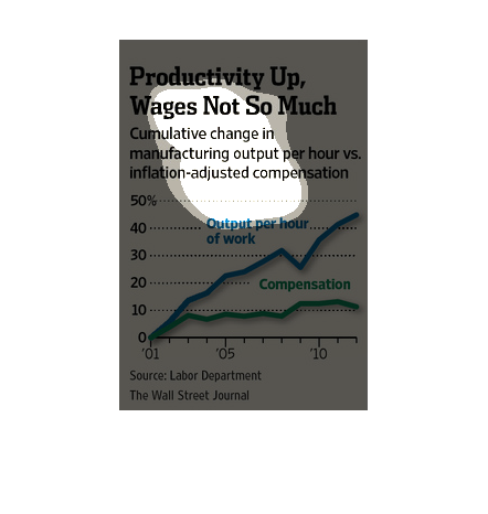
This chart describes productivity up, wages not so much. Specifically, cumulative change is
manufacturing output. The chart contains photographs to enhance the information presented.
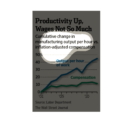
This image shows or depicts in line graph statistical format data concerning how in manufacturing
sector of employment how productivity or workers are up, but wages not so much.
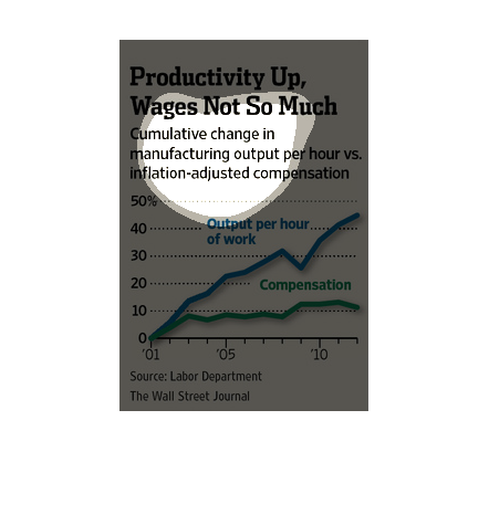
A graph relating productivity of workers against the rages received over years. It shows that
productivity has increased dramatically while wages also increase but not at nearly as much.
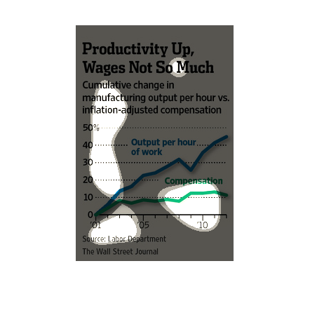
The figure presented to the left is titled productivity up, wages, not so much.   The figure
is a representation of the statistical data for wages and productivity.
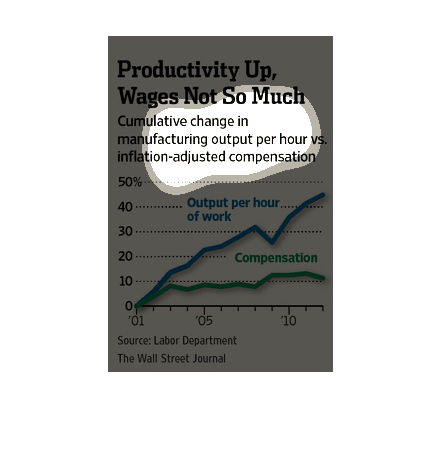
The image is a chart showing an up swing in productivity (Cumulative Change in manufacturing
output), but wages not moving up.  It seems that while productivity has shown an increase
up to 50% from 2001 to 2010, wages have remained much the same during those years.
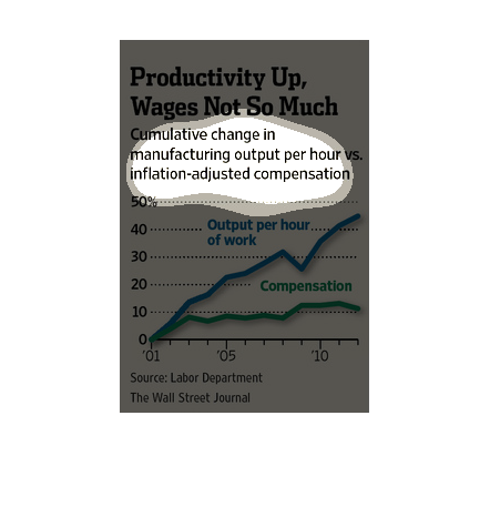
This chart shows in spite of increased productivity in manufacturing, wages aren't going up
to compensate. There has been an almost 50% increase in output per hour, and wages have only
increased about 10%.
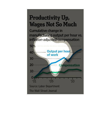
This graph is entitled "Productivity Up, Wages, Not So Much." It is an ascending graph showing
inflation and compensation per hour. Output of work is increasing with a blue line more than
compensation, which is shown as a green line.
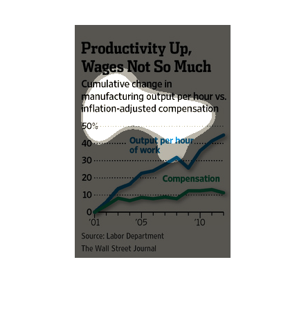
This is a chart that graphs shows that although the percent of output per hour of work has
risen that the wages are not rising near as fast over the past 10 years.
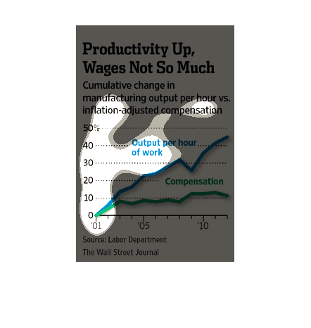
This chart from the Wall Street Journal shows how productivity of labor is at an all time
high but wages have remained stagnant or slightly higher .
The image depicts the cumulative change in manufacturing output per hour versus inflation
adjusted compensation. Output per hour has increased while compensation has somewhat decreased
in recent years. Output is much higher than compensation.
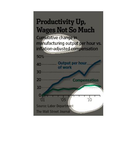
This graph is illustrating the discrepancy between worker output and wages. The graph is depicting
that although productivity is up, wages in the work force are not.
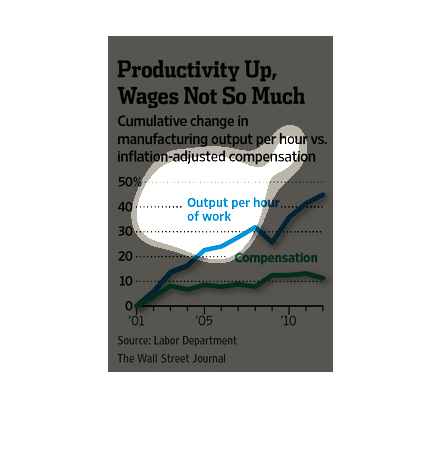
This chart shows the change in manufacturing output per hour vs. the inflation adjusted compensation
for the years 2001 to 2015.  Output has climbed steadily to almost 50% whereas wages have
climbed only about 10%.
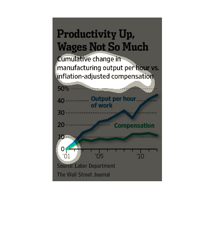
This chart from the Wall Street Journal shows how productivity is on the rise but wages for
labor is stagnate or falling relative to past real wages.