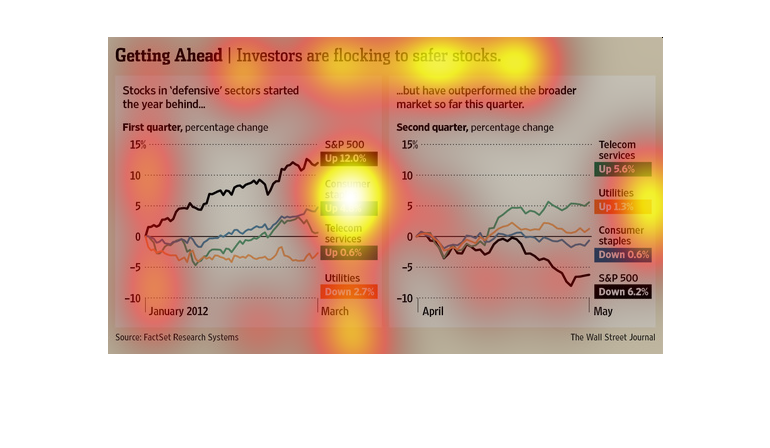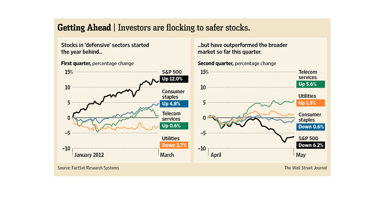
This image shows or depicts in line graph statistical format information concerning or dealing
with how investors are flocking to safer stocks. They are hedging their bets so to speak.
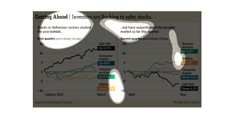
This chart describes getting ahead. Specifically, stocks in defensive sectors started the
year behind. Different categories are represented by different colors.
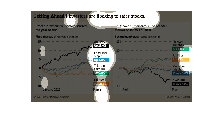
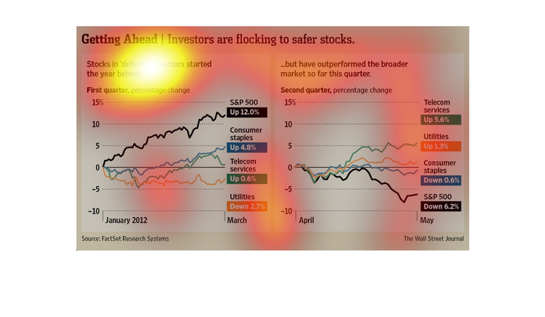
This chart describes your typical graph chart that sets up one or a number of categories,
illustrated by either a map, a graph, an illustration, or photograph.
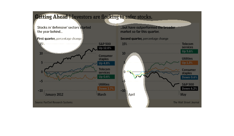
This chart breaks down the different elements of the stock market and how they performed recently.
The chart breaks down by quarter and by the amount of change per each
This chart from the Wall Street Journal shows how investors, in particular retail investors,
are pouring money into defensive sector stocks as a hedge
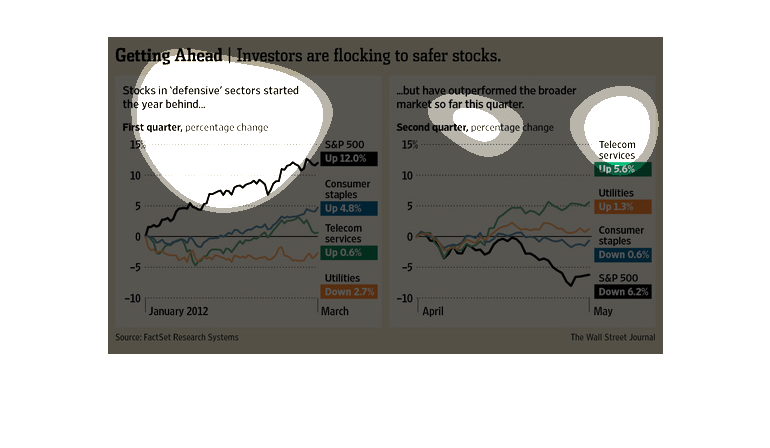
this graph maps out the changes over the last few years in different stocks such as utilities
telecom services and consumer staples. Investors are looking for safer stocks to build their
portfolio and make it safer while still profitable
This chart from the Wall Street Journal shows how investors are starting to pour money into
defensive or other safe stocks. These include utilities, consumer products, and index funds
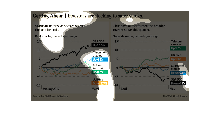
The image depicts how investors are flocking to safer stocks. Consumer staples, Telecom services
and Utilities are up, with the S&P is up 12%. The stocks in 'defensive' sectors started the
year behind, but managed catch up.
The image depicts how investors are flocking to safer stocks. Stocks classified as being in
'defensive' sectors had started behind but then manged to outperform the broader market in
the quarter studied.
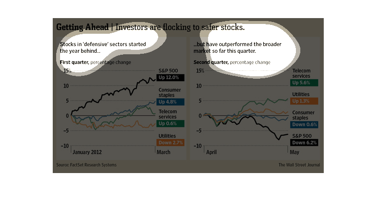
The left hand side of the graph shows stocks in defensive sectors starting the year behind
and the right hand side shows them outperforming the broader market.
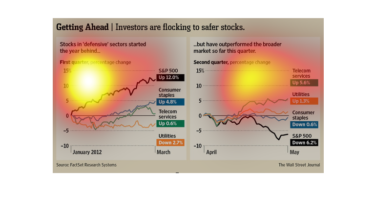
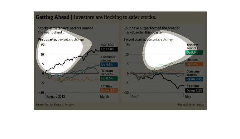
This chart shows that stocks in defensive sectors started the year behind, but have subsequently
outperformed the broader market thus far quarterly in the year 2012.
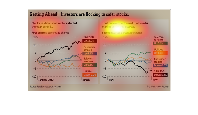
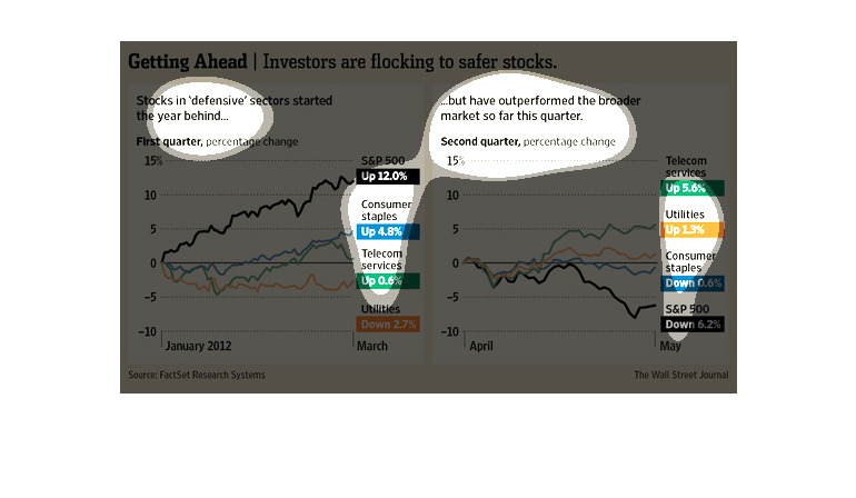
This is a chart about what stocks investors are choosing in 2012. The first quarter, most
stocks were up, but they did not outperform in the second quarter.
This is a set of graphics showing the distribution of investments by type of stock or bond
across time, including a comparison of things like utilities, stocks, bonds, and other investments.
It shows that over time, investors have moved toward stocks perceived as more safe.