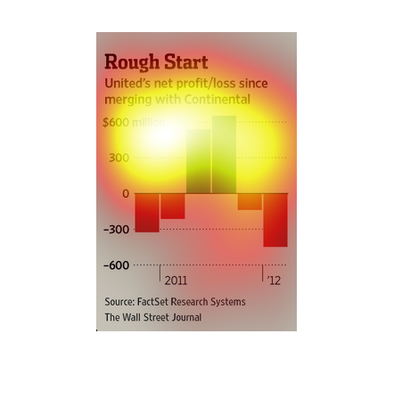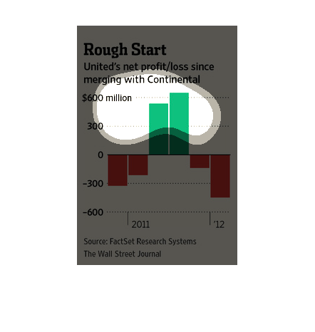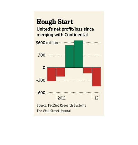
This chart from the Wall Street Journal shows how the United Continental merger was not a
hit in the beginning, as the combined entity experienced losses
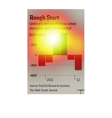
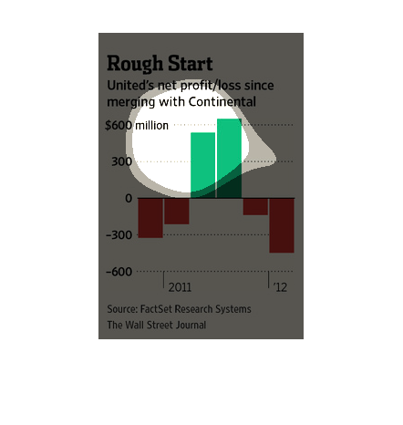
This image looks at United Airlines performance (financially speaking) since its merger with
Continental Airlines.  The bar graph looks at 2011 and 2012 and shows that United has been
in the red for most that time.
This graph illustrates United Airlines' profit and loss since merging with Continental Airlines.
There is a short time in 2011 where there was a profit surrounded by times of loss.
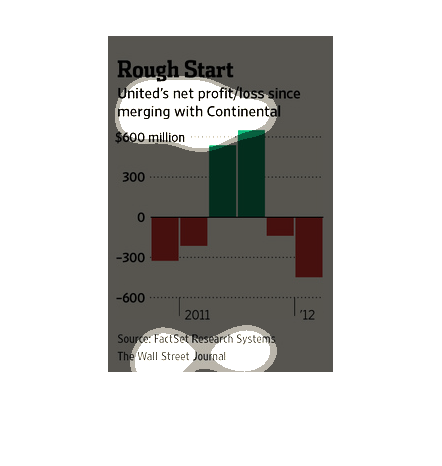
This bar graph shows United airlines net profit/loss since emerging with Continental. The
highest profit was over $600 million. In 2012 there was a net loss of almost $600 million.
The figure presented to the left is titled Rough Start.  The figure is a representation of
the statistical research data for United's net profit/loss.
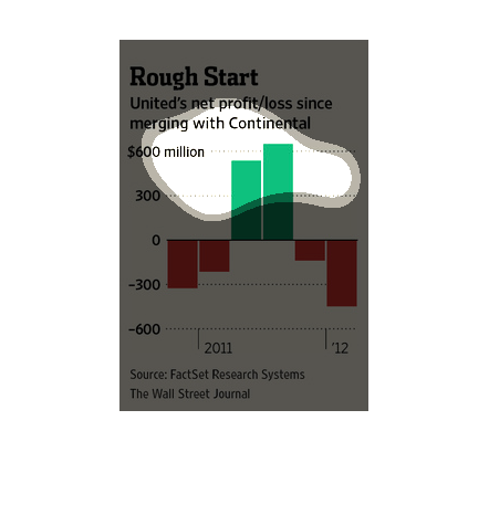
This image shows or depicts in statistical bar graph format data concerning United's net profit/loss
since merging with Continental. Source is Wall Street Journal.
This graph depicts United Airlines' economical gains since merging with Continental Airlines.
Data was taken from around 2011 to 2012. United Airlines had either large profits or large
losses.
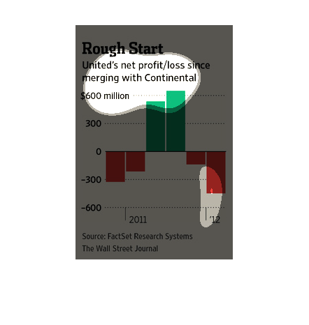
This graph is illustrating the net worth, and net loss of United Airlines since it's merger
with Continental Airlines. The graph depicts that the value has decreased since the merger.