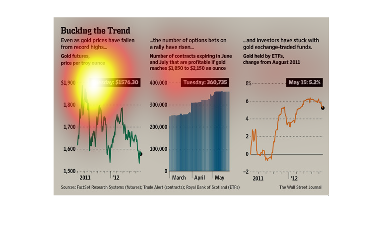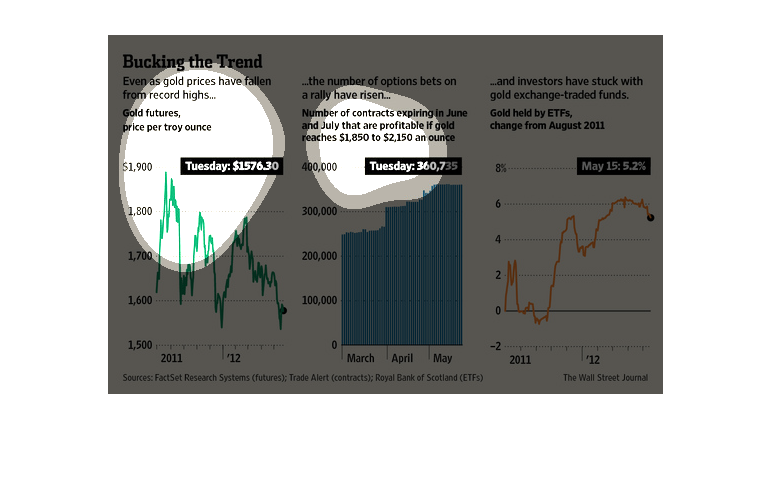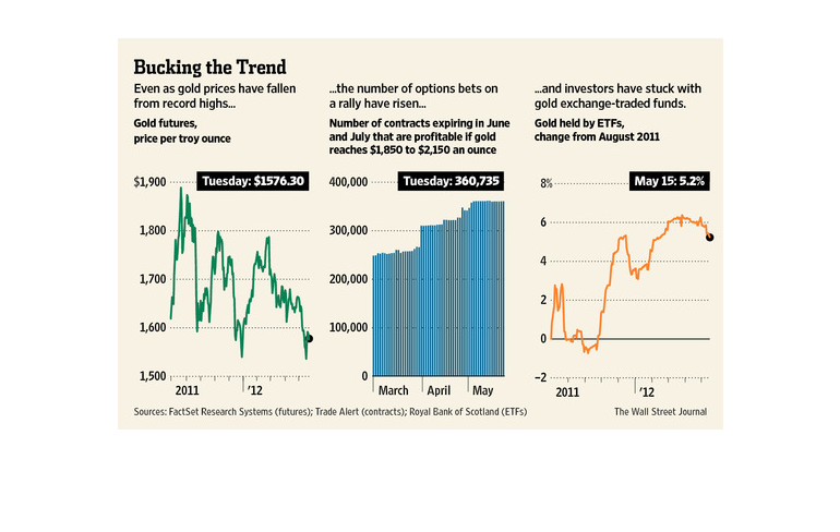
This chart from the Wall Street Journal shows how the gold market is in decline in terms of
spot prices but that investors are betting on a rally by buying options
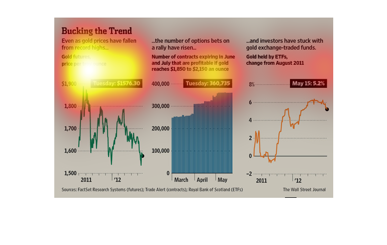
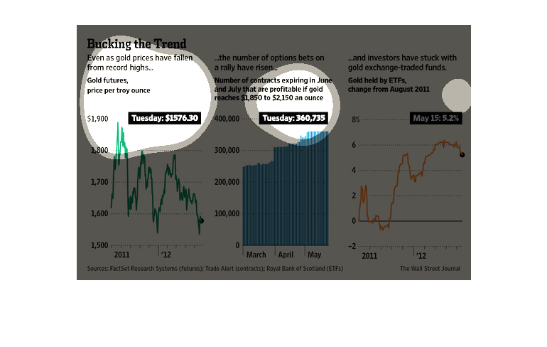
The image depicts how option bets have risen, even though gold prices have fallen, with investing
continuing to occur in gold exchange-traded funds over the time period studied.
This image shows multiple graphs. One shows the overall decline in the price of gold, another
that the number of options bets are increasing, and a third that  investors continue to buy
gold funds.
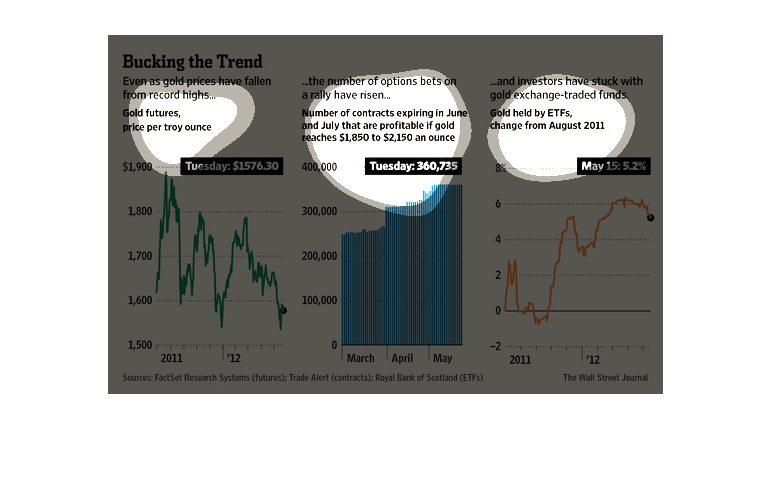
This chart details how gold prices have fallen on the left, option and contracts on gold have
risen in the middle, and gold changed by exchange traded funds are on the right.
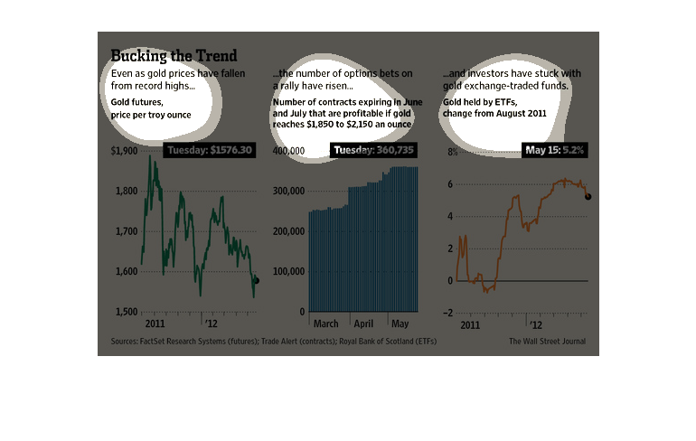
This chart describes as well as depicts the future rise in gold prices even thought the price
of gold has recently decreased. It also gives information on investors.
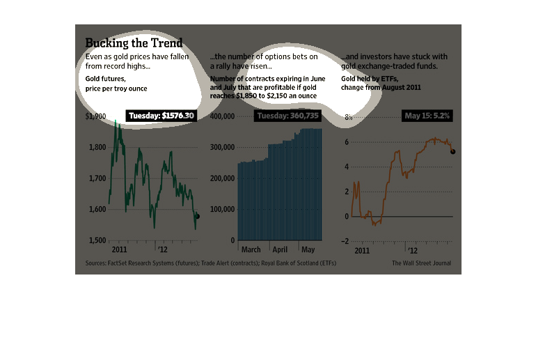
This chart from the Wall Street Journal shows how gold prices have fallen despite increasingly
bullish bets on futures and money pouring into gold funds
This graph is showing 3 charts. The first showing that the price per troy ounce of gold has
decreased from 2011 to 2012. The second graph shows the number of contracts expiring have
increased from March to May. In the third graph, that gold ETFs have steadily increased from
Aug. 2011 to 2012.
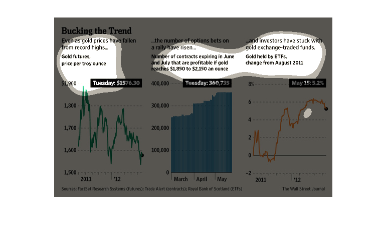
This image discusses gold. Gold prices have fallen from record highs, but the number of options
betting on a rally have risen and investors have stuck with gold-exchange related funds.
 Each of these three distinct points is illustrated graphically.
This graph shows the relationship between the price of gold and the price of gold futures.
This graph shows the trends in turns of line graphs and bar graphs.