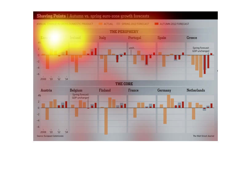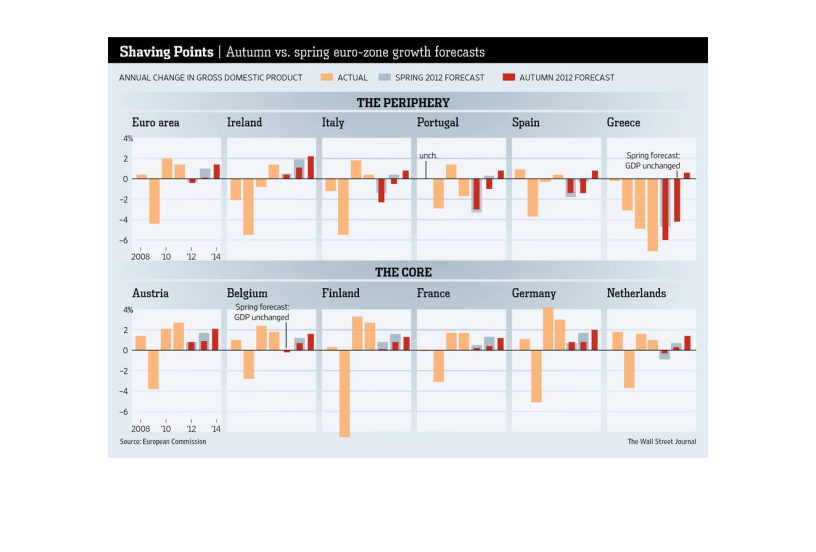
This image shows the gross domestic product changes over time in several European countries.
Included are Portugal, Spain, Greece, the Netherlands, and Germany, among others.
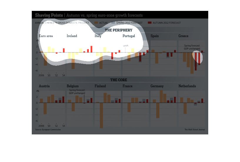
This map shows the "Shaving Points" Autumn vs. Spring Euro Zone growth forecasts. It appears
that Germany and Austria are projected to have the most growth.
This chart shows the Autumn vs. Spring euro-zone growth forecasts.  The annual change in gross
domestic product is compared across various zones for the time periods in 2012.
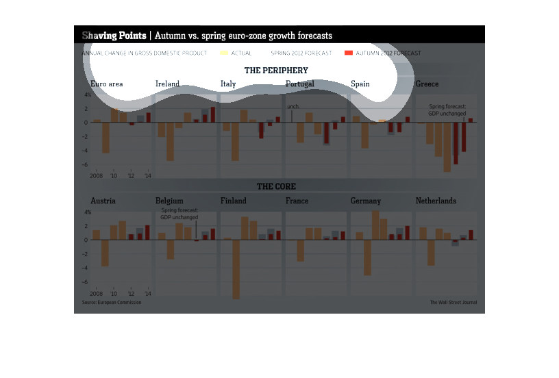
This chart details autumn and spring euro zone growth rates.  It has the annual change in
gross domestic product in the Euro Area, Ireland, Italy, Portugal, Spain and Greece.
This chart from the Wall Street Journal shows how the euro zone economic growth is more seasonal
and not as strong as anticipated. Other than that it is hard to read
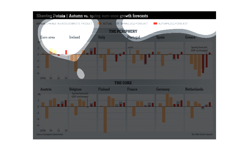
This chart describes as well as depicts the autumn vs. spring euro growth forecasts  as an
annual change in gross domestic product in a few different countries.
This chart depicts the difference in growth of the Euro Zone, autumn vs. spring.  On the bottom
of the chart, the core members of the euro zone's growth are shown, including Germany and
France.
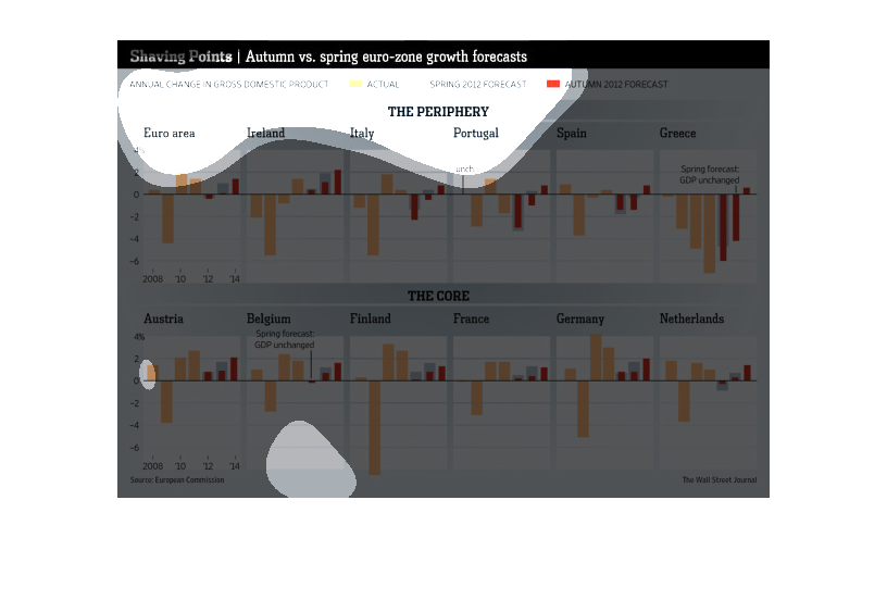
This chart from the Wall Street Journal shows how the euro zone GDP growth projections are
pretty cyclical between Autumn and Spring time.
The figure presented to the left is titled Shaving points.  The figure is a representation
of the statistical data for Autumn vs. Spring euro zone forecasts.
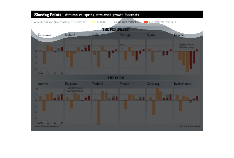
This image compares the annual changes in gross domestic product in multiple countries across
Europe. It shows both actual past forecasts and future forecasts.
This graph is displaying results in Autumn vs. Spring euro-zone growth forecasts in 2012.
The graphs shows the annual change in Gross domestic products for different European countries.
In Ireland and Austria, they are expecting a Gross increase for both seasons. However in Greece,
they are forecasted to have the most negative Gross for both seasons when compared to the
other countries in the chart.
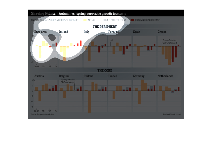
This chart describes shaving points. Specifically, autumn versus spring euro-zone growth forecast.
Different categories are represented by different colors.
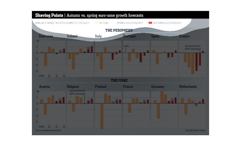
This image gives a forecast on the autumn and spring performance of the Eurozone as per annual
change in gross domestic product (GDP).  The graphic bar chart compares the Eurozone with
countries like Ireland, Portugal, France and the Netherlands.