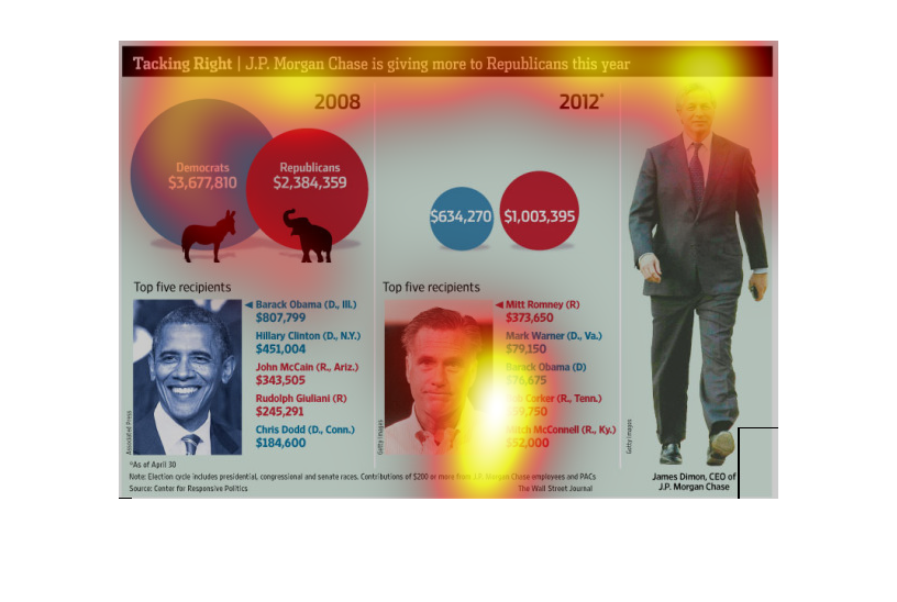
This graph illustrates the increase in money that JP Morgan Chase has given to republicans
during the 2012 election. The graph depicts these increases from 2008-2012.
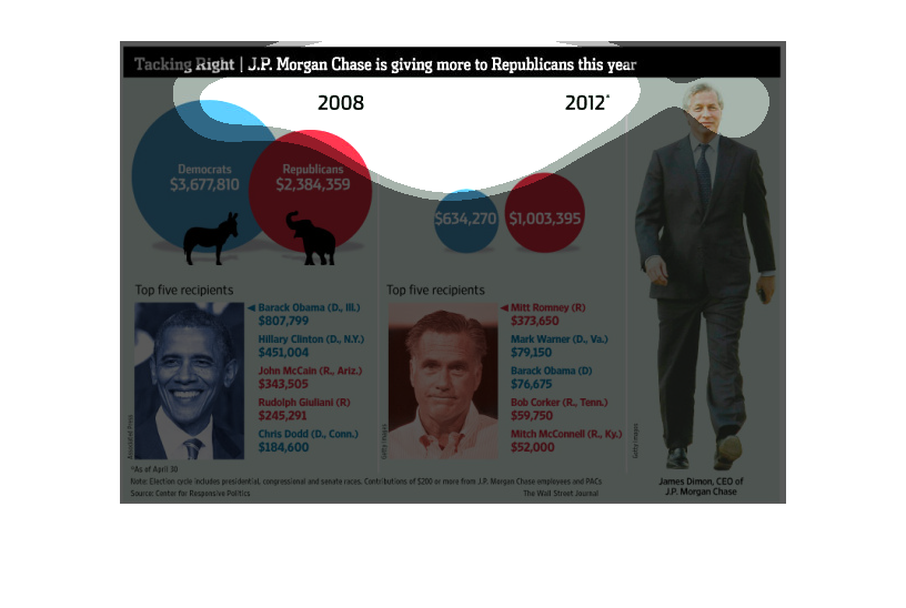
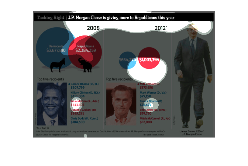
The image depicts how J.P. Morgan Chase is giving more money to republicans than democrats
in 2012 compared to 2008. Barack Obama received more money in 2008 than Mitt Romney did in
2012.
This chart from the Wall Street Journal shows how JP Morgan is giving primarily to republicans
during the 2012 presidential election but also some to democrats
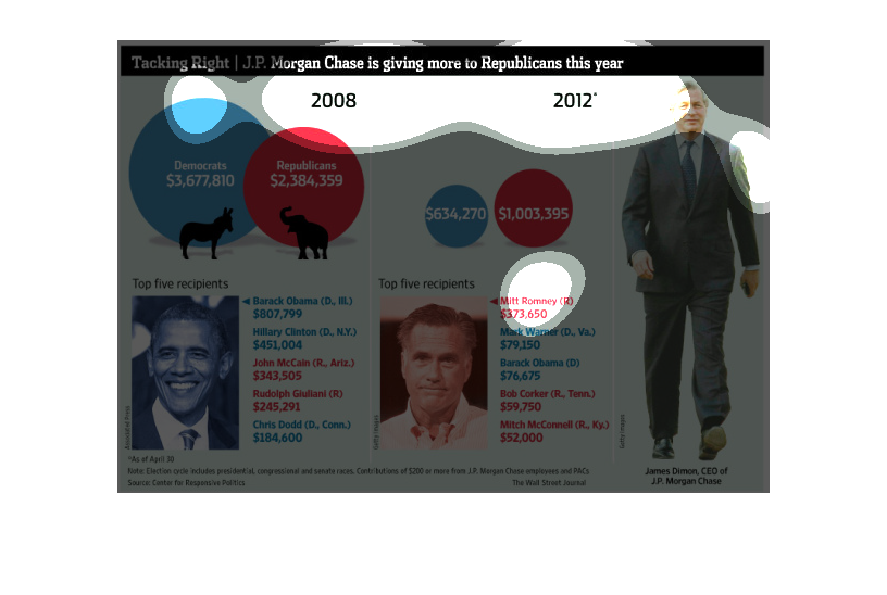
This chart is titled: Tacking right- JP Morgan chase is giving more to Republicans this year.
It shows the spending for the election years 2008, and 2012.
This image shows how much money that J.P. Morgan Chase has given to candidates in previous
years. In 2008, the company gave more to Republicans than Democrats.
This is a political chart that is showing J.P. Morgans funding. It shows that they are paying
more to the republics this year than democrats. There are two circle charts showing this.
The image describes a chart where a bank, JP Morgan chase is giving more money to Republicans
than Democrats. In 2008, Democrats received more than Republicans. As of 2012, Republicans
are receiving more funds than Democrats.
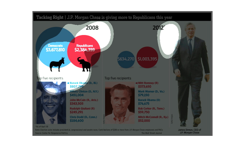
In this study conducted by the Wall Street Journal- during the 2012 Presidential Campaign-
we see that various heads of banks had approached the candidates and willing to spend more
on their respective parties than ever before.
The image is an infographic that talks about the 2012 presidential election. Specifically,
about money donations from J.P Morgan Chase, and how in the 2012 election cycle they gave
more to republican candidates than they did in the 2008 election cycle.
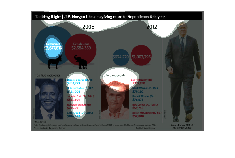
This figure presented is titled Tracking Right.  The figure is a representation of the statistical
data for J.P. Morgan Chase is giving more to republicans this year.
This is a graph that shows how much money JP Morgan Chase has given to Republicans candidates
for public office in 2008, along with top 5 recipients of donations from them altogether.
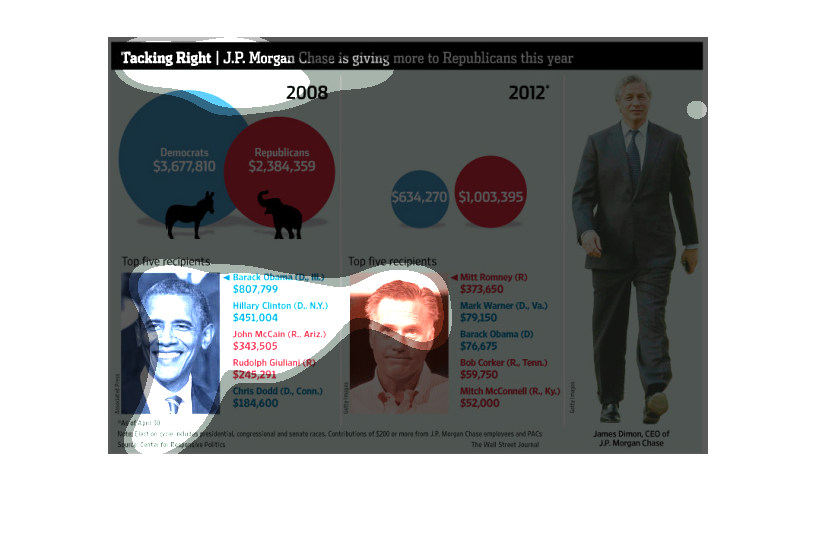
This image is entitled "Tacking Right:  J.P. Morgan Chase is giving more to Republicans this
year."  Data ranges from 2008 to 2012.  The image on the right shows the CEO of J.P. Morgan
Chase.  Amounts paid to Democrats are shown in blue circles.  Amounts paid to Republicans
are shown in red circles.  The top five recipients for each party are listed.  A photo of
Obama and Romney are shown beside each list for each respective party.  The source is Center
for Responsive Politics.  This image appeared in The Wall Street Journal.
This chart from the Wall Street Journal shows how JP Morgan is giving to primarily republican
candidates during the 2012 election cycle. The number 1 recipient was romney