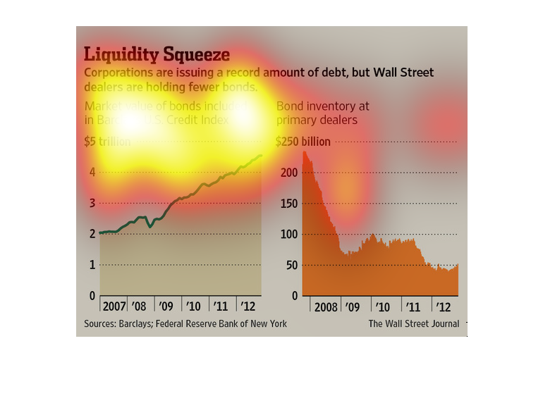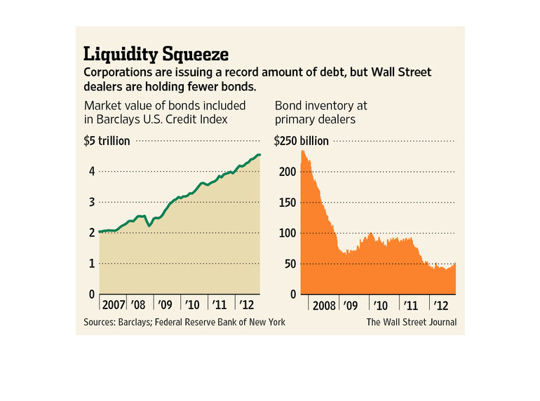
This is a series of line graphs concerning the issue of corporate debt. It focuses on the
time from 2007-2008 to today, which suggests that the graphic concerns the recession. It compares
debt to bond inventories, finding debt to be the much larger of the two.
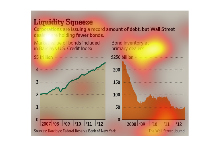
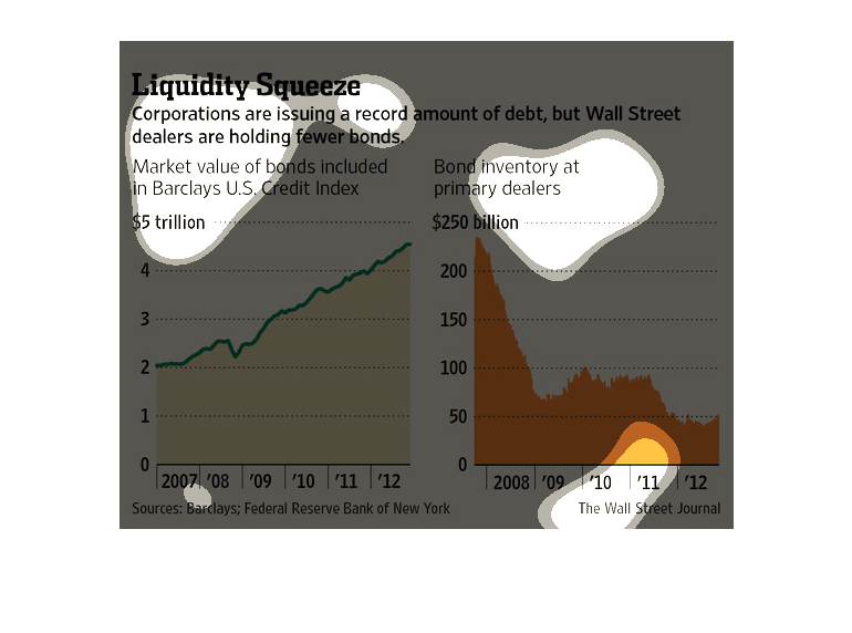
This chart is labeled "Liquidity Squeeze", and states companies are issuing more debt, but
there are fewer Wall Street dealers holding bonds. The left chart shows Bond value in the
US at 4.5 trillion by 2012, and a bond inventory of less than $50 billion.
This chart is showing information about how corporations are giving high amounts of debt but
the amount of bonds in wall street is lowered. There is a chart for bond inventory as well
as the market value of the bonds.
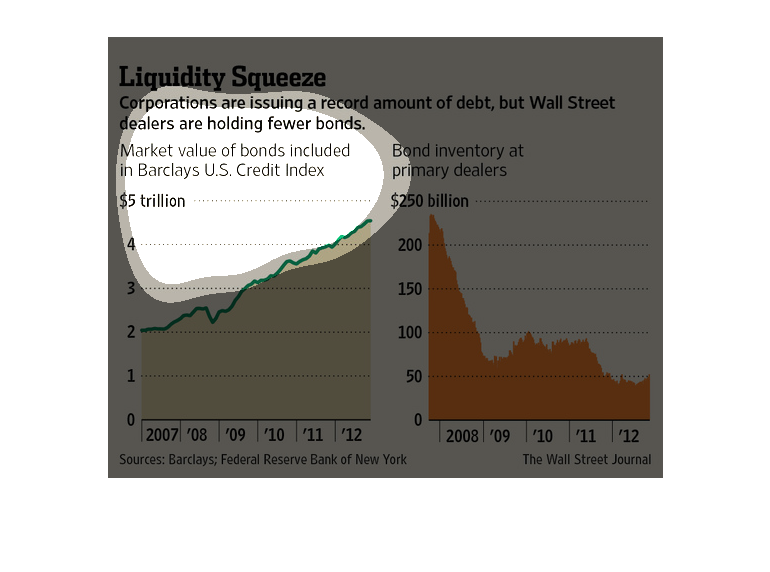
The image depicts how corporations are issuing a record amount of debt while wallstreet traders
are holding onto fewer bonds. Bond prices are increasing, while bond inventory is dramatically
decreasing from 2008-2012.
Pictured here are two charts that show how corporations are issuing less debt, while Wall
Street dealers have fewer bonds. The growth from 2007-2012 (sourced from the Federal Reserve)
is an increase to 5 trillion. The decrease from Wall Street is down from 250 billion in 2008,
to below 50 Billion in 2012.
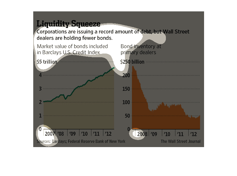
This image is entitled "Liquidity Squeeze."  It shows corporations are issuing a record amount
of debt, but Wall Street dealers are holding fewer bonds.  The graph on the left shows market
value of bonds included in Barclays U.S. Credit Index (2007 - 2012) ranging from $0 to 5 trillion.
 The graph on the right shows bond inventory at primary dealers (2008 - 2012) ranging from
$0 to $250 billion.  Sources: Barclays and Federal Reserve Bank of New York.  The image appeared
in The Wall Street Journal.
This chart from the Wall Street Journal shows how major corporations in the united states
are issuing short term debt but that banks are no longer holdering them
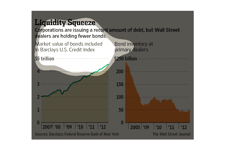
The following chart shows that Wall Street is issuing a record level of new Debt in the form
of Bonds. However Bond Holders are holding fewer bonds than they ever have.
This is a bar graph depicting the amount of bond inventory held by Wall Street bankers, compared
with the rising amount of debt Wall Street bankers are taking on each year, starting in 2007.
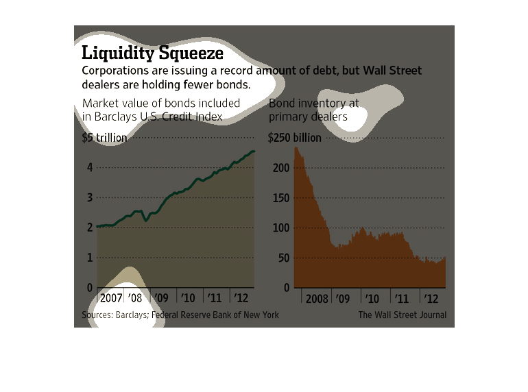
This image shows or depicts in both line and bar graph statistical formats data concerning
corporations issuing a record amount od debt, but wall street dealers are holding fewer bonds.
This chart shows how corporations are issuing a recored amount of debt while Wall Street is
holding a fewer number of bonds. The value of bonds by dealers only amounts to $250 billion
while market value is near $5 trillion.
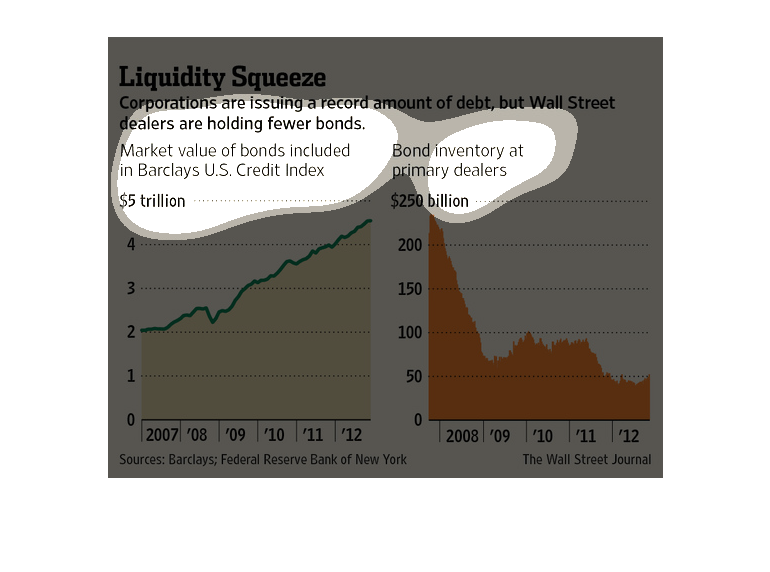
This is a chart showing despite the record amount of debt issued by corporations that wall
street is holding fewer bonds. Debt has gone from $2 to $4.5 trillion form 2007 to 2012, but
bonds have gone from $250 to $50 billion.
This chart from the Wall Street Journal shows how companies in the UNited States are issuing
record amounts of debt but that banks are not holding the debt