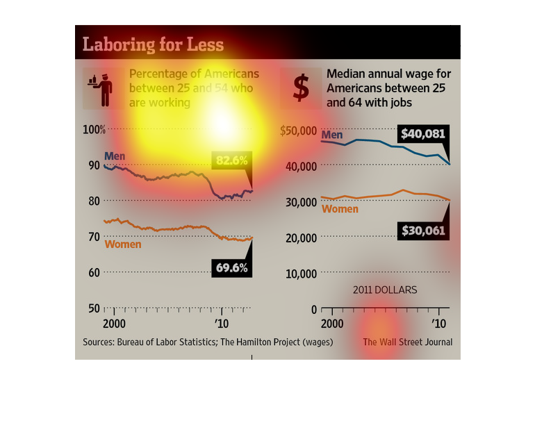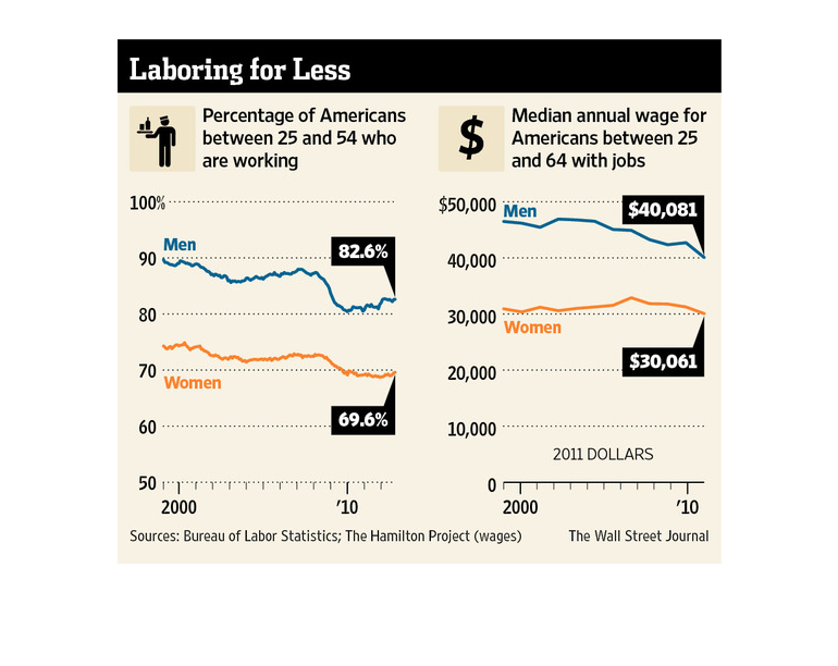
This graphic contains vast research that states that in ten years- from 2000 to 2010- we have
seen a rapid decline in the value of labor; people are working cheaper than at the beginning
of the decade
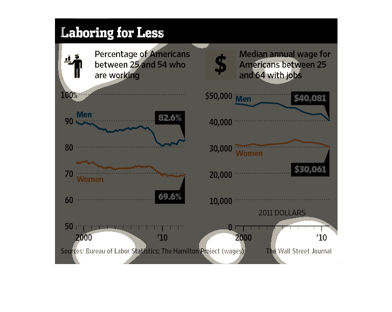
The figure presented to the left is titled Laboring for Less.  The figure is a representation
of the statistical research data for American workers who make less.
This is a graphic that is meant to illustrate the actual percentage of Americans between the
ages of 25 and 54 who are actually working. It also shows the median average wage for those
between the ages of 25 and 64.
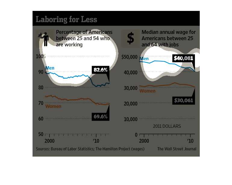
In this graphic we see that labor has remained the same while wages remain stagnant and expenses
increase over the years. In fact it goes on to point in its headline people are working the
same for far less.
The image depicts the percentage of Americans between 25 and 54 who are working and the median
annual wage for these workers. Wages appear to be decreasing while workers have decreased
over the years as well.
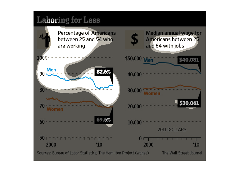
This chart shows the percentage of Americans between 25 & 54 who are working.  It also shows
the median annual wage for Americans between 25 and 64 with jobs.
This chart from the Wall Street Journal shows how the employment participation rate among
men and women between 25-54 is lower and the median income is decreasing
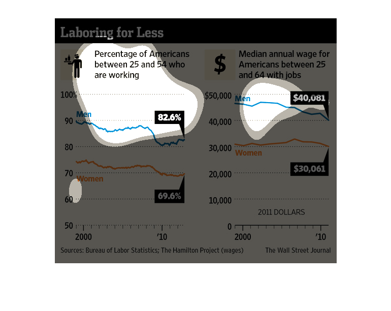
This image argues that we have been 'laboring for less.' That is, median incomes have fallen
over the period 2000-10, as per one graph.  Another graph shows that labor force participation
rates have dropped during that same period.
This chart shows the percentage of Americans between age 25 and 54 who are working on the
left side and the median annual wage for Americans with jobs on the right side.
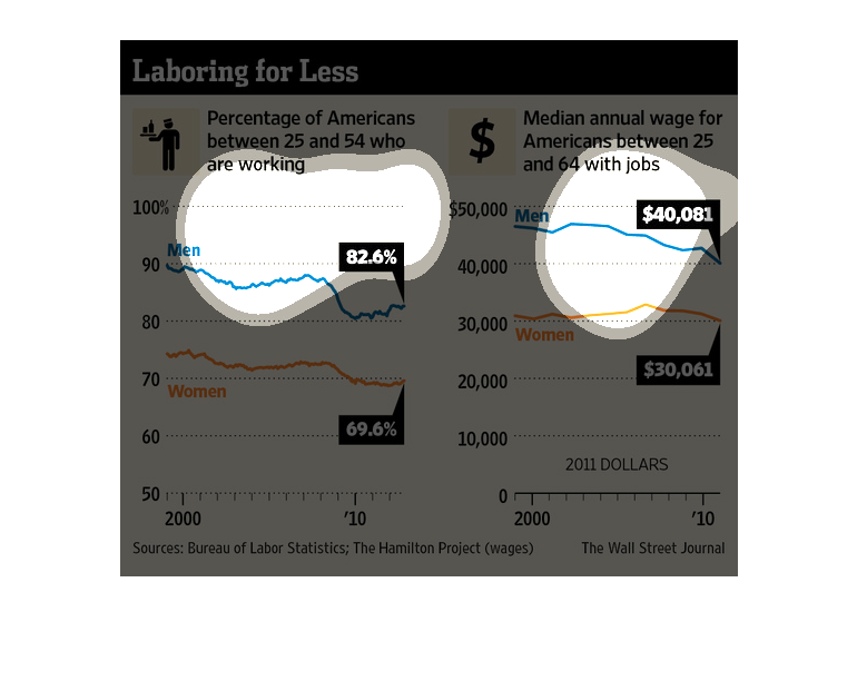
Two graphs split down the middle. The one on the left is for Percentage of Americans between
25 and 54 are working. The blue lines for men,and the orange for women's. Median annual wage
for Americans between 25 and 54 is on the right, with blue and orange representing what they
did before.
This chart from the Wall Street Journal shows how less people in the United States are in
the labor force and, despite the shortage, wages are also falling
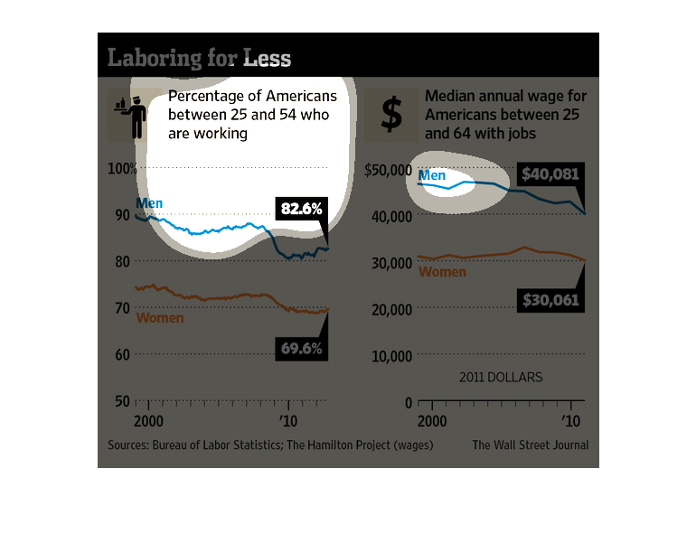
Laboring for Less  This image discusses the workforce and employment, particular workers between
25-54.  One graph spans the last decade and plots Men and Women.  The other graph looks at
median incomes for Men and Women.
The image depicts the percentage of Americans between 25 and 54 who are working. The data
indicates that men have a higher employment percentage versus women, men also have a higher
median wage than women.
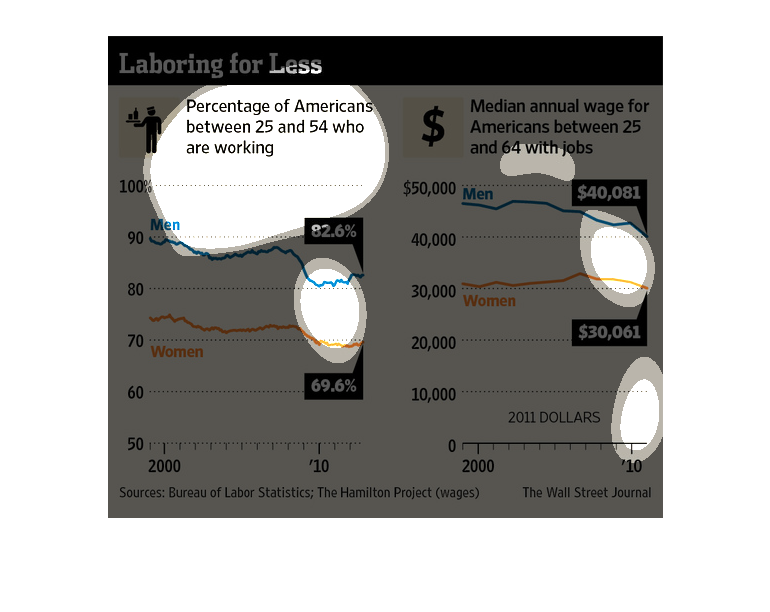
This chart describes laboring for less. Specifically, percentage of Americans between 25 and
54 who are working. Different categories are represented by different colors.