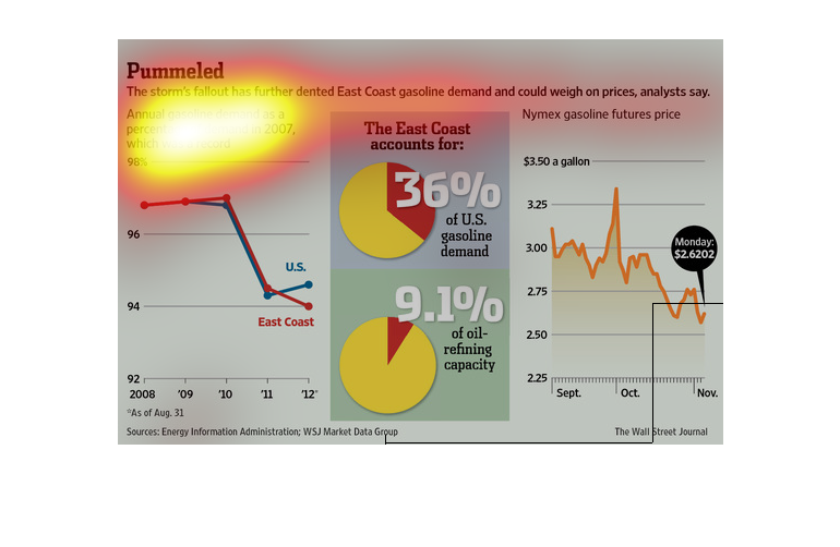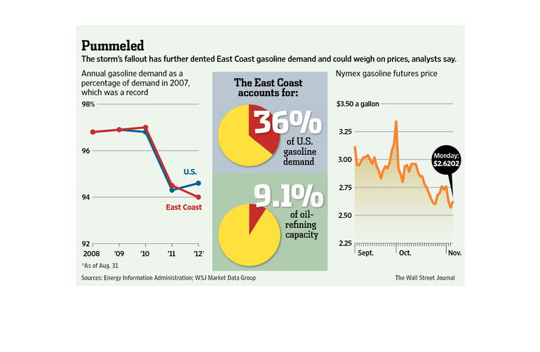
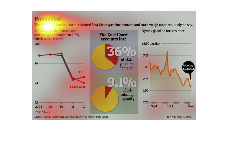
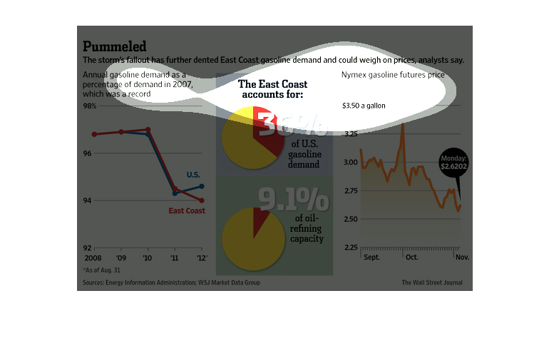
This series of graphs and charts show how the storm has affected the east coast, economcally.
On the left, a graph of gas prices from 2007 to 2012. In the center, pie charts show the demand
and how much it supplies. Finally on the right, the overall price of gas, trending up and
down.
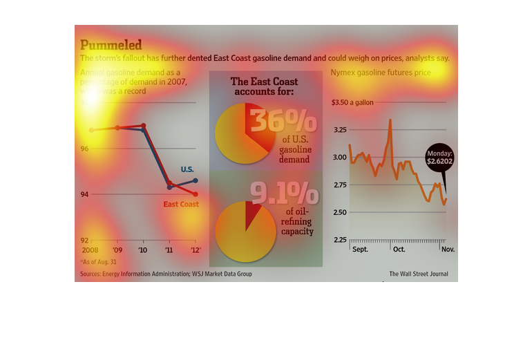
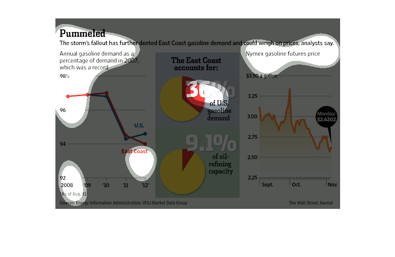
This chart shows annual gasoline demand as a percentage of gasoline demand from 2007, east
coast demand and oil capacity statistics, and the Nymex gasoline futures price.
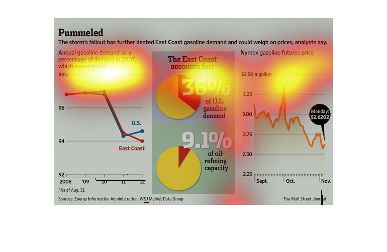
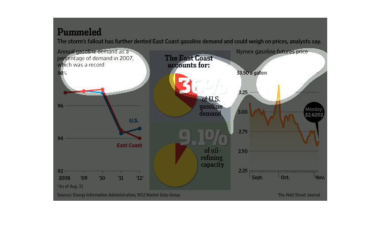
In this study from the Wall Street Journal- from data obtained from the Energy Information
Administration- we see that their was a great deal of energy cost because of hurricane Sandy.
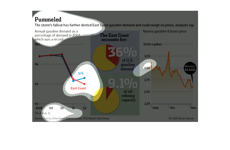
This chart from the Wall Street Journal shows how superstorm sandy is having a large impact
on gas prices in the region, with prices spiking to highs.
This chart describes pummeled. Specifically, the storm's fallout has deeper dented East coast
gasoline demand. Different categories are represented by different colors.
This graphic is a series of maps of the east coast of the United States. It shows where various
severe storms have occurred in recent years, and it traces the impact of these storms on gasoline
prices in the region. it also includes share of gas revenues from the region.
This chart from the Wall Street Journal shows how oil prices and in particular gasoline prices
will increase as a result of the damage done to infrastructure and supply lines by superstorm
sandy
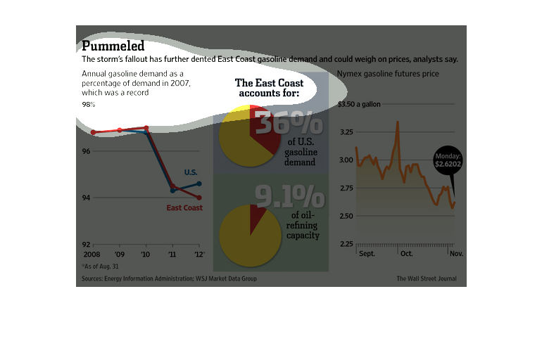
This graph compares annual gasoline demand since 2007 which was at a record 98%. It shows
the huge demand the East Coast had on gasoline at the time making up for 36% of the nation.
The image depicts how a natural disaster on the east coast has caused a downward decent in
gasoline demand on the East coast, and could affect gasoline prices as a result. The east
coast has slightly lower demands compared to the rest of the US.
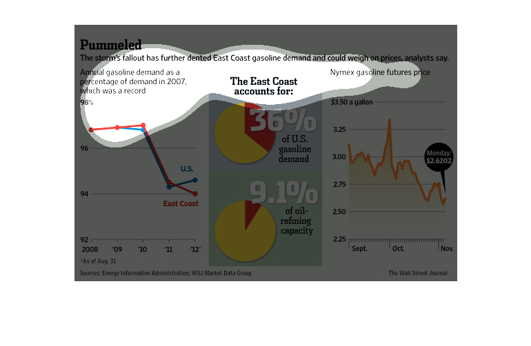
This image speaks of the impacts of a storm on the east coast US where slackening demand will
weigh on gasoline prices.  Graphics illustrate this fact in three different ways. Through
a two graph charts, and a pie chart that shows the significance of east coast demand of all
US gasoline (at 36%).
This is a chart about gas prices as a result of a storm. It states demand in 2012 was around
95% of the 2007 demand in the US and on the east coast, and that the east coast accounts for
36% of the demand of US gasoline.
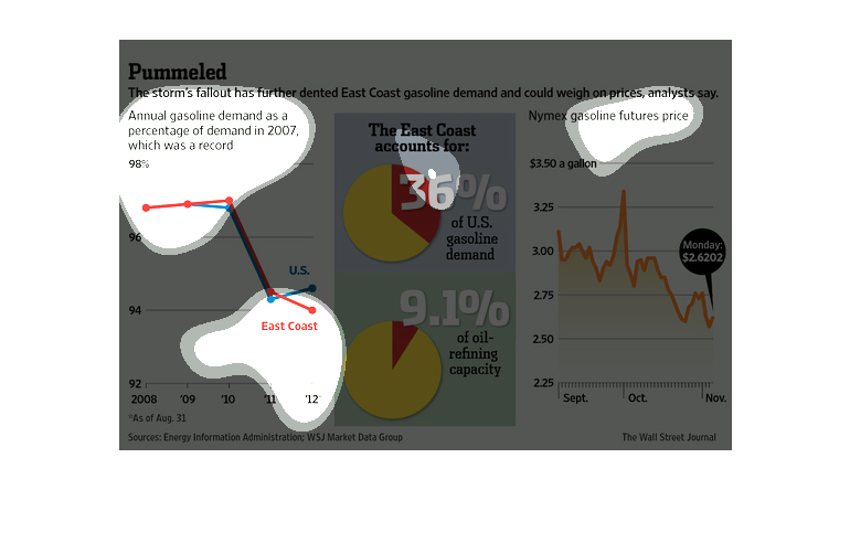
This is a set of various graphics that are meant to clearly illustrate the after effects of
the storm that has led to the dented prices of East Cost gasoline.
The figure presented to the left is titled Pummeled.  The figure is a representation of the
statistical research data for storm fallout effecting gas.
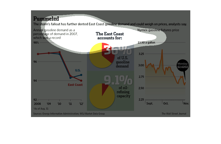
This chart describes and depicts the annual gasoline as a percentage of demand for the year
two thousand and seven, also it shows the effect that the storm has had.