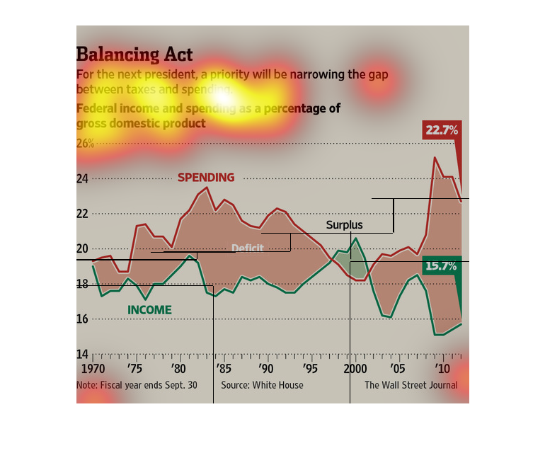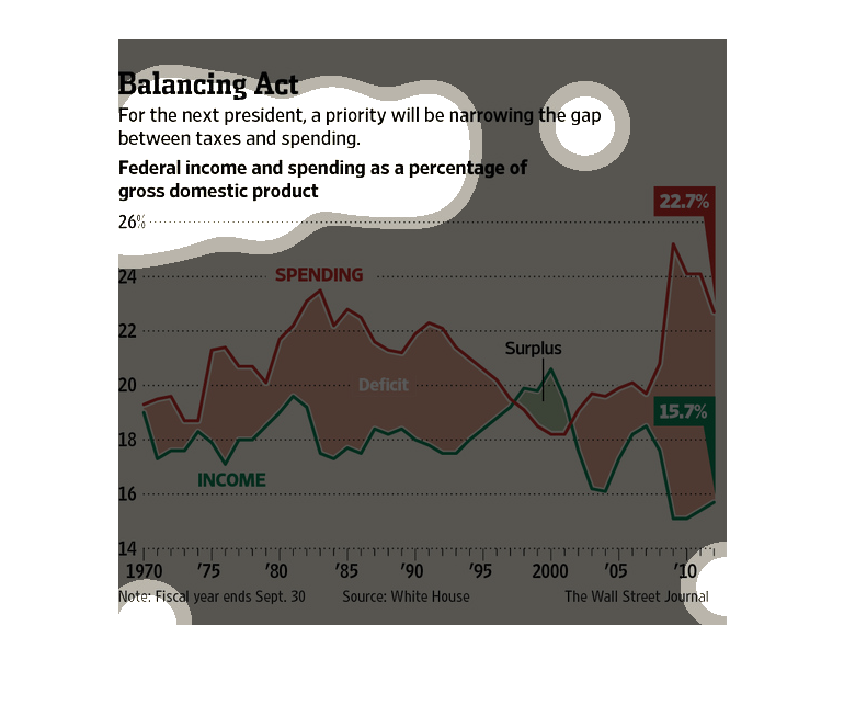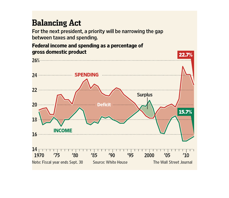
This chart from the Wall Street Journal shows how the next president in the US will be forced
to make tough decisions to narrow the budget deficit.
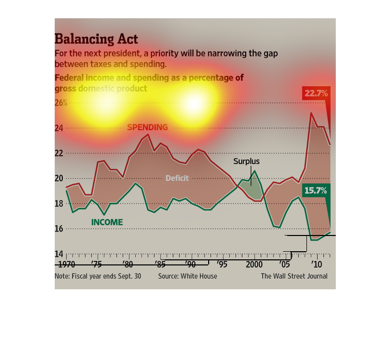
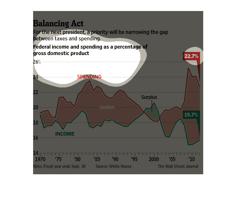
This article talks about how the next president will have to narrow the gap between taxes
and spending. Then there is one line graph on the bottom of the article showing federal income
spending as a percentage of GDP.
The figure presented to the left is titled Balancing Act.  The figure is a representation
of the statistical research data for narrowing taxes for the next president.
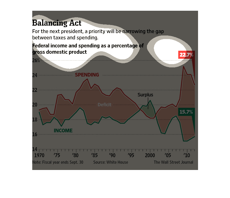
This picture illustrates the dilemma facing America right now. With the national debt on the
rise, the chart makes the claim that the next president will have to do a better job balancing
taxing and spending to balance the federal budget to begin the process of releasing America
from debt.
This chart shows the federal income spending  as a percentage of all gross domestic products.
It covers the years 1970 to 2010 and shows the need for a priority on narrowing the gap between
taxes and spending.
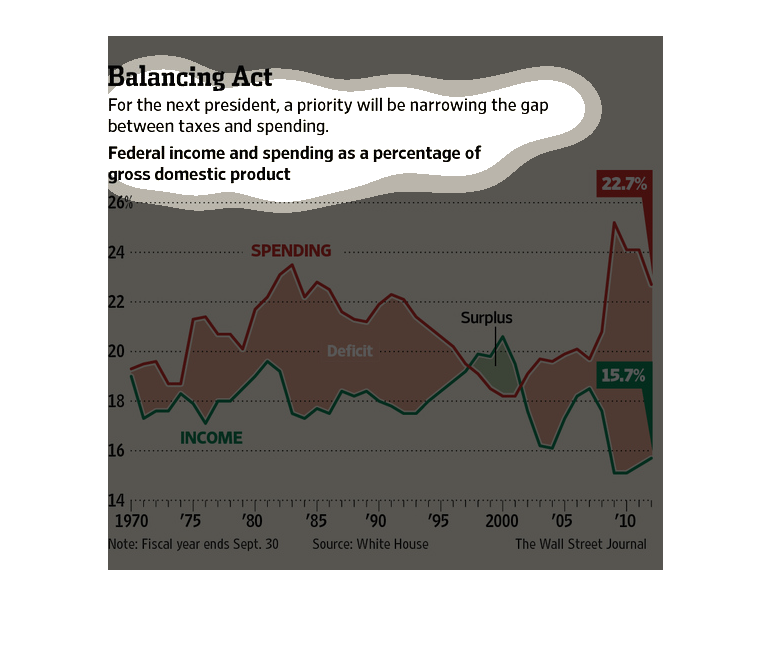
This chart from the Wall Street Journal shows how the gap between tax collection and government
spending needs to be narrowed by the next president and congress
This chart describes balancing act. Specifically, for the next president, a priority will
be narrowing the gap. Different categories are represented by different colors.
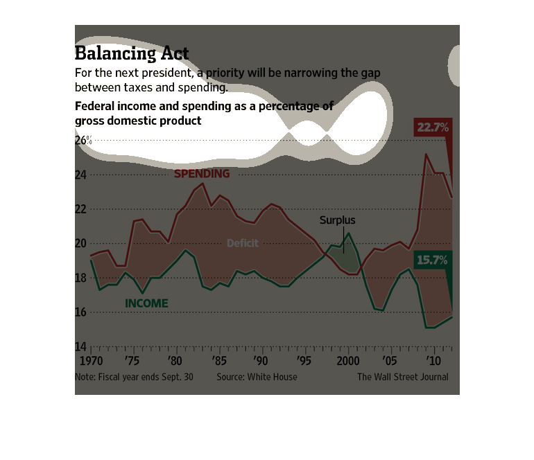
This graph shows the federal government's income and spending since 1970, along with the debt
(or surplus) as a percentage of the total U.S. gross domestic product.
This chart shows a line graph comparing federal income and federal spending over time in the
Unites States. Recently, income has decreased while spending has increased.
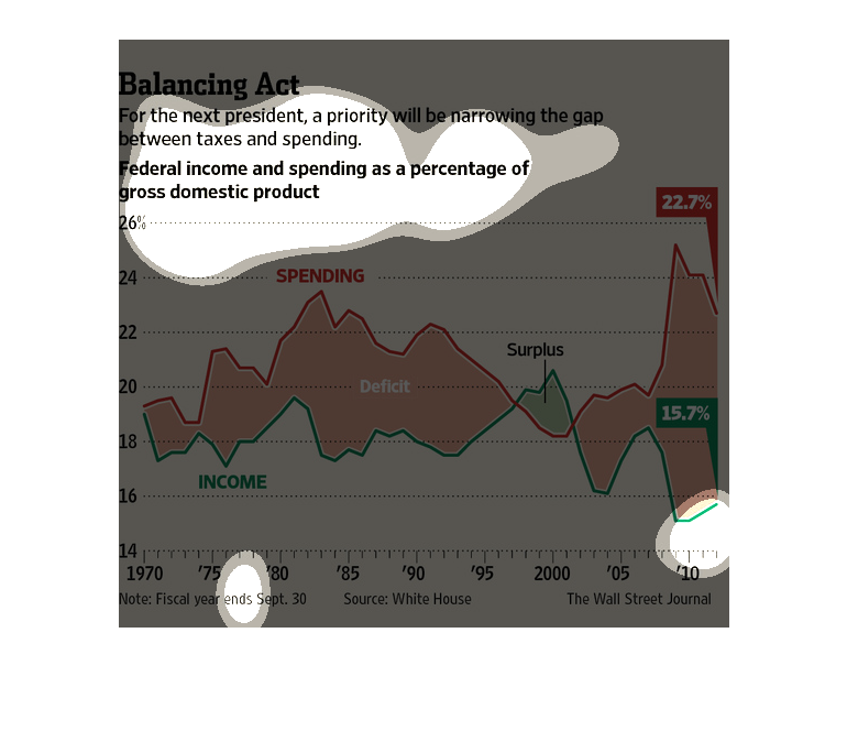
In this study conducted by the Wall Street Journal- from information obtained from the White
House- we see the charting of taxing and spending trends from 1970 to 2010; forty years that
have to be accounted for and balanced.
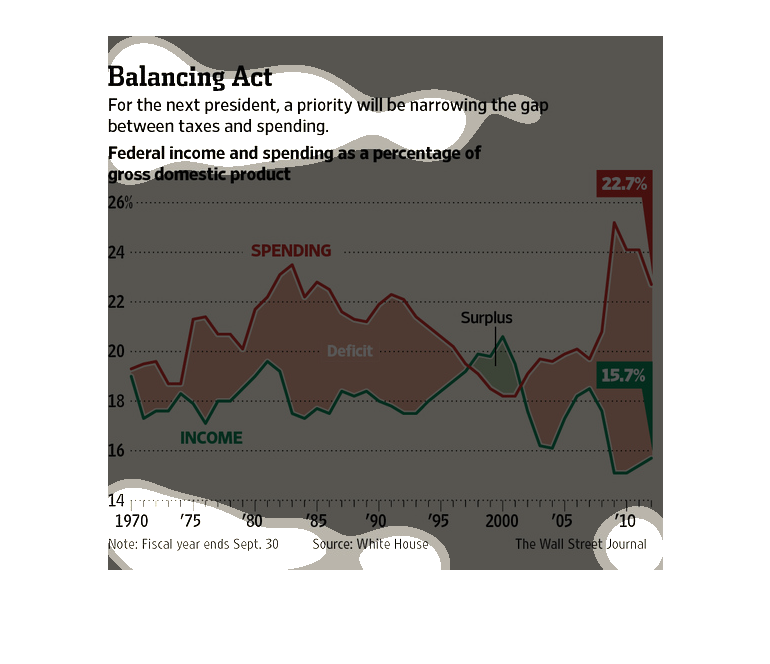
This is a line graph showing the relationship between the federal income and spending that
is going on and it is shown over the amount of years. It states the goal for the next president
is to help solve this issue.
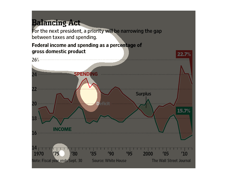
This graph shows federal income and spending as percentages of gross domestic products. It
shows the rise starting from 1970 to the huge spending spikes in 2010.
This chart illustrates how the next President needs to mind the gap between taxes and federal
spending as a percentage of gross domestic product with data from 1970 to 2010.