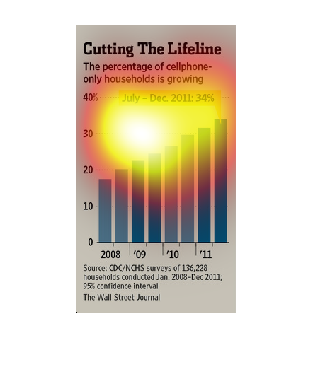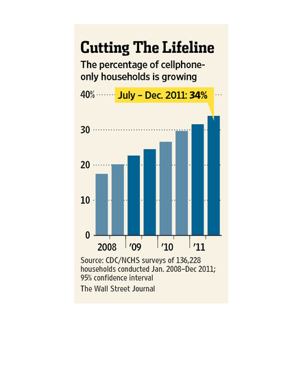
This image shows that the number of households that use only cellphones is increasing over
time. Data is taken from around 2008 to 2011. Overall, a large and steady increase is shown.
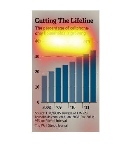
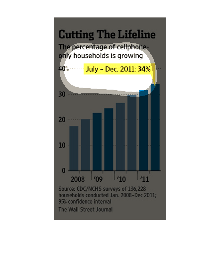
The image depicts the percentage of cell phone-only households growing. The percentage of
households has been increasing over the years, hitting 34% as of 2011.
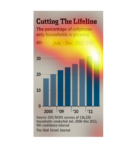
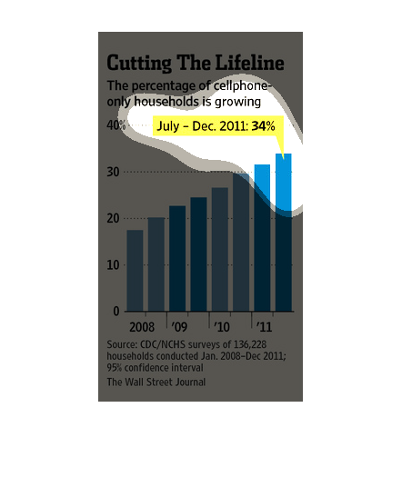
This graph shows the trend of households getting rid of their landline phones in favor of
being cellphone only house holds from 2008 to 2011. In December of 2011 34% of households
no longer had a landline.
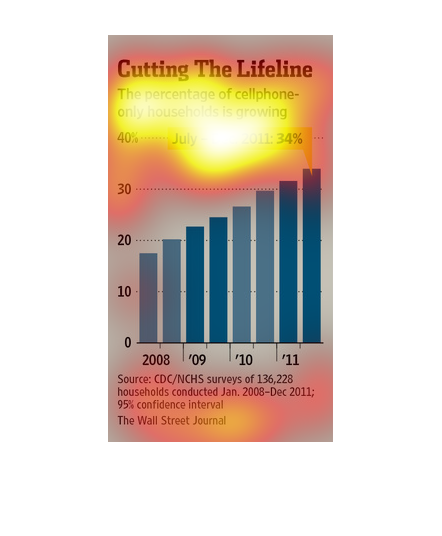
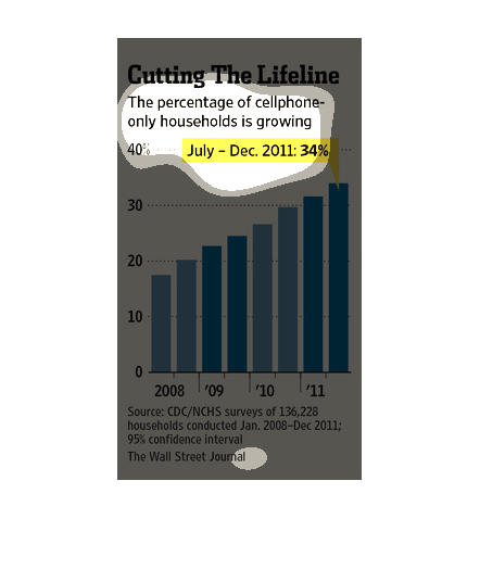
This chart from the Wall Street Journal shows how many households are starting to migrate
to a cell phone only house, which means cutting the land line
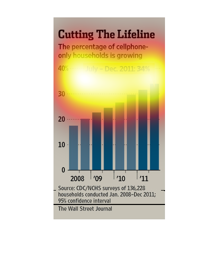
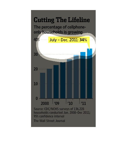
The image depicts the percentage of cellphone-only households growing. 34% of household in
the US were cellphone-only household as of December 2011, increasing steadily since around
2008.
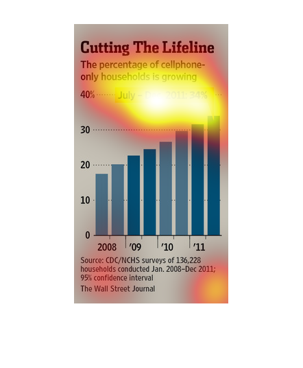
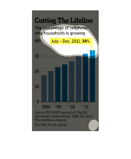
This blue bar graph is titled Cutting the Lifeline and states that the percentage of cellphone-only
households is growing graphing data from 2008 to 2011.
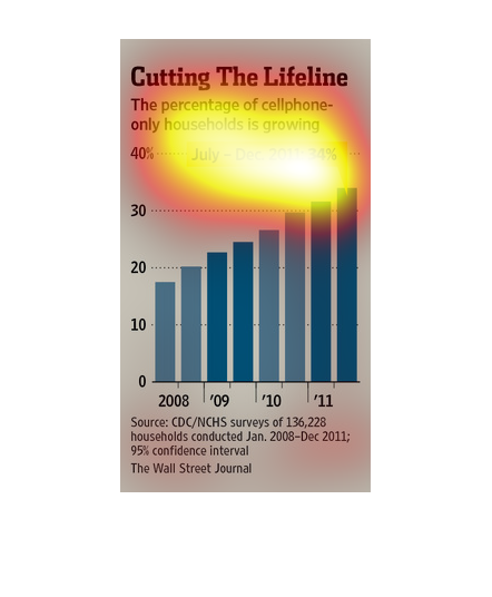
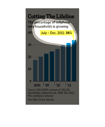
This image shows or depicts in bar graph statistical format data concerning the ever-increasing
cell phone only households for the year 2011. Source is Wall street journal.
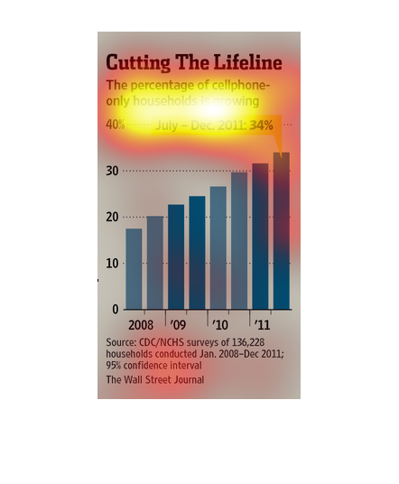
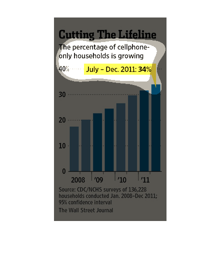
This bar graph shows the growth in cellphone only households from 2008 to 2011. The data is
based on survey conducted by the CDX/NCHS during the time period. Results indicate that at
the end of the survey in 2011, 34% of households relied on cellphones as their only telephone.
This was a dramatic increase from the 18% of cellphone only households in 2008.
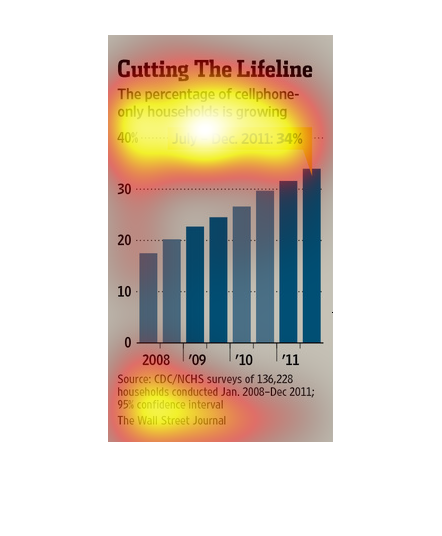

This chart from the Wall Street Journal shows how american households are starting to cut
the cord and ditch land line based phones in favor of just cell phones
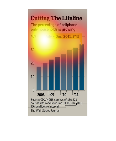
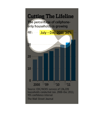
This chart illustrates how the percentage of cell phone only households is growing.  This
graph goes from 2000 to 2011 and there are 34% at the end of 2011 who only have cell phones.
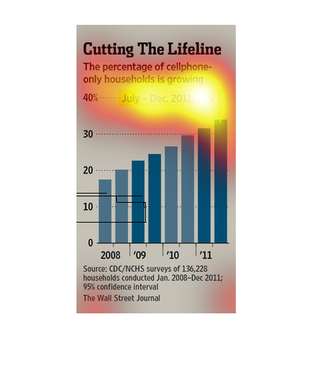
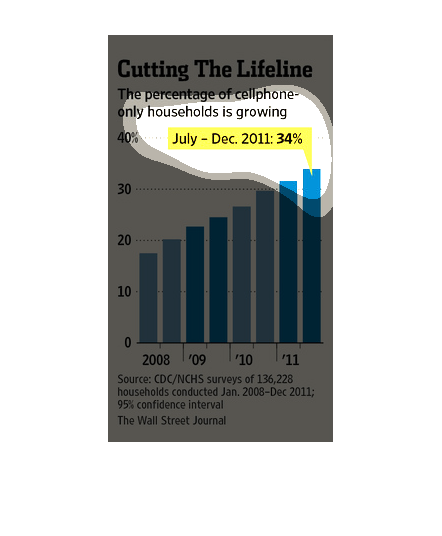
This image argues how the percentage of cell phone only household is growing.   The bar chart
show a steady decline of cell phone only households from 2008 to 2011. Most recently, that
percentage is 34%.
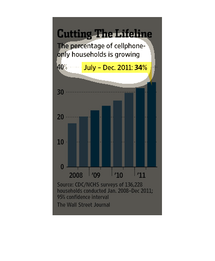
This image is entitled "Cutting the Lifeline."  It shows the percentage of cellphone-only
households is growing.  Percentages range from 0 - 40 from 2008-2011.  The source is CDC/NCHS
surveys.  This image appeared in The Wall Street Journal.
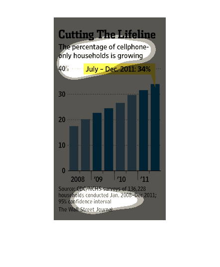
This chart describes as well as depicts the rising percentage of the United States's cell
phone only households from july  to december of two thousand and eleven.