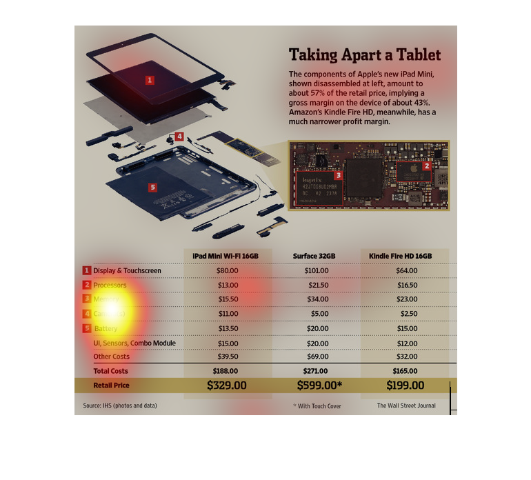
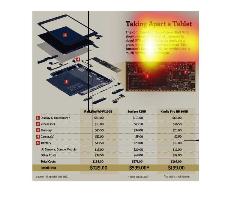
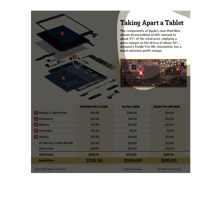
The image depicts how Apple is profiting more from it's iPad mini compared to the Amazon profiting
from it's Kindle Fire device. A diagram is provided showing the component breakdown.

This article is about taking apart a tablet. They compared the Ipad Mini, Surface, and Kindle
Fire HD. In the table they compared the cost for each tablet part( like the camera, battery,
memory, processors, and the display) and then total the cost on the bottom. Then they compared
the cost to how much the item retail for. They also included a picture of a break down of
a tablet to show where the parts are located.
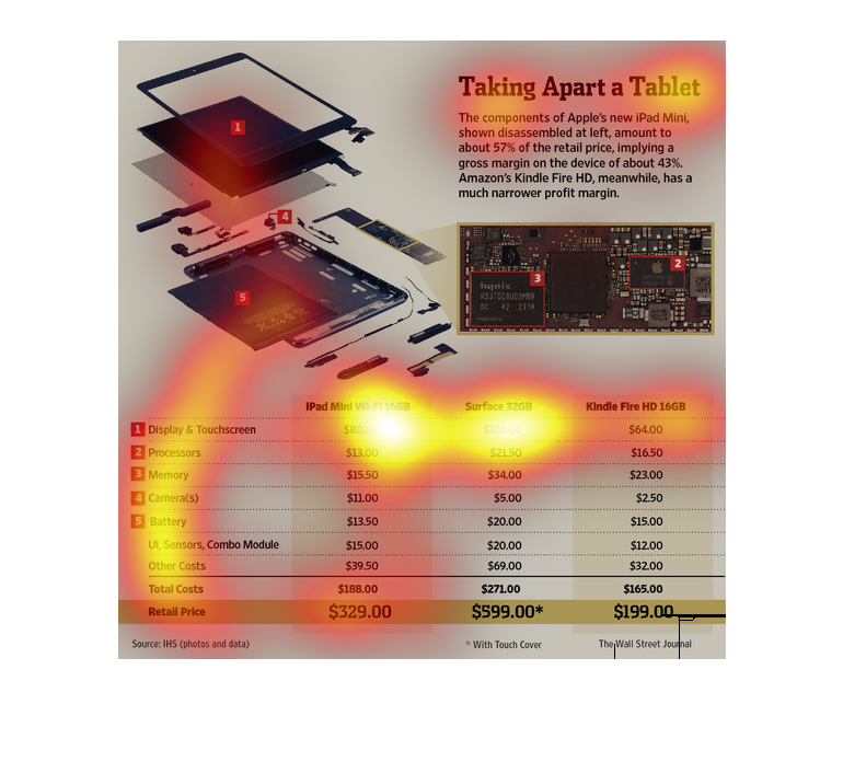
This chart describes taking apart a tablet. Specifically, the components of Apple's new iPad
Mini. The chart contains photographs to enhance the information presented.
This image shows an Apple IPad taken apart, as well as a Kindle. The components are shown
and priced graphically and texually, to get an idea of the gross profit margins (for the IPad,
it is over 40%, while the Kindle is less).
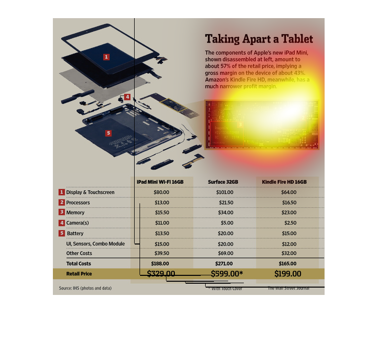
This image shows a disassembled iPad mini. Its individual parts are compared to the Surface
32GB and the Kindle Fire HD 32GB. The pieces of the Surface cost the most.
This chart from the Wall Street Journal shows how amazon sources and sells its tablets, specifically
the cost to produce and anticipated gross margin
This chart from the Wall Street Journal shows the manufacturing components and costs of a
tablet from Amazon and estimates the gross margin per tablet sold
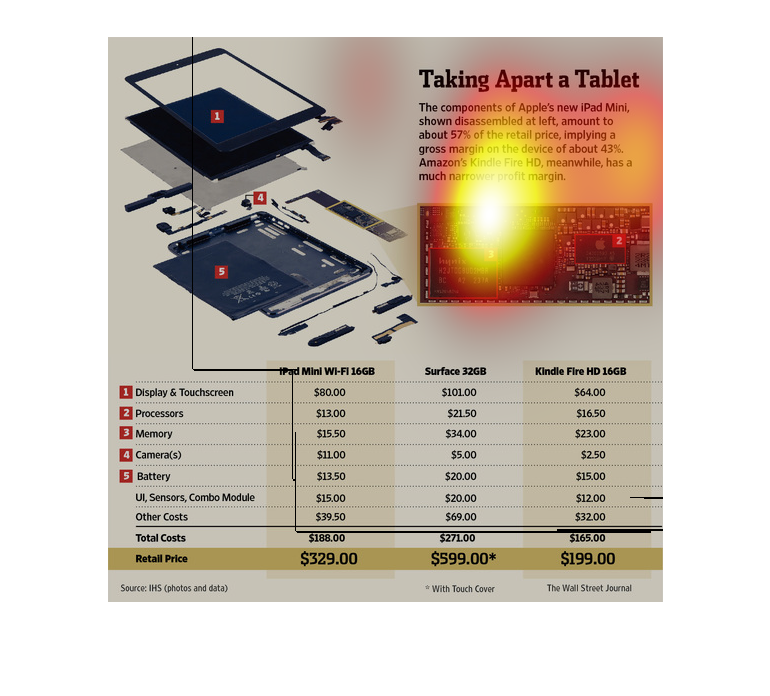
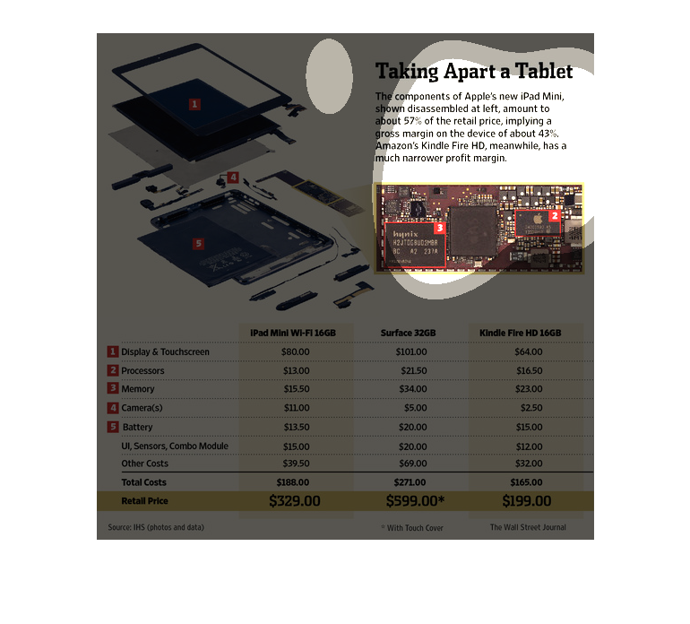
This chart describes as well as depicts that Apple's disassembled Ipad Mini, Amounts to fifty
seven percent of the retail price, implying a gross margin  of about 43%
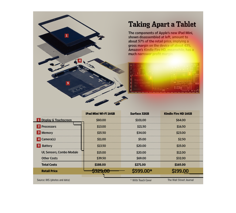
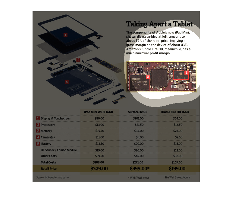
This chart compares the actual cost on parts from  tablets compared to the actual retail value
they are sold at. The Amazon Kindle Fire HD receives a lower gross margin for their product
compared to the Ipad Mini.
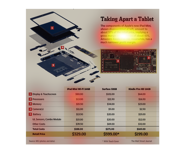
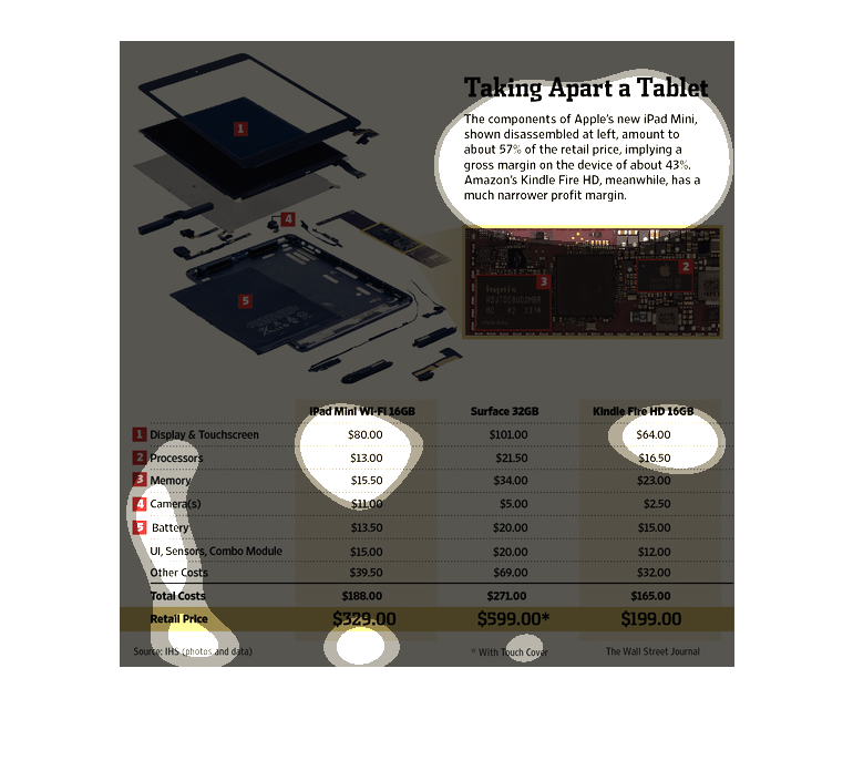
The figure presented to the left is titled Taking apart a tablet.  The figure is a representation
of the statistical data for the components of the iPad.
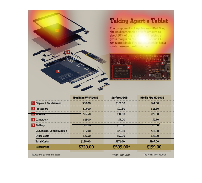
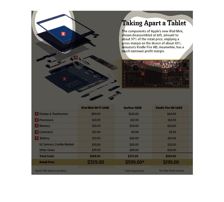
This article compares an iPad mini, surface, and a Kindle Fire HD. They compare each part
cost, and retail price for each tablet. There is also a picture of a tablet broken down to
see where each part is located.
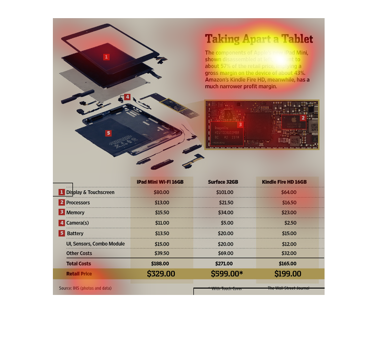
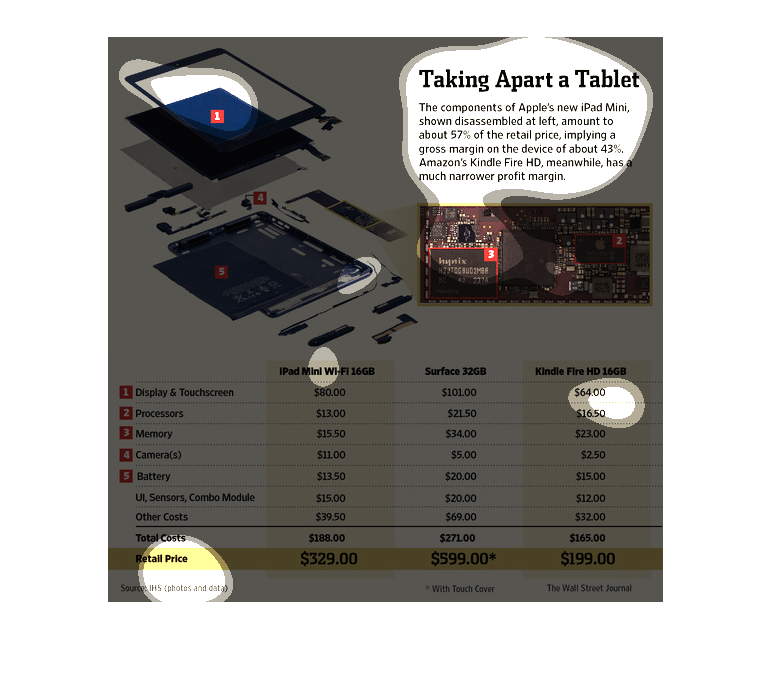
This slide shows the components of a tablet when you take it apart. It shows pictures of the
components inside such as the processor, memory, cameras, batteries and sensors. The three
devices captured are Ipad mini WiFi 16GB, Surface 32GB and Kindle Fire HD 16GB. It also shows
the retail prices of each, with Surface having the highest retail price.
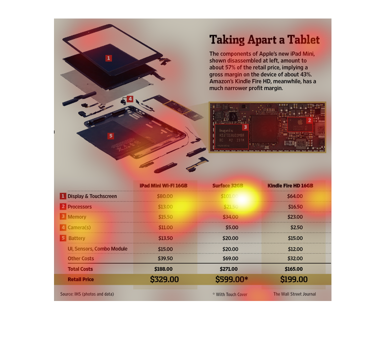
The image depicts a diagram of the components within Apple's iPad Mini tablet. Based on the
data, iPad Mini has a higher profit margin compared to the Amazon's Kindle Fire HD.
This chart is your typical graph chart that sets up one or a number of categories, which is
illustrated by either a map, a graph, an illustration, or photograph.
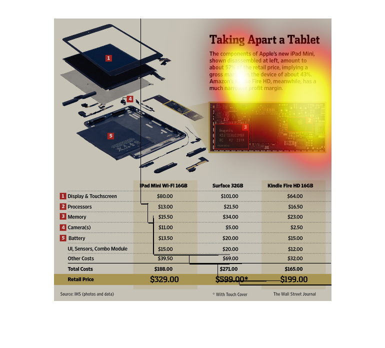
The graph called "Taking apart a tablet". It lists three different types of tablets, and one
the chart it says how much money goes into each parts. At the bottom it gives sums of how
much it costs each.