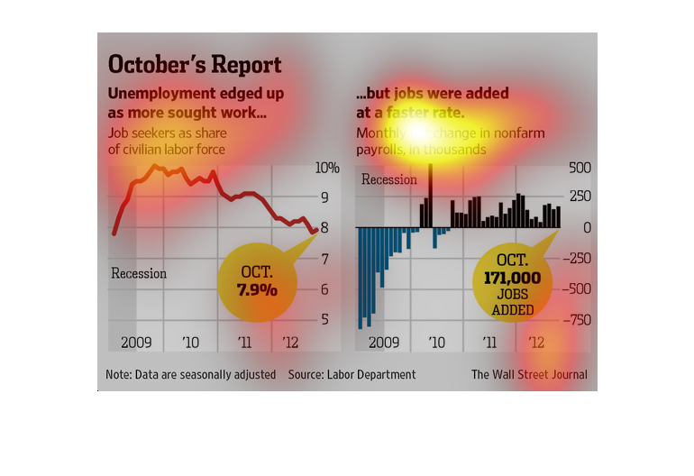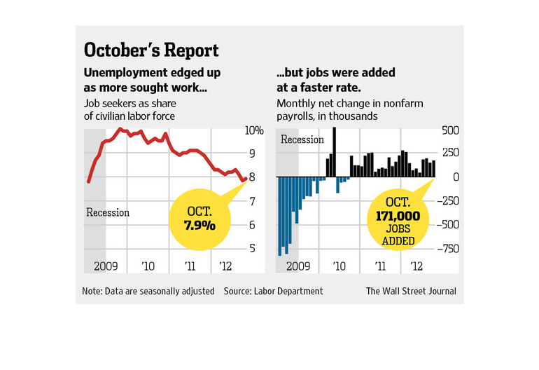
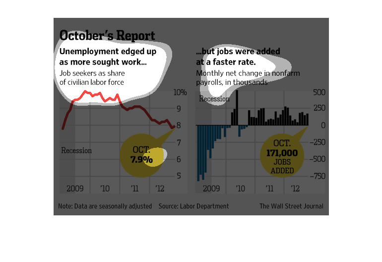
A comparison of the jobs in the country post recession versus the jobless rates in the country.
Even though jobs were being added, the jobless rate climbed as people entered the workforce.
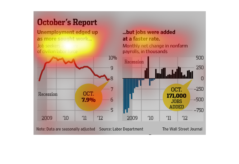
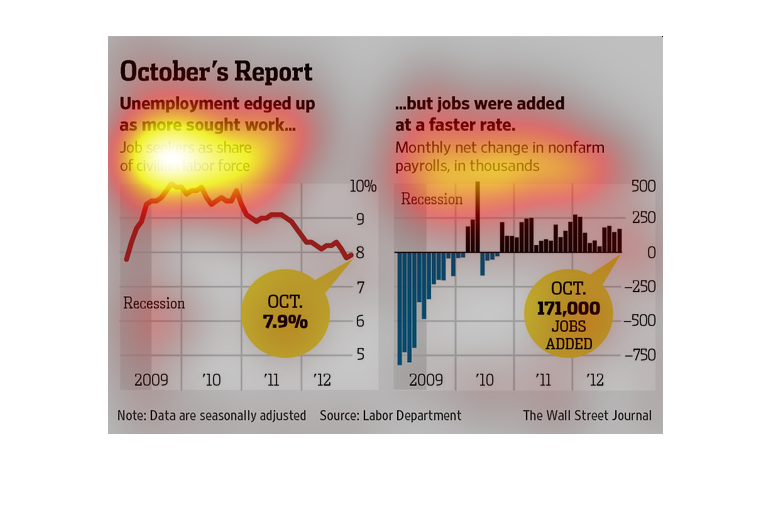
According to this study by the Wall Street Journal, unemployment is on the rise. They say
this leads to all sorts of negative things to happen in the state.
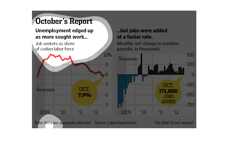
This chart describes October's report. Specifically, unemployment edged up as more sought
work. Different categories are represented by different colors.
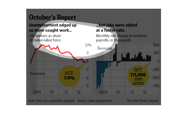
This chart from the Wall Street Journal shows how the unemployment rate remained relatively
unchanged because more people entered the workforce and more jobs were created
This chart shows how the unemployment rate has edged up despite having jobs added at a faster
rate. This chart represents the labor force in the United States.
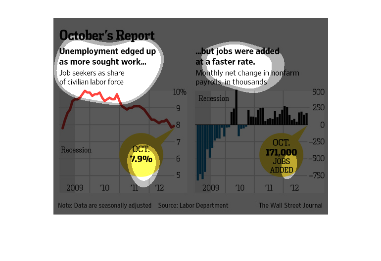
The left hand side of the graph shows job seekers as a share of the civilian labor force.
 The right side of the graph shows monthly net change in nonfarm payrolls.
Two graphs, a line graph and a bar graph, called "October's Report". The line graph has a
red line and focuses on job seekers as share of civilian labor force.  And the other one is
a graph with the blue in the negatives, and black as anything above, focusing on Monthly Net
Change In Nonfarm Payrolls.
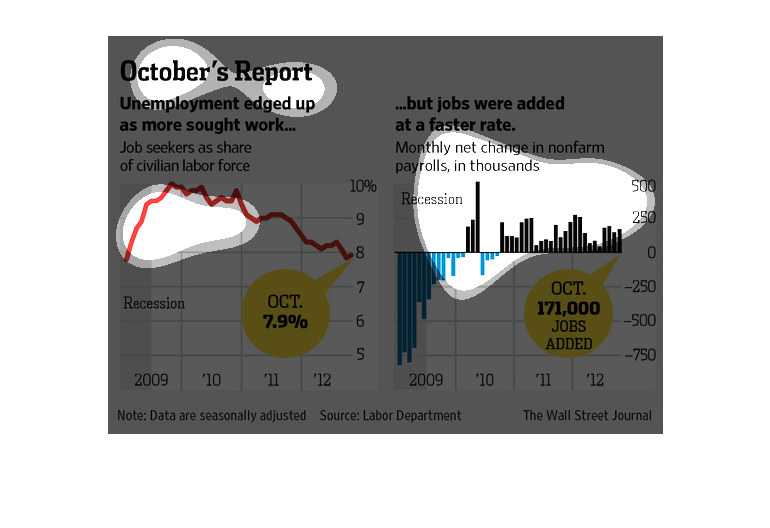
October's Report: Unemployment edged up and more sought work  This image has two graphs, for
time span 2009-12  The one of the left measure jobs seeks share of the civilian labor force.
It has been declining.  The image on the right measures jobs added, showing that they were
added at a FASTER rate
The image depicts unemployment increasing as more people sought work. Yet the data indicates
that jobs were also added at a faster rate, with 171,000 jobs in 2012.
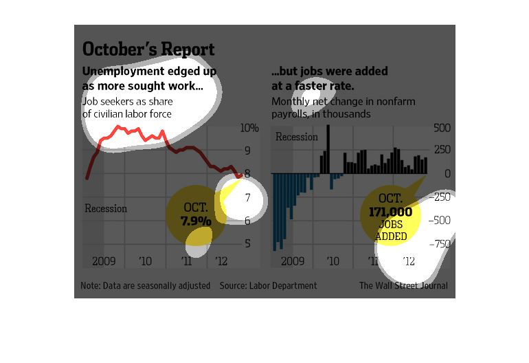
This is a chart regarding jobs in October. More people were looking for work and able to get
it as 171,000 Jobs were added to the market in October.
This chart from the Wall Street Journal shows how the unemployment rate actually increased
because people started entering the workforce despite an increase in overall jobs available
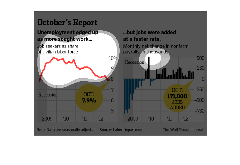
Two graphics support the claim that unemployment edged up as more people sought work in October.
One of these graphs shows job seekers as a percentage of the labor force which FELL. But the
other graph shows how jobs growth slowed faster than this fall. So the claim is true.
The image depicts unemployment increasing slightly as more people are seeking work. Number
of job seekers has decreased, but jobs were added at a faster rate.