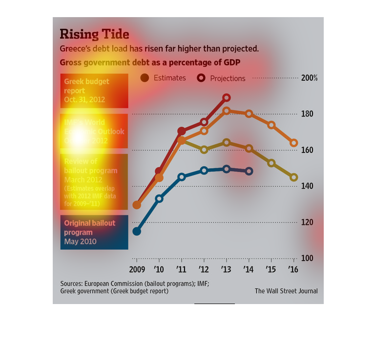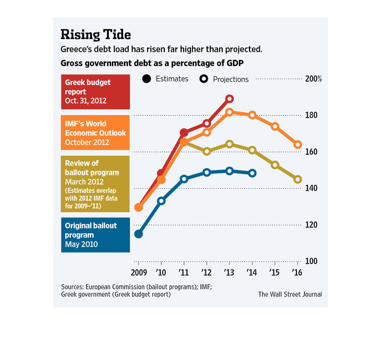
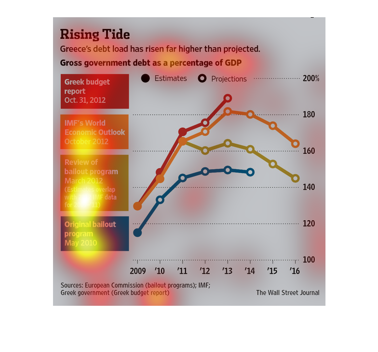
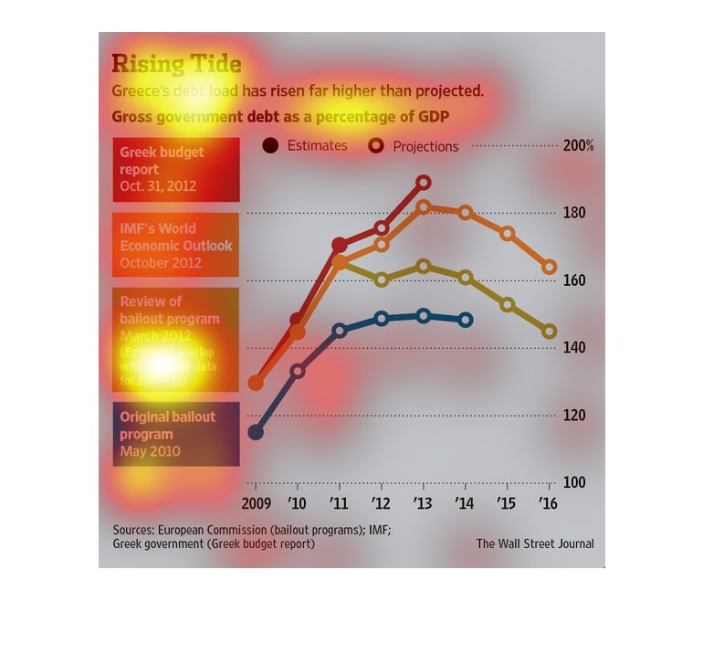
This chart from the Wall Street Journal shows how the debt levels as measured as a percent
of GDP for Greece is increasing at a faster rate than anticipated


This image shows or depicts in line graph and textual statistical format information concerning
Greece's ever growing debt load and how it has risen far more than expected.


The figure presented to the left is titled Rising Tide.  The figure is a representation of
the statistical research data for the debt load in Greece rising.

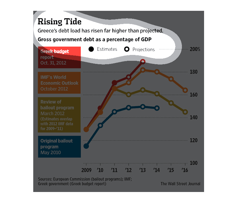
This article talks about how Greece is in more debt than projected. In the middle of the article
is a line graph which shows 4 different lines, ( Greek budget report, IMF's World Economic
outlook, Review of Bailout program, and Original Bailout).

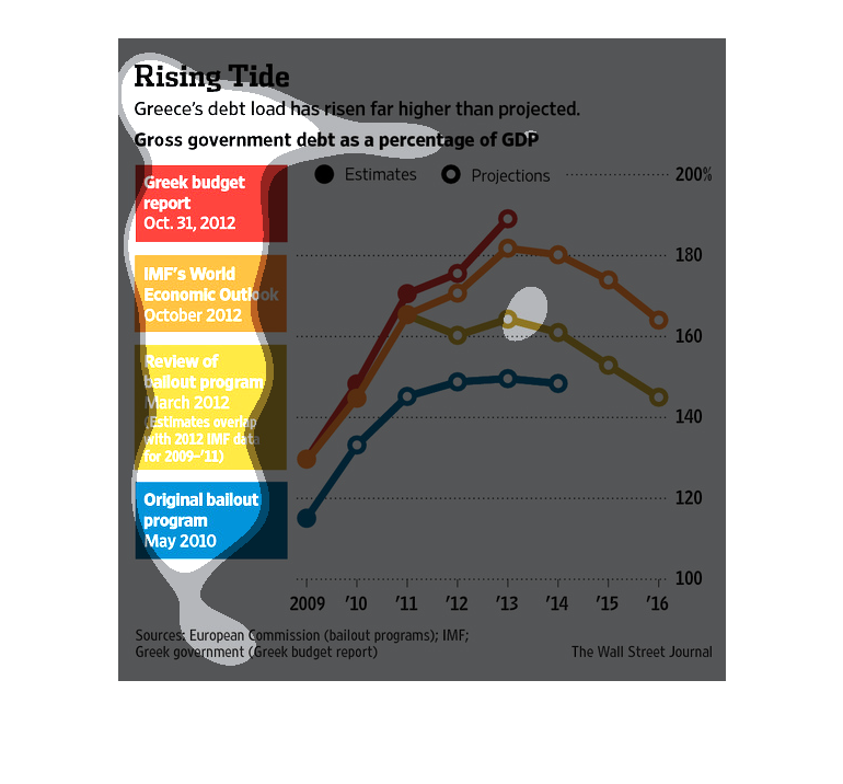
This is a graph of government debt as a percentage of GDP. It goes from 2009 to 2016, and
features color coded estimations from different agencies, and bailout numbers.
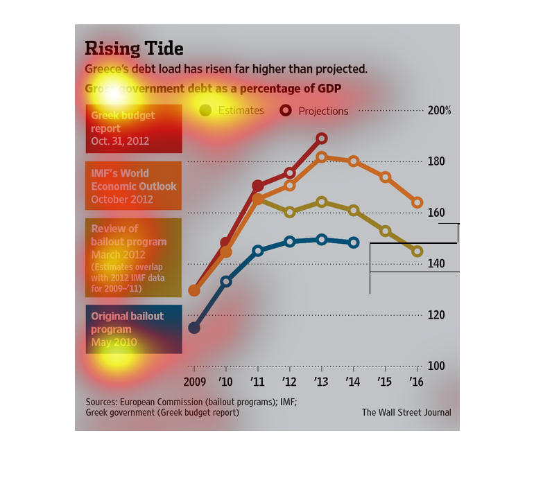
This chart from the Wall Street Journal shows how Greece's sovereign debt load has risen to
unsustainable heights and more than projected originally
This image shows a chart of Greece's increasing debt over time in comparison with initial
projections and several bailout programs. The actual debt has risen higher than all these
measures.
This chart is your typical graph chart that sets up one or a number of categories, illustrated
by either a map, a graph, an illustration, or photograph.
The image depicts Greece's debt load having risen far higher than projected. Even with the
bailout program, a review of the bailout program, and the IMF's outlook, Greece's debt load
rose higher than any provided outlook projected.
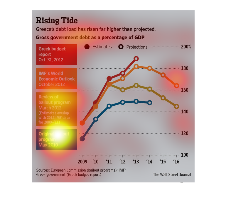
This image shows or depicts in both textural and line graph statistical formats Greece's rising
debt load being far than projected. Years from 2009 to 2016.

This image shows Greece's debt load and how it has risen far higher than projected. The graph
shows gross government debt as a percentage of GDP. The information listed is the Greek budget
report from Oct 31, 2012. Also IMF's economic outlook and review of the bailout program.

This is a graph of Greece, showing the rate at which the gross national debt increased each
year. The graph is split into colors showing each different source, their projections, and
how Greece's GND exceeded their expectations.
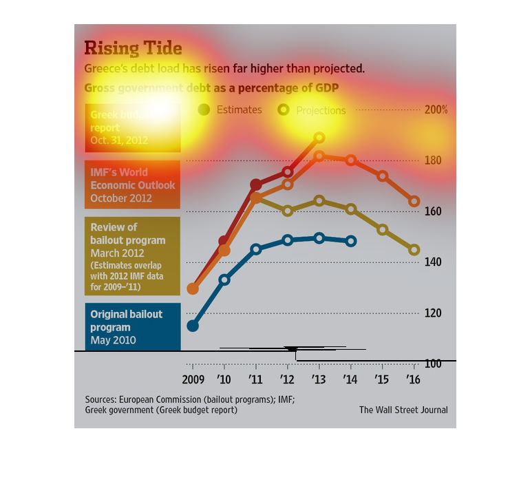
Greece is in a very dangerous position right now. The fact that they are on the verge of bankruptcy
is alarming and will cost the Euro zone a lot of grief.
This image discusses Greece's debt crisis, claiming that its debt load exceeds what was previously
projected.  The graph lines on the accompanying figure show this. There are lines for the
Greek budget report, the IMF's world economic outlook and other lines that show Greece is
fairly worse than expected.