Epson 3800: Step-By-Step Printing Workflowby Eric ChanLast updated: February 7, 2009
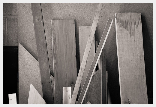
Old Boards, December 2008
OverviewA very common question is "why don't my prints match what I see on my screen?" or "why do my prints look much darker than what I see on my screen?" There are many possible answers to these questions. I have already written some notes on display calibration, display profiles, and soft proofing. Usually the problems stem from an improperly calibrated display, incorrect application settings, incorrect printer driver settings, or perhaps even a misunderstanding of what to expect from the prints. In other words, lots of things could go wrong during the printing process! It's no wonder these questions get asked as often as they do.I have written this page to help photographers resolve these problems and to get better screen-to-print matches. This page offers practical step-by-step instructions. I don't cover much theory here, but I do try to explain the basic reasoning behind each step, particularly the obscure ones. (If you are interested in learning more about the methods behind the madness, I highly recommend Fraser et al.'s Real World Color Management book.) This page focuses on printing to an Epson 3800 printer from Photoshop CS2, Photoshop CS3, and Photoshop CS4 under Windows XP, since that is what I use. I have also recently added instructions for printing from Lightroom 2, as well as driver configuration screenshots on Mac OS 10.5.x. If you are printing to a different printer (e.g., an Epson R2400 or HP B9180), from a different application (e.g., QImage or LightZone), or under a different operating system, then you may need to adapt these instructions.
Table of contents
Display calibration and profilingIn order to get consistent and repeatable screen-to-print matches, your display must be properly calibrated and profiled, preferably using a hardware colorimeter. The device I use and recommend is the Eye-One Display 2 colorimeter. (Note that since the GretagMacbeth and X-Rite companies have recently merged, this colorimeter may now be repackaged under a different name.)If you have a CRT display, I recommend setting your display calibration options to Gamma 2.2, 6500 K for the color temperature, and 100 cd/m2 for the target luminance. If you have a LCD display, I recommend setting your display calibration options to Gamma 2.2, "native white point" for the color temperature, and 100 cd/m2 for the target luminance. This last point is very important: new LCDs are capable of emitting a lot of light (and often are extremely bright out of the box). If you edit images on a super-bright display, your print will appear too dark by comparison. Even if your calibration software recommends setting the target luminance to a higher value (e.g., 120 cd/m2), I still suggest using a lower value such as 100 cd/m2. If you use a hardware colorimeter to calibrate and profile your display, make sure to disable Adobe Gamma, which comes with Adobe Photoshop. See this Adobe tech note to learn how to disable it. Here are a couple of quick tests you can use to check your monitor setup:
Not all monitor calibration packages allow you to specify a target luminance during the calibration process. I don't recommend these packages because having the proper monitor brightness is very important to getting consistent screen-to-print matches. I strongly recommend investing in a colorimeter package whose software allows you to specify a target luminance. However, in case you don't have such a colorimeter package, you can still get a reasonable estimate for an appropriate brightness of the display, if you have a digital camera with a spot meter. Here's the procedure: Open a blank white window, e.g., in a web browser, in Photoshop, in MS Word, etc. Give yourself lots of blank white space. Point your camera's spot meter at the white space. Set the camera to manual exposure, f/8, 1/15 sec, ISO 100. Adjust the brightness of the display till the exposure indicator lies at the middle of the camera's exposure scale. If you can accomplish this, then the display will be at roughly 100 cd/m2. New users often express the following sentiment (which I've certainly experienced myself before): I just invested in an expensive printer, and inks and paper aren't cheap either -- do I really need to put more money into a hardware colorimeter? Well, no, of course you don't have to. But if you want consistent screen-to-print matches, I strongly encourage you to consider it. Setting up Photoshop CS2's color settingsMake sure Photoshop's Color Settings are set up properly. Here are the settings I use (click on the image to see a bigger version). Photoshop CS3 and CS4 settings are similar.
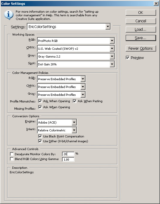
Click the image above to see a bigger version that you can actually read! In Photoshop, go to the Edit menu and choose Color Settings... I prefer to edit images using the ProPhoto RGB working space. Adobe RGB is also a good choice. I don't recommend using sRGB because the gamuts of modern inkjet printers (including the Epson 3800) exceed the gamut of sRGB in some areas, particularly greens and blues. Using sRGB prevents you from accessing the full range of colors that your printer, inks, and paper are capable of producing. Presumably, you've invested in a good printing system, so don't arbitrarily limit your color choices by choosing sRGB! I never edit images in Grayscale mode, so the choice of the Gray working space isn't important to me. In the example above, I've set it to Gray Gamma 2.2. Note that if you choose ProPhoto RGB or Adobe RGB as your RGB working space, it's a good idea to stay in 16-bit editing mode throughout the entire image editing process. This will help maintain smooth tonal transitions and minimize quantization (blocky) artifacts. I recommend checking all of the checkboxes in the Color Management Policies section. (You may need to click on the More Options button first to see this section at all.) Doing so will let Photoshop alert you to potential problems as they occur (e.g., if you open an image that doesn't have a color profile embedded).
How to soft-proof your imagesSoft-proofing is a handy feature that allows you to preview how your images will look when printed on paper. Some colors in your image (usually the saturated colors) may not be reproducible in the print; these colors are said to be out of gamut. The actual color gamut of the print depends on several factors, including the printer, ink, paper, and printer driver settings. Colors that lie out of gamut are remapped by the printer profile to colors that lie in gamut. Soft-proofing gives you a way to check if the profile has done a good job remapping these colors (as opposed to messing up your image).Important note: the soft-proofing results will only be meaningful if your display is properly calibrated using a hardware-based colorimeter. To soft-proof your image in Photoshop, go to the View menu, choose Proof Setup, then Custom... You will see a box like this appear: 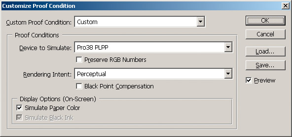
Soft-proof configuration with the Perceptual Rendering Intent Select the appropriate profile from the Device to Simulate menu. In the example above, I have chosen the Epson-supplied profile for Premium Luster for the Epson 3800 printer (Pro38 PLPP). If you have a custom profile and it is installed properly, select it from the Device to Simulate menu. Important: make sure that the Preserve RGB Numbers box is unchecked and that the Simulate Paper Color box is checked (see example image above). In most cases, you should either (1) set the Rendering Intent menu to Perceptual and uncheck Black Point Compensation (as shown in the example image above) or (2) set the Rendering Intent menu to Relative Colorimetric and check Black Point Compensation (as shown in the example image below). How do you know which option to choose? As with most things in life, the answer is: it depends! The most practical advice I can give is to toggle between the two configurations and pick the one that gives the more pleasing visual result. To learn more about rendering intents, check out this informative article by Bruce Fraser.
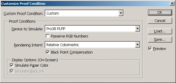
Soft-proof configuration with the Relative Colorimetric Rendering Intent Usually, you will see a big drop in contrast when you turn on soft-proofing, especially after you check the Simulate Paper Color box. Don't worry. The soft-proof feature attempts to simulate the contrast range of the paper with the side effect that the preview looks pretty flat. The actual print should look fine. Here are some things to look for when soft-proofing and comparing rendering intents:
It is common to use the Perceptual rendering intent for some images and to use the Relative Colorimetric rendering intent for other images. This is why it's important to soft-proof each image so that you can make the choice on a per-image basis. Remember, printer profiles can do amazing things, but even the best profiles are "dumb" in the sense that they don't take into account the contents of your images. For example, let's say we have an image with strong reds and greens, but only some of the reds are out of gamut. The Perceptual tables in most profiles tend to reduce saturation in all hues. These profiles may do a good job of desaturating our reds to fit the output gamut, but they may also unnecessarily desaturate the greens (which were already in gamut to begin with). If you find this is happening to your images, it may be worthwhile to make selective color edits on your image (e.g., selectively desaturate the reds, but leave the greens alone). In other words, it may be necessary to optimize the color for the specific printer or paper that you are working with. For some of your images, the differences between the Perceptual and Relative Colorimetric rendering intents may be very subtle and perhaps imperceptible. If you can't see significant differences between these two configurations, that's fine; just pick one and print with it. What if both rendering intents look terrible in the soft-proof? What if, for example, you see nasty color transitions or blocked-up shadow detail with both configurations? This could be the sign of an inferior printer profile. A good printer profile can make a big difference in the result, especially in tonal separation and color detail preservation. For example, I used to use a paper whose profiles (supplied by the manufacturer) had difficulty separating between subtle shades of green. This was problematic for me, because many of my nature photographs contain significant amounts of green. I thought this was a limitation of my printer at the time (an Epson Stylus Photo 2200) or the paper I was using. As it turned out, the problem was with the profile. Later, I built a custom profile for this paper and the green separation issues disappeared. I was amazed. Moral of the story: soft-proofing can also help you identify printer profile issues. If you are experiencing trouble with default or manufacturer-supplied profiles, consider investing in a high-quality custom profile. If the soft-proofing discussion above seems overly complicated to you, don't worry. The practical steps are easy to follow. Just turn on soft-proofing as described above, compare the two rendering intent configurations, and pick the one that looks best to you. With some experience, you'll have a good idea of which intent works well with which images.
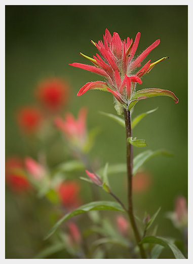
Indian Paintbrush, Jasper National Park, Canada, June 2006
How to print color and B&W images with the RGB color driverPreparation: you should prepare your image in Photoshop in RGB Color mode. I recommend using 16-bit editing throughout your entire image processing workflow. The following steps can be used to print color images as well as black-and-white (B&W) images. If you are printing neutral B&W images, however, I recommend printing using the ABW driver instead. I strongly recommend preparing your final image (i.e., the image to be printed) at 360 pixels/inch (ppi), the native resolution of the Epson 3800 printer driver. This will often require resampling your image in Photoshop (via Image Size) to the desired output dimensions at 360 ppi. Steps:
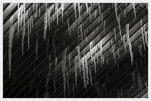
Icicles, Franconia Notch State Park, New Hampshire, March 2005
How to print B&W images with the ABW driver (without ABW profiles)Note: I updated this section significantly in November 2008 with a new recommended workflow. The new workflow has three key advantages over the previous method: (1) it is more similar to my recommended workflow for standard RGB color printing, therefore making it easier to remember, (2) it works in all color-managed application and OS environments that I'm aware of, including Lightroom, and (3) it avoids a potential glitch when printing from Photoshop CS4 on a Mac OS X Leopard system to the Epson ABW driver (the glitch is that no print emerges from the printer!).Preparation: You should prepare your image in Photoshop in either Grayscale mode or RGB Color mode. If you choose the latter option, make sure that your image is truly gray (i.e., R = G = B for every pixel in your image). The Epson ABW driver is a grayscale driver. If your image contains any color (e.g., if you attempt to add a warm tone to your image in Photoshop), the ABW driver will convert the image to grayscale before printing it, thereby discarding your color toning efforts. The only way to add color toning to images printed through the ABW driver is to use the Horizontal and Vertical knobs in the ABW driver settings (see below). I strongly recommend preparing your final image (i.e., the image to be printed) at 360 pixels/inch (ppi), the native resolution of the Epson 3800 printer driver. This will often require resampling your image in Photoshop (via Image Size) to the desired output dimensions at 360 ppi. Limitations: Please be aware of the following limitations of this procedure:
Steps:
How to print B&W images with the ABW driver (with ABW profiles)If you have ICC profiles designed to be used with the ABW driver, such as the ones provided on this page, then follow the instructions below carefully. They are similar to the RGB color printing instructions, but differ in a few key places.Preparation: you should prepare your image in Photoshop in RGB Color mode or Grayscale mode. I recommend using 16-bit editing throughout your entire image processing workflow. I strongly recommend preparing your final image (i.e., the image to be printed) at 360 pixels/inch (ppi), the native resolution of the Epson 3800 printer driver. This will often require resampling your image in Photoshop (via Image Size) to the desired output dimensions at 360 ppi. Steps:
How to print images from LightroomThe above steps were written for printing from Photoshop. Printing from Lightroom is similar, but the interface is different (and, in my opinion, made much easier through the use of presets!).Steps:
In other words, by using presets, you can skip Steps 3 through 6 entirely and you don't have to see any more printer dialog boxes! And you can create as many presets as you want (e.g., one for each common printing configuration).
How to configure the Epson driver on the MacThe above instructions were largely written with Windows in mind, since that's the platform I was using at the time. Printing on the Mac is very similar, but the Page Setup and Epson printer driver dialog boxes look different. If you are printing on the Mac, the following screenshots should help you configure the Page Setup and Epson driver dialog boxes properly:Screenshots for printing on Mac OS 10.5.x to the 3800, driver 6.11 (RGB color mode) Screenshots for printing on Mac OS 10.5.x to the 3800, driver 6.11 (ABW mode) In the example shown in these screenshots, I was configuring the driver to print on Red River Arctic Polar Satin, without borderless. Notice how in the PageSetupSize.jpg screenshot you have to select not only the paper size, but also the feed mechanism. This is important. If you wish to print, say, on Velvet Fine Art but you don't select the Manual - Rear option shown in the screenshot for your selected paper size, then you won't be able to select the Velvet Fine Art option from the Media Type popup menu in the driver.
|